Using Custom Photoshop Brushes to Create an Immersive Lighting Effect
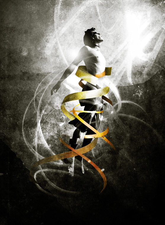
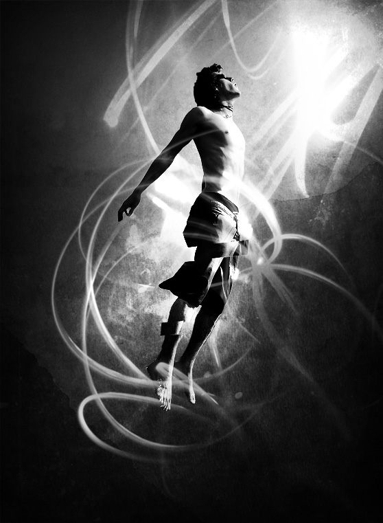
In this this tutorial I'm going to walk you through a few steps on how to use custom Photoshop brushes along with a few vector elements to create this immersive lighting effect composition. You'll be surprised at how easy the steps are to create this piece.
First off, here's a look at what we'll be creating. Here is a list of the WeGraphics elements that I used for this piece.
Painted Light Effects Brushes
Grunge and Retro Mountains
For those non-WeGraphics Members, I'd like to suggest these free resources as an alternative.
Psionic Storm Brush Set
Grunge Stone Wall Texture
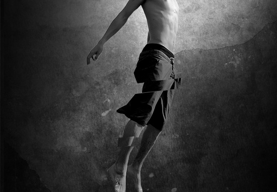 Now combine (Cmd + E) the layers containing sections of his legs with his original layer. Then duplicate the layer and set that layers blend mode to "Overlay". That should punch the contrast on the boy a little.
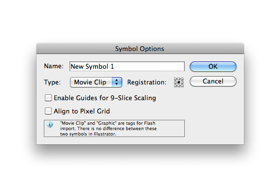
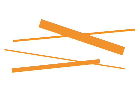 Select all of the rectangles and drag them over to the symbols palette. This new dialog will appear. You can name the symbol, if you like, and you can ignore the rest. Press Okay to add the symbol to the palette.
 You can delete the group of shapes after adding them to the symbols palette.
Now create a simple line drawing with the pen tool similar to what I have below.
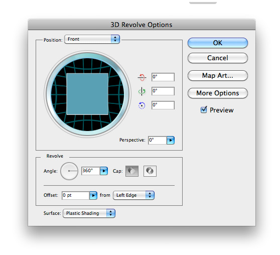
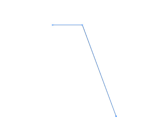 Now select (Effect | 3D | Revolve). Inside the dialog choose "Front" for the position, and check "Preview".
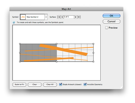
 Now click "Map Art". You'll need to make several selections in this dialog. First choose the number 5 for the Surface (this may require a little experimentation, so choose a different surface if number 5 doesn't work right for you). Choose your newly created symbol in the symbol drop down box.
 Now choose "Scale to Fit", and check "Shade Artwork" and "Invisible Geometry". Click Okay. You should now have something like this.
 Again, you may need to experiment with the size and number of rectangles for your initial symbol, until you get something you are happy with to wrap around the boy back in Photoshop. Once you have something you like, move on to the next step.
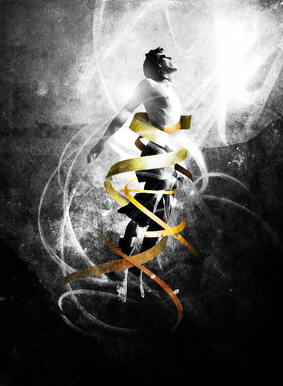 Then I created a Gradient Map Adjustment Layer and placed it above all others. I used a dull olive color for the gradient.
 Below is my final image. I hope this tutorial help to illustrate how easy it is to use custom brushes to create a stunning effect in a very short amount of time. I'd love to see your results, feel free to share them using the comment fields below.

First off, here's a look at what we'll be creating.
 Here is a list of the WeGraphics elements that I used for this piece.
Painted Light Effects Brushes
Grunge and Retro Mountains
For those non-WeGraphics Members, I'd like to suggest these free resources as an alternative.
Psionic Storm Brush Set
Grunge Stone Wall Texture
Step 1
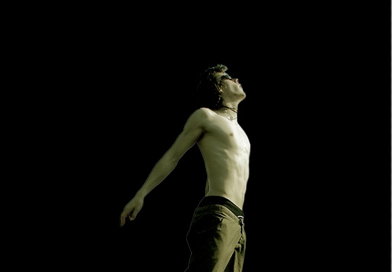
Lets start by grabbing the stock photo of the boy jumping. You can download it here. Now use you favorite selection method to pull the boy from the background. I used a combination of the Quick Selection Tool (W) to make the initial selection, and Quick Mask Mode to clean up the edges. Now copy and paste the boy onto a new black canvas 725 x 990 pixels.
Step 2
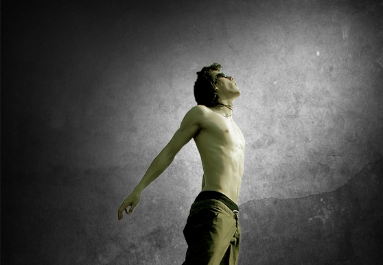
For the next step lets go ahead and create the background. I pulled a texture from the Grunge and Retro Mountains set. I sized it down and placed it on a layer behind the boy. I set the layer's blend mode to Overlay. Then on a layer below the texture I used a large soft gray brush to paint some of the texture behind the boy.
Step 3
Next lets desaturate the boy (Image | Adjust | Desaturate). Then make a few random selections, and cut and paste them to offset sections of the boy's legs. To tilt your selections at an angle use (Select | Transform Selection). Now combine (Cmd + E) the layers containing sections of his legs with his original layer. Then duplicate the layer and set that layers blend mode to "Overlay". That should punch the contrast on the boy a little.

Step 4
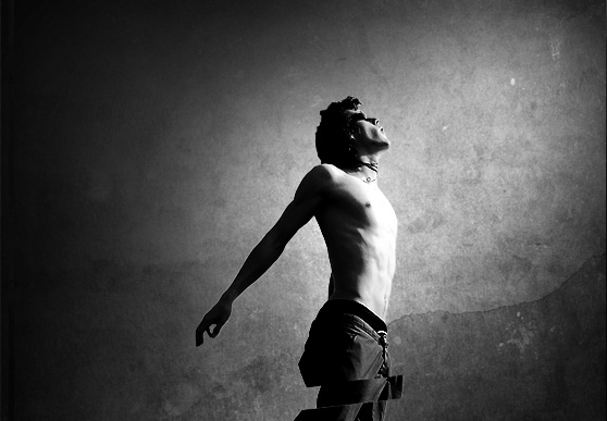
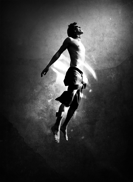
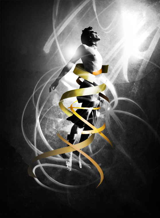
In this next step I've simply applied a few brushes from the Painted Light Effect Brush Set each to its own layer with a blend mode set to Overlay. Below is the progression of brushes being applied.


Step 5
To create the ribbons wrapping around the boy, we need to head over to Adobe Illustrator for this next step. In Illustrator create a new canvas with some random rectangles in an orange/gold color. You'll have to experiment a little in order to get the variety and pattern correct for these ribbons. Adjusting this initial layout is how to accomplish that. Select all of the rectangles and drag them over to the symbols palette. This new dialog will appear. You can name the symbol, if you like, and you can ignore the rest. Press Okay to add the symbol to the palette.
 You can delete the group of shapes after adding them to the symbols palette.
Now create a simple line drawing with the pen tool similar to what I have below.
 Now select (Effect | 3D | Revolve). Inside the dialog choose "Front" for the position, and check "Preview".
 Now click "Map Art". You'll need to make several selections in this dialog. First choose the number 5 for the Surface (this may require a little experimentation, so choose a different surface if number 5 doesn't work right for you). Choose your newly created symbol in the symbol drop down box.
 Now choose "Scale to Fit", and check "Shade Artwork" and "Invisible Geometry". Click Okay. You should now have something like this.
 Again, you may need to experiment with the size and number of rectangles for your initial symbol, until you get something you are happy with to wrap around the boy back in Photoshop. Once you have something you like, move on to the next step.
Step 6
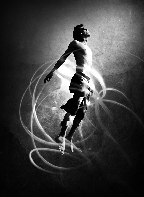
Copy and paste your ribbons onto your Photoshop document. I ended up with 3 different ribbon layers, and I placed them in between some of the light layers. Experiment with different arrangement to see what you like the best. I erased portions of the ribbons so that it appears that they are wrapping around the boy. I also used the dodge and burn tools to create subtle shadows around the ribbons where they overlap.
Step 7
For the final step, I copied the mountain texture layer onto a new layer above all others and set that layer's blend mode to Overlay. Then I created a Gradient Map Adjustment Layer and placed it above all others. I used a dull olive color for the gradient.
 Below is my final image. I hope this tutorial help to illustrate how easy it is to use custom brushes to create a stunning effect in a very short amount of time. I'd love to see your results, feel free to share them using the comment fields below.
