Photoshop Quick Tip: Ultra Glossy Text Effect
Really shiny beveled text is cool, and eye catching. When I come across effects like this I always stop and try to identify the layer styles that were used to achieve the look. The fact is you can create a very complex look with just a few layer styles. In this Quick Tip, I'll show you just how easy it can be.

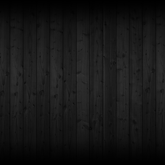
 This makes the fade to black at the top and bottom of the background. That's all we need to do for the background.
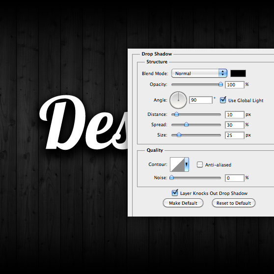
 Lets start applying our layer styles. First up is a really thick drop shadow.
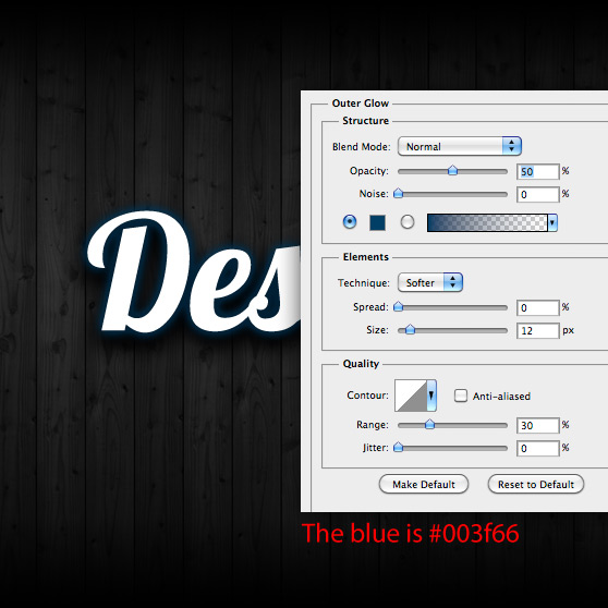
 Next is a subtle blue Outer Glow.
 Now for the beveled edge.
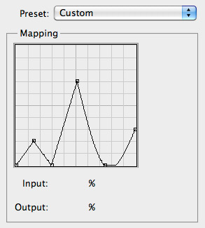
 Double click the Gloss Contour thumb and create a contour similar to mine. It doesn't have to be exact. You may want to adjust it a little depending on the font you chose.
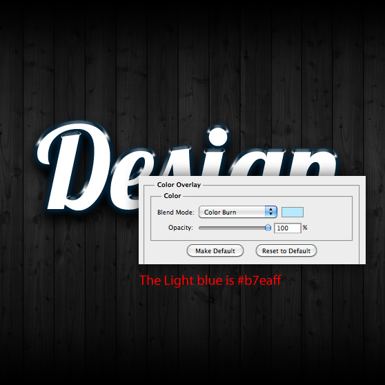
 Now lets add a light blue Color Overlay and a Gradient Overlay. You won't be able to see these effects applied just yet because of the blend modes that we are setting. But that will all change after adding the Pattern Overlay.
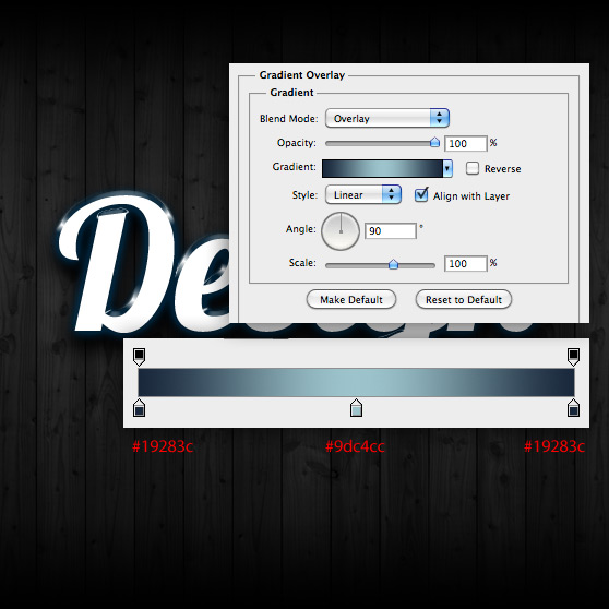
 And the Gradient Overlay.
 Press Okay and save the newly applied layer styles.
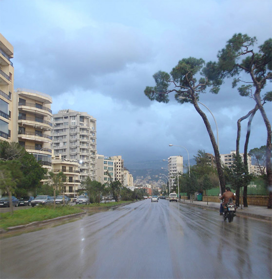 I desaturated the image ( Shift + Cmd + U ) and applied a Spherize Filter ( Filter | Distort | Spherize ) with amount set to 100%.
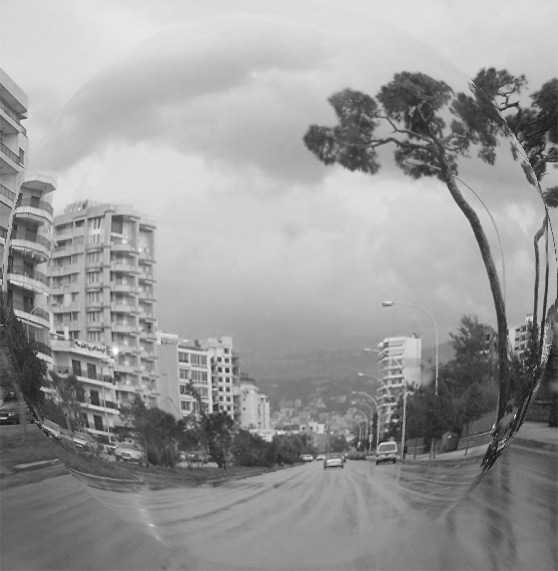 Next I gave it a slight radial blur ( Filter | Blur | Radial Blur ) with amount set to 15.
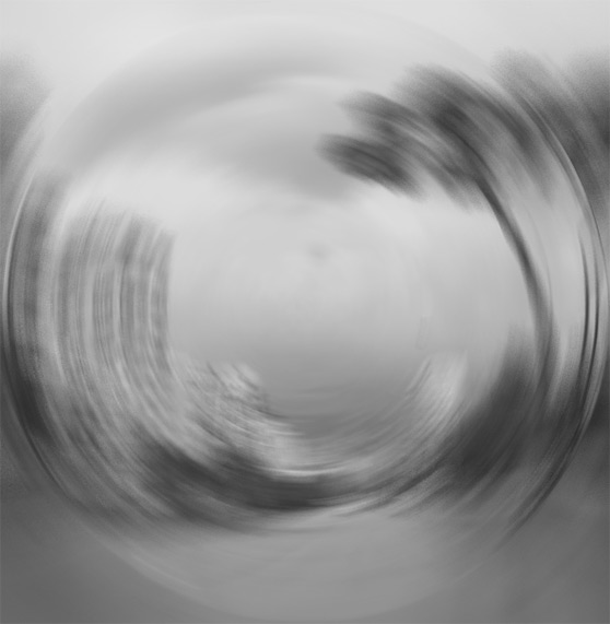 Now save this image as a pattern ( Edit | Define Pattern ). You can leave the name set to Pattern 1.
Now back to our layer styles... It's time to add the Pattern Overlay. Choose our newly created pattern from the drop down.
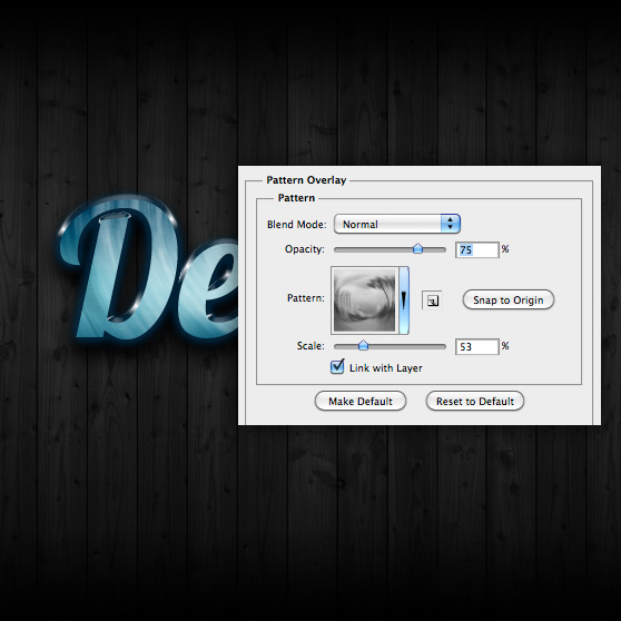 Use your cursor to adjust the patterns position over the text while the Pattern Overlay dialog box is still open. You should have something similar to the image below.
 Our last layer style to be applied is a gradient stroke.
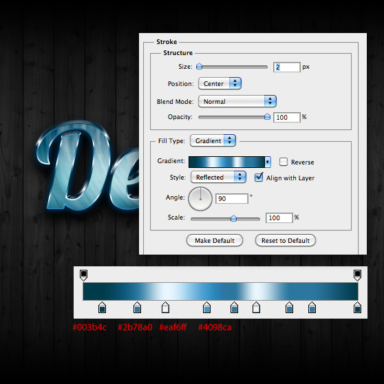 As a final step, and to add a bit more shininess, I like to take a soft white brush and paint a bit of glare on the highlights. Do this on a layer above the text layer.
 The completed effect.

Preview
Here's a look at what we'll be working to achieve.
Step 1
Create a new document 700px width and height at 72 dpi. Lets start with a really cool background image. I chose a wood panel texture for mine, I grabbed it from this set. If you're not a WeGraphics member, you can use any wood texture or even a subtle paper texture that you may have laying around. I desaturated ( Shift+Cmd+U ) my texture to make it a bit darker. I also added a new gradient adjustment layer with the following gradient. This makes the fade to black at the top and bottom of the background. That's all we need to do for the background.

Step 2
You can use any font for this effect, but I'm a fan of Lobster, so I chose that font to create this effect. Create a new Type Layer with the Type Tool (T) and type something large enough to span the majority of our document. Lets start applying our layer styles. First up is a really thick drop shadow.
 Next is a subtle blue Outer Glow.
 Now for the beveled edge.
 Double click the Gloss Contour thumb and create a contour similar to mine. It doesn't have to be exact. You may want to adjust it a little depending on the font you chose.
 Now lets add a light blue Color Overlay and a Gradient Overlay. You won't be able to see these effects applied just yet because of the blend modes that we are setting. But that will all change after adding the Pattern Overlay.
 And the Gradient Overlay.
 Press Okay and save the newly applied layer styles.
Step 3
For the Pattern Overlay, I used an image that I found here. I desaturated the image ( Shift + Cmd + U ) and applied a Spherize Filter ( Filter | Distort | Spherize ) with amount set to 100%.
 Next I gave it a slight radial blur ( Filter | Blur | Radial Blur ) with amount set to 15.
 Now save this image as a pattern ( Edit | Define Pattern ). You can leave the name set to Pattern 1.
Now back to our layer styles... It's time to add the Pattern Overlay. Choose our newly created pattern from the drop down.
 Use your cursor to adjust the patterns position over the text while the Pattern Overlay dialog box is still open. You should have something similar to the image below.
 Our last layer style to be applied is a gradient stroke.
 As a final step, and to add a bit more shininess, I like to take a soft white brush and paint a bit of glare on the highlights. Do this on a layer above the text layer.
 The completed effect.
