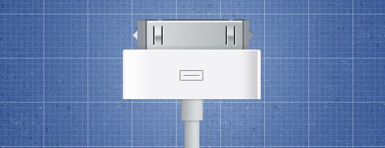
Illustration Tutorial: Creating an iOS Device Connector in Photoshop
If you own any iOS devices, you'll be all too familiar with the dock connector. It sits there, on your desk, only letting Apple products use it. But have you ever stopped and looked at its beauty? Despite being a simply cable, Apple has added some nice curves and a design which makes it ideal for a bit of Photoshop illustration. Read on to see how to make this pixel-perfect design from scratch (and with a little help from some WeGraphics resources).
Preview

Step 1
Create your file for your main work. The size of the document doesn't really matter, as the background we'll be creating is completely tileable. For this tutorial, I'll use a size of 558x300px. Set the background color to #3c5c99.

Step 2
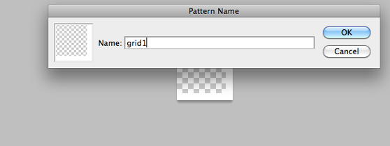
Next, we'll construct the blueprint-style grid-based background. To do this, we'll leave our current document to create a pattern. Make a document 8x8px, with a transparent background. Using your pencil tool, draw a 1px white line vertically on the far right, and horizontally along the bottom. Hit Ctrl+A to select all the content, and Edit>Define Pattern to generate a pattern out of your selected area. Name it whatever you want.
Step 3
Open another document, this time 64x64px, and once again, with a transparent background. Like the previous pattern, draw a 1px white line vertically on the far right, and horizontally along the bottom. Set the opacity of this layer to 30%. Create a new layer. Bring up the Fill window (Shift-Backspace). Under "Use", select pattern, and find the pattern we've just made. Hit "OK", and you"ll see a smaller grid along with your larger grid you've just created. Set the opacity of this layer to 10%. Using the same method from Step 2, define this document as a pattern.

Step 4
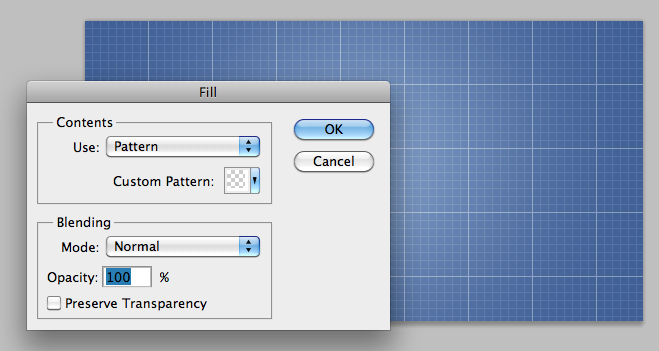
Return to our main document, and on a new layer, fill it with our newest pattern. You'll see a nice blueprint pattern starting to emerge. Next, take a soft round brush at around 600 px in white, and on a new layer, just click once to add a circular glow. Set the blending mode of this to Soft Light.
Step 5
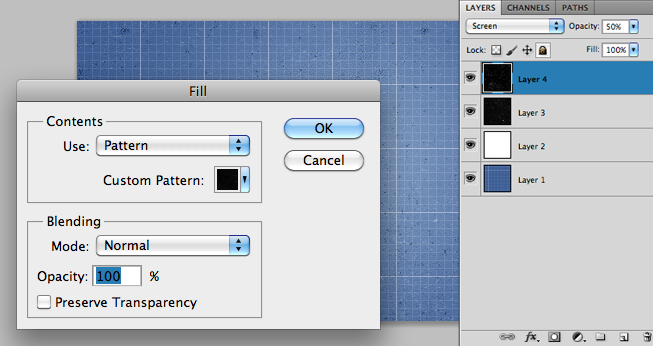
Let's add a few grunge details to our background. I'm using the Grunge Paper Patterns set for this. Simply take a few of the patterns and fill them in on a new layer. Then, experiment with the blending modes and opacity until you get something you like. For some of the textures, you might want to convert them to black and white (Image>Adjustments>Black & White). Personally, I'm using Textures 4 and 6, both at 50% opacity, with No. 6 set to Subtract, and No. 4 set to Screen. However, there's no right way to do it, so experiment all you like, there are countless possibilities.
Step 6
Now, let's get started on our dock connector itself. To start, construct a rounded rectangle 200x24 with a radius of 3px. You can set the size of the rectangle by hitting the triangle in the tool options, and choosing "Fixed Size". Place it as shown in the image and apply the following styles.

Step 7
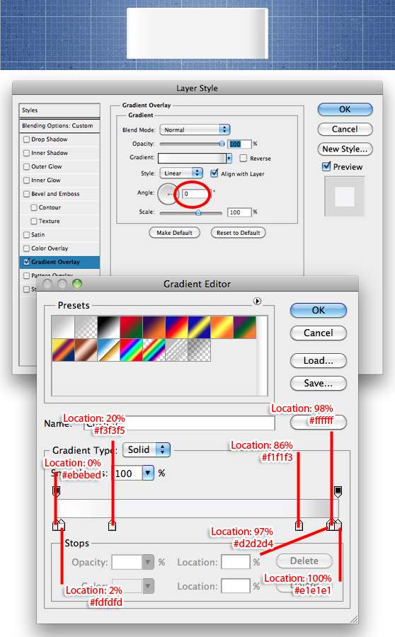
Next, using the rectangle tool, create a rectangle 200x70px, and place it around the centre of the canvas. Apply the following styles to it.
Step 8
To produce the dock connector icon, we'll create a rounded rectangle 34x15px, with a radius of 1px. Rasterize the layer. Ctrl+Click the layer thumbnail to select the content of that layer. Go to Select>Modify>Contract, and contract the selection by 1px. Delete the selection, leaving a 1px border. Take the pencil tool, and draw a 1px horizontal line in the middle of the rectangle. Apply a Color Overlay to this layer of #7c7c7c.

Step 9
Create another rectangle, this time 162x44, and place it as shown. Rasterize it. Apply these layer styles.

On a new layer, construct a small triangle with the tool of your choosing (pen tool, polygon tool, polygonal lasso tool), and place it on the top edge of the rectangle, a bit in from one side. Duplicate the triangle, and place it the other side. Merge these two layers (Select the layers and hit Ctrl+E). With our newest rectangle layer selected, Ctrl+Click on the thumbnail of this triangle layer. Hit Delete to erase that shape from our rectangle layer. Delete the triangle layer too.
Step 10
Now, create two small triangles either side of the rectangle. Let the left triangle be #e0e5e9, and the right be #90959d. Add the following drop shadow to both.

Step 11
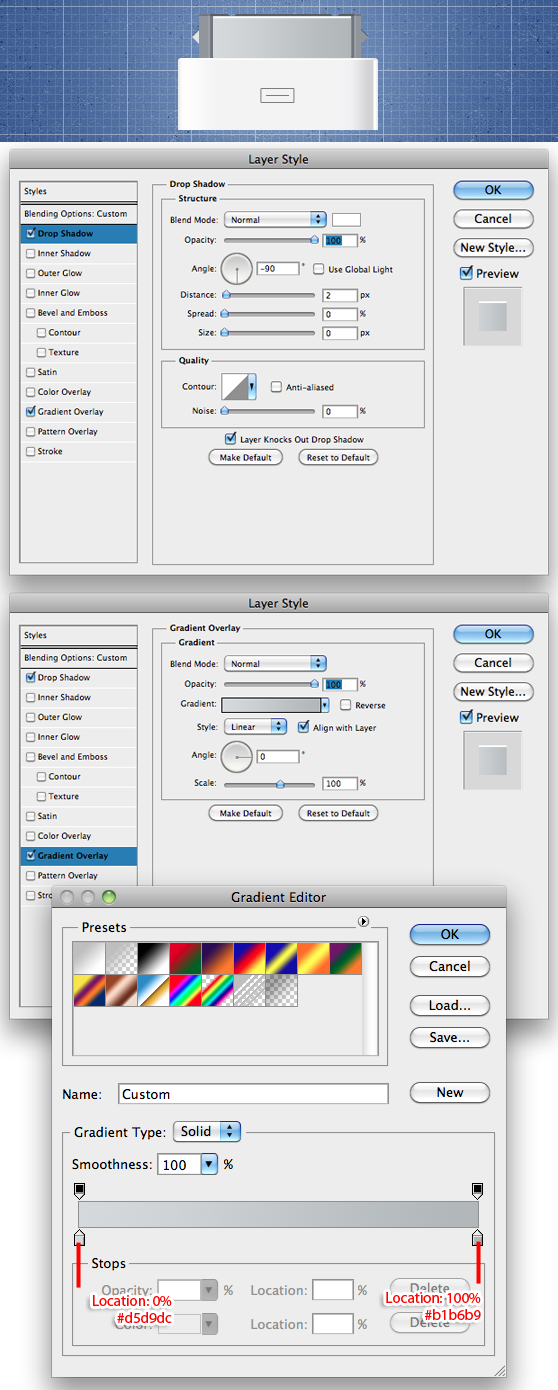
Make a rectangle, 138x40px, and place as shown. Apply the following styles to it.
Step 12
Using the pencil tool, draw a 2px vertical line as shown, in #353c3f. Apply these styles to it.

Then duplicate the layer so that there are 4 of them, and place them as shown.
Step 13
Create a small white square, the width between the lines we've just created. Add a motion blur to it (Filter>Blur>Motion Blur) at 90 degrees and 8px.

Next, create another small rectangle (we don't seem to be creating anything else!) and add the following layer styles to it.

Step 14
To add a bit of a shadow to our metal section, we'll make a rectangle the same width as the metal section, and a height of 2/3px. Place it just below the metal. Add these styles to it.

Step 15
Having completed our dock connector itself, now we can start on the cable. This, like almost all of the tutorial, involves making little rectangles, but the magic comes out once we start adding styles to it. To start, we'll make a rectangle 22px wide, stretching from the bottom of the connector to the bottom of the canvas. Add this gradient overlay to the layer.

Step 16
We'll create a shadow for the layer. Make a rectangle 22x5px, with the color #727272, and apply a motion blur at 90 degrees, 5px. We won't know where to put it until we've completed the next step, so let's get that done.

Step 17
Make a square, 32x32px, and place it on the bottom edge of the connector. Apply the same style as the cable.

You can now move the shadow we created in Step 16 so that it fits under the square, casting a bit of a shadow.

Step 18
This is the last step, and you'll be surprised to hear that it too involved creating a rectangle, this time 32x 5px, at #727272. Apply a motion blur at 90 degrees and 5px, and place it by the bottom of the dock connector. Any part of this layer which goes above into the connector can be cut off using the marquee tool.

Conclusion
Congratulations, you've reached the end, and are probably sick of drawing little rectangles by now. Hopefully, however, you've got a great result and have learned a little along the way. If anything didn't work the way it should, or you have any queries, don't be afraid to ask in the comments.

