How to Mockup Your Logo on a Free Stock Photo of a Coffee Mug
Create your own reusable mockups using free stock photos
This tutorial will show you how to create your own professional looking mockup using a free CC0 stock photo downloaded from UnSplash. You can use these techniques on other photos to create your own custom mockups.
Step 1
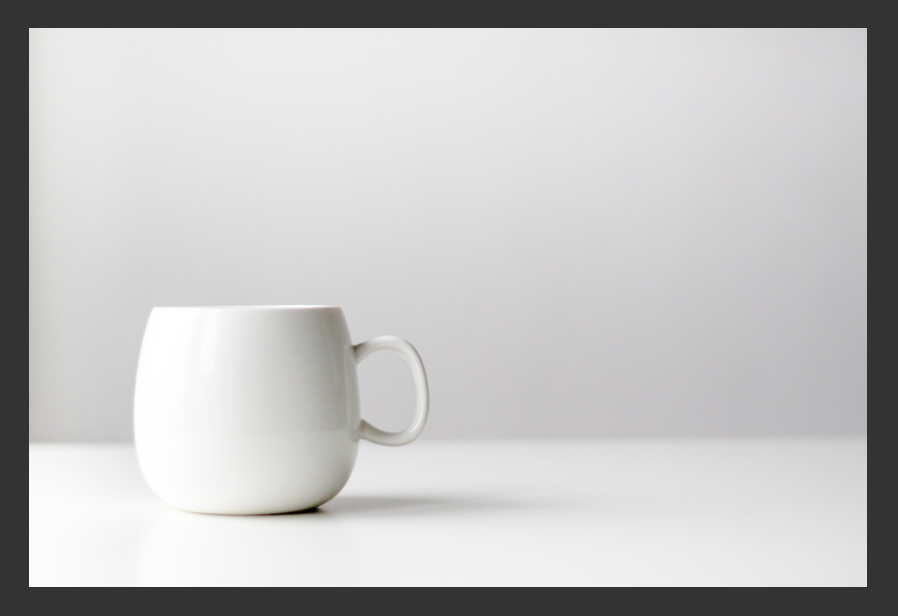
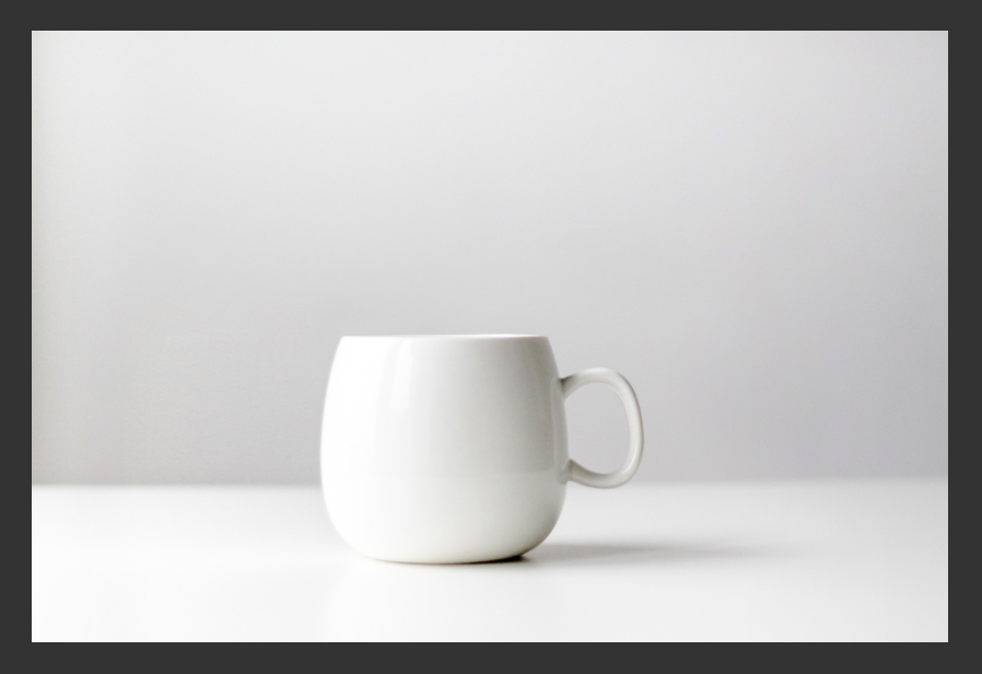
First, download the stock photo that you will be working with and open it in Photoshop. I found this lovely photo of a coffee mug on UnSplash by creator Nordwood Themes.
Note: Since writing this tutorial, the stock photo appears to have been removed from Unsplash, however you can still download it using the link above.
Step 2
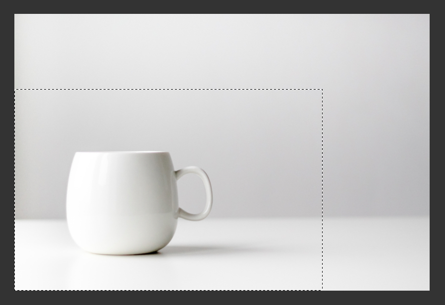
Time to prep the image a little bit to make it more suitable for a mockup. At the moment the mug is too far off to the side, we can correct this by making a rough selection around the mug using the Marquee Selection Tool.
Start from the bottom left corner and be sure to get a decent amount of background texture in your selection on all sides.
Step 3
Copy and paste your selection onto a new layer and move it to the right so that the mug is closer to the middle of the dartboard.
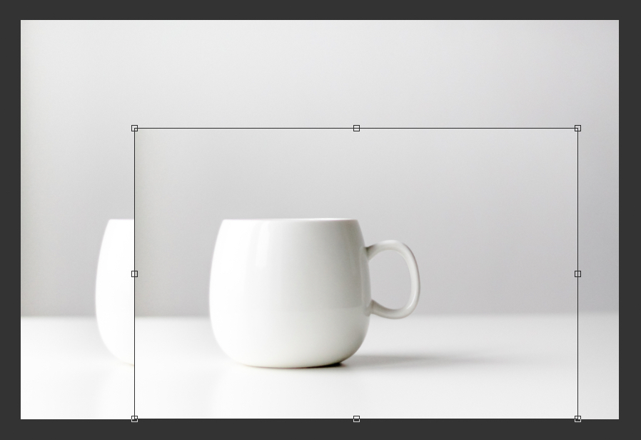
Step 4
Now with the Marquee Selection Tool, make a selection covering the available background texture on the left side of mug.
Use the Transform tools (CMD+T/CTRL+T) to stretch out the selection to the left and cover up the original mug on the background layer.
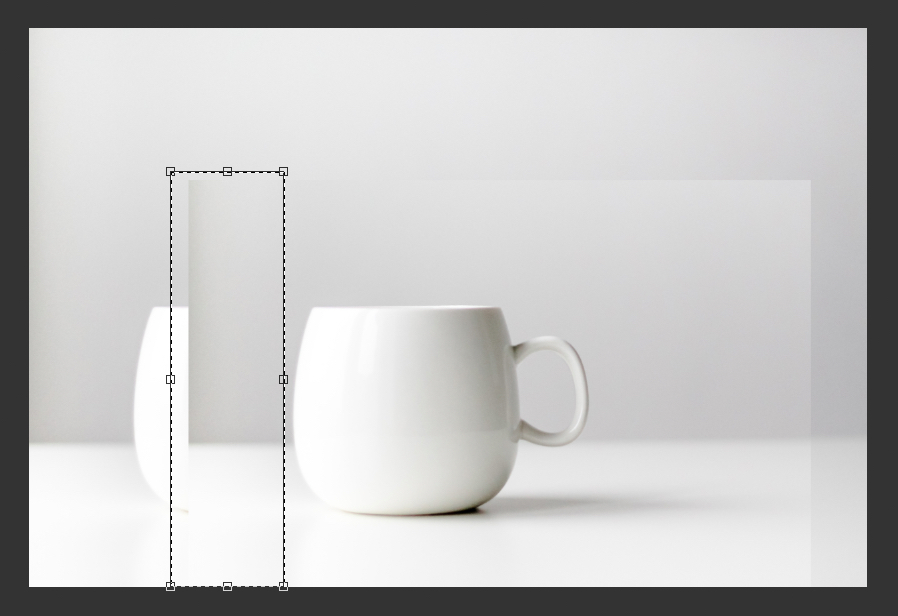
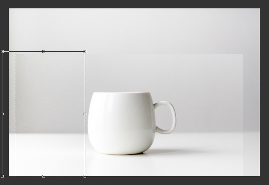
Step 5
In the Layers panel click the icon to create a new mask on the top layer, or go to Layer > Layer Mask > Reveal All.
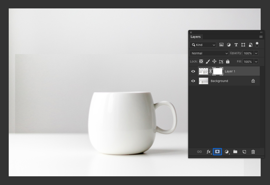
Step 6
Select the Brush Tool and use these settings:
- Soft Round Brush
- 600 Pixels
- Opacity: 50%
- Flow: 100%
- Color: Black
Check that the mask is selected in the Layers panel and use the Brush Tool to paint around the edges of top layer. The goal here is to blend the two layers together.
Try to avoid revealing the original mug on the layer below, if you accidentally do this just switch the brush color to white and paint over it again.

Step 7
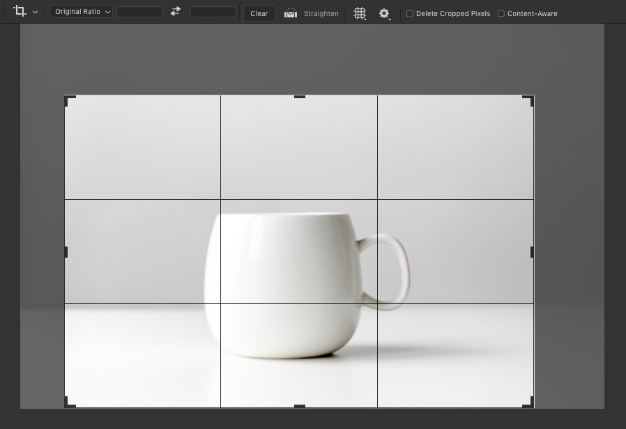
Select the Crop Tool and set the ratio to Original Ratio and then crop the image so that the mug is in the middle and takes up more of the overall frame.
Step 8
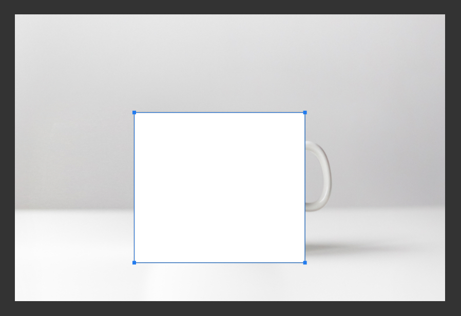
Now we are going to add in our design. Use the Rectangle Tool to draw a White rectangle shape that covers the whole mug (not the handle).
This will act as the bounds to our design, we want to make it slightly larger than the actual mug so that we have a few extra pixels to play with when transforming and warping it later.
Step 9
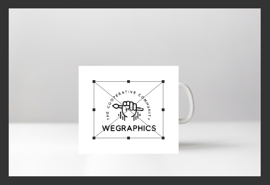
Now place your design on a new layer above the white rectangle, within the confines of the white rectangle. If you don't have a design handy, just type out some simple placeholder text.
Step 10
Select both the rectangle and design layers in the Layers panel and right click on them.
Choose Convert to Smart Object.
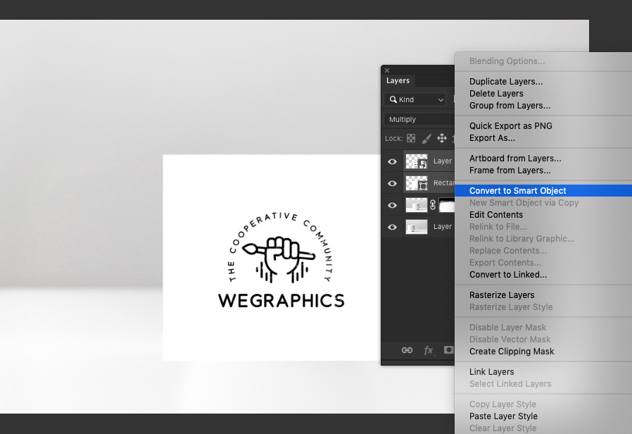
Step 11
Temporarily set the Opacity of the new smart object layer to 50% so that we can see the mug below.
Press CMD+T/CTRL+T to enter Transform mode.
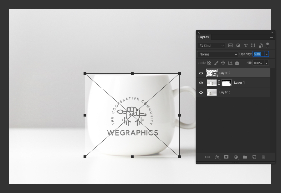
Step 12
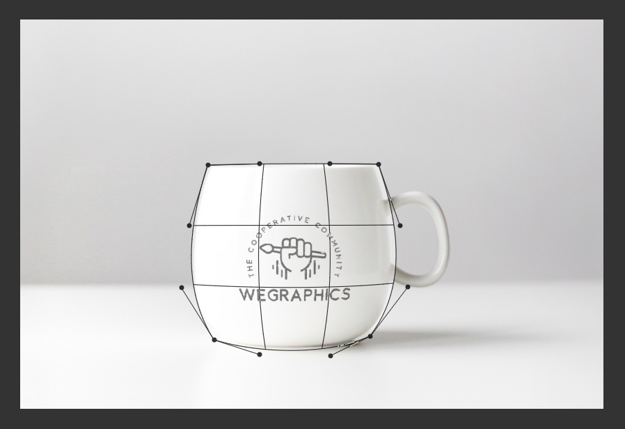
Go to Edit > Transform > Warp and use the controls that appear on the smart object to warp your design to the shape of the mug.
Start by moving the outside corner points inwards to meet the mug and adjust their handles to match the outer shape of the mug, then move the two vertical segments in the middle of the grid left and right respectively to create a subtle bulge effect.
This part relies on using your eye to match the warp effect to the contours of the mug. It doesn't need to be absolutely perfect, but try to give it a good shot.
Step 13
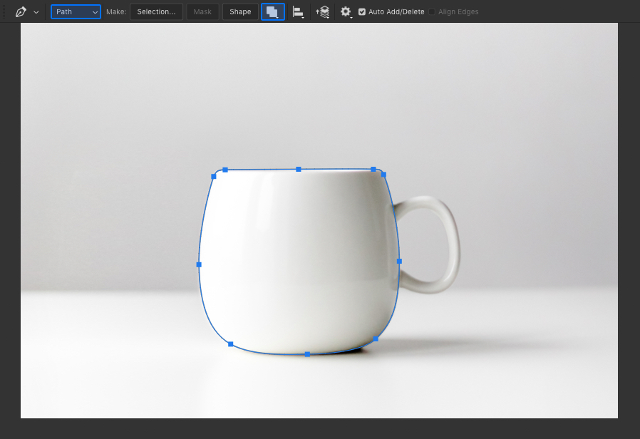
Hide the smart object layer temporarily and select the Pen Tool.
- Type: Path
- Mode: Combine Shapes
Use the pen tool with these settings to draw a path around the body of the mug. Try to get as close as possible to the edges.
Step 14
Show the smart object layer again, and also set the Opacity back to 100% then with the path you created in the last step still selected go to Layer > Vector Mask > Current Path.
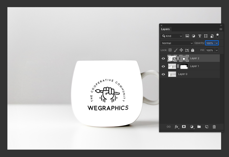
Step 15
Open the Properties window and enter 1.0 px into the Feather option.
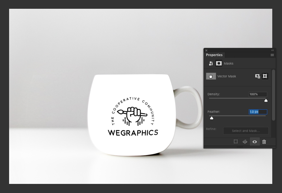
Step 16
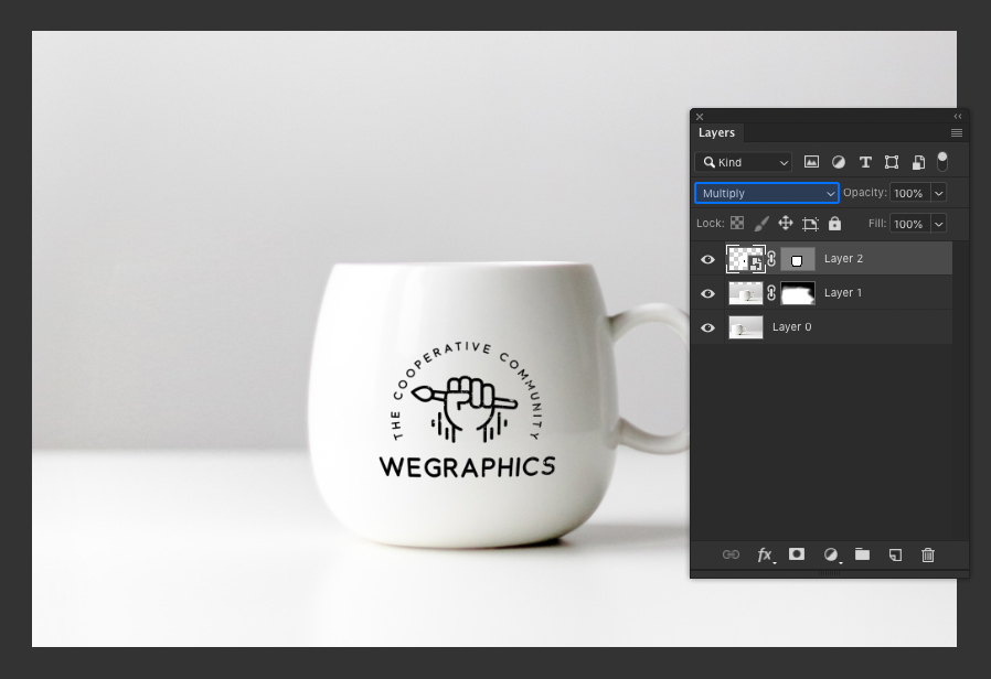
Set the blend mode of the smart object layer to Multiply.
As the mug is white, we will only be using darker colors in our design anyway so the Multiply blend mode works perfectly. If the mug was a different/darker color we would leave the mode as Normal and give our design a transparent background instead.
Step 17
This is starting to look pretty good now but we can make it look even more realistic by adding some highlights to the design.
Select the two background layers and right click them.
Choose Convert to Smart Object.
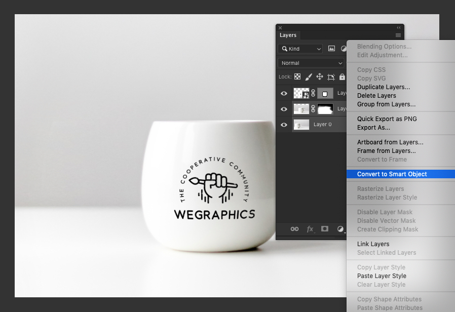
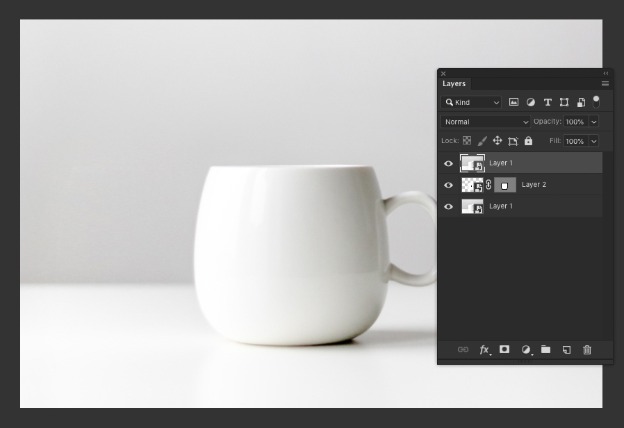
Step 18
Duplicate the background smart object and move the copy to the top of the layer order.
Step 19
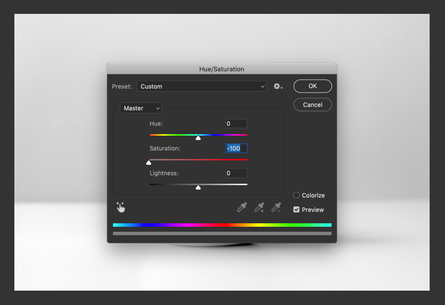
Go to Image > Adjustments > Hue/Saturation and set the Saturation to -100.
Step 20
Go to Image > Adjustments > Levels and set the shadow input level to 220.
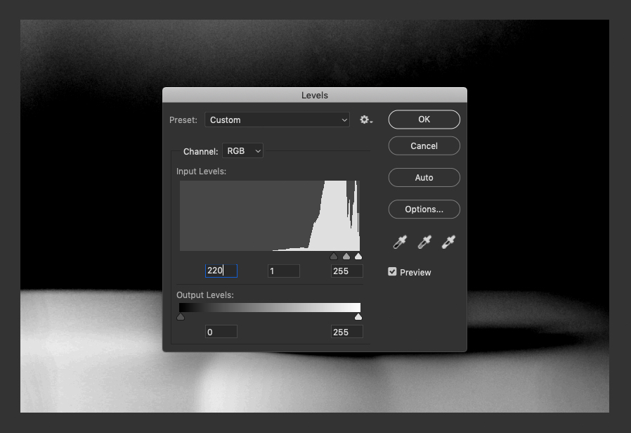
The goal here is the isolate the highlights from the original image.

Step 21
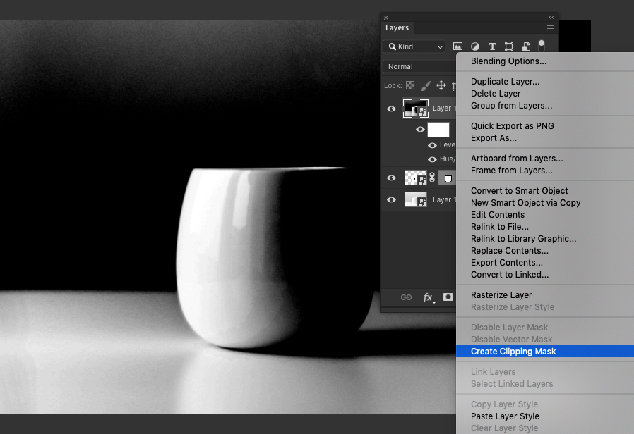
Right click on the top layer and choose Create Clipping Mask.
Step 22
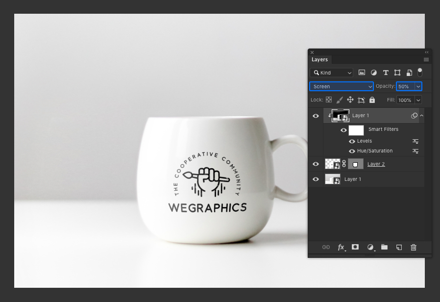
Set the blend mode of the top layer to Screen and Opacity to 50%. This will show through some of the mug highlights on the design layer. Try hiding and showing this Screen layer to see the effect and adjust the opacity of the layer if necessary to make the effect more or less noticeable.
Result & Conclusion
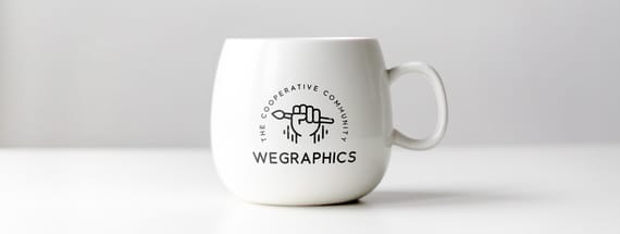
Here is the final result, a pretty realistic looking mug mockup that you created yourself simply using a stock photo. This technique can be applied to almost any type of image, however it does work best on photos of plain white objects with a shallow depth of field.
Here is the bonus, because we used Smart Objects, this is a true mockup in every sense. You can now place any design, text or image onto the mug without needing the redo any steps. Make sure to save your work in case you want to use it again at a later date!
