How to Make a Metallic Transformers-Style Logo
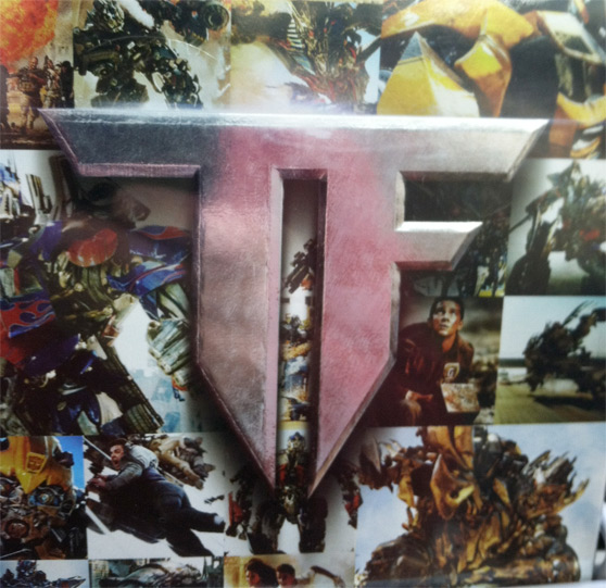
Yesterday I was browsing through the movie section at the local grocery store, and the logo graphic on this new Transformers movie box set caught my eye. It's just a simple TF, but the shape and the use of light and texture are striking. After studying it for a moment, I thought it would make an excellent tutorial here at WeGraphics.
If you're a WeGraphics member then you already have all of the materials to create this graphic. If not, I will suggest some alternative free materials.
For WeGraphics members you'll need these two sets:
- Scratched Metallic Textures
- Smoke Textures and Brushes Vol1
Free alternatives:
- Metal Scratches by Walnuss
- Smoke Brushes by Graham Jeffery
Here's a look at what we'll be creating
 Also, here's a look at the original box set that I photographed at the grocery store.
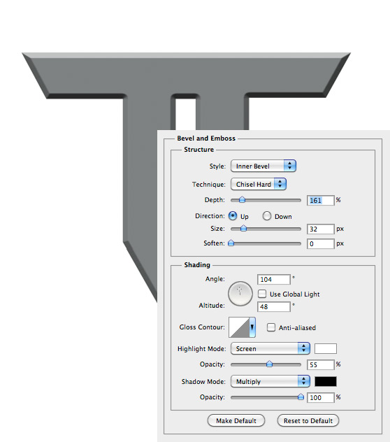 I don't use Bevel and Emboss styles very often, so one problem I ran into were these rounded corners. It seems like there should be a way to make those hard edges versus rounded, but I couldn't find a way to correct that. So I simply made a box half one color, and half another and turned it to match each corner.
 If someone knows of a way to do this within the layer style options, I'd love to hear how.

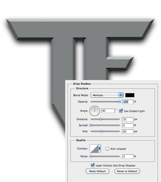
 Then I used a large soft black brush on a layer behind the TF shape to thicken the shadows a bit.

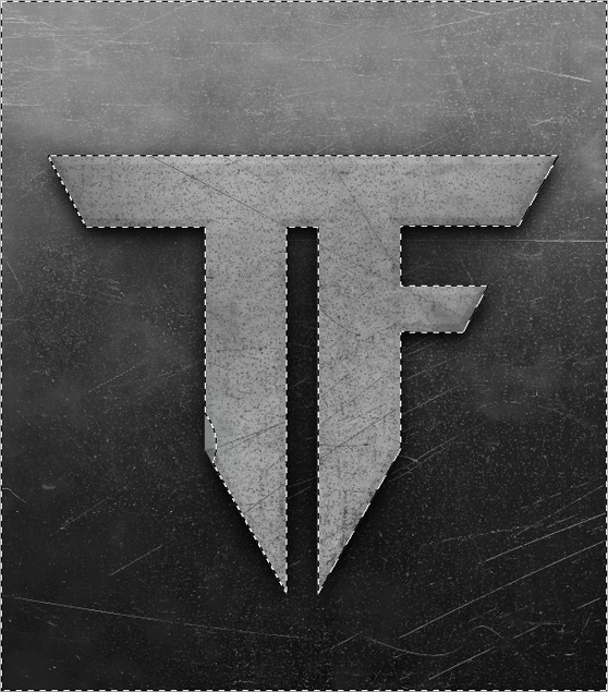 Now deselect the shape (Cmd+d) and set the textures blending mode to Overlay, and the opacity to 80%.

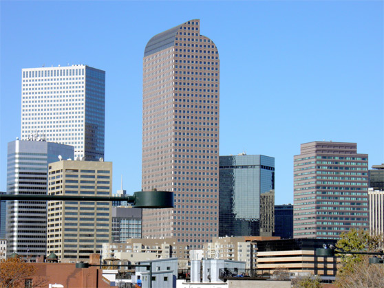 Using the exact same method you used in the previous step, apply the image to a new layer above the TF shape, add a heavy Gaussian Blur, create the same TF selection and delete the portion of the image that extends beyond the TF. Then change the reflection image blending mode to Overlay.
 Now with the same TF selection still active, lets create a new layer and paint some shadows around the left side of the TF shape. The shadow layer should also be set to Overlay and around 65% opacity. The animation below shows the before and after for my painted shadows.
 Do the same thing to the right side using a soft white brush to create a subtle highlight. Use the same Overlay blend mode and 65% opacity.

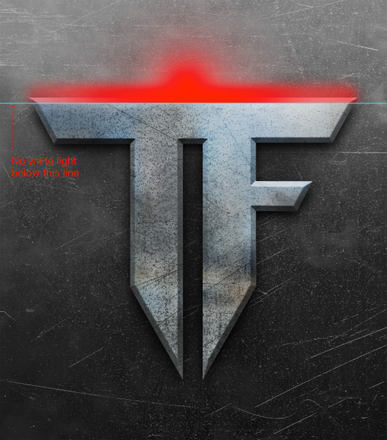 Use a soft eraser set to 50% opacity to remove some of the light as it approaches the edge of the T and F.


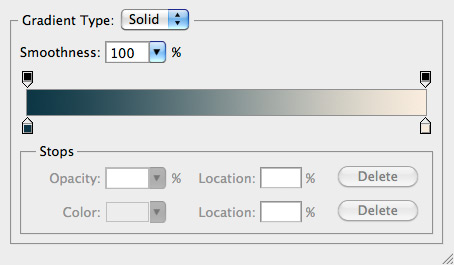 Below is my final composition. I hope you've learned how simple it can be to create a piece, worthy of a blockbuster trilogy, with just a few textures and brushes in Photoshop. Try these techniques in your own artwork and see what you can create!

 Also, here's a look at the original box set that I photographed at the grocery store.

Step 1
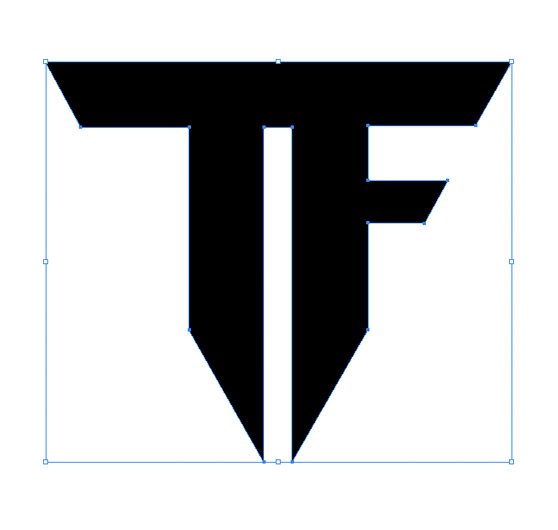
The first thing we need to do is create the TF shape. You can do this with the pen tool in Photoshop, but I like to use Illustrator. There's no real way to to instruct you on how to draw this shape other than to hold the shift key while clicking your points so that your lines remain perfectly straight. You can also turn on the ruler (Cmd+R) and the grid (View | Show Grid). These two tools will help you to get the proportions right.
Step 2
Now you can copy and paste your shape, as a shape layer, into a new Photoshop document. I made my new doc at 2400x2700 at 300 dpi. I applied a Bevel and Emboss layer style to the shape with the following settings. I don't use Bevel and Emboss styles very often, so one problem I ran into were these rounded corners. It seems like there should be a way to make those hard edges versus rounded, but I couldn't find a way to correct that. So I simply made a box half one color, and half another and turned it to match each corner.
 If someone knows of a way to do this within the layer style options, I'd love to hear how.

Step 3
Next up, lets apply a very heavy drop shadow to the shape.
Step 4
Now lets start applying some textures. I chose a texture from the Scratched Metallic Textures pack to use as a background. I desaturated and positioned it as follows. Then I used a large soft black brush on a layer behind the TF shape to thicken the shadows a bit.

Step 5
For the texture used on the TF shape, I grabbed a different file from the Scratched Metallic Texture pack and placed it on a layer above the TF shape. Then press the Cmd key and click the TF shape layer thumbnail in the layers palette to create a selection of the TF shape. Inverted the selection by pressing (Cmd+Shift+i), then press delete. This sill delete all of the texture except what is overlaying the TF shape. Now deselect the shape (Cmd+d) and set the textures blending mode to Overlay, and the opacity to 80%.

Step 6
Lets add a reflection to the surface of the TF. To do this grab an image of, well, just about anything. I used a city scape that I found here. Using the exact same method you used in the previous step, apply the image to a new layer above the TF shape, add a heavy Gaussian Blur, create the same TF selection and delete the portion of the image that extends beyond the TF. Then change the reflection image blending mode to Overlay.
 Now with the same TF selection still active, lets create a new layer and paint some shadows around the left side of the TF shape. The shadow layer should also be set to Overlay and around 65% opacity. The animation below shows the before and after for my painted shadows.
 Do the same thing to the right side using a soft white brush to create a subtle highlight. Use the same Overlay blend mode and 65% opacity.

Step 7
In this next step we need to apply some of the intense lighting coming from above the logo. To do this I used a soft white brush. Below I will show you the areas that I painted using red. Use a soft eraser set to 50% opacity to remove some of the light as it approaches the edge of the T and F.

Step 8
We could stop here as this is pretty close to what's on the box set, but I want to add a few more touches. Using some brushes from the Smoke Brush Set, apply a bit of steam coming from the top where the light is hitting the logo. Be subtle, and take these layers down to about 30 % opacity.
Step 9
For the final step lets add a Gradient Map adjustment layer. I used the following gradient as the setting for the layer. Below is my final composition. I hope you've learned how simple it can be to create a piece, worthy of a blockbuster trilogy, with just a few textures and brushes in Photoshop. Try these techniques in your own artwork and see what you can create!
