How to Illustrate a Realistic Guitar Using Photoshop
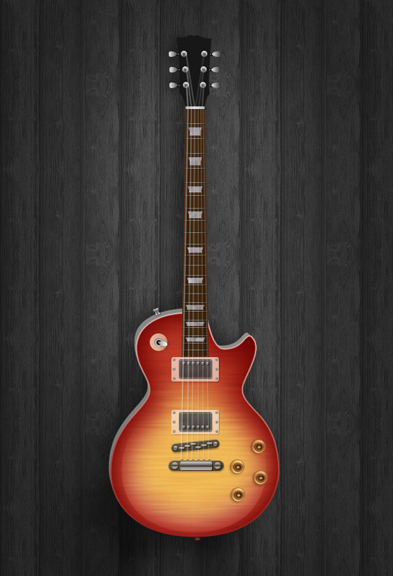
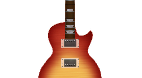
In this tutorial we're going to explore how easy it is to illustrate a guitar in Photoshop using tiny shapes, gradients and subtle shadows. Using these techniques and a good reference photo you can create an amazing amount of detail and realism. Lets jump right in.
Below is a preview of what we'll be creating.
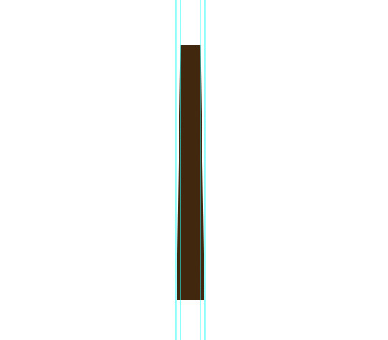
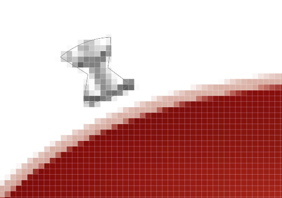
 You'll need to slightly taper the the top using the Direct Selection Tool (A). You can setup guides to help you make this adjustment. It also helps to zoom in so that you can see the pixel grid as you nudge the corners together.
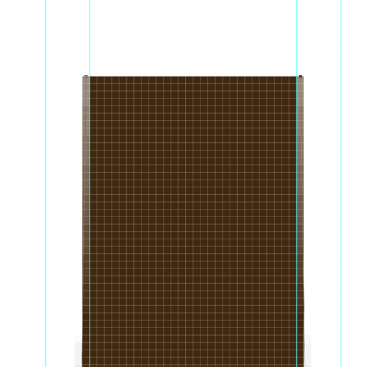
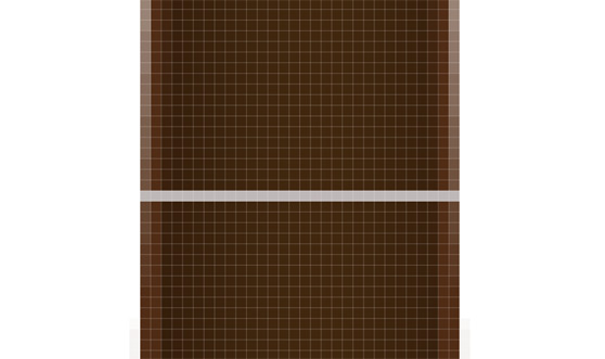
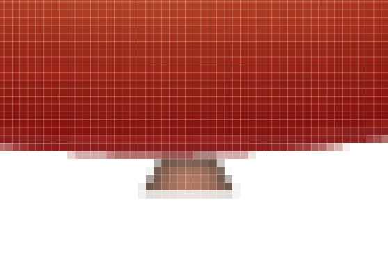
 Below is a closeup of what you should see when nudging pixels with the direct selection tool.
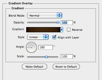
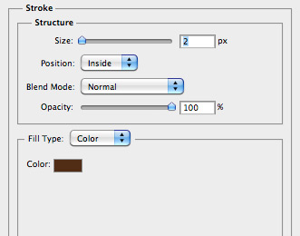
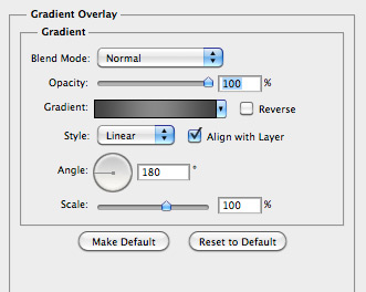
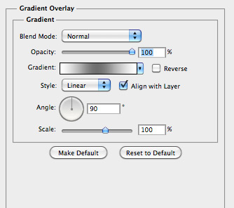
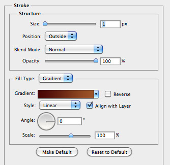
 Next I added a subtle stroke and gradient to add a little bit of realism to the neck. I used the following setting.
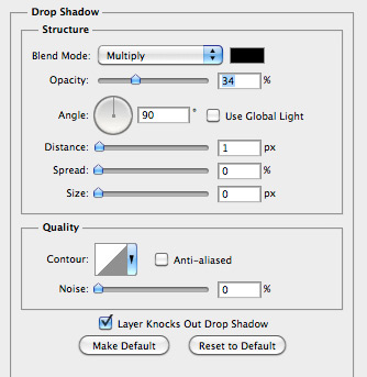
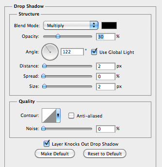
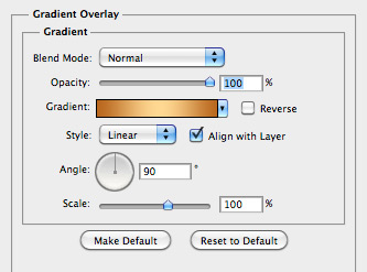
 Then I applied a small drop shadow and subtle gradient using the following settings.
 For spacing the frets refer to your reference image. As they space down the neck of the guitar they gradually get wider and are spaced closer together.
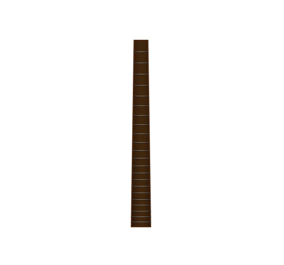 Once you've got all of the frets placed you can combine them into one layer by selecting all of the layers and press (Cmd + E) to merge them.
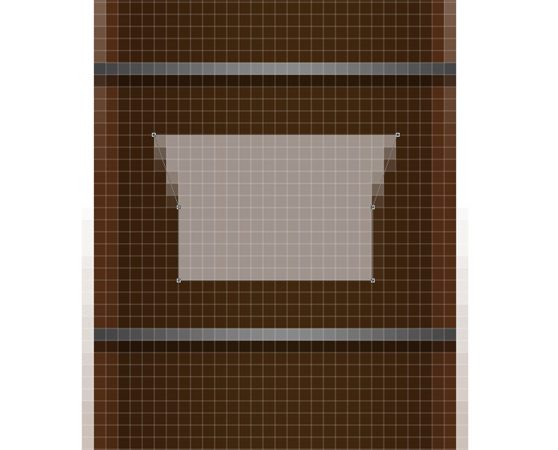 These inlays also have a slight pearl look to them. To accomplish this I added a pattern overlay effect.
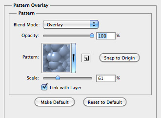 The results of the pattern overlay... Note that is is very subtle.
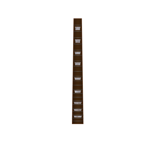
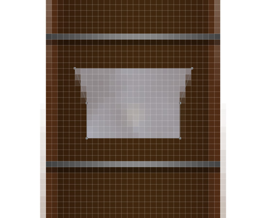 As you distribute these inlays down the neck of the guitar, you'll need to do a few things. The height decreases based on the space between frets and they each get slightly wider. Use the Direct Select Tool to nudge these shapes to the correct size. Also note that you'll need to shift the size of the pattern overlay so that each inlay does not look exactly the same.
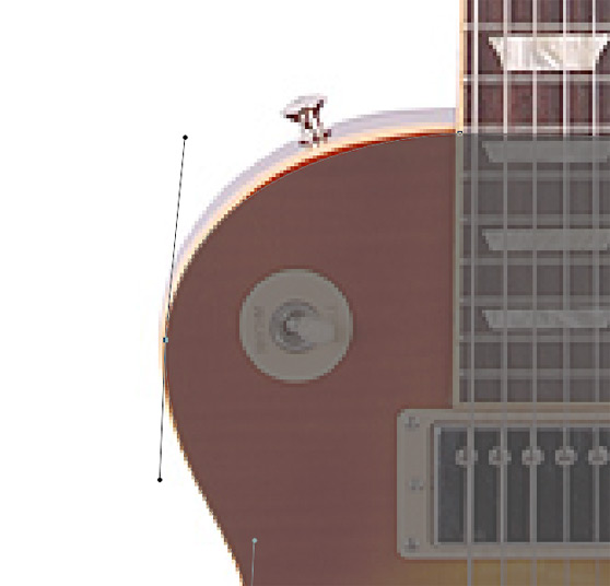 Once you've completed the path for the body shape you'll need to copy it to your working document. Use the neck of the guitar that you drew in the previous step to adjust the size of the body to the right proportion. For this guitar the body was the length of the neck to the first fret.
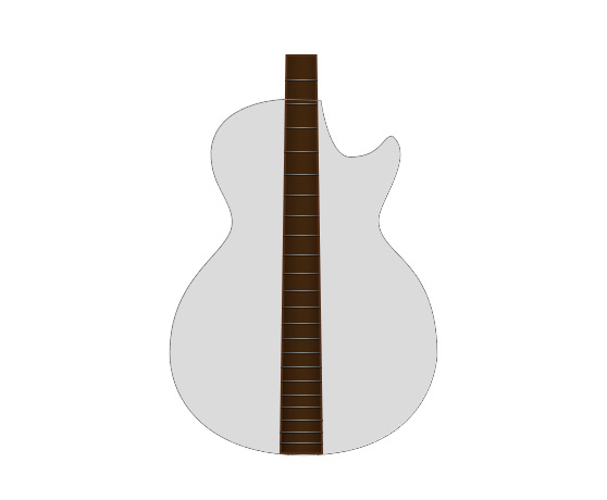 Place the newly sized body shape in the correct position in relation to the neck. I'm going to color this guitar exactly like my reference image, so I chose a deep orange as the base color for the body.
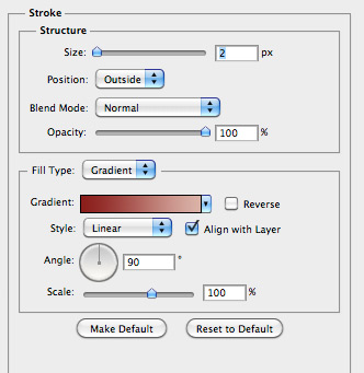
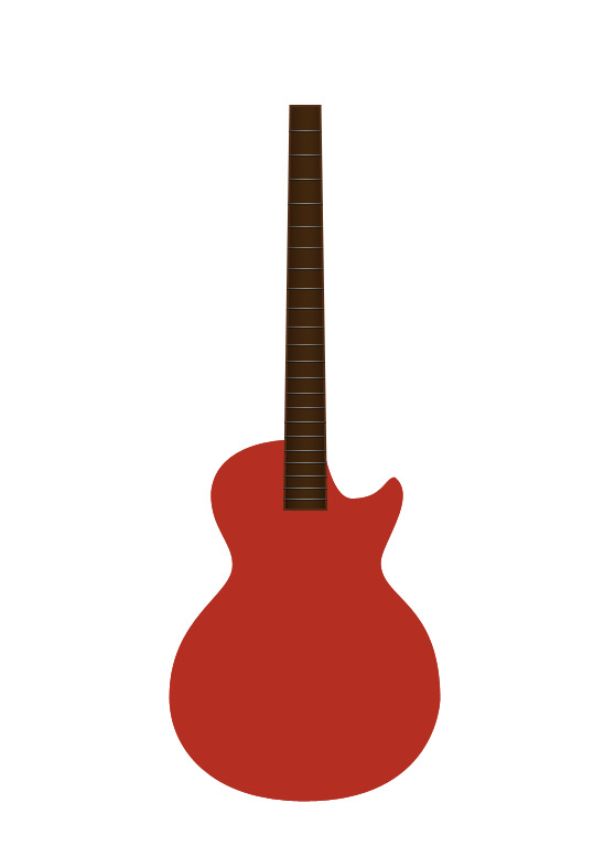 I also added a small stroke around the edge of the shape.
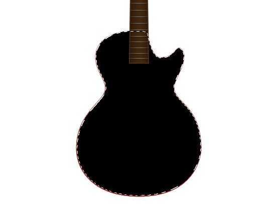
 Next, I made a selection of the body shape by Cmd+clicking the layers thumbnail in the layers palette. On a new layer above the body shape I filled the selection with black.
 Once you've done this, keep your selection and choose (Select | Modify | Contract) and enter 20 pixels. Now choose (Select | Modify | Feather) and enter 20 pixels. Hit the Delete key to remove the center portion of the black. Keep the selection, and set this layers blending mode to Overlay.
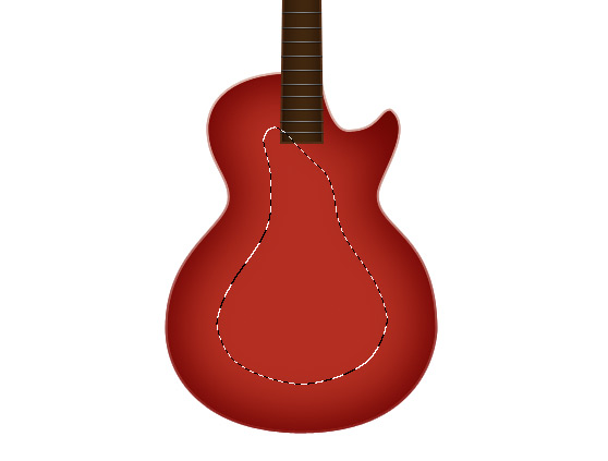 Now with the same selection choose (Select | Modify | Contract) again and enter 20 pixels. This time, on a new layer, fill the selection with a light yellow/orange. Now you can remove the selection.
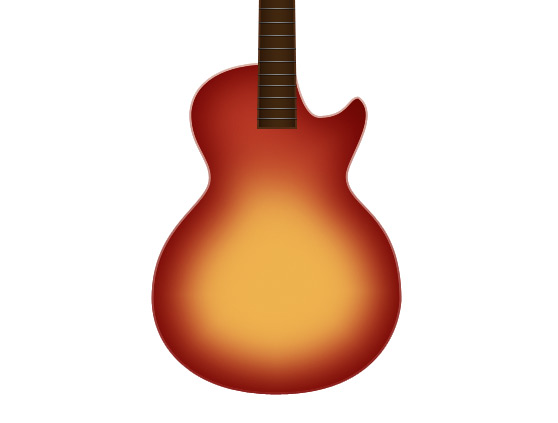 Next we need to add that slight wood texture from the reference photo. To do this make a new selection and fill it with a light gray on a layer above the body.
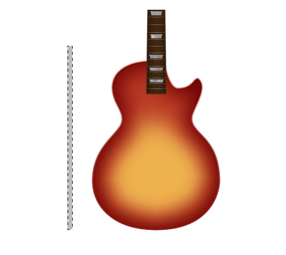 Now choose (Filter | Noise | Add Noise) and enter something around 15 for the amount. Stretch the shape over the body using the Transform Tool (Cmd+T).
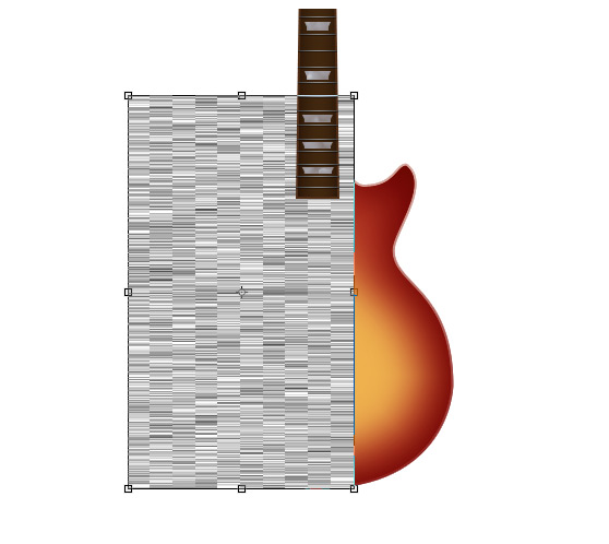 Now apply a light Gaussian Blur.
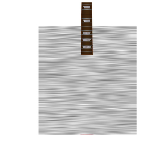 Now set the layer's opacity to 30% and the blending mode to Overlay.
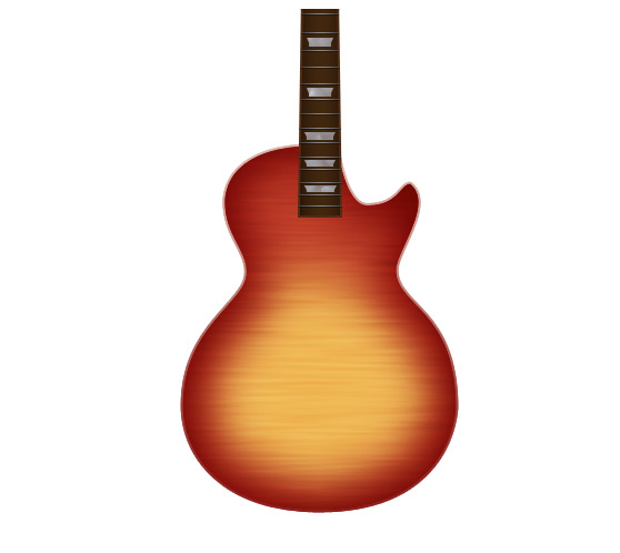 If you plan to use a dark background in the final piece you'll want to set this layer as a mask for the body so that it won't appear outside the edge of the guitar.
 I applied a slight drop shadow and gradient.
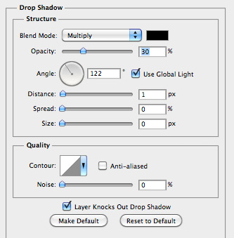
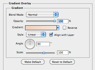 The pickup is the same shape, only slightly smaller than the plate.
 I applied the following styles.
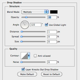
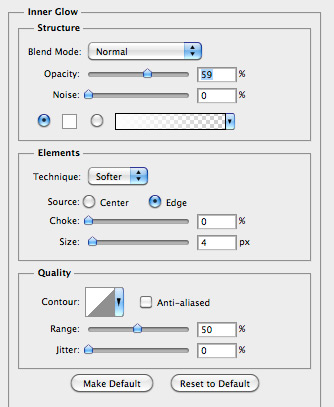
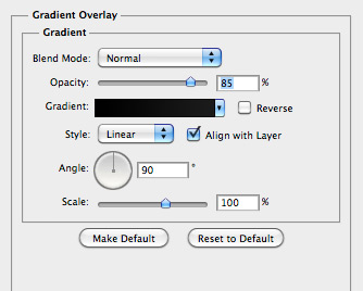
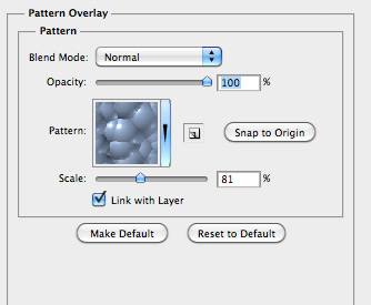
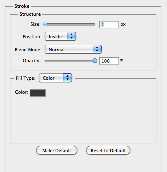 The screws on the plate are small shapes drawn with the circle tool, with the following gradient.
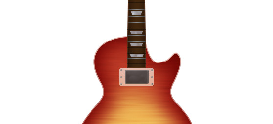
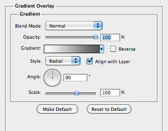 The rivets on the pickup are also small circle shapes with the following styles.
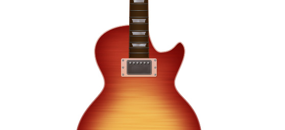
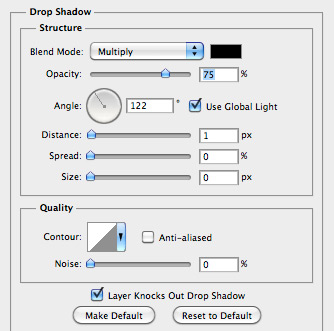
 Now that you have completed the first pickup, you can merge the layers, or combine them into a layer group. Then duplicate the layer or group and move it below the first to create the second pickup.
 For the first shape I used the Rounded Rectangle Tool again with a border radius of 10. The following layer styles are also applied.

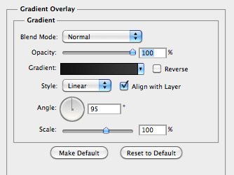 The bolts are small circles with the following gradient applied.

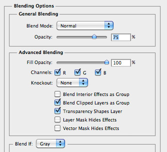 And finally the guides are tiny rectangles staggered with the following drop shadow and gradient.

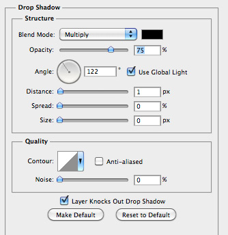
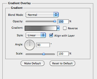
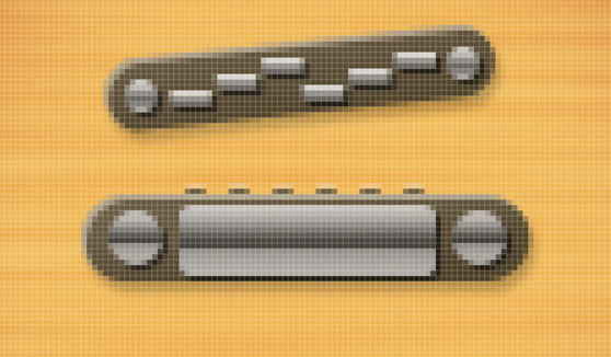 For the base draw the same shape as in the previous step, but slightly larger. Apply the same styles as well.
 For the other elements will be applying the same layer styles, as follows.

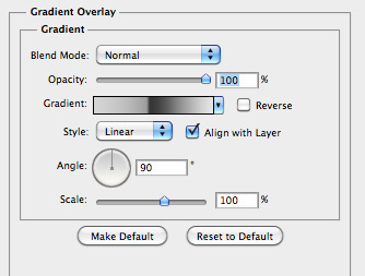 As for the small squares where the strings are attached.. These are so tiny that you don't have to apply any styles to them. Just evenly distribute 6 across the center.
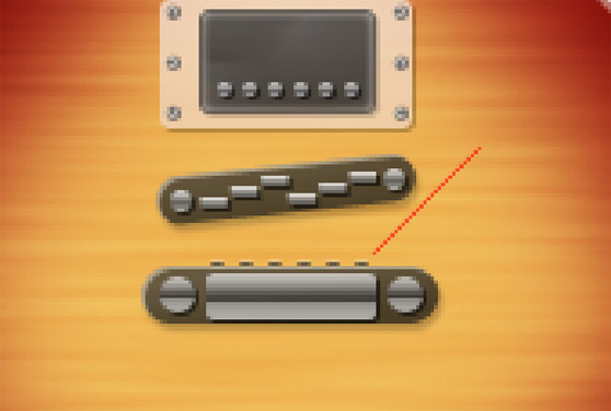
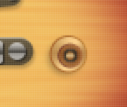 For the base of the knob, draw a circle and apply the following styles.

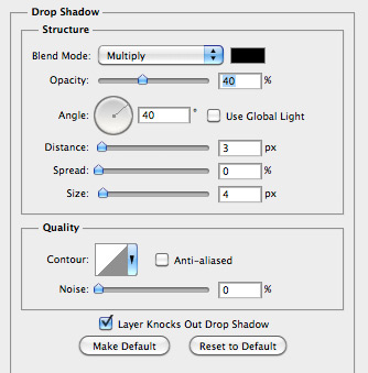
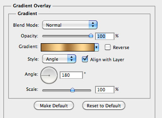
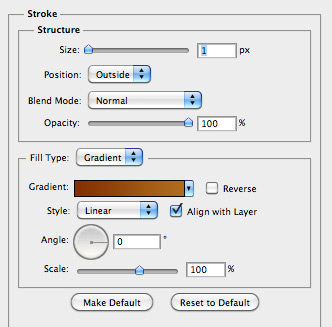 The secondary circle is slightly smaller and off centered from the first. Apply the following styles.

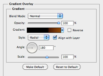
 The top most circle is much smaller than the first, with the following gradient style.

 Now duplicate the knob and distribute as shown below.

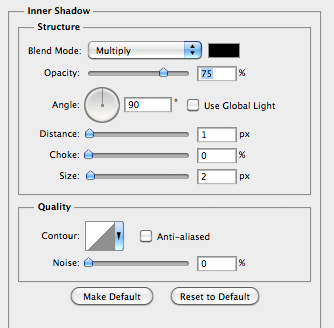
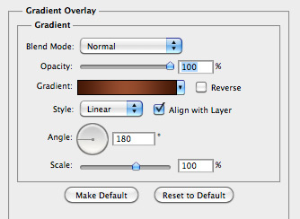
 I applied the following gradient and inner shadow to the strap holder.
 For the top strap holder I drew a little more shape.
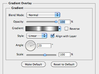
 I applied the following gradient.
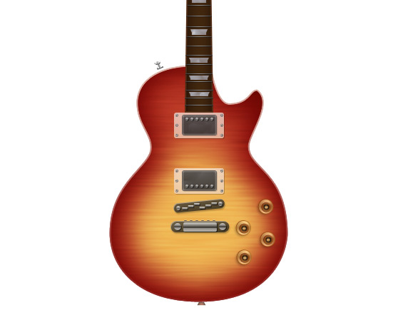
 Below are the completed strap holders.
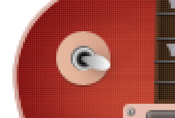 For the switch base, draw a circle and apply the following.


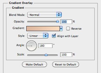 For the switch hole draw a smaller circle with the following gradient.

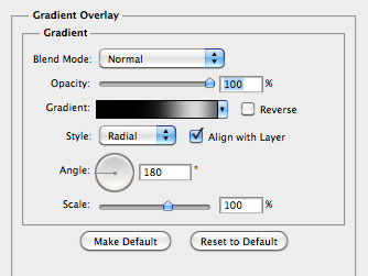 For the actual switch, draw an elongated circle. Basically draw a normal circle and use the Direct Select Tool to nudge one side.
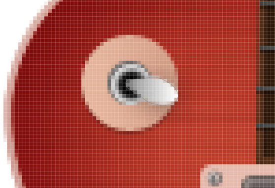 To complete the switch I applied the following styles.
 Once you have drawn your shape for the head, copy and paste it to the working document. Then scale it so that the base of the head matches the width at the top of the neck. Once you've added the head, you'll need to draw the nut at the base of the head.
This is simply a rectangle with a subtle gray gradient.
 For the tuning pegs will draw a couple more simple shapes. All 4 of these shapes have the same gradient applied.
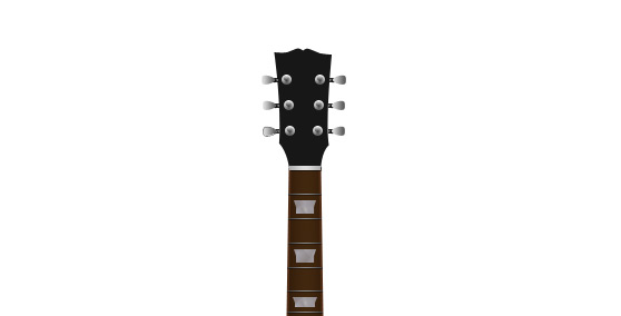
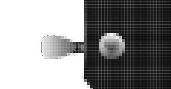 Once you have drawn these shapes, copy and distribute them over the head as follows.
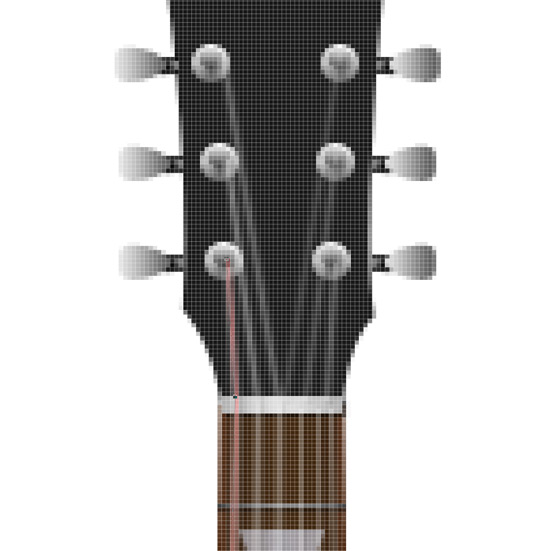
 Draw your path from the bridge to the tuning key, be sure to include the bend at the nut. The first string path is labeled pink below for visibility.
 Once you've drawn the path, make sure that your brush is set to white, and 2 pixels. Then with the pen tool (Ctrl + click) on the canvas and select stroke path. When the dialog appears, choose Brush for the tool, and unselect "Simulate Pressure".
Repeat this step for all 6 strings.
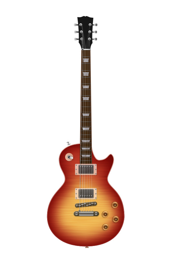
 I hope this tutorial showed you how powerful the most simple Photoshop Tools can be. The more familiar you become with them the more amazing detail you can create in your illustrations. Experiment and have fun!

Step 1
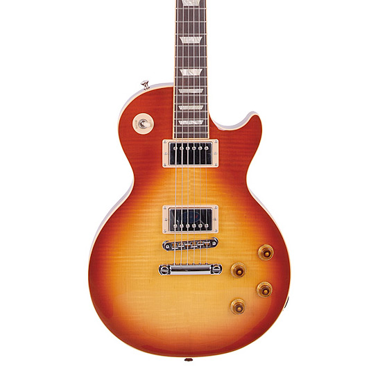
For the first step we need to locate a good reference photo that has the right angle and amount of detail that we want to capture. I found the one below and will be using it throughout the tutorial. These techniques will work with any reference photo you prefer.
Step 2
Now it's time to start drawing. I'm going to tackle the neck of the guitar first. We'll be using vector shapes primarily in this tutorial, so lets grab the Rectangle Tool (U), and draw a long thin rectangle shape to start the neck. You'll need to slightly taper the the top using the Direct Selection Tool (A). You can setup guides to help you make this adjustment. It also helps to zoom in so that you can see the pixel grid as you nudge the corners together.
 Below is a closeup of what you should see when nudging pixels with the direct selection tool.
 Next I added a subtle stroke and gradient to add a little bit of realism to the neck. I used the following setting.


Step 3
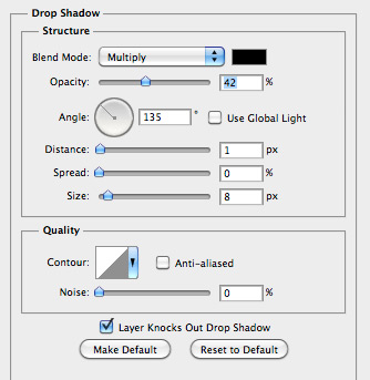
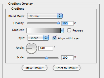
Now lets add some more details to the neck. For the frets I drew a single one pixel line using the Pencil Tool (B). Then I applied a small drop shadow and subtle gradient using the following settings.

 For spacing the frets refer to your reference image. As they space down the neck of the guitar they gradually get wider and are spaced closer together.
 Once you've got all of the frets placed you can combine them into one layer by selecting all of the layers and press (Cmd + E) to merge them.
Step 4
Now lets add the inlays to the neck. For most guitars these are simply dots, but for this Les Paul it's a little more fancy. The shape is a square with an expanded top half. Draw the shape using the pen tool. These inlays also have a slight pearl look to them. To accomplish this I added a pattern overlay effect.
 The results of the pattern overlay... Note that is is very subtle.
 As you distribute these inlays down the neck of the guitar, you'll need to do a few things. The height decreases based on the space between frets and they each get slightly wider. Use the Direct Select Tool to nudge these shapes to the correct size. Also note that you'll need to shift the size of the pattern overlay so that each inlay does not look exactly the same.

Step 5
To draw the body shape you'll need to refer to the reference photo, if you need to you can also trace the body shape directly from the reference using the Pen Tool (P). Once you've completed the path for the body shape you'll need to copy it to your working document. Use the neck of the guitar that you drew in the previous step to adjust the size of the body to the right proportion. For this guitar the body was the length of the neck to the first fret.
 Place the newly sized body shape in the correct position in relation to the neck. I'm going to color this guitar exactly like my reference image, so I chose a deep orange as the base color for the body.
 I also added a small stroke around the edge of the shape.
 Next, I made a selection of the body shape by Cmd+clicking the layers thumbnail in the layers palette. On a new layer above the body shape I filled the selection with black.
 Once you've done this, keep your selection and choose (Select | Modify | Contract) and enter 20 pixels. Now choose (Select | Modify | Feather) and enter 20 pixels. Hit the Delete key to remove the center portion of the black. Keep the selection, and set this layers blending mode to Overlay.
 Now with the same selection choose (Select | Modify | Contract) again and enter 20 pixels. This time, on a new layer, fill the selection with a light yellow/orange. Now you can remove the selection.
 Next we need to add that slight wood texture from the reference photo. To do this make a new selection and fill it with a light gray on a layer above the body.
 Now choose (Filter | Noise | Add Noise) and enter something around 15 for the amount. Stretch the shape over the body using the Transform Tool (Cmd+T).
 Now apply a light Gaussian Blur.
 Now set the layer's opacity to 30% and the blending mode to Overlay.
 If you plan to use a dark background in the final piece you'll want to set this layer as a mask for the body so that it won't appear outside the edge of the guitar.
Step 6
Now we can apply some details to the guitar body. Lets start by drawing the pickups. These are simply shapes with subtle layer styles to make them appear 3D. For the plate that is behind the pickup, I drew a rounded rectangle with a corner radius of 3. I applied a slight drop shadow and gradient.

 The pickup is the same shape, only slightly smaller than the plate.
 I applied the following styles.


 The screws on the plate are small shapes drawn with the circle tool, with the following gradient.

 The rivets on the pickup are also small circle shapes with the following styles.


 Now that you have completed the first pickup, you can merge the layers, or combine them into a layer group. Then duplicate the layer or group and move it below the first to create the second pickup.

Step 7
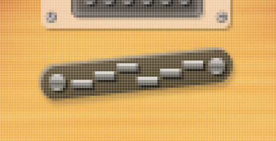
Ready for more tiny details on the guitar body? Good, because that's what this next step includes! Lets take a closer look at the guides for the strings. You can see that it is made up of three shapes. For the first shape I used the Rounded Rectangle Tool again with a border radius of 10. The following layer styles are also applied.


 The bolts are small circles with the following gradient applied.

 And finally the guides are tiny rectangles staggered with the following drop shadow and gradient.


Step 8
Okay, if you're still with me you can see that small shapes and layer styles are the heart of this tutorial. But you now have a good idea of what you can do with some subtle shadows and gradients. Just a few more to go! For the bridge and string inserts we'll be drawing a few more shapes. 4 to be exact. For the base draw the same shape as in the previous step, but slightly larger. Apply the same styles as well.
 For the other elements will be applying the same layer styles, as follows.

 As for the small squares where the strings are attached.. These are so tiny that you don't have to apply any styles to them. Just evenly distribute 6 across the center.

Step 9
In this step we'll be tackling the last of the tiny details for the knobs. Let's get rolling. The knobs are made up of 3 circles. For the base of the knob, draw a circle and apply the following styles.


 The secondary circle is slightly smaller and off centered from the first. Apply the following styles.


 The top most circle is much smaller than the first, with the following gradient style.

 Now duplicate the knob and distribute as shown below.

Step 10
The bottom strap holder is a simple square with the top two corners nudged in. I applied the following gradient and inner shadow to the strap holder.

 For the top strap holder I drew a little more shape.
 I applied the following gradient.
 Below are the completed strap holders.

Step 11
Now for the final detail on the body. The switch consists of two circles for the base, and an elongated circle for the switch. For the switch base, draw a circle and apply the following.


 For the switch hole draw a smaller circle with the following gradient.

 For the actual switch, draw an elongated circle. Basically draw a normal circle and use the Direct Select Tool to nudge one side.
 To complete the switch I applied the following styles.


Step 12
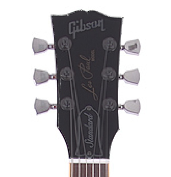
Now it's time to build the head of the guitar. Once again you'll need to look back to the reference photo for the shape. You can even trace the shape using the Pen Tool. Once you have drawn your shape for the head, copy and paste it to the working document. Then scale it so that the base of the head matches the width at the top of the neck. Once you've added the head, you'll need to draw the nut at the base of the head.
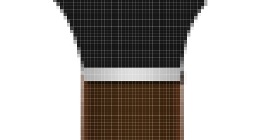
This is simply a rectangle with a subtle gray gradient.
 For the tuning pegs will draw a couple more simple shapes. All 4 of these shapes have the same gradient applied.
 Once you have drawn these shapes, copy and distribute them over the head as follows.

Step 13
Now it's time to string it up and see how she plays :-) To draw the strings will be using the Pen Tool to create a path, that we will then stroke using a 2 pixel white brush for the first 3 larger strings and a 1 pixel brush for the last 3 smaller strings. Select the Pen Tool and make sure it is set to draw a path. Draw your path from the bridge to the tuning key, be sure to include the bend at the nut. The first string path is labeled pink below for visibility.
 Once you've drawn the path, make sure that your brush is set to white, and 2 pixels. Then with the pen tool (Ctrl + click) on the canvas and select stroke path. When the dialog appears, choose Brush for the tool, and unselect "Simulate Pressure".
Repeat this step for all 6 strings.

Step 14
To finish it up, I added a wood pattern from the the Wood Patterns Set here at WeGraphics. I also painted a little shadow on a layer behind the guitar with a soft black brush at 30% opacity. To create the lighter colored edge, I just duplicated the body shape and nudged it up a few pixels. I also created a subtle shine on the body with a white to transparent gradient. I hope this tutorial showed you how powerful the most simple Photoshop Tools can be. The more familiar you become with them the more amazing detail you can create in your illustrations. Experiment and have fun!


