How to Create Dynamic Prototype Style Video Game Art
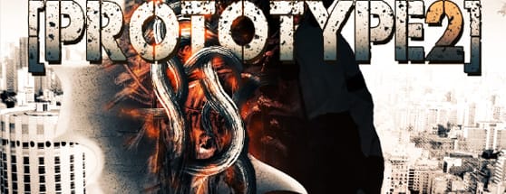
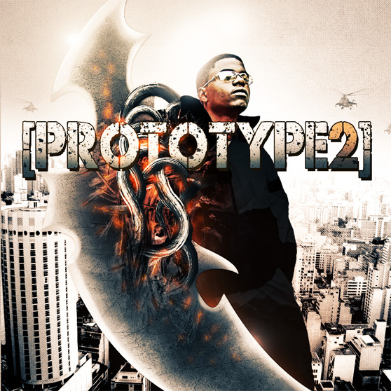
I'm not very good at video games, therefore I don't play a lot. But I do pay close attention to video game art and design. I take a lot of inspiration from these dynamic illustrations and incredible graphics. I recently came across a promo poster for a game called Prototype 2, and fell in love with the design. I was curious to see if I could create something similar with a touch of my own style and design. Below is a walk through on how I created my own Prototype 2 promo art.
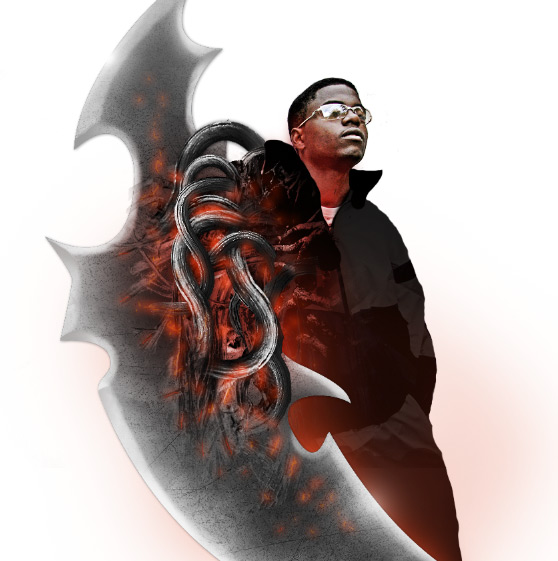
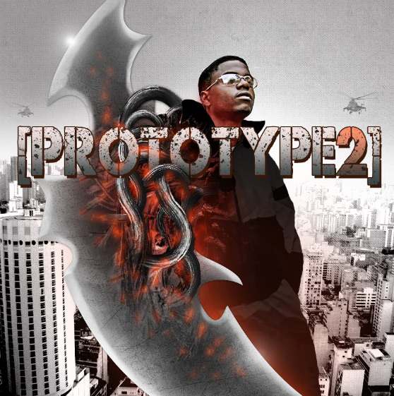
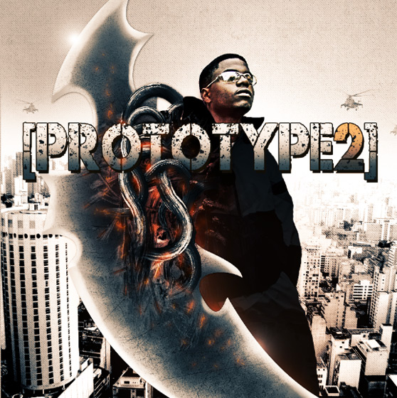
Here is a look at my finished piece.
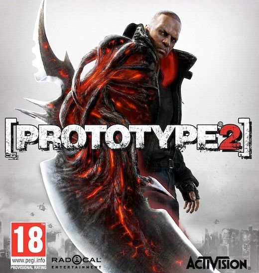
 Here is the promo artwork that inspired the tutorial.
 Once you've created the blade you can copy and paste it over to a new PS document sized 865x865 at 72 dpi. You'll need to tilt it to the left slightly, and keep it large enough to allow some of the blade to extend beyond the frame edge.
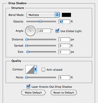
 Lets add a very slight drop shadow to the blade shape.
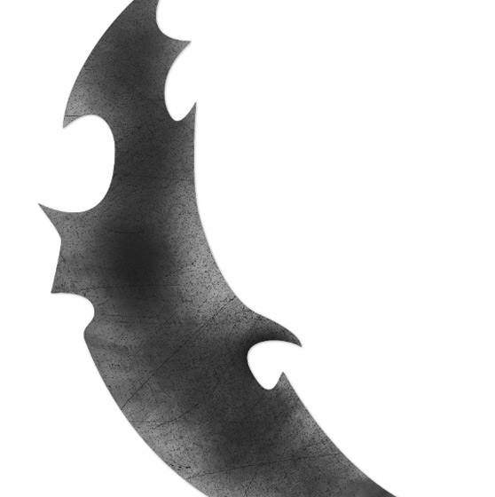
 Next, lets add a bit of texture to the blade. I used the blue image from the Scratched Metallic Textures here at WeGraphics, but you can use any good metal texture. Lay the texture in a layer above the blade shape, then make a selection of the blade shape by Cmd+Clicking on the layer's thumbnail. Invert the selection (Cmd+Shift+i) and delete the texture that extends beyond the blade's edge. Now desaturate the blade texture (Cmd+Shift+u), then use the Burn Tool (O) to darken some of the middle.
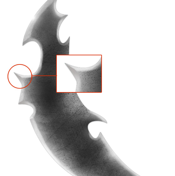
 Now make a selection from the blade shape layer again, and on a new layer, use a soft white brush to trace the edges of the blade. This is to make it look like it has a sharpened edge. Note that I used a slightly darker gray brush on the opposite sides of points on the blade.
 Grab these layers and drop them into a new layer group. We're done with the blade for now.
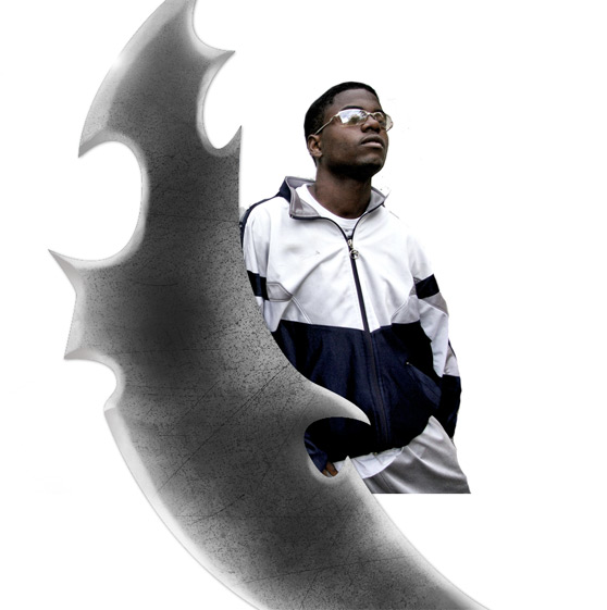 I used a couple of methods to sharpen him up with a bit of contrast. I duplicated the layer, and set the blend mode to opacity, then blurred it a little with a Gaussian blur. I made another duplicate layer and used the old high pass trick. Click (Filter | Other | High Pass), and then set that layer's blend mode to Opacity.
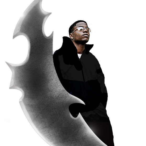
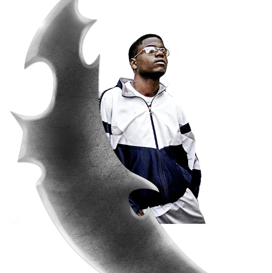 On a new layer above the guy, I drew some dark gray clothes on him and set that layer's blend mode to Multiply. With the brush I enlarged his collar.
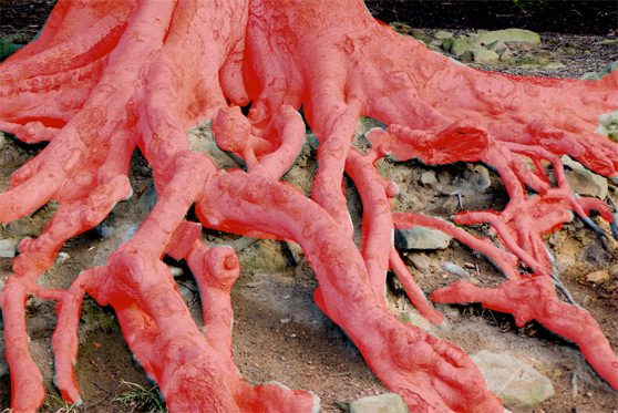 Copy and paste the selected roots to a layer above the blade. Convert the roots to black and white (Cmd+Shift+u), then darken them using a levels adjustment (Cmd+l), and finally use a soft edge eraser tool (E) to remove the hard edges.
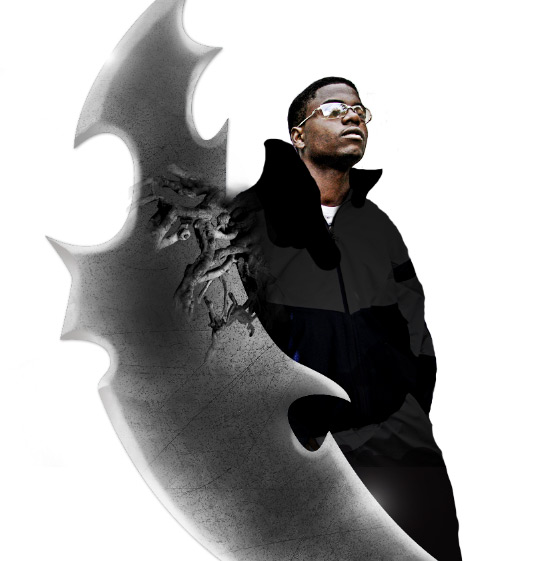 Next duplicate the roots layer 3 times and move them around similar to the example below.
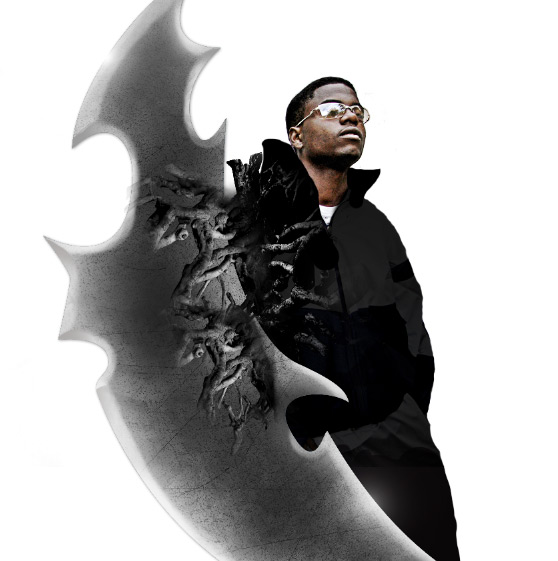 With the second roots image titled "Confusion"... do the same thing. Crude selection, copy and paste, and bump the contrast with levels. Place these roots on a layer above the first group of roots.
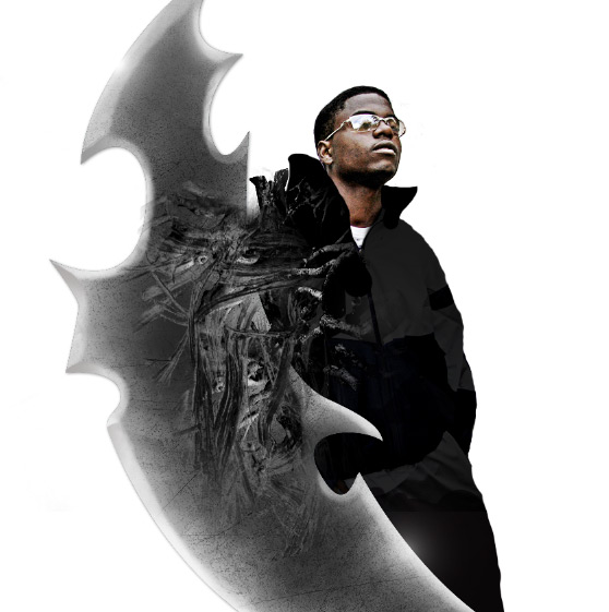 That's starting to look pretty interesting, but I want to add some larger more prominent roots above these. To do this, I used a selection from the tree bark texture. I copied it and pasted it on a layer above all others, then used the Puppet Warp Tool (Edit | Puppet Warp) to bend and shape them. If you're not familiar with the Puppet Warp Tool, check out our tutorial.
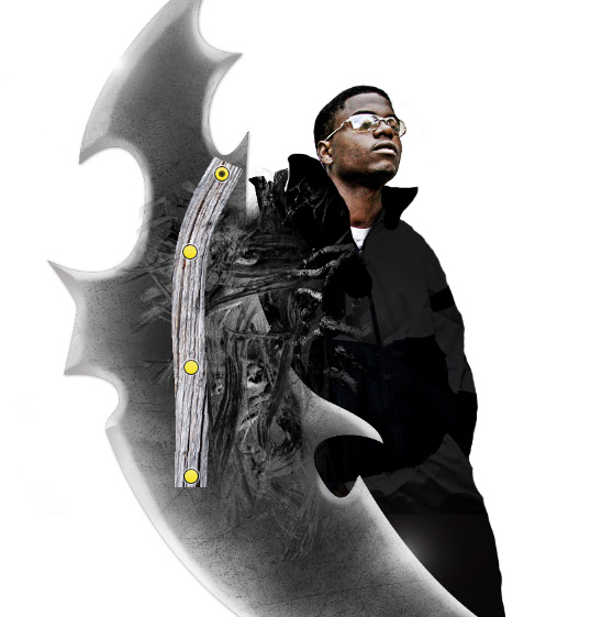 You'll also need to use a levels adjustment to darken the tree bark selections. Once you've bent them into the right positions, you can use the dodge and burn tools to create highlights and shadows. Also, I used the eraser t soften the ends a bit
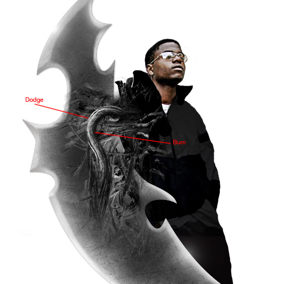 Once you've duplicated this process 5 or 6 times you should have something that looks like the following. Note: I erased portions of the fibers to make it look like they are overlapping.
 Basically we're just lighting the area behind the blade. We also need to add some light reflecting from the guy's face.
 Now, a large spot of light on a layer below the tree branch fibers.
 With a small 2pt brush with an outer glow layer style, I painted small cracks near shadows in the blade.
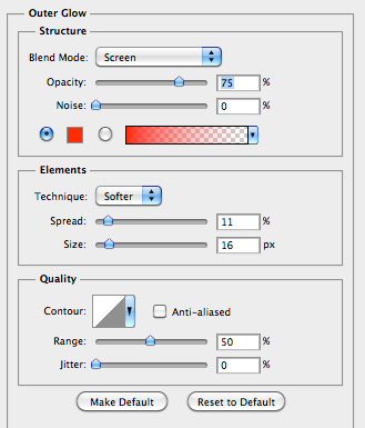
 Here are the settings for the layer style.
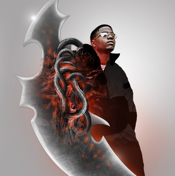 On a new layer above this one, I added one of the Seamless Grunge Canvas Patterns released earlier this week on WeGraphics. This step is subtle and not required if you want to skip the texture.
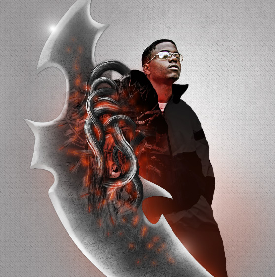 Next, we need to copy and paste the cityscape image above the texture layer. Set the cityscape layer's blend mode to Soft Light. Copy it 2 times and set the top most layer's blend mode to Vivid Light.
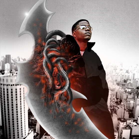 Lastly, I added some helicopters from our stock image. These were simply copied and pasted and then set to Multiply. You may have to lighten them a bit with a levels adjustment. Also, the further helicopters should have a lower opacity than ones that are closer to view.
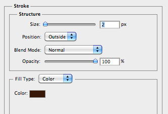
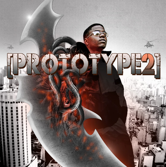 The type has a couple of layer effects applied.
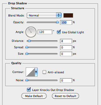
 Also, I used a free brush set called Dust Particles to add a bit more grunge to the type face.
 Lastly, I want to take a soft white brush and add a highlight just above the guy's head. This needs to be on a new layer above the guy.
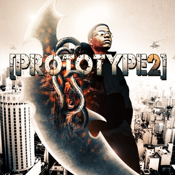 That's it! There was a lot of steps to this one, but I'm pretty happy with the final result. I hope you were able to pick up some new ideas and techniques from this one. If anyone follows along, I'd love to see your results in the comments below.
 Here is the promo artwork that inspired the tutorial.

Gathering Photos
First up, I new I needed some pretty specific photos to complete this illustration. After searching far and wide, I came up with the following:Untitled by John Steven Fernandez imgp3750 by *ljon São Paulo by Rodrigo_Soldon Confusion by born1945 Tree trunk texture by OntologicalDoubt Roots by SFB579
Creating the Blade
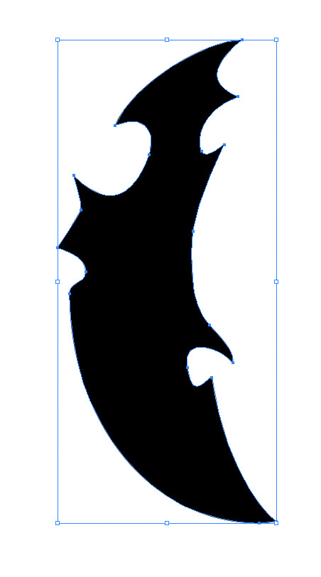
The most prominent item in the composition is the blade. I knew that I couldn't find blade photo because the overall shape of the blade is too ornate and unlike any knife that you typically see. To create the shape of the blade I went over to Adobe Illustrator and drew the shape with the pen tool. There's no real way to teach you how to create this shape, but if you're familiar with the pen tool and how it works then it should be a snap. If not, I suggest taking some time to learn the basics of using the pen tool to draw basic shapes in Illustrator. It's well worth it, and you'll never look back. Once you've created the blade you can copy and paste it over to a new PS document sized 865x865 at 72 dpi. You'll need to tilt it to the left slightly, and keep it large enough to allow some of the blade to extend beyond the frame edge.
 Lets add a very slight drop shadow to the blade shape.
 Next, lets add a bit of texture to the blade. I used the blue image from the Scratched Metallic Textures here at WeGraphics, but you can use any good metal texture. Lay the texture in a layer above the blade shape, then make a selection of the blade shape by Cmd+Clicking on the layer's thumbnail. Invert the selection (Cmd+Shift+i) and delete the texture that extends beyond the blade's edge. Now desaturate the blade texture (Cmd+Shift+u), then use the Burn Tool (O) to darken some of the middle.
 Now make a selection from the blade shape layer again, and on a new layer, use a soft white brush to trace the edges of the blade. This is to make it look like it has a sharpened edge. Note that I used a slightly darker gray brush on the opposite sides of points on the blade.
 Grab these layers and drop them into a new layer group. We're done with the blade for now.
Adding the Figure Behind the Blade
Next up, we need to extract the guy from the background, using whatever selection method you prefer, and drop him on a layer behind the blade layer group. I used a couple of methods to sharpen him up with a bit of contrast. I duplicated the layer, and set the blend mode to opacity, then blurred it a little with a Gaussian blur. I made another duplicate layer and used the old high pass trick. Click (Filter | Other | High Pass), and then set that layer's blend mode to Opacity.
 On a new layer above the guy, I drew some dark gray clothes on him and set that layer's blend mode to Multiply. With the brush I enlarged his collar.

Adding The Fibers Attached to the Blade
Now it's time to start adding some of the fibers that attach the blade to the guy's arm. I used images of tree roots to accomplish this. Open up the tree roots image and make a crude selection in Quick Mask Mode (Q). It doesn't have to be perfect. Copy and paste the selected roots to a layer above the blade. Convert the roots to black and white (Cmd+Shift+u), then darken them using a levels adjustment (Cmd+l), and finally use a soft edge eraser tool (E) to remove the hard edges.
 Next duplicate the roots layer 3 times and move them around similar to the example below.
 With the second roots image titled "Confusion"... do the same thing. Crude selection, copy and paste, and bump the contrast with levels. Place these roots on a layer above the first group of roots.
 That's starting to look pretty interesting, but I want to add some larger more prominent roots above these. To do this, I used a selection from the tree bark texture. I copied it and pasted it on a layer above all others, then used the Puppet Warp Tool (Edit | Puppet Warp) to bend and shape them. If you're not familiar with the Puppet Warp Tool, check out our tutorial.
 You'll also need to use a levels adjustment to darken the tree bark selections. Once you've bent them into the right positions, you can use the dodge and burn tools to create highlights and shadows. Also, I used the eraser t soften the ends a bit
 Once you've duplicated this process 5 or 6 times you should have something that looks like the following. Note: I erased portions of the fibers to make it look like they are overlapping.

Adding Light to the Composition
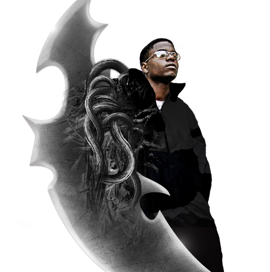
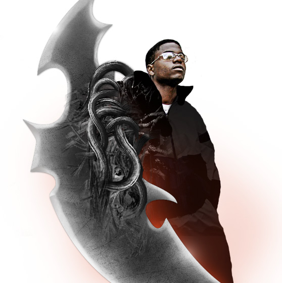
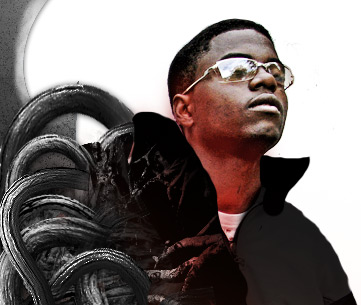
If you refer back to the inspiration piece you'll see that there are several spots on the blade where light is peaking through cracks and openings. To create these lighted cracks will use a soft red brush (#e5431c). We'll start from the largest light portion down to the smallest cracks. First up, on a layer underneath the blade, we want to use a large soft brush and paint some light as follows. Basically we're just lighting the area behind the blade. We also need to add some light reflecting from the guy's face.
 Now, a large spot of light on a layer below the tree branch fibers.
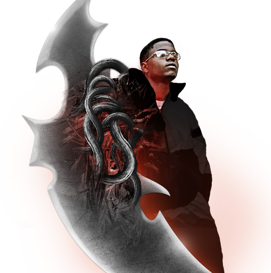
 With a small 2pt brush with an outer glow layer style, I painted small cracks near shadows in the blade.
 Here are the settings for the layer style.

Creating a Background Scene
For the background, I used a radial gradient from white to light gray (#a7a5a6) starting over the guy's left shoulder. This gradient is on a new layer at the bottom of the stack. On a new layer above this one, I added one of the Seamless Grunge Canvas Patterns released earlier this week on WeGraphics. This step is subtle and not required if you want to skip the texture.
 Next, we need to copy and paste the cityscape image above the texture layer. Set the cityscape layer's blend mode to Soft Light. Copy it 2 times and set the top most layer's blend mode to Vivid Light.
 Lastly, I added some helicopters from our stock image. These were simply copied and pasted and then set to Multiply. You may have to lighten them a bit with a levels adjustment. Also, the further helicopters should have a lower opacity than ones that are closer to view.
Adding the Type Treatment
For the title font, I chose a font face called Codec, available here at WeGraphics. If you're not a WG member, any good grungy type face will work. I suggest Capture It as an alternative. I placed the font on a layer between some of the tree bark fibers, so that it looks like some of them are overlapping the type. The type has a couple of layer effects applied.


 Also, I used a free brush set called Dust Particles to add a bit more grunge to the type face.

Final Tweaks and Adjustments
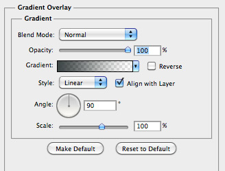
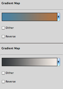
If you're still with me, congrats! We're almost there. Next up, I want to add two Gradient Map adjustment layers to the very top of the stack. Here are the settings for those two gradients.
 Lastly, I want to take a soft white brush and add a highlight just above the guy's head. This needs to be on a new layer above the guy.
 That's it! There was a lot of steps to this one, but I'm pretty happy with the final result. I hope you were able to pick up some new ideas and techniques from this one. If anyone follows along, I'd love to see your results in the comments below.
