How to Create a Unique Fantasy World Featuring Your Logo
In this tutorial we're going to explore some techniques for compositing images to make a fantasy world scene. We'll also look at a method for converting the composition into a creative logo mockup.
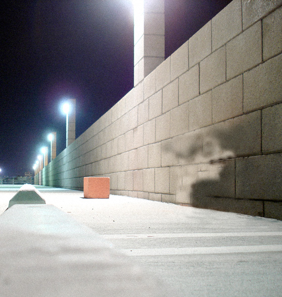
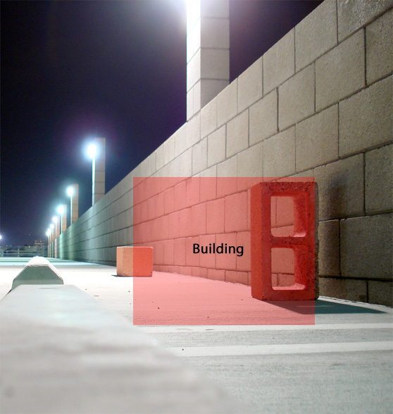 I used the Clone Stamp Tool (S) to remove the cinder block. It doesn't have to be perfect because most of this area will be covered by the building.
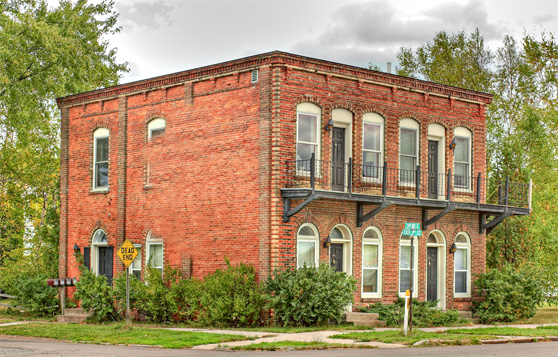 Now we need to clip the building from it's background. I used Quick Mask Mode to paint the selection area. Be sure to include the grass, sidewalk and some of the surrounding shrubs.
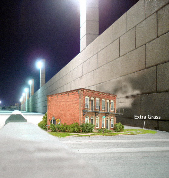
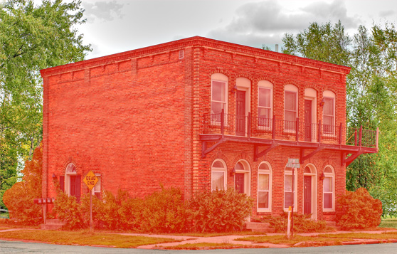 Once the selection is completed, copy and paste the building onto a new layer in our composition. Once again, I used the Clone Tool to add a bit of extra grass and sidewalk to the left and right of the building. Zoom in very close and do this with a 2-3 pixel clone brush.
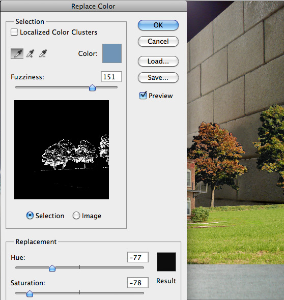
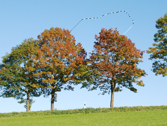 Once you copy and paste the trees to a layer behind the building, we'll need to blend some of the blue sky that is still visible through the leaves of the trees. I used (Image | Adjust | Replace Color) to do this. With this tool you can select a color in the composition with the eye dropper, and use the sliders to adjust the Hue, Saturation and Lightness. Use these controls to darken the blue sky areas visible in the trees.
 Next, I erased some of the grass around the trees so that it blends more with the grass around the building.
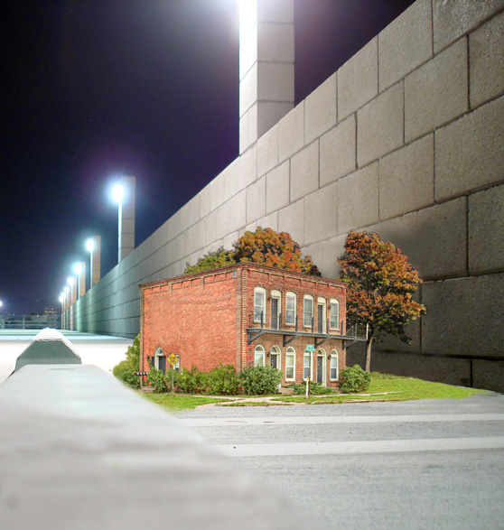
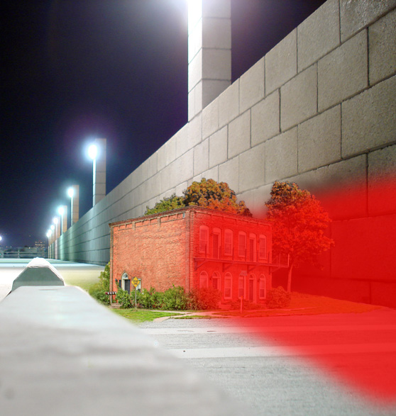 Here are my completed shadows. I used a soft eraser to blend the edge as it fades near the border of the image.
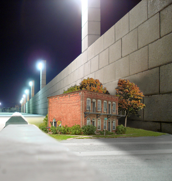
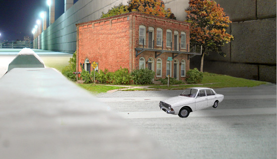 We'll need to add some shadows around the car as well. On a layer under the car use another soft black brush to paint some shadows.
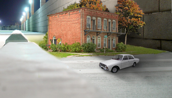 On a layer above the car, paint a few shadows down the driver side of the car.
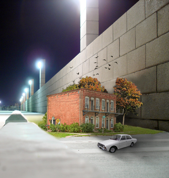 To add a bit more detail to the sky, lets drop a few clouds in. To generate the clouds, open a new document with the same size and resolution as our composition. Press (D) on the keyboard to reset your foreground and background colors to black and white. Click (Filter | Render | Clouds). Then make a loose selection with the Lasso Tool (L).
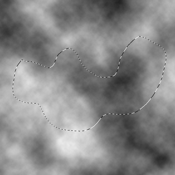 Now feather the selection. (Select | Modify | Feather)
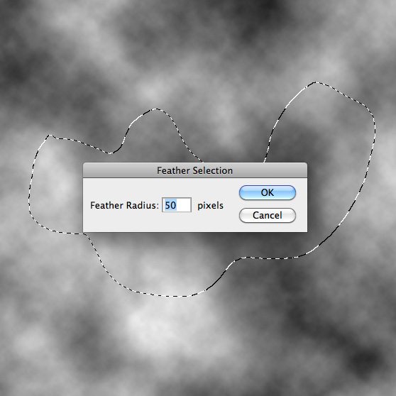 Copy and paste the clouds to a layer above the building in our composition. Set that layer's Blending Mode to Screen, and adjust the size to look natural.
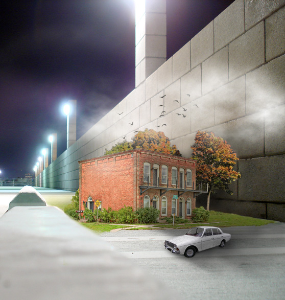
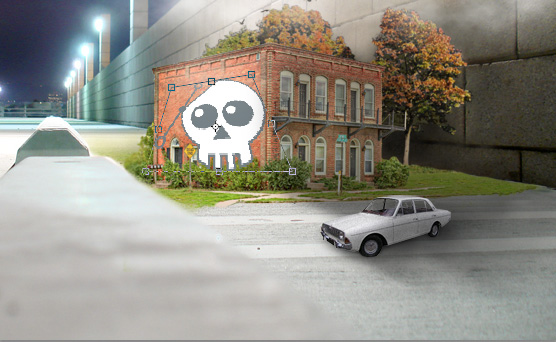 Once you've copied and pasted the logo graphic onto a layer above the building use the transform tool to adjust the logo to the correct perspective. (Edit | Scale | Distort).
When you have the logo sized and positioned. Use a grunge textured brush as your eraser and click over the logo a few time to erase portions of it. This is to help the logo look painted and worn. For this effect I chose a brush from the Perfect Grunge PS Brush Set.
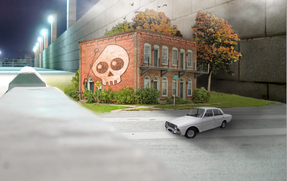

 Now we'll darken the edges a bit using a new Gradient Fill layer.
Use the settings below to create something similar.
 I hope you've enjoyed this tutorial and I hope these techniques have inspired some new thoughts and ideas for your next design.
Preview
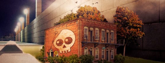
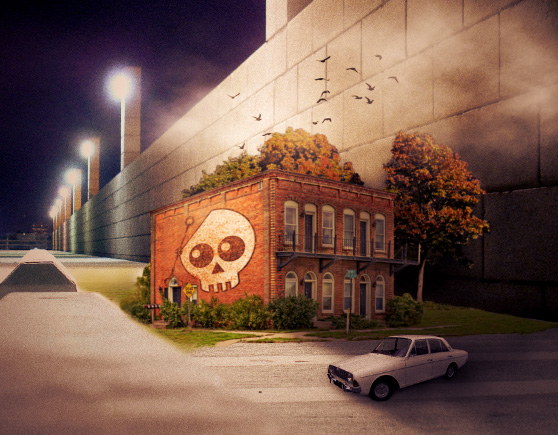
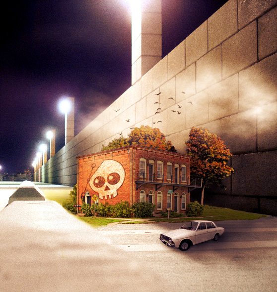
Here's a look at what we'll be creating.
Step 1
Let's start by gathering some images for our micro world scene. After some exploring around the web, I came up with this group of photos: Parking Lot Apartment Building Trees Flying Birds Vintage CarStep 2
Let's use the parking lot image as the background and the apartment building as the focal point. I want to place the building where the cinder block is located. I used the Clone Stamp Tool (S) to remove the cinder block. It doesn't have to be perfect because most of this area will be covered by the building.

Step 3
Before we add the building image to our scene, lets remove the windows from the left side. It's easiest to do this when working with the original larger image. Grab the Clone Tool once again and begin selecting source areas (Option+Click), and painting over the windows. This will come into play later when we add the logo image to the wall. Now we need to clip the building from it's background. I used Quick Mask Mode to paint the selection area. Be sure to include the grass, sidewalk and some of the surrounding shrubs.
 Once the selection is completed, copy and paste the building onto a new layer in our composition. Once again, I used the Clone Tool to add a bit of extra grass and sidewalk to the left and right of the building. Zoom in very close and do this with a 2-3 pixel clone brush.

Step 4
Next, we're going to add some trees behind the building and cover up some of the brick wall. Clip the trees from their background using the Quick Selection Tool (W). Paint the blue sky background, and then invert the selection (Cmd+Shift+I) to select the trees and a portion of the grass. Once you copy and paste the trees to a layer behind the building, we'll need to blend some of the blue sky that is still visible through the leaves of the trees. I used (Image | Adjust | Replace Color) to do this. With this tool you can select a color in the composition with the eye dropper, and use the sliders to adjust the Hue, Saturation and Lightness. Use these controls to darken the blue sky areas visible in the trees.
 Next, I erased some of the grass around the trees so that it blends more with the grass around the building.

Step 5
Now, lets add some shadows. Below is the general area we'll shadow using a soft black brush with am Opacity and Flow set to 30%. We'll paint these shadows on a layer above the building. Here are my completed shadows. I used a soft eraser to blend the edge as it fades near the border of the image.

Step 6
Now lets throw in a few details. Grab the car image and clip it from the white background using whatever selection method you prefer. I selected the white background and used Quick Mask Mode to cleanup the edges a bit. Now, copy and paste the care in front of the building. The car is already in the correct perspective so no adjustment should be needed there. Just scale it down to the right size. We'll need to add some shadows around the car as well. On a layer under the car use another soft black brush to paint some shadows.
 On a layer above the car, paint a few shadows down the driver side of the car.
Step 7
Now grab the bird image and clip the flock from the background. Copy and paste the birds to a layer above the building. Scale and position them so that it looks like they are flying from the trees. To add a bit more detail to the sky, lets drop a few clouds in. To generate the clouds, open a new document with the same size and resolution as our composition. Press (D) on the keyboard to reset your foreground and background colors to black and white. Click (Filter | Render | Clouds). Then make a loose selection with the Lasso Tool (L).
 Now feather the selection. (Select | Modify | Feather)
 Copy and paste the clouds to a layer above the building in our composition. Set that layer's Blending Mode to Screen, and adjust the size to look natural.

Step 8
Now lets add the logo to the wall to turn the piece into a unique logo mock-up. Grab a logo vector of your choice, if you don't have one handy you can download the WeGraphics logo. Once you've copied and pasted the logo graphic onto a layer above the building use the transform tool to adjust the logo to the correct perspective. (Edit | Scale | Distort).
When you have the logo sized and positioned. Use a grunge textured brush as your eraser and click over the logo a few time to erase portions of it. This is to help the logo look painted and worn. For this effect I chose a brush from the Perfect Grunge PS Brush Set.

Step 9
To better match the building with the parking lot background, lets add a touch of noise. To do this, select the parking lot background layer and click (Filter | Noise | Add Noise). Keep it subtle with a setting around 3.
Step 10
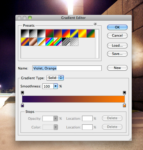
To complete the piece lets adjust the lighting. Add a new Gradient Map adjustment layer above all others. I used a purple to orange gradient. It's one of the preset gradients available in the window.
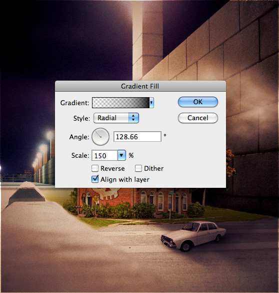
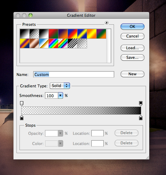
 Now we'll darken the edges a bit using a new Gradient Fill layer.
Use the settings below to create something similar.


**UPDATE**
Based on some comments regarding the buildings perspective being a little off. I adjusted the building side wall using the Warp Tool (Edit | Transform | Warp) to better represent a one point perspective.Final Image
I cropped the final image so that it adjusted the focal point more on the building... Thanks for the suggestion Mason! ;-) I hope you've enjoyed this tutorial and I hope these techniques have inspired some new thoughts and ideas for your next design.
