How to create a professional and clean web layout (with PSD-to-HTML conversion)
Our passion for web stuff grow day by day, so today we'll learn how to create a highly-professional and clean web layout. We will see that using gradients, the noise filter and some subtle 1px lines to achieve depth, we can easily create a great web design for a wide range of uses.
As usual the post is divided in two parts: first we create the web page in photoshop and then we convert the PSD in a working HTML/CSS page ready for the web. Following this step by step walkthrough of design you?ll learn, touching with your hands the entire process to make a web page, how to design and code a modern site.
Do you want to download the source files of this tutorial (PSD+HTML/CSS)? Become a member today and get access to all premium areas for only 7$ month. Learn more?
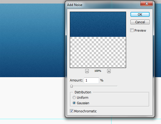
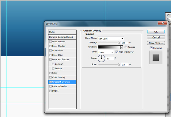 Duplicate and rasterize the layer just created and add a noise filter (Filter>Noise>Add Noise).
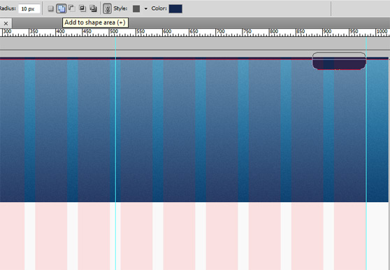
 Use again the Rectangle Tool to draw a rectangular shape (heigh 4-5 pixels, color #162850), select the Rounded Rectangle Tool with a radius of 10px and add a little shape (make sure to select the option Add to shape area) as shown.
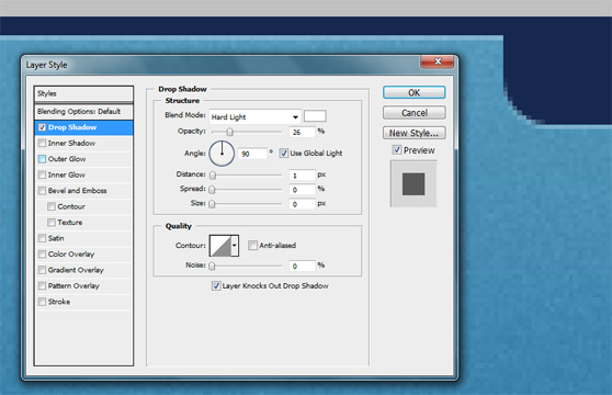
 Draw a 1px line, using Drop Shadow, in order to add depth as shown in the images below.
 Now add other 3 layer, but this time set fill to 0% and add a Gradient Overlay for each layer as shown below in the images.
 Using Rounded Rectangle Tool draw a small square (hold down Shift to draw a perfect square), then with the Custom Shape Tool draw a little arrow as shown.
Rasterize the two layers and use the arrow to cut out an arrow from the square. Then resize and transform the custom shape as shown.
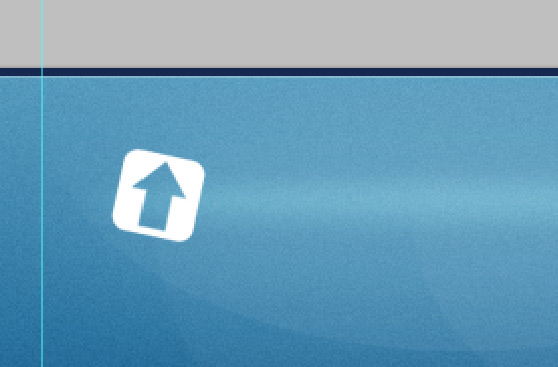 Add the following style:
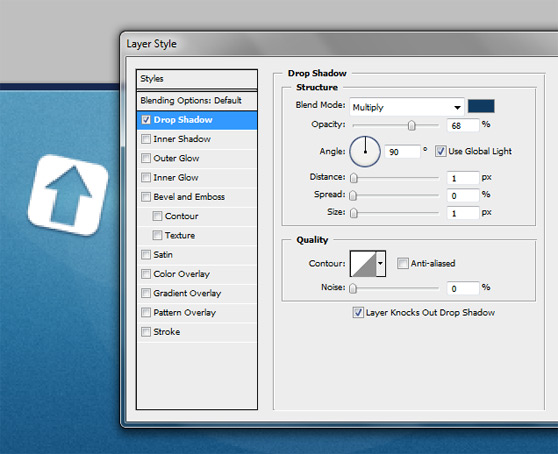
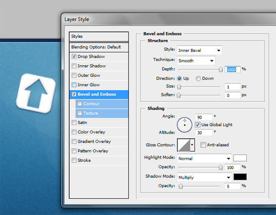
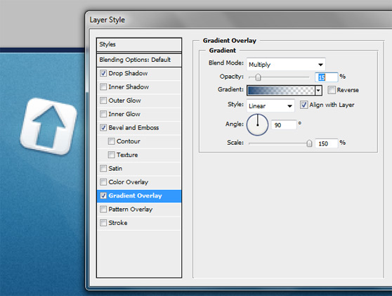 Now with Type Tool write the name of the company, then add the same style that we have just used for our icon.
 Now it's time to create an attractive box for describing the quality of the service and to engage new users.
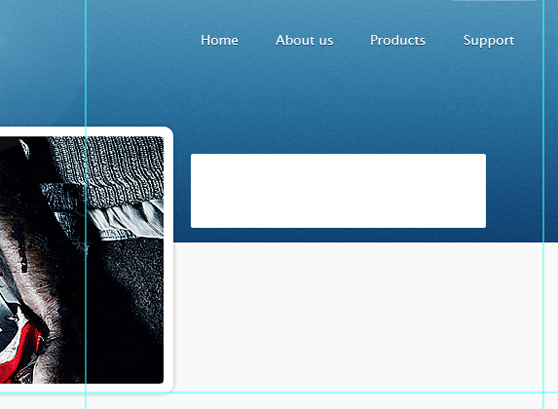
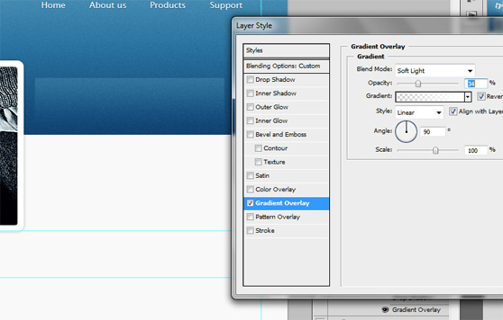
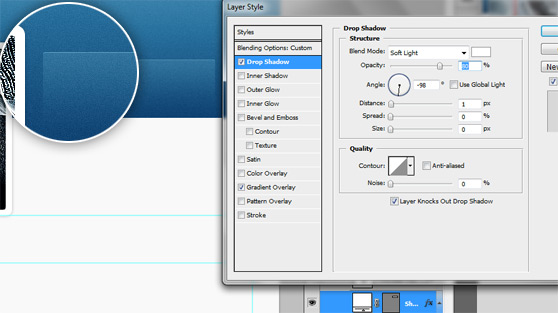
Add a rectangular shape on the right, then set the Fill to 0% and add a nice style a Gradient Overlay and a Drop Shadow to create a nice box, see below for the details.
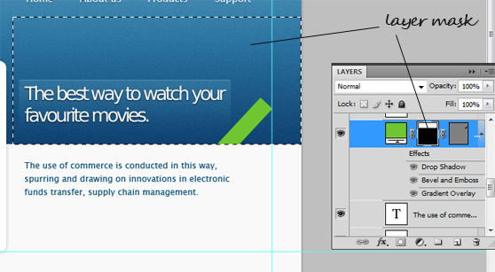
 Add some text, use Dejavu Sans (30 pt, white) for the title and Lucida Sans (12 pt, #0b537f) for the paragraph. Draw a rounded rectangular shape (radius 2px, color #6fc630), right-click on the rectangle and rotate it, finally add a layer mask to obtain the following result.
 Now set the style for our ribbon as shown below.
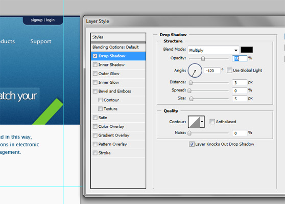
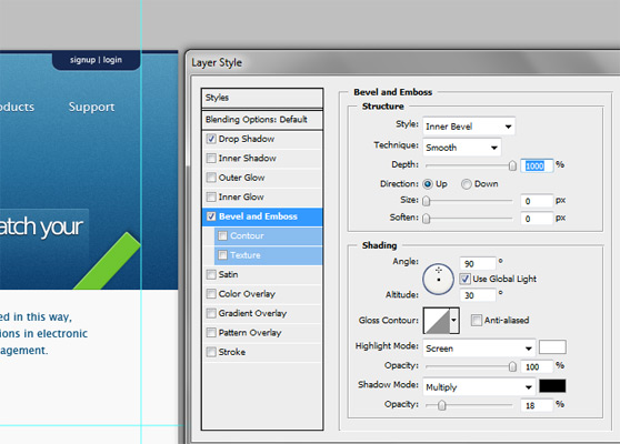
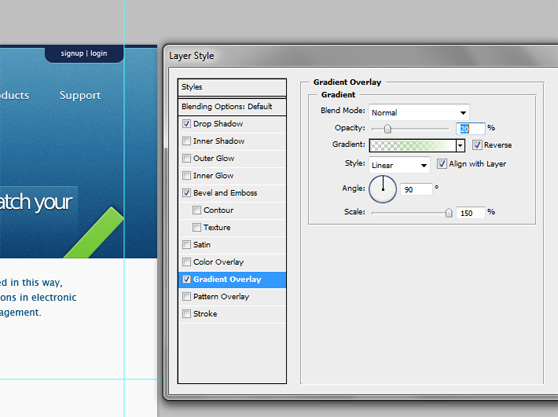 Add two call-to-action buttons, orange and blue, through Rectangle Tool... make them precious using Bevel and Emboss and Gradient Overlay as shown.
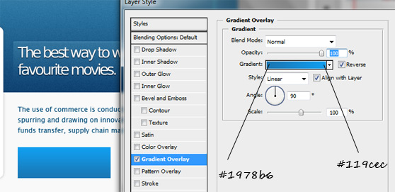
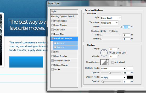 Repeat the process in order to create an orange button.
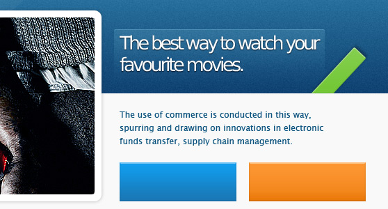 Add the descriptions for the buttons, fell free to use a soft Gradient Overlay (use a green color for the green button and so on) and a subtle Drop Shadow to create the following effect.

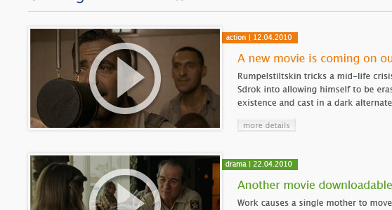
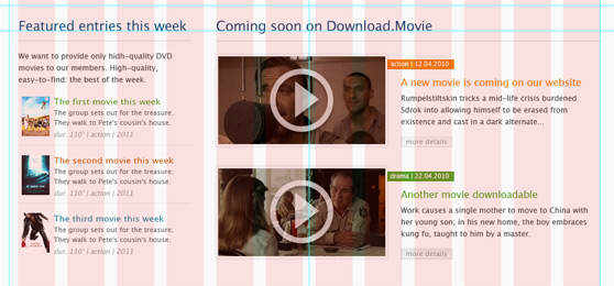 I don't want to annoy you with redundant stuff. It's clear that you can utilize the techniques used for the header to realize the elements of this section. Some examples? The two screenshots in the "Coming soon on Download.Movie" section are made using the same steps that we have followed during the creation of the screenshot for the down-header, there is only a difference: you have to add a Color Overlay (from Styles; color black, Opacity 30%). The 'play' button is a mix of two shapes like in the logo, once rasterized the icon you have to add only a black Drop Shadow and to set the right value of Opacity for the layer (70%). Again, for 'read more' buttons you have to remember what we have done previously with call-to-action buttons, now instead of orange, green and blue, use light grey. Just the last advice, make use of the '12 Col Grid' layer and of Photoshop's guides to balance your contents.
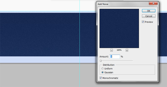
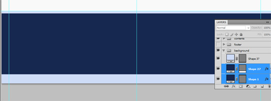 Add a soft Gradient Overlay to the dark blue layer then rasterize all layers and a add a subtle noise effect. I've decided to not add the noise effect for the credits background.
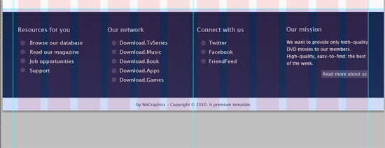
 Finally add some lists with useful links (to create the points for the list items draw a little circle using Ellipse Tool - hold down Shift, color #cfdcf8 - and set Opacity to 20%, the duplicate the layer) and a description box (for the 'read more' button use the same technique tah we have just applied for the points, the font is Lucida Sans). Add the credits and the psd mockup is complete.
 The markup for the top-bar and the header, we use unordered lists for the menu and h1 for the logo.
 Now take a look at the markup for the entire main-box section.
 The HTML structure for the footer.
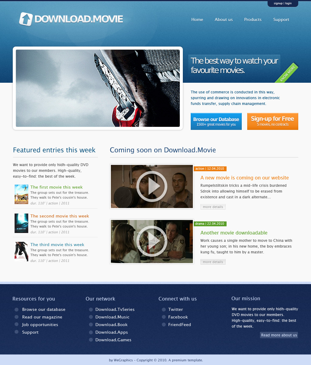
The Final Result
Below you can see the final result of our efforts: a nice web layout with a lovely design and a fresh style. Click here to see a live preview of the template.


DOWNLOAD PSD + HTML/CSS TEMPLATE
[hidepost] [download id="58" format="1"] [/hidepost]
Become a Premium Member and get unlimited access to source files and premium resources for only 7$/month. Click here to learn more.
The Design Process
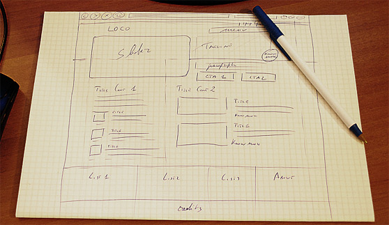
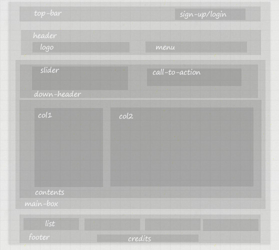
I recommend you to sketch before create your web design using Photoshop; it's the first important step. Imprint your ideas, on how the layout should be, on a blank sheet to keep in mind your objective during the entire design process. Below you can see my sketch for this 'project', Download.Movie.
Step 0 - The document
Let's start with Photoshop. First of all, create a new document 1024x1200 pixels with a resolution of 72 pixels/inch and transparent background contents. Import the 960 grid template (12 Col Grid), it is useful to design the page within 960 pixels.Step 1 - The background
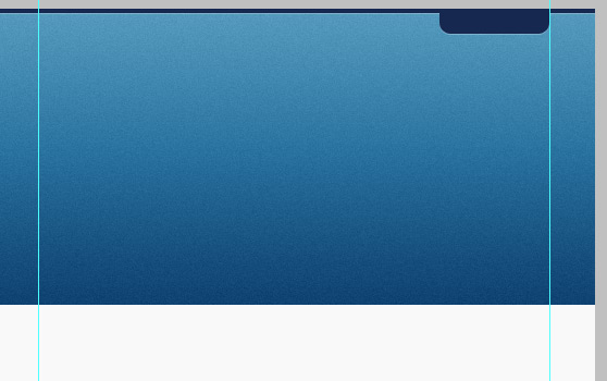
Create a selection (using the Selection Tool) that covers the entire canvas, generate a new layer called 'background' and fill the selection (right click > Fill) with #f9f9f9 color, then you can lock the layer. Use the Rectangle Tool to draw a rectangular shape on the top of the page (height about 270 pixels, color #29729f). Add a linear Gradient Overlay (double-click on the layer in the Layers Palette) from black to white (set Bland Mode to Soft Light, Scale 150%). Duplicate and rasterize the layer just created and add a noise filter (Filter>Noise>Add Noise).
 Use again the Rectangle Tool to draw a rectangular shape (heigh 4-5 pixels, color #162850), select the Rounded Rectangle Tool with a radius of 10px and add a little shape (make sure to select the option Add to shape area) as shown.
 Draw a 1px line, using Drop Shadow, in order to add depth as shown in the images below.


Step 2 - Logo
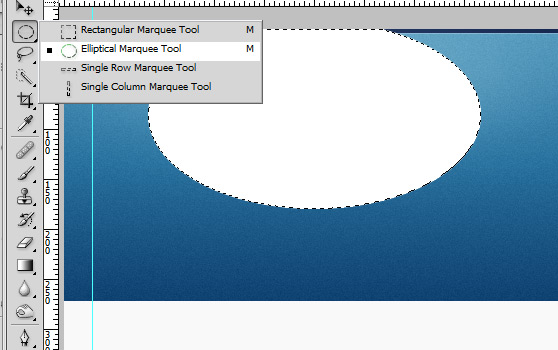
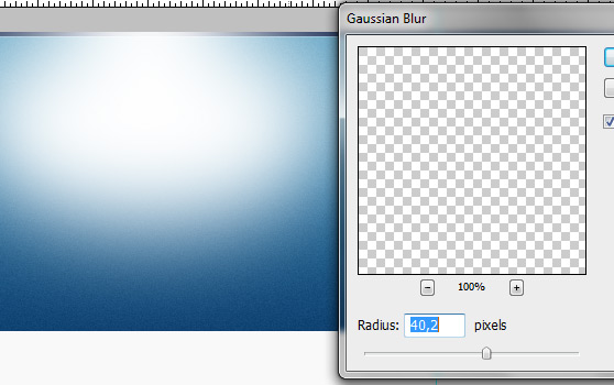
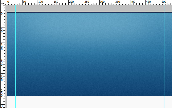
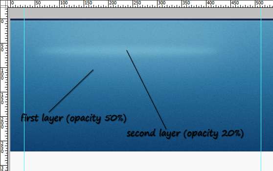
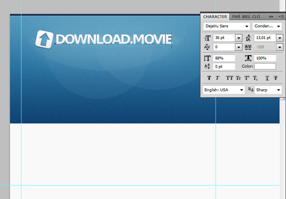
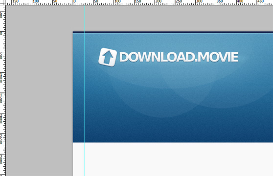
On the top-left side of the page we add the logo. To create a soft light effect for the background, you can use the Elliptical Marquee Tool creating 2 white layers with a Gaussian Blur Filter (Filter>Blur>Add Noise) and an opacity of 50% for the first layer and of 20% for the second layer.


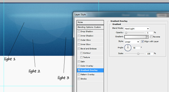
 Now add other 3 layer, but this time set fill to 0% and add a Gradient Overlay for each layer as shown below in the images.
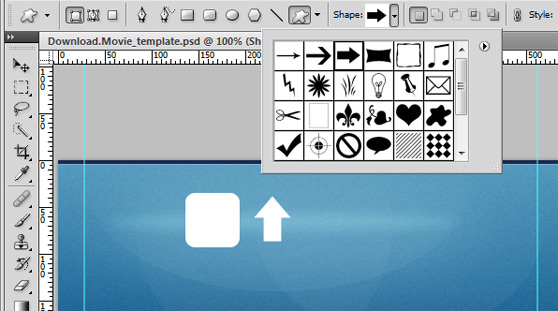
 Using Rounded Rectangle Tool draw a small square (hold down Shift to draw a perfect square), then with the Custom Shape Tool draw a little arrow as shown.
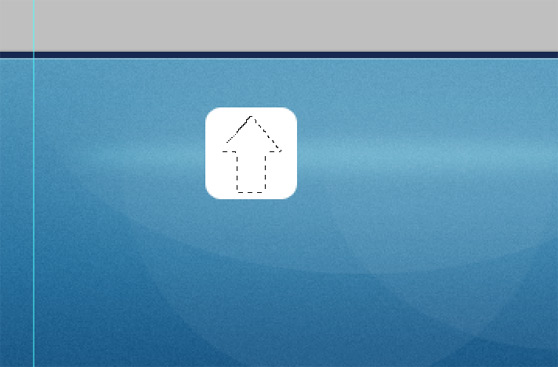
Rasterize the two layers and use the arrow to cut out an arrow from the square. Then resize and transform the custom shape as shown.


 Add the following style:


 Now with Type Tool write the name of the company, then add the same style that we have just used for our icon.


Step 3 - Complete the header
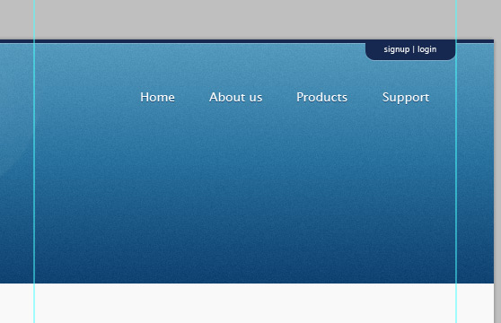
To complete the header add the menu and a sign-up/login box, use the Type Tool and a soft Drop Shadow for the text to obtain the following result.
Step 4 - The down-header
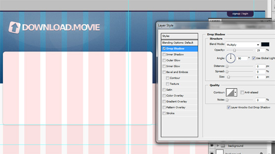
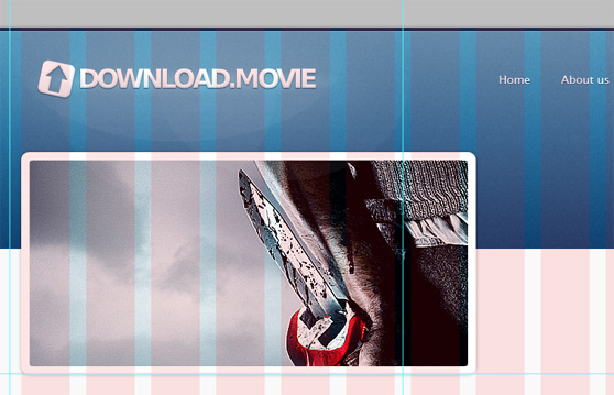
Draw a new rounded rectangular shape and add a soft Drop Shadow; then put in an amazing movie image.
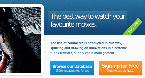
 Now it's time to create an attractive box for describing the quality of the service and to engage new users.
Add a rectangular shape on the right, then set the Fill to 0% and add a nice style a Gradient Overlay and a Drop Shadow to create a nice box, see below for the details.


 Add some text, use Dejavu Sans (30 pt, white) for the title and Lucida Sans (12 pt, #0b537f) for the paragraph. Draw a rounded rectangular shape (radius 2px, color #6fc630), right-click on the rectangle and rotate it, finally add a layer mask to obtain the following result.
 Now set the style for our ribbon as shown below.


 Add two call-to-action buttons, orange and blue, through Rectangle Tool... make them precious using Bevel and Emboss and Gradient Overlay as shown.

 Repeat the process in order to create an orange button.
 Add the descriptions for the buttons, fell free to use a soft Gradient Overlay (use a green color for the green button and so on) and a subtle Drop Shadow to create the following effect.

Step 5 - The contents
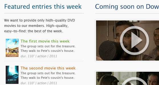
This section is the core of our layout where the visitors can easily find useful information. We want to build a simple two columns layout with some images and descriptions, see below to take a look at the final result. I don't want to annoy you with redundant stuff. It's clear that you can utilize the techniques used for the header to realize the elements of this section. Some examples? The two screenshots in the "Coming soon on Download.Movie" section are made using the same steps that we have followed during the creation of the screenshot for the down-header, there is only a difference: you have to add a Color Overlay (from Styles; color black, Opacity 30%). The 'play' button is a mix of two shapes like in the logo, once rasterized the icon you have to add only a black Drop Shadow and to set the right value of Opacity for the layer (70%). Again, for 'read more' buttons you have to remember what we have done previously with call-to-action buttons, now instead of orange, green and blue, use light grey. Just the last advice, make use of the '12 Col Grid' layer and of Photoshop's guides to balance your contents.

Step 6 - The footer
Add three new rectangles (colors #cfdcf8 and #162850) as shown below to create the background for the footer. Add a soft Gradient Overlay to the dark blue layer then rasterize all layers and a add a subtle noise effect. I've decided to not add the noise effect for the credits background.
 Finally add some lists with useful links (to create the points for the list items draw a little circle using Ellipse Tool - hold down Shift, color #cfdcf8 - and set Opacity to 20%, the duplicate the layer) and a description box (for the 'read more' button use the same technique tah we have just applied for the points, the font is Lucida Sans). Add the credits and the psd mockup is complete.

PSD-to-HTML conversion
Now it's time to create the HTML/CSS structure, this begins understanding the main structure of the layout.
Step 7 - HTML Structure
First of all we have to create a blank index.html and style.css, then, using our favourite text editor (I write my code through Notepad), we can initialize our HTML document with Doctype, head and body.<!DOCTYPE html PUBLIC "-//W3C//DTD XHTML 1.1//EN" "http://www.w3.org/TR/xhtml11/DTD/xhtml11.dtd"> <html xmlns="http://www.w3.org/1999/xhtml"> <head> <title>Download.Movie - A great database of movies</title> <meta http-equiv="content-type" content="text/html; charset=UTF-8" /> <link rel="stylesheet" href="style.css" media="screen" /> </head> <body> </body> </html>Now, according with the structure displayed in the above image, we can write the basic html structure.
<!DOCTYPE html PUBLIC "-//W3C//DTD XHTML 1.1//EN"
 "http://www.w3.org/TR/xhtml11/DTD/xhtml11.dtd">
<html xmlns="http://www.w3.org/1999/xhtml">
<head>
<title>Download.Movie - A great database of movies</title>
<meta http-equiv="content-type" content="text/html; charset=UTF-8" />
<link rel="stylesheet" href="style.css" media="screen" />
<script src="jquery.js" type="text/javascript"></script>
</head>
<body>

<div id="top_background">

<div class="main_container">

	<div class="top_bar">

	</div>

	<div class="header">

	</div>

	<div class="main_box">
		<div class="slide">
		</div>

		<div class="tagline">

		</div>

		<div class="content">

			<div class="left_content">

			</div>

			<div class="right_content">


			</div>

		</div>

	</div>

</div>

</div>

<div class="footer">

</div>

</body>
</html>
Add reset to the style.css as shown below.
/* CSS Reset */

html, body, div, span, h1, h2, h3, h4, h5, h6, p, img, ul, li, fieldset, form, label { margin: 0; padding: 0; border: 0; outline: 0; font-size: 100%; vertical-align: baseline; background: transparent; }

ol, ul { list-style: none; }

:focus { outline: 0; }
Step 7 - Background, top-bar and header
Extract the following images to reproduce the top section of the website as we have planned in the psd mockup. The markup for the top-bar and the header, we use unordered lists for the menu and h1 for the logo.
<!DOCTYPE html PUBLIC "-//W3C//DTD XHTML 1.1//EN"
 "http://www.w3.org/TR/xhtml11/DTD/xhtml11.dtd">
<html xmlns="http://www.w3.org/1999/xhtml">
<head>
<title>Download.Movie - A great database of movies</title>
<meta http-equiv="content-type" content="text/html; charset=UTF-8" />
<link rel="stylesheet" href="style.css" media="screen" />
<script src="jquery.js" type="text/javascript"></script>
</head>
<body>

<div id="top_background">

<div class="main_container">

	<div class="top_bar">
		<ul class="login">
			<li><a href="#">login |</a></li>
			<li><a href="#">sign-up</a></li>
		</ul>
	</div>

	<div class="header">
		<div class="logo">
			<h1><a href="#">Download.Movie</a></h1>
		</div>

		<ul class="navigation">
			<li><a href="#">Home</a></li>
			<li><a href="#">About us</a></li>
			<li><a href="#">Products</a></li>
			<li><a href="#">Support</a></li>
		</ul>
	</div>

	<div class="main_box">
		<div class="slide">
		</div>

		<div class="tagline">

		</div>

		<div class="content">

			<div class="left_content">

			</div>

			<div class="right_content">


			</div>

		</div>

	</div>

</div>

</div>

<div class="footer">

</div>

</body>
</html>
And now the CSS rules. Note that we add the support for @font-face, importing the font Dejavu that we will use in the down-header section.
* General */

@font-face { font-family: 'DejaVuSansCondensedBook'; src:  url('DejaVuSansCondensed-webfont.ttf') format('truetype'); }

body { background: #f9f9f9; font: 12px "Lucida Sans Unicode", sans-serif; line-height: 1.5em; color: #555; }

a { text-decoration: none; }

#top_background { background: url(images/top_bck.jpg) repeat-x; }

.main_container  { margin: 0 auto; width: 960px;  background: url(images/logo_bck.png) no-repeat; }

/* Main-container classes */

.top_bar { float: right; position: relative; top: 0px; right: -11px; width: 101px; height: 24px; background: url(images/login_bck.jpg) no-repeat; padding-left: 11px; }

	ul.login li { display: inline; padding-left: 2px;  }
	ul.login li a { color: #f2f2f2; font-size: 10px; }
	ul.login li a:hover { color: #89c0dd; }

.header { clear: both; height: 80px; margin-bottom: 53px; }
	.logo { float: left }
	.logo h1 a { display: block; width: 345px; height: 50px; background: url(images/logo.png) no-repeat; text-indent: -9999px; margin: 16px 0 0 40px; }

	ul.navigation { float: right; margin: 30px 40px 0 0; }
	ul.navigation li { display: inline; margin-left: 30px; }
	ul.navigation li a { color: #fff; font-size: 14px; text-shadow: 1px 1px 0px #155479; }
	ul.navigation li a:hover { text-decoration: underline; }
Step 8 - Main-box, down-header and contents
Now we can add the down-header with a slideshow and the contents section. In order to realize a nice slider we use the cycle plugin. First of all download the jQuery plugin and paste the file 'jquery.cycle.lite.min.js' into the folder of our template, download jQuery and paste 'jquery.js' too and then you have to add the following lines of code.<head> <title>Download.Movie - A great database of movies</title> <meta http-equiv="content-type" content="text/html; charset=UTF-8" /> <link rel="stylesheet" href="style.css" media="screen" /> <script src="jquery.js" type="text/javascript"></script> <script type="text/javascript" src="jquery.cycle.lite.min.js"></script> </head>For the elements contained into the main-box we will use the following images.
 Now take a look at the markup for the entire main-box section.
<!DOCTYPE html PUBLIC "-//W3C//DTD XHTML 1.1//EN"
 "http://www.w3.org/TR/xhtml11/DTD/xhtml11.dtd">
<html xmlns="http://www.w3.org/1999/xhtml">
<head>
<title>Download.Movie - A great database of movies</title>
<meta http-equiv="content-type" content="text/html; charset=UTF-8" />
<link rel="stylesheet" href="style.css" media="screen" />
<script src="jquery.js" type="text/javascript"></script>
</head>
<body>

<div id="top_background">

<div class="main_container">

	<div class="top_bar">
		<ul class="login">
			<li><a href="#">login |</a></li>
			<li><a href="#">sign-up</a></li>
		</ul>
	</div>

	<div class="header">
		<div class="logo">
			<h1><a href="#">Download.Movie</a></h1>
		</div>

		<ul class="navigation">
			<li><a href="#">Home</a></li>
			<li><a href="#">About us</a></li>
			<li><a href="#">Products</a></li>
			<li><a href="#">Support</a></li>
		</ul>
	</div>

	<div class="main_box">
		<div class="slide">
			<img src="images/screenshot1.jpg" alt="screenshot" />
			<img src="images/screenshot1_2.jpg" alt="screenshot" />
			<img src="images/screenshot1_3.jpg" alt="screenshot" />
		</div>

		<div class="tagline">
			<h2>The best way to watch your favourite movies</h2>
			<span class="know_more_green"><a href="#"></a></span>
			<p>The use of commerce is conducted in this way, spurring and drawing on innovations in electronic funds transfer, supply chain management.</p>
			<span class="cta_browse"><a href="#"></a></span>
			<span class="cta_signup"><a href="#"></a></span>
		</div>

		<div class="content">

			<div class="left_content">
				<h3>Featured entries this week</h3>
				<p>We want to provide only high-quality DVD movies to our members. High-quality,
easy-to-find: the best of the week.</p>
				<ul>
					<li><img src="images/screenshot2.jpg" alt="screenshot" /><h4 class="orange"><a href="#">The first movie this week</a></h4><p>The group sets out for the treasure. They walk to Pete's cousin's house</p><span class="details">dur. 110? | action | 2011 | <a href="#">more...</a></span></li>
					<li><img src="images/screenshot3.jpg" alt="screenshot" /><h4 class="green"><a href="#">The first movie this week</a></h4><p>The group sets out for the treasure. They walk to Pete's cousin's house</p><span class="details">dur. 110? | action | 2011 | <a href="#">more...</a></span></li>
					<li><img src="images/screenshot4.jpg" alt="screenshot" /><h4 class="cyan"><a href="#">The first movie this week</a></h4><p>The group sets out for the treasure. They walk to Pete's cousin's house. </p><span class="details">dur. 110? | action | 2011 | <a href="#">more...</a></span></li>
				</ul>
			</div>

			<div class="right_content">

				<h3>Featured entries this week</h3>
				<div class="box_trailer">
					<a href="#"><img src="images/screenshot5.jpg" alt="screenshot" /></a>
					<span class="meta_info meta_orange">action | 12.04.2010</span>
					<h4 class="orange"><a href="#">A new movie is coming on our website</a></h4>
					<p>Rumpelstiltskin tricks a mid-life crisis burdened Sdrok into allowing himself to be erased from
existence and cast in a dark alternate...</p>
					<span class="trailer_more"><a href="#"></a></span>
				</div>

				<div class="box_trailer">
					<a href="#"><img src="images/screenshot6.jpg" alt="screenshot" /></a>
					<span class="meta_info meta_green">drama | 12.04.2010</span>
					<h4 class="green"><a href="#">Another movie downloadable</a></h4>
					<p>Work causes a single mother to move to China with her young son; in his new home, the boy embraces kung fu, taught to him by a master.</p>
					<span class="trailer_more"><a href="#"></a></span>
				</div>

			</div>

		</div>

	</div>

</div>

</div>

<div class="footer">

</div>

</body>
</html>
Now activate the slider adding the following lines of code just above the </body> tag.
<script type="text/javascript">
$(document).ready(function() {
    $('.slide').cycle({
		fx: 'fade',
		speed:  1500,
		timeout: 4500
	});
});
</script>
It's time for the style.
.main_box { clear: both; }

	.slide { background: #fff; -moz-border-radius: 10px; -khtml-border-radius: 10px; -webkit-border-radius: 10px; border-radius: 10px; -moz-box-shadow: 0px 0px 5px rgba(1, 10, 18, 0.45); -khtml-box-shadow: 0px 0px 5px rgba(1, 10, 18, 0.45); -webkit-box-shadow: 0px 0px 5px rgba(1, 10, 18, 0.45); box-shadow: 0px 0px 5px rgba(1, 10, 18, 0.45); width: 560px; height: 274px; display: block; float: left; margin-bottom: 40px; }
	.slide img { padding: 10px; }

	.tagline { background: url(images/slog_bck.png) no-repeat; float: left; width: 370px; margin: 25px 0 0 30px; }
	.tagline h2 { font-family: 'DejaVuSansCondensedBook'; color: #fff; text-shadow: 1px 1px 0px #0f334f; font-size: 23px; line-height: 26px; font-weight: normal; letter-spacing: -1px; width: 300px; padding: 10px;}
	.tagline p { margin-top: 40px; padding-left: 10px; color: #0b537f; }

	.know_more_green a { float: right; display: block; position: relative; top: -55px; right: -6px; width: 86px; height: 74px; background: url(images/know_more_green.png) no-repeat; }

	.cta_browse a { display: block; width: 168px; height: 56px; background: url(images/cta_blu.jpg) no-repeat 0px 0px; float: left; margin: 26px 0 0 10px;}
	.cta_browse a:hover { background-position: 0px -56px; }
	.cta_signup a { display: block; width: 168px; height: 56px; background: url(images/cta_orange.jpg) no-repeat 0px 0px; float: left; margin: 26px 0 0 24px; }
	.cta_signup a:hover { background-position: 0px -56px; }

	.content { clear: both; overflow:auto; margin-bottom: 20px; }

		.left_content { width: 280px; float: left; }

		.orange a { color: #ed7d0f; }
		.green a { color: #5a9e28;}
		.cyan  a { color: #28819e; }
		.orange a:hover { color: #ff9e05; text-decoration: underline; }
		.green a:hover { color: #74d82b; text-decoration: underline; }
		.cyan  a:hover { color: #2fb4e0; text-decoration: underline; }

		.content h3 { font-size: 20px; color: #0b537f; font-weight: normal; border-bottom: 1px solid #e0e0e0; padding-bottom: 10px; margin-bottom: 20px; }
		.left_content ul { margin-top: 25px; }
		.left_content ul li  { border-bottom: 1px solid #e0e0e0; padding-bottom: 8px; margin-bottom: 15px; font-size: 11px; line-height: 16px; color: #757474; }
		.left_content ul li img { float: left; margin-right: 10px; }
		span.details { font-size: 10px; color: #a8a8a8;  }
		span.details a { color: #333; }
		span.details a:hover { text-decoration: underline; }

		.right_content { width: 630px; float: left; margin-left: 50px; }

		.box_trailer { clear: both; }
		.box_trailer img { background: #fefefe; padding: 5px; -moz-box-shadow: 0px 0px 3px rgba(51, 51, 51, 0.35); -khtml-box-shadow: 0px 0px 3px rgba(51, 51, 51, 0.35); -webkit-box-shadow: 0px 0px 3px rgba(51, 51, 51, 0.35); box-shadow: 0px 0px 3px rgba(51, 51, 51, 0.35); float: left; z-index: 100; position: relative; margin: 0 15px 30px 0; }
		span.meta_info { padding: 1px 6px; color: #fefefe; z-index: 99; margin-top: 18px; position: relative; top: 8px; left: -15px; font-size: 10px; }
		.meta_green { background: #5a9e28; }
		.meta_orange { background: #ed7d0f; }
		.box_trailer h4 { font-size: 16px; font-weight: normal; margin: 20px 0 10px 0; }
		span.trailer_more a { display: block; width: 83px; height: 19px; background: url(images/more.jpg) no-repeat 0px 0px; float: right; margin-top: 10px; }
		span.trailer_more a:hover { background-position: 0px -19px; }
Step 9 - The footer
Finally we create the footer with three lists of useful links, a box with a little description and some credits. We use only the image for the background. The HTML structure for the footer.
<div class="footer">

	<div class="foot_cont">
		<div class="foot_col">
			<h3>Resources for you</h3>
			<ul>
				<li><a href="#">Browse our database</a></li>
				<li><a href="#">Read our magazine</a></li>
				<li><a href="#">Job opportunities</a></li>
				<li><a href="#">Support</a></li>
			</ul>
		</div>

		<div class="foot_col">
			<h3>Our network</h3>
			<ul>
				<li><a href="#">Download.TvSeries</a></li>
				<li><a href="#">Download.Music</a></li>
				<li><a href="#">Download.Book</a></li>
				<li><a href="#">Download.Apps</a></li>
				<li><a href="#">Download.Games</a></li>
			</ul>
		</div>

		<div class="foot_col">
			<h3>Connect with us</h3>
			<ul>
				<li><a href="#">Twitter</a></li>
				<li><a href="#">Facebook</a></li>
				<li><a href="#">FriendFeed</a></li>
			</ul>
		</div>

		<div class="foot_col last_col">
			<h3>Our mission</h3>
			<p>We want to provide only hidh-quality DVD movies to our members.
High-quality, easy-to-find: the best of the week.</p>
			<span class="about_but"><a href="#">Read more about us</a></span>
		</div>
	</div>

	<div class="credits">
		<p>by WeGraphics - Copyright © 2010. A premium template.</p>
	</div>

</div>
Use the following css lines of code to enhance the style of the footer.
/* Footer */

.footer { background: url(images/foot_bck.jpg) repeat-x; clear: both; }

		.foot_cont { height: 218px; margin: 0 auto; width: 960px; }

			.foot_col { float: left; width: 220px; margin: 45px 20px 0 0; }
			.last_col  { margin-right: 0px; width: 240px; }
			.foot_col h3 { color: #cfdcf8; font-size: 14px; font-weight: normal; }
			.foot_col ul { margin: 10px 0 0 10px; }
			.foot_col ul li { padding: 4px 0 4px 20px; background: url(images/list.png) no-repeat 0px 7px; }
			.foot_col ul li a { color: #f1f3f8; font-size: 12px; }
			.foot_col ul li a:hover  { color: #89c0dd; }
			.foot_col p { color: #f1f3f8; margin-top: 10px; }

			span.about_but a { color: #cfdcf8; padding: 2px 5px; background: #3e5077; -moz-border-radius: 3px; margin-top: 10px; float: right; font-size: 10px;}
			span.about_but a:hover { background: #4e6188; color: #fff; }

		.credits { clear: both; background: #cfdcf8; margin-top: 20px; }
		.credits  p { text-align: center; font-size: 11px; color: #1c3059; padding: 8px; }
Nice job, friends! We have just built our nice, professional, web design.
DOWNLOAD THE SOURCE FILES
[hidepost] [download id="58" format="1"] [/hidepost]
Become a Premium Member and get unlimited access to source files and premium resources for only 7$/month. Click here to learn more.


