Designing a Comic Book Cover with No Illustration
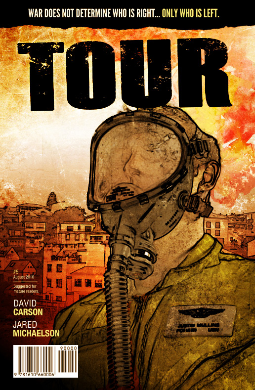
As much as I'd like to be... I'm no illustrator. But often times, as a designer I'm tasked with creating a digital illustration. Lucky for me with the right reference and resources an illustration can be created without ever putting pencil to paper. In this tutorial we will explore the process behind my mock comic book cover for a book titled Tour.
 This cover design was created using several resources including textures, brushes and photos. I'll go into detail on each, as we work through the tutorial. Let's begin!
 Scale the image down to leave room for the title at the top of the cover. Select the white back ground with the selection tool, and press the Delete key to remove it. Name the layer that contains the photo "Original", and set it's blend mode to Multiply.
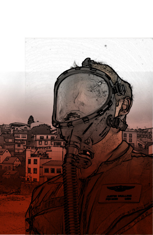 I like things to go from very dark to to light. So let's make another new layer above our red gradient. Choose black this time and make a smaller gradient from the bottom left corner.
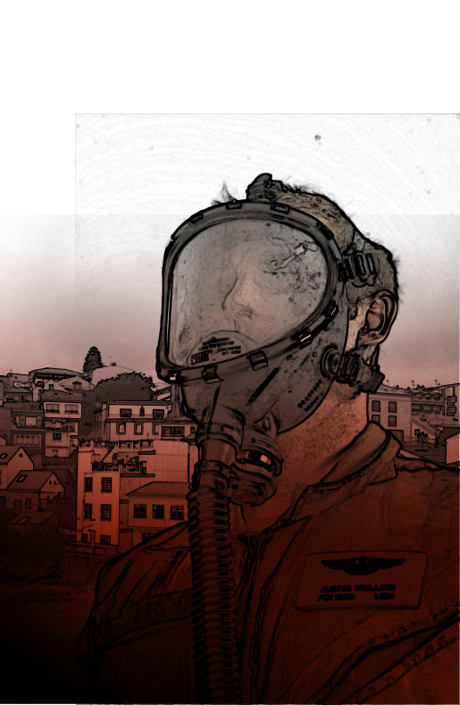 This black gradient will serve as the background for some of our type placement.
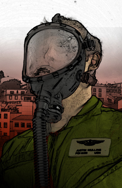 You can see below how imperfect my coloring is when the line work layers are turned off.
 I'm also going to add a nice subtitle or tag line to the top above the title. What good is a cover without a gripping tag line?
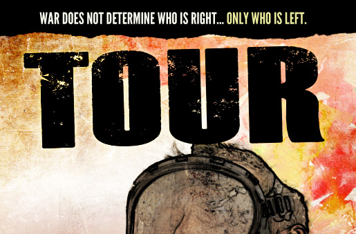 The torn paper effect is from one of my upcoming brush releases... so you'll have to stay tuned to WeGraphics for that one ;-)
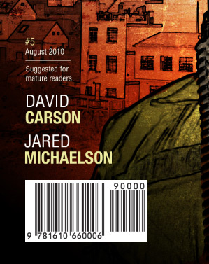
Let's also add a few other finishing elements. I added an author and artist name, as well as a bar code image.

Preview
Here's a look at what we will be creating. This cover design was created using several resources including textures, brushes and photos. I'll go into detail on each, as we work through the tutorial. Let's begin!
Share your tutorial results on our facebook page! The work with the most likes will win a Premium WeGraphics Account. If you are already a member, you will win $14 in cash (2 months of premium membership).
Step 1
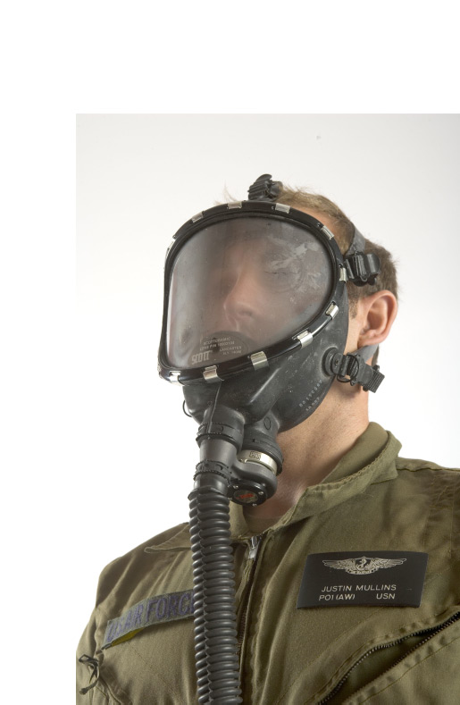
Let's create a new Photoshop document at 6.875" x 10.5" (300 dpi). This is the average size of a printed comic book. Let's also download our first reference photo and place it in the new PS document. This photo is a free sample from a great website called Photo Reference For Comic Artists. Scale the image down to leave room for the title at the top of the cover. Select the white back ground with the selection tool, and press the Delete key to remove it. Name the layer that contains the photo "Original", and set it's blend mode to Multiply.
Step 2
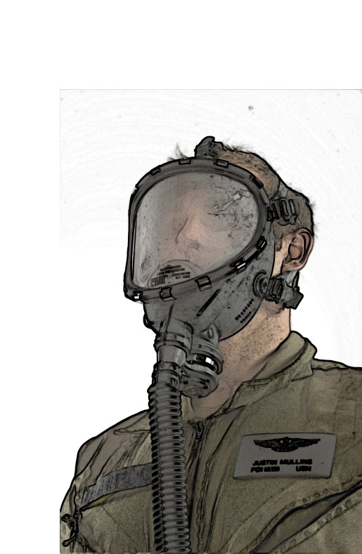
Duplicate the photo layer twice. Name one of the new layers "Thick Line" and name the other "Detail Line". Select the layer that you named "Detail line" and choose Filter > Stylize > Find Edges. For the layer that you named "Thick Line" choose Filter > Stylize > Glowing Edges. Apply these settings: Edge Width = 7, Edge Brightness = 8, Smoothness = 7. Click Okay While the "Thick Line" layer is still selected choose Image > Adjust > Desaturate. Now invert the layer by pressing Command+i (Mac) or Crtl+i (PC). You should now have something that looks similar to this.
Step 3
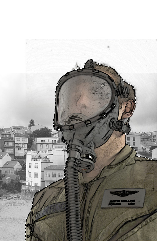
Okay, let's leave our gas mask guy alone for a bit and add a background to our cover. Download this image for the background. Place it in a new layer titled "Cityscape" behind all other layers. Choose Image > Adjust > Desaturate to convert it to black and white. Now duplicate the layer and title it "Cityscape Detail Line". Now apply another Filter > Stylize > Glowing Edges. Apply these settings: Edge Width = 5, Edge Brightness = 3, Smoothness = 5. Click Okay. Now invert the layer by pressing Command+i (Mac) or Crtl+i (PC). Because our other layers are set to a Multiply Blend Mode, you'll be able to see the city through our gas mask guy. In order to remedy that, we'll need to Command+Click the layer thumbnail for the layer titled "Original" then select each of our background Cityscape layers and press delete.
Step 4
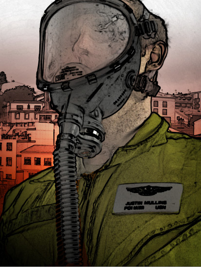
We now have our basic illustration in place. All without picking up a single pencil. Next, we're going to start adding some color and shading to the cover. First off, this is a war themed comic, so I want to add some grim elements to the piece. Let's start by adding a deep red shade over our city scape. To do this select a deep red for your foreground color. I chose #a52307. Use the gradient tool to apply a gradual fade of red, in a new layer below all of the others, from the bottom to half way up the cover. I like things to go from very dark to to light. So let's make another new layer above our red gradient. Choose black this time and make a smaller gradient from the bottom left corner.
 This black gradient will serve as the background for some of our type placement.
Step 5
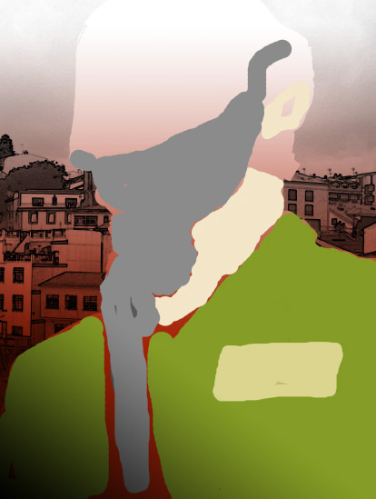
Now back to our gas mask guy. Let's add some color to him to make him stand out as the main focus of the cover. Beneath the layer labeled "Original", lets create a new layer titled "Colors". It's okay if you lack the ability to color inside the lines... Since you'll be coloring beneath the lines layers all you have to do is get close to the lines. ;-) The colors are up to you. I chose a drab green for the uniform and name patch, a flesh tone for the skin, and a light gray for the mask. You can see below how imperfect my coloring is when the line work layers are turned off.

Step 6
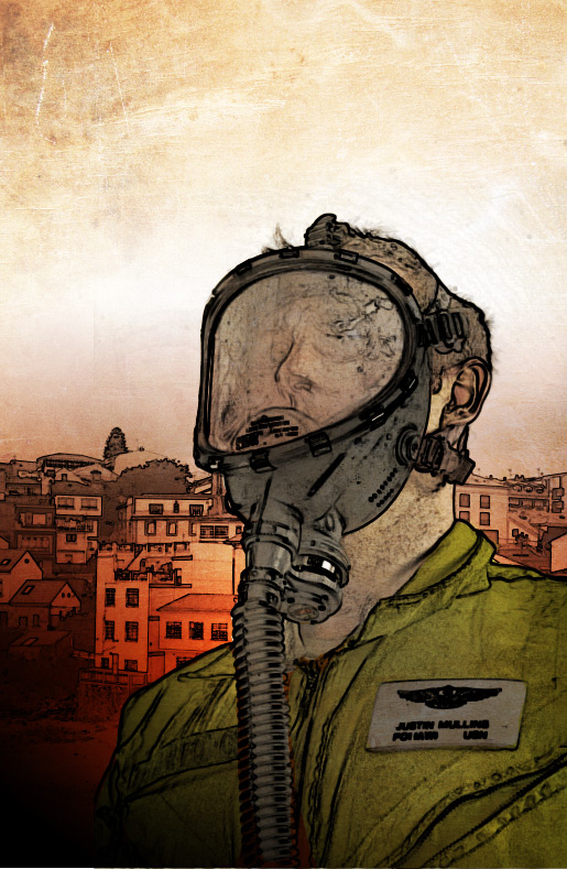
Now that our guy is colored, I'd like to add some highlight. I don't like how his uniform is all one color. There are several ways to achieve the highlight effect that I want, but the easiest way is to create a new layer above the "Colors" layer and name it "Highlights". Change this new layers blend mode to "Overlay". Now press the letter D and then the letter X on your keyboard. This changes your foreground color to white. Choose a large brush with a 0% hardness. Now start coloring over the gas mask guy to create some highlight areas. Below is my result.
Step 7
Let's add a little grunge texture to the overall piece to roughen it up a bit. Download Subtle Grunge Textures from the WeGraphics Texture collection. This is a superb collection of grunge elements that add just enough texture to a piece without being over the top, which is what we're looking for here. Choose a texture and add it to a layer at the bottom of the stack.
Step 8 - A little more grunge
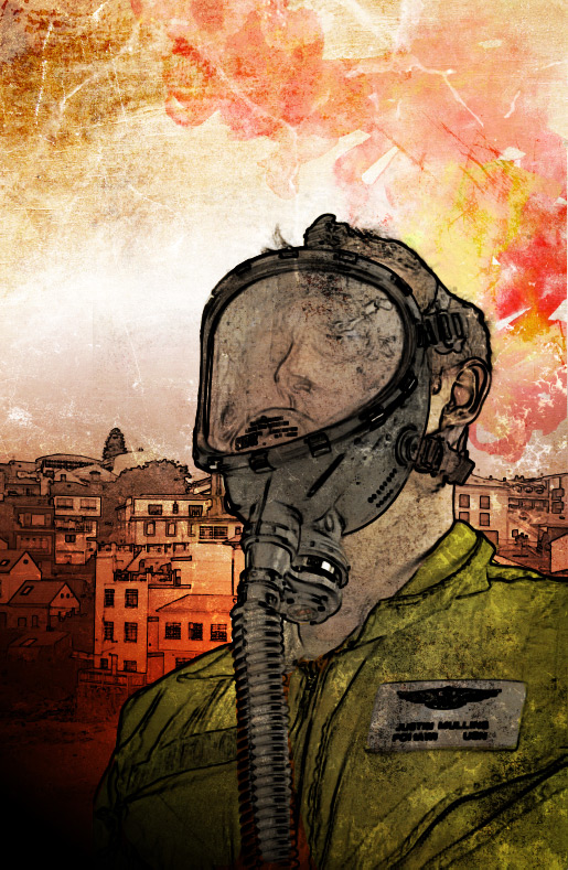
Okay... It's just not enough for my taste. If it is for yours, imply move onto step 9. I like to dirty things up a little when it comes to a piece like this. So let's grab a couple more tasty resources from the WeGraphics resource collection. I'm using Water Color Textures Vol1 and Grunge Brush Set Vol1. For the water color textures... I threw one in the upper right corner above the gas mask guy and set the layer Blend Mode to Multiply. I also dropped the opacity to 50%. I created a new layer at the top of the stack for the brushes and clicked in a few random spots using black and white colors for the brush. I then set the Blend Mode for this layer to Overlay. I'm not going to throw to many specifics at you for this step because it's sort of random and a matter of what you like for the image.
Step 9
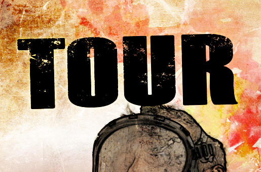
Okay, now it's time to set some type. This is my favorite part, because it's the stage finishing stage when everything finally starts coming together. For the title, I'm going to call this book "Tour" and I'm going to set it in a thick bold font for the sake of impact. I chose a font called Dead Kansas. It has the perfect look, plus a touch of grunge, which matches the rest of the cover. I'm also going to add a nice subtitle or tag line to the top above the title. What good is a cover without a gripping tag line?
 The torn paper effect is from one of my upcoming brush releases... so you'll have to stay tuned to WeGraphics for that one ;-)
Let's also add a few other finishing elements. I added an author and artist name, as well as a bar code image.

Step 10
This last step is something that you can do to change the overall color or mood of the piece. You certainly don't have to, though. It's fine the way it is, but if you're like me you can't stop poking and tweaking. I wanted the finished piece to have even more of a red colored, dangerous feel to it. So I added a new Curves Adjustment Layer to the top of the layer stack. I gave the layer the following settings: RGB: Output=132 Input=113 Red: Output=165 Input=150 Green: Output=113 Input=130 Blue: Output=88 Input=143Finished
And there you have... A grim and gritty comic book cover illustration without the use of pencils and ink. I don't know about you, but I would pick up this book and read it. We didn't cover anything too advanced in this tutorial. But nevertheless, it's a good example of what can be done with very simple techniques. I hope you learned something new and picked up some ideas to try in your next project.