Design a Retro Inspired Sci-Fi Film Poster
Here is a preview of what we'll be creating in this tutorial.

Step 1 - The Right Inspiration
When setting out to create a design like this, it's invaluable to gather the right inspiration. I did a Google search for "vintage sci-fi posters" and was presented with more than enough posters from this era to send me down the right path for this type of design.
Step 2 - Setting Up a Background
The background for our poster will help create the right mood. It's dark, and we're in outer space... That's what we're trying to establish with our background. Create a new document at 558x837 at 72dpi. I'm not printing this design, so those dimensions will work fine for my purposes. If you'd like to print yours create your new document a 11x17 inches and 300 dpi. Fill the background with solid black. Now create a new layer, and fill the layer with solid black. And choose (Filter | Render | Clouds ). Now apply a radial blur (Filter | Blur | Radial Blur ) and set the layer's opacity to 75%.
 Now apply a Gradient Map adjustment layer above all other layers, and set the adjustment layer's blend mode to overlay. Use a gradient of #0e3e63 to #fd7c00 for the gradient map.
 To create the star field and nebula effect, I grabbed an awesome image from deviantArt user ineedfire.
 Copy and paste the image onto your canvas in a layer below the gradient map. Set the nebula layer's blend mode to screen, and the opacity to 75%.
 That looks great, but I want to enhance the stars a bit by adding a few more. To do this create a new layer, this time above the gradient map. Fill it with solid black. Then click (Filter | Noise | Add Noise) and use a setting around 20 for the amount, and the distribution should be set to Gaussian.
 Now choose (Image | Adjust | Levels) and move the outer arrows in a bit to remove some of the white dots.
 Now set the layer's blend mode to screen.
 That does it for our poster background!
Step 2 - Applying Poster Edges
Now lets add a border around the background. To do this I made a selection, with the Rectangular Marque Tool (M), around the edge of the poster. Then I inverted the selection (Cmd+Shift+I) and filled it with #e8cfbd, on a layer above the gradient map. To enhance the border a bit further... On a new layer, I added one more selection, and applied a 1px stroke (Edit | Stroke) to that selection, using the same color.
 Next, I wanted to add just a bit of a worn look to the poster. To do this I added a noise effect texture, from this set, to the topmost layer and set it's blend mode to screen. If you're not a WeGraphics member, adding this effect is completely optional.

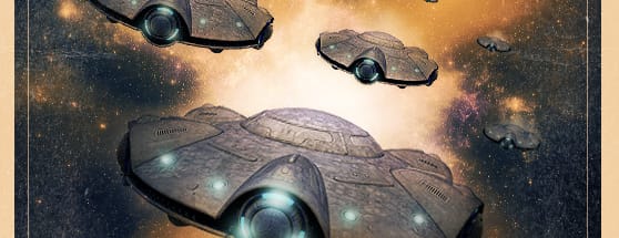
Step 3 - Adding Flying Saucers
After searching around a bit, I found the perfect isolated space ship image at iStock Photo. I want to add the top view of the ship to my poster, but I don't need to extract it from the background, since we'll be doing some blending with colors around the ship. So we can use the Rectangular Marque Tool (M), to select the top ship and copy and paste it to our poster. Place it on a layer above the gradient map. I've turned off the gradient map layer in the images below, so you can clearly see what edits I'm making to the ship layer.
 Set the ship layer's blend mode to multiply to remove the white background.
 Apply a (Filter | Sharpen | Sharpen ) to bring out some of the detail. Now using a light gray you can paint a little bit of color to a layer underneath the ship to hide any stars or nebula that might be showing through the ship.
I also used a soft white brush on a layer above the ship to enhance the lights a bit. Set the light layer's blend mode to overlay.
Apply a (Filter | Sharpen | Sharpen ) to bring out some of the detail. Now using a light gray you can paint a little bit of color to a layer underneath the ship to hide any stars or nebula that might be showing through the ship.
I also used a soft white brush on a layer above the ship to enhance the lights a bit. Set the light layer's blend mode to overlay.
 That does it for our ship. Now you can group all of the layers together in a layer group and duplicate the group as many times as you want and resize and reposition each copy until it looks like an entire fleet of flying saucers is approaching.... Beware Earth People!

Step 4 - Adding Typography
What's a sci-fi movie poster without a gripping title treatment and some menacing tag lines!? Lets start with a title treatment. I'm using a free font called League Gothic. Type out a large title, on a layer below the gradient map, and apply the following layer effects to the type.
 The gradient used is #373636 to #e3e2e2.
 Now rasterize the type layer by Ctrl+Clicking the layer and selecting "Rasterize Type". Now use the warp tool (Edit | Transform | Warp) to shape the text similar to the way I have below.
 On a layer above the type, I used a soft black brush set to around 30% opacity to paint some shadows over the type so that it looks like the ship is flying over it.
 Lets apply some film credits below the main title. I don't want to take the time to type out all of the credits, so I'm just going to copy and paste some existing credits from and old poster that I found here.
Once copied I convert the credits to black and white, and bump up the black with a levels adjustment.
Lets apply some film credits below the main title. I don't want to take the time to type out all of the credits, so I'm just going to copy and paste some existing credits from and old poster that I found here.
Once copied I convert the credits to black and white, and bump up the black with a levels adjustment.
 Then I copy and paste the credits to a layer below the gradient map. I set this layers blend mode to screen.
 For the type treatment at the top of the poster, I used League Gothic again, with the same layer styles applied.

Step 5 - Final Adjustment
As a final lighting adjustment I want to duplicate the gradient map layer, and drag it above all other layers, then set its opacity to 50%. This is just to help blend the colors a bit more. Below is a look at the final poster.
More from Tutorials

How to Make Light Leaks From Images in Photoshop
Tutorialsby Diego Sanchez
Light leaks can instantly add warmth, depth, and a cinematic feel to your images, and creating them in Photoshop is much easier than you might think. In this tutorial, we’ll transform ordinary images into beautiful light leak overlays using just a few simple tools like Blur, Contrast adjustments, and the Liquify filter. By manipulating colors and shapes, you can craft soft gradients of light that bring a nostalgic, film-inspired atmosphere to your photos. Whether you want to enhance portraits, add flair to design projects, or create dreamy lighting effects, this method gives you full control over the final look in just a few minutes.
Read more
Enhance Autumn Colors in Lightroom with Ease
Tutorialsby Diego Sanchez
Enhancing the warm and vibrant tones of autumn photography is easier than it seems with just a few simple adjustments in Lightroom. By carefully refining exposure, boosting contrast, and enhancing the reds, oranges, and yellows, you can transform any fall image into a rich and captivating scene. Using only Lightroom’s basic tools along with the Color Mixer and Color Grading panels, you’ll bring out the full beauty of autumn landscapes with ease.
Read more
Easily Add a Twilight Mood to Your Photos in Lightroom
Tutorialsby Diego Sanchez
Give your photos a mystical touch by transforming ordinary daylight or sunset shots into captivating twilight scenes. By combining simple adjustments with precise tweaks in the Color Mixer, enhancing tones with Color Grading, and adding a delicate layer of Grain, it’s possible to achieve a soft, cinematic glow. These subtle yet impactful edits can shift the mood of your images, creating a serene, atmospheric look that feels like the perfect blue hour moment.
Read more
How to Create an Editable Soft Glow Text Effect in Illustrator
Tutorialsby Diego Sanchez
Creating eye-catching visual effects in Illustrator doesn’t always require complex tools or multiple layers. Sometimes, a single feature—used creatively—can deliver stunning results. Today, I’ll show you how to create a soft glow text effect using nothing but the Appearance Panel in Illustrator. Thanks to its non-destructive structure, you’ll be able to edit your text at any time without losing the effect, making it perfect for experimenting with different styles, colors, and typefaces without starting over.
Read more