Design a Quick and Easy Indie Rock Gig Poster
Gig posters are great fun for a designer. Typically you have the band's music for inspiration, and beyond that, anything goes. These posters are often abstract and can often be incredible expressions of art. But, more often than not, you are working with a limited budget and limited time. So you need to create something incredible, quickly and inexpensively. Lets take a look at how that can be accomplished.
A lot of times gig posters will be illustration based. But since we don't have the time to create a custom illustration, our poster will be photo based. Lets gather some interesting photos and textures that might work well together. Here's what I found.
- Dead Tree
- Black Birds
- Single Tree
- Grunge Texture
Note: When using images for printed commercial work, be sure to check licenses and ask permission from the photographer before using.
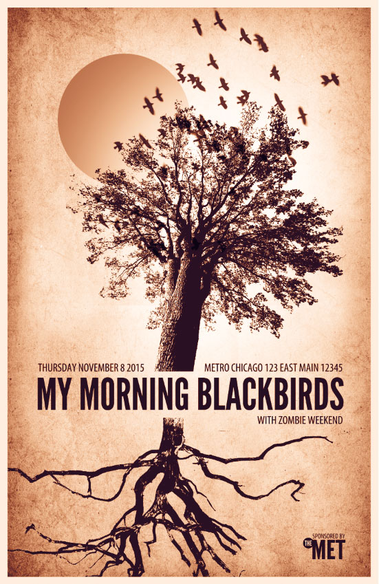
And here's a look at what we'll be creating with these resources.

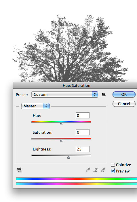
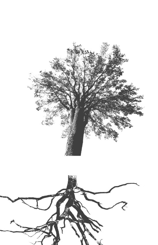
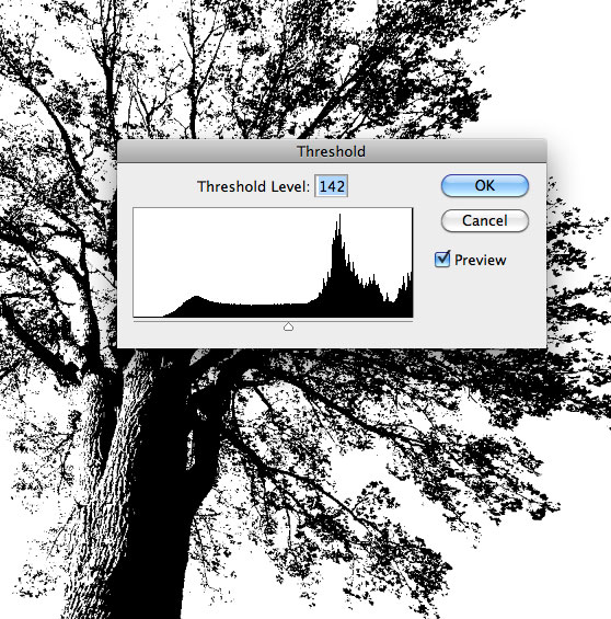 Now with the Magic Wand Tool (W) select the black area and copy and paste it to the poster document. We want the tree to be more gray than solid black, so select (Image | Adjust| Hue/Saturation), and bump the Lightness slide up a touch.
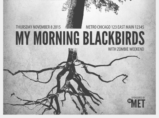
 Lets repeat the exact steps for the dead tree / roots photo. We'll place it on the canvas and flip it to position the image as tree roots.
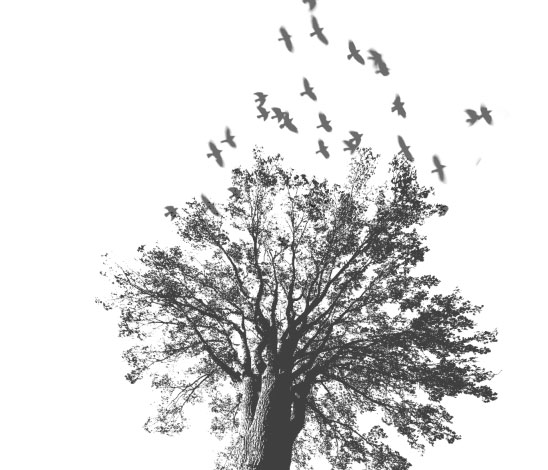
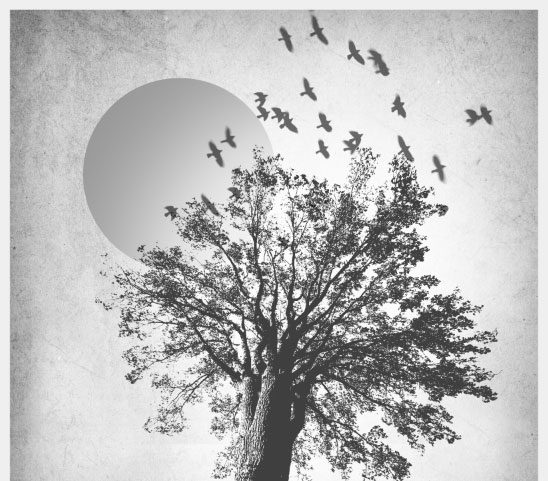
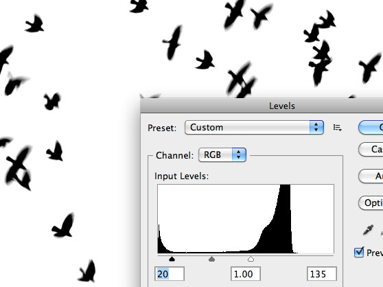 Place the image on the canvas above the tree, and rotate it to appear as though the birds are flying from the tree. Set the layers blending mode to Multiply to hide the white background behind the birds.
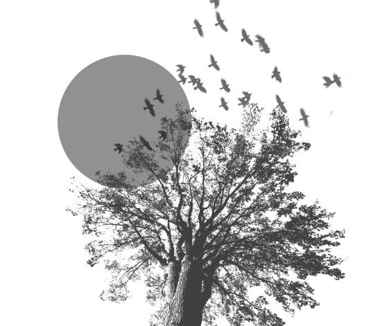
 Now using the Ellipitcal Marque Tool (M), hold the shift key and draw a circle selection on a layer behind the tree layer. Fill that layer with a medium gray (#919191), to create a moon.
 Next I created a border by using the Rectangle Marque Tool (M) to draw a selection around the edge of the document. Then I inverted the selection and filled it with a light gray (#efefef) on a layer above all others.
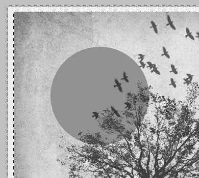 On a layer between the tree and moon, use a large soft white brush to paint a highlight behind the tree. Set that layer's blend mode to Overlay.
 There you have it... A finished gig poster done very quickly. I hope you picked up some new techniques from this tutorial and can apply them in your next project.


Step 1
Create a new document 11x17 at 300 dpi. Then grab the image of the single tree. To convert it to a solid black shape, we'll desaturate it (Cmd+Shift+u), and then apply the Threshold setting (Image | Adjust | Threshold). You'll need to bump the setting up just a bit to get enough black. Now with the Magic Wand Tool (W) select the black area and copy and paste it to the poster document. We want the tree to be more gray than solid black, so select (Image | Adjust| Hue/Saturation), and bump the Lightness slide up a touch.
 Lets repeat the exact steps for the dead tree / roots photo. We'll place it on the canvas and flip it to position the image as tree roots.

Step 2
Now we'll add some secondary elements. For the image of the birds, desaturate it (Cmd+Shift+u) then adjust the Levels (Image | Adjust | Levels) to remove the gray sky area. Place the image on the canvas above the tree, and rotate it to appear as though the birds are flying from the tree. Set the layers blending mode to Multiply to hide the white background behind the birds.
 Now using the Ellipitcal Marque Tool (M), hold the shift key and draw a circle selection on a layer behind the tree layer. Fill that layer with a medium gray (#919191), to create a moon.

Step 3
Next up, lets add the background texture. The texture I chose was not quite large enough to fill the background of an 11x17 poster. So I duplicated the texture 4 times and positioned each copy to fill the document. Then I merged all four layers and used the Clone Stamp Tool (S) to hide the seams. Next I created a border by using the Rectangle Marque Tool (M) to draw a selection around the edge of the document. Then I inverted the selection and filled it with a light gray (#efefef) on a layer above all others.
 On a layer between the tree and moon, use a large soft white brush to paint a highlight behind the tree. Set that layer's blend mode to Overlay.

Step 4
Now lets add some text. I chose two font faces for this poster. For the main title font I used League Gothic. This is one of my favorite type faces. It's bold and condensed, and works great for titles and headlines. For the secondary font I used Myriad Pro Condensed Bold. This font comes with most Adobe applications so you should already have it. If not, choose a condensed font that compliments League Gothic. I placed the type as follows.
Step 5
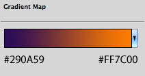
Now it's time to add some color. To do this add a Gradient Map Adjustment Layer above all other layers in the composition. Set the adjustment layer's blend mode to Overlay, and use the following gradient. There you have it... A finished gig poster done very quickly. I hope you picked up some new techniques from this tutorial and can apply them in your next project.
