Creating a Vintage Typography Layout in Adobe Illustrator
Vintage style typography is classic and remains popular still today. There's something about the hand drawn and hand placed feel of these types of layouts that is appealing and draws your eye. Lets take a look at how to create a vintage style type layout in Adobe Illustrator.
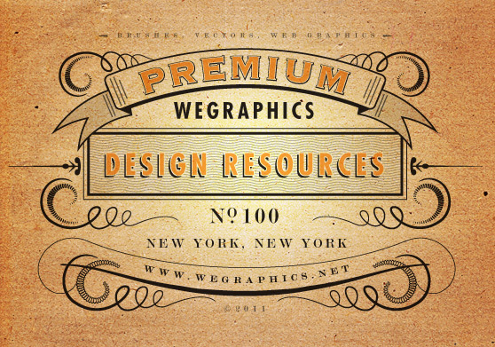
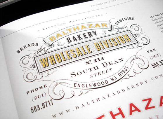
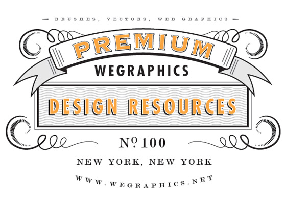
Here's a look at what we'll be creating. Before getting started I found a great inspiration piece to use as reference for the steps will be working through in this tutorial.
 When putting together a design like this there are a few very important factors to consider in order to achieve that vintage look.
- Fonts - You have to put in the time to seek out the right fonts. Reference material from the time period is essential. There wasn't near as many fonts in existence 50 or 100 years ago as there are today. So you don't want to choose a font that doesn't come close in style to what was available back then.
- Shapes - Shapes and elements were drawn by hand, so keep that in mind when putting together your design elements. The lines should vary in width and if you can make them slightly imperfect, that's even better.
- Symmetry - Most vintage layouts such as this one contain some degree of symmetry. So keep in mind what your designing on the left should be repeated on the right.
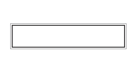
 I want to create something similar to our reference photo here, and if you notice the rectangle is not just a simple box. There is a two borders, one thick and one thin. Plus a background texture consisting of wavy lines.
For my borders I chose .05 in for the thick border and .015 in for the thinner border.
 Fir the background we need to create a series of wavy lines. Lets start by drawing a straight line using the Pen Tool (P). Make it the length of the box. I made my line 30% black.
Now choose (Effect | Distort & Transform | Zig Zag). Enter similar settings to what I have below.
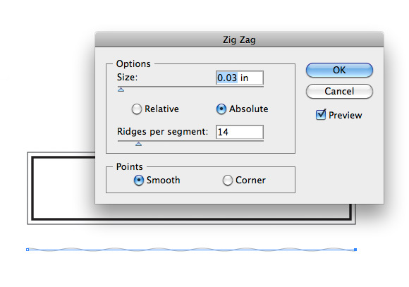 Now lets place our wavy line at the base of the rectangle box. Lets also copy and paste the line and place the duplicate at the top of the box.
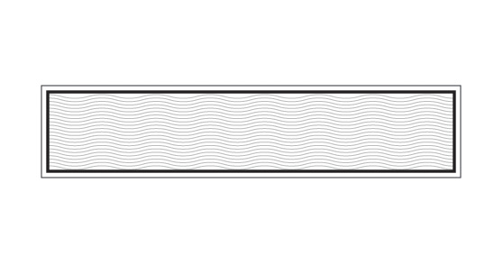
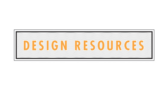
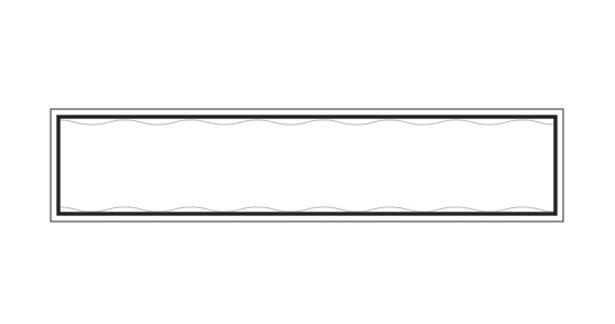 Now select (Object | Blend | Blend Options). For spacing choose Specified Steps and enter an amount of 20. Now select both wavy lines and choose (Object | Blend | Make). You should now have a set of evenly spaced lines filling the box.
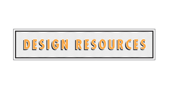
 For the drop shadow I simply duplicated the type, changed the color to black and placed it behind the original. I offset the shadow 4-5 pixels to the bottom and left.
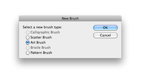
 Now drag this shape to the brushes palette to create a new brush. When the dialog box opens select Art Brush and click OK.
 Using the Spiral Tool, draw a curl similar to the one below. You'll need to use the down arrow key on your keyboard to remove segments before releasing the mouse button to complete the shape. Once you have the shape, choose our new brush from the brush palette.
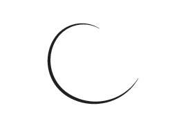 Now copy and paste this shape 3 times, each time reducing the scale, until you have something similar.
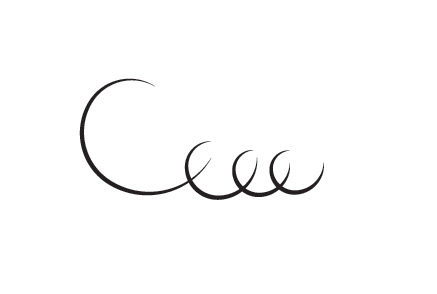 With the Direct Selection Tool (A), zoom in to each of the loops and connect the paths by selecting only the two end points and pressing (Cmd+J) to join them.
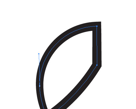 You'll need to do a little bit of editing with the Convert Anchor Point Tool to each loop so that it is smooth versus the hard angle created by joining the paths. Below is my result after a little clean up.
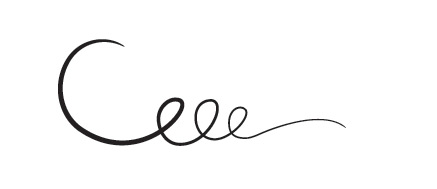 Don't worry about being too perfect. We want this to appear hand drawn, as it's part of the appeal of the final piece.
In the image below I'm showing the steps I used to create the second custom brush that we need.
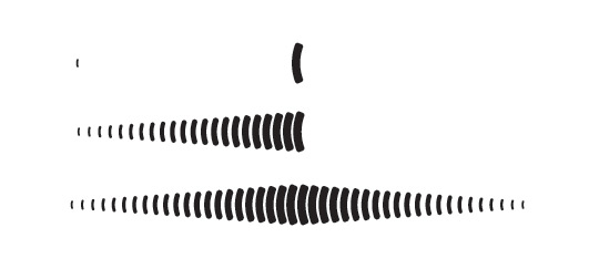 I created the first two shapes, one larger than the other, then used the blend tool again to create the segments in between them. I then duplicated the shape and flipped it to make the opposite side. Expand the appearance (Object | Expand) and then drag the new shape to the brush palette to create another art brush.
Draw another spiral with the Spiral Tool, and apply this new brush.
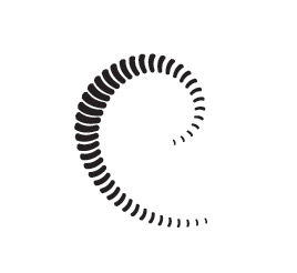 Now add this new shape to our first set of spirals.
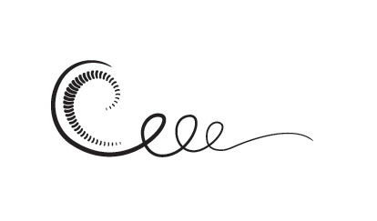 Now we need to place this shape with our original rectangle. Lets also copy and paste it and apply it to both sides. Choose (Object | Transform | Reflect - Vertical) to flip it.
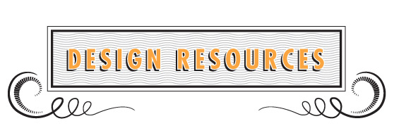
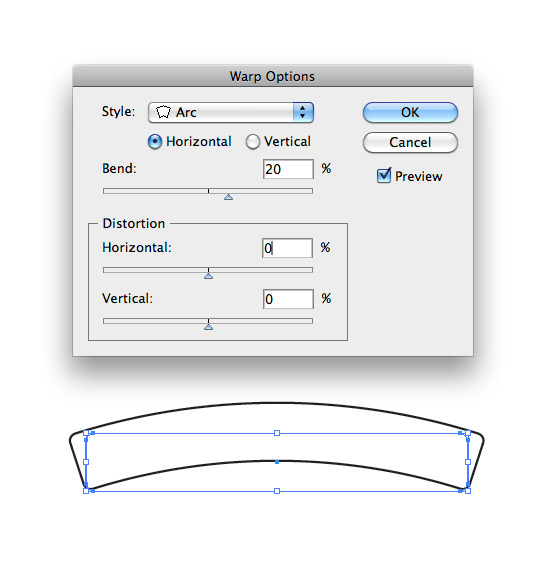
 Now choose (Effects | Warp | Arc) to give the banner an even bend.
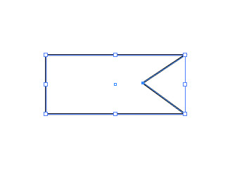
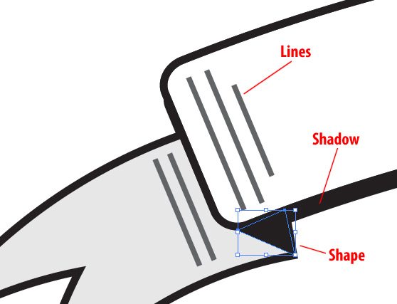
 Create a rectangle for the banner ends. Add 1 point to the side using the Add Anchor Point Tool (+). Then nudge this point using the arrow keys on your keyboard until you get something similar.
 Now apply the same Arc effect to this shape. I also filled mine with 10% black.
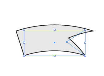 Expand the appearance of this shape and then add it behind the banner, duplicating it for each side.
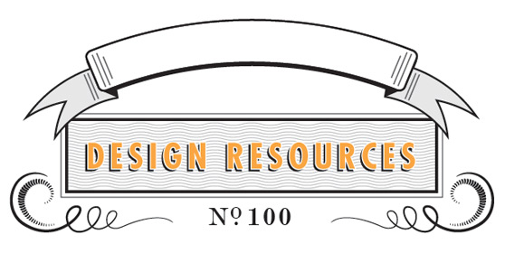 I added a few more details to the banner, shown below.
 For the font within the banner I chose Copperplate for it's classic vintage look. I applied the same border and shadow technique used within the rectangle.
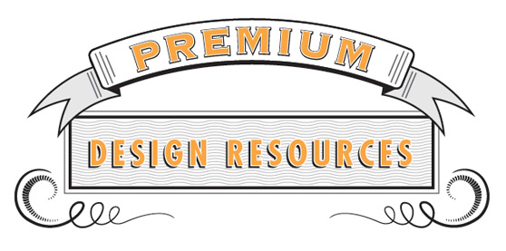
 For the title below the banner I chose the same Futura font from the rectangle, but solid black with now borders or shadows.
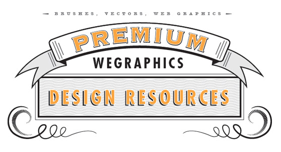 For the text at the bottom I chose Modern No. 20 again. Notice the treatment of the No. 100. I borrowed that from the reference photo. I love the placement of the "0" and the "."
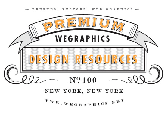 For the URL I used the Arc effect again, this time I entered a negative number to bend the text upward.
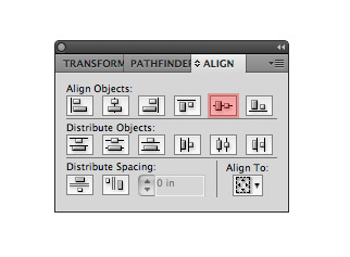
 Use the Align Palette to make sure that these pieces are aligned horizontally.
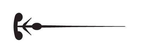
 For the left and right edge of the banner create lets create another element. I combined a few basic shapes below to create this embellishment.
 Again, use the align tools to center these objects horizontally with each other.
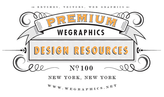
 Now apply our original custom brush. You may have to reduce the stroke. You should have something similar to the image below when done.
 For the top of the banner a I made a thin line and applied the same Arc.
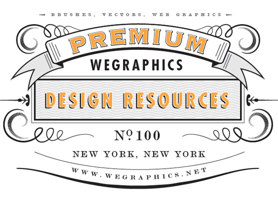 Lets copy and paste our original swirls one more time, and place them at the bottom below the banner. I also used the Spiral Tool to create a thin curve that matches the top of the banner. I aligned it the edge and copied it for the opposite side.
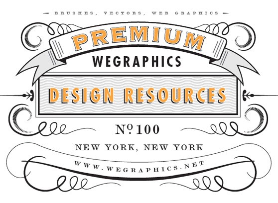 For the final addition... Lets create one more custom brush. Using the a Blend once more, I created the following set of shapes for a custom brush.
 Below is the brush applied to another spiral.
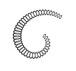 I placed two of these spirals in the bottom banner.
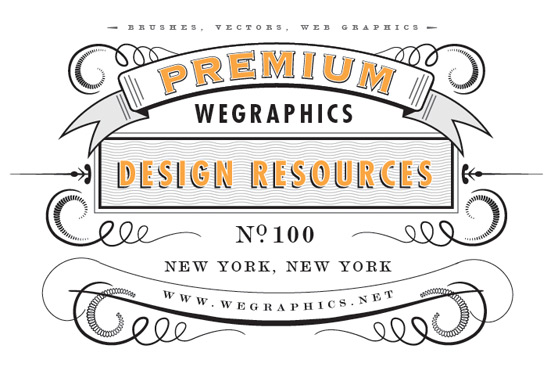 That's it! Our final Vintage Type Layout. These techniques could be applied in any number of ways to create unique patterns and layouts. I hope this tutorial inspires you to experiment with your own and see what you can come up with.

Here's a look at what we'll be creating.
 Before getting started I found a great inspiration piece to use as reference for the steps will be working through in this tutorial.
 When putting together a design like this there are a few very important factors to consider in order to achieve that vintage look.
- Fonts - You have to put in the time to seek out the right fonts. Reference material from the time period is essential. There wasn't near as many fonts in existence 50 or 100 years ago as there are today. So you don't want to choose a font that doesn't come close in style to what was available back then.
- Shapes - Shapes and elements were drawn by hand, so keep that in mind when putting together your design elements. The lines should vary in width and if you can make them slightly imperfect, that's even better.
- Symmetry - Most vintage layouts such as this one contain some degree of symmetry. So keep in mind what your designing on the left should be repeated on the right.
Step 1
In Illustrator, on a new art board, lets start with the basic shape of our layout. Which is the rectangle center portion. I want to create something similar to our reference photo here, and if you notice the rectangle is not just a simple box. There is a two borders, one thick and one thin. Plus a background texture consisting of wavy lines.
For my borders I chose .05 in for the thick border and .015 in for the thinner border.
 Fir the background we need to create a series of wavy lines. Lets start by drawing a straight line using the Pen Tool (P). Make it the length of the box. I made my line 30% black.
Now choose (Effect | Distort & Transform | Zig Zag). Enter similar settings to what I have below.
 Now lets place our wavy line at the base of the rectangle box. Lets also copy and paste the line and place the duplicate at the top of the box.
 Now select (Object | Blend | Blend Options). For spacing choose Specified Steps and enter an amount of 20. Now select both wavy lines and choose (Object | Blend | Make). You should now have a set of evenly spaced lines filling the box.

Step 2
For the font that appears in the box I wanted a good bold san serif. I chose Futura with a tracking of 150 to spread the letters a bit. For the color I chose a light orange with a white border stroke. For the drop shadow I simply duplicated the type, changed the color to black and placed it behind the original. I offset the shadow 4-5 pixels to the bottom and left.

Step 3
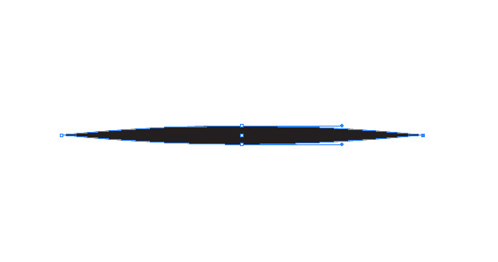
For the first ornament we'll need to create a custom art brush. Start with a very wide thin, solid black, circle drawn with the Ellipse Tool (L). Using the Convert Anchor Point Tool (Shift + C). Click both left and right points so that the shape comes to a fine point on both ends. Now drag this shape to the brushes palette to create a new brush. When the dialog box opens select Art Brush and click OK.
 Using the Spiral Tool, draw a curl similar to the one below. You'll need to use the down arrow key on your keyboard to remove segments before releasing the mouse button to complete the shape. Once you have the shape, choose our new brush from the brush palette.
 Now copy and paste this shape 3 times, each time reducing the scale, until you have something similar.
 With the Direct Selection Tool (A), zoom in to each of the loops and connect the paths by selecting only the two end points and pressing (Cmd+J) to join them.
 You'll need to do a little bit of editing with the Convert Anchor Point Tool to each loop so that it is smooth versus the hard angle created by joining the paths. Below is my result after a little clean up.
 Don't worry about being too perfect. We want this to appear hand drawn, as it's part of the appeal of the final piece.
In the image below I'm showing the steps I used to create the second custom brush that we need.
 I created the first two shapes, one larger than the other, then used the blend tool again to create the segments in between them. I then duplicated the shape and flipped it to make the opposite side. Expand the appearance (Object | Expand) and then drag the new shape to the brush palette to create another art brush.
Draw another spiral with the Spiral Tool, and apply this new brush.
 Now add this new shape to our first set of spirals.
 Now we need to place this shape with our original rectangle. Lets also copy and paste it and apply it to both sides. Choose (Object | Transform | Reflect - Vertical) to flip it.

Step 4
To create the banner at the top, draw a rounded rectangle with a corner radius of .1 in. Now choose (Effects | Warp | Arc) to give the banner an even bend.
 Create a rectangle for the banner ends. Add 1 point to the side using the Add Anchor Point Tool (+). Then nudge this point using the arrow keys on your keyboard until you get something similar.
 Now apply the same Arc effect to this shape. I also filled mine with 10% black.
 Expand the appearance of this shape and then add it behind the banner, duplicating it for each side.
 I added a few more details to the banner, shown below.
 For the font within the banner I chose Copperplate for it's classic vintage look. I applied the same border and shadow technique used within the rectangle.

Step 5
Lets go ahead and start fleshing out the design with more text. For the top portion I want to choose one more font. I knew I wanted something with a thin/thick serif style. After some searching I decided on a font called Modern No. 20. I chose a lighter 75% black for the color. The ornaments on each side are simple arrows created from a triangle shape. For the title below the banner I chose the same Futura font from the rectangle, but solid black with now borders or shadows.
 For the text at the bottom I chose Modern No. 20 again. Notice the treatment of the No. 100. I borrowed that from the reference photo. I love the placement of the "0" and the "."
 For the URL I used the Arc effect again, this time I entered a negative number to bend the text upward.
Step 6
Lets add a few more design elements. To embellish the top a bit I copied and pasted our original swirls and flipped them horizontally, then placed them behind the banner. Use the Align Palette to make sure that these pieces are aligned horizontally.
 For the left and right edge of the banner create lets create another element. I combined a few basic shapes below to create this embellishment.
 Again, use the align tools to center these objects horizontally with each other.

Step 7
For the final step I want to further embellish the bottom portion. To do that, lets create another banner for the url. Draw a line with 3 points using the Pen Tool. With the Direct Selection Tool move the center point down to create a subtle arch. Now smooth the points by clicking and dragging horizontally while holding the shift key. Now apply our original custom brush. You may have to reduce the stroke. You should have something similar to the image below when done.
 For the top of the banner a I made a thin line and applied the same Arc.
 Lets copy and paste our original swirls one more time, and place them at the bottom below the banner. I also used the Spiral Tool to create a thin curve that matches the top of the banner. I aligned it the edge and copied it for the opposite side.
 For the final addition... Lets create one more custom brush. Using the a Blend once more, I created the following set of shapes for a custom brush.
 Below is the brush applied to another spiral.
 I placed two of these spirals in the bottom banner.
 That's it! Our final Vintage Type Layout. These techniques could be applied in any number of ways to create unique patterns and layouts. I hope this tutorial inspires you to experiment with your own and see what you can come up with.
