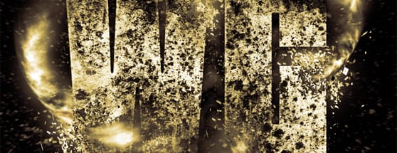
Create an Exploding Light Text Effect in Photoshop
In this tutorial I wanted to take a look at a couple of techniques for an exploding text effect. I knew going into this tutorial that I wanted a thick heavy font with portions that are corroding and breaking apart with various explosions, and I want some dramatic lighting to punch it up a bit.
Below is a preview of what we'll be creating. Full text version. Click to enlarge.


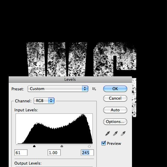
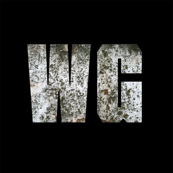 Now let's remove the color from the texture by clicking (Image | Adjust | Desaturate). Then lets adjust the levels (Image | Adjust | Levels) to make the blacks blacker and the whites whiter.
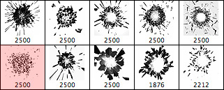 Instead of loading it as a brush load it as your Eraser (E), scale it down to around 200, begin erasing portions of the text with a single click each time.
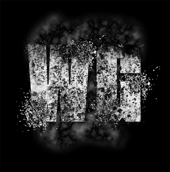
 Now on a new layer behind the text select your Brush Tool (B), color set to white, and sized around 600-800 and begin adding the exploding areas around the portions that you erased.
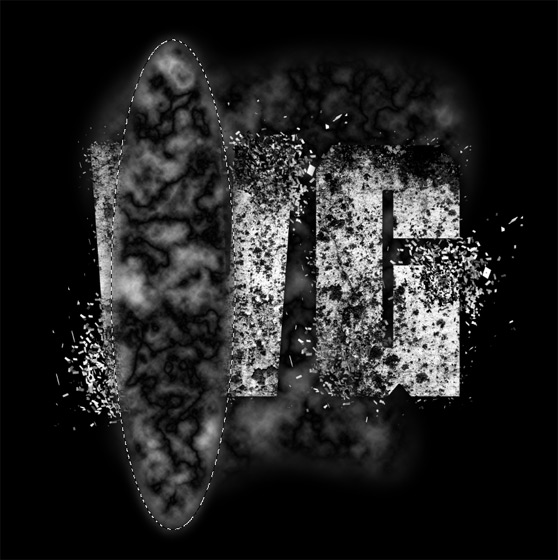 Next we need to reshape the light streak using the Warp Tool (Edit | Transform | Warp). Create an arc that you can place around the letters. The goal here is to make it look as though the streaks of light are moving around the letters.
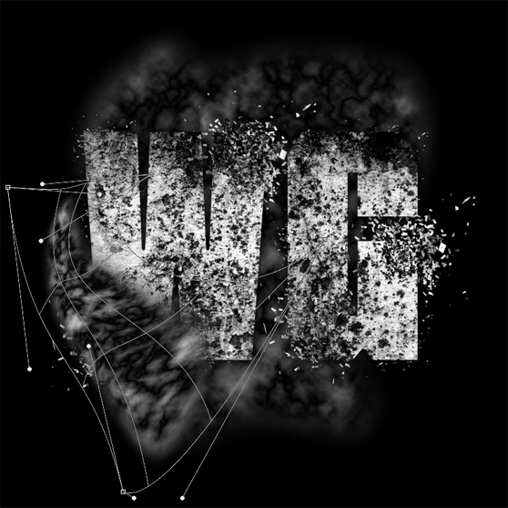 Once you get the shape right with the Warp Tool duplicate it several times and move, rotate and scale it around the letters to correspond with your explosions. You may need to add a layer behind the text for some of these streaks. I also erased some areas on the streaks to make them appear as though they are coming through the explosions.

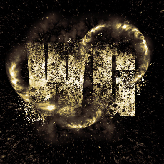
 Below are the results of my coloration. The subtle orange hue gives the letters a bit of a metallic feel, which I like.
 That's all there is to it. I'd love the hear what you think of these simple techniques. And feel free to share your results with us using the comment fields below.
Below is a preview of what we'll be creating.
 Full text version. Click to enlarge.

Step 1
Choose a nice heavy font. I chose a font called Tank. You can purchase it here if you don't already have it. Create a new square document in Photoshop, 1200x1200 pixels at 300 dpi. Make the background black and enter some text in white.
Step 2
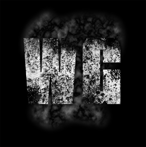
Next I want to place a texture over the text. I chose the first texture in the Grunge Wall Texture Pack here at WeGraphics. I placed the texture over the text layer, and loaded the text's shape as a selection by holding the Cmd key and clicking the text layers thumbnail. I then inverted the selection (Cmd + Shift + i) and deleted the texture that fell outside the text shape. At this point you can hide or delete the text layer. We won't be using it moving forward. Now let's remove the color from the texture by clicking (Image | Adjust | Desaturate). Then lets adjust the levels (Image | Adjust | Levels) to make the blacks blacker and the whites whiter.

Step 3
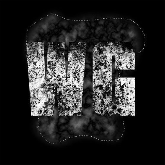
Now we need to add a subtle background. Make a freehand selection around the text with the Lasso Tool (L). Then feather the selection (Select | Modify | Feather) by 50 pixels. Fill the selection with solid black on a new layer behind the text. Then select (Filter | Render | Difference Clouds). You may need to repeat the Difference Clouds a couple of times before you are happy with the results. Set the opacity of the clouds layer to 50%.
Step 4
Now it's time to start removing some of our letters to create the explosion effect. Download the Free 3D Explosion Brush Set from WeGraphics. I used only the brush below for all of the explosions in this piece. Instead of loading it as a brush load it as your Eraser (E), scale it down to around 200, begin erasing portions of the text with a single click each time.
 Now on a new layer behind the text select your Brush Tool (B), color set to white, and sized around 600-800 and begin adding the exploding areas around the portions that you erased.

Step 5
Now lets begin adding some of the lighting effects. I decided that I wanted to make streaks of light that appear to be breaking the text up. To do that, I created a new layer and drew an oval selection with the Elliptical Marque Tool (M). Same as before, I feathered the selection by 30, filled it with black on a new layer, and rendered Difference Clouds 2 or 3 times. Next we need to reshape the light streak using the Warp Tool (Edit | Transform | Warp). Create an arc that you can place around the letters. The goal here is to make it look as though the streaks of light are moving around the letters.
 Once you get the shape right with the Warp Tool duplicate it several times and move, rotate and scale it around the letters to correspond with your explosions. You may need to add a layer behind the text for some of these streaks. I also erased some areas on the streaks to make them appear as though they are coming through the explosions.

Step 6
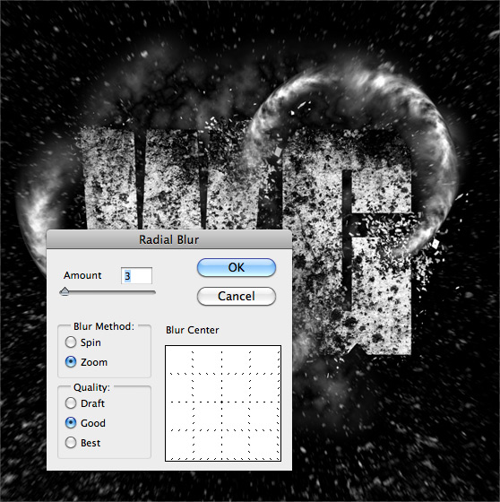
I want to add a bit more to the overall explosion effect. Right now the bang is not quite big enough. In order to accomplish this I grabbed a brush from the Perfect Grunge Brush Set, and added it to a layer above all others. I then added a Radial Blur (Filter | Blur | Radial Blur) to the layer using the following settings.
Step 7
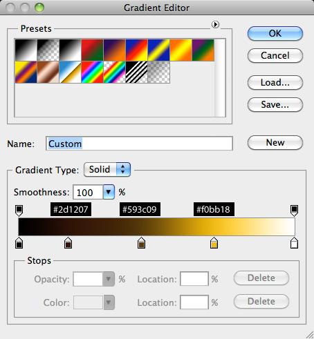
Next let's add a bit of color to the document. On a layer above all of the others let's add a new Gradient Map Adjustment Layer. I used the following settings for my gradient. Below are the results of my coloration. The subtle orange hue gives the letters a bit of a metallic feel, which I like.

Step 8
For the final step, lets add a bit of lighting around the streaks we added earlier. To accomplish this, lets create a new layer above your streaks and begin clicking with a soft white brush. Vary the brush in sizes from around 200-400. To light the explosion areas, I created a new layer behind the text and used the same soft white brush. That's all there is to it. I'd love the hear what you think of these simple techniques. And feel free to share your results with us using the comment fields below.