
How to Create a Creepy Crawly Horror Movie Poster
Scare up an audience with this movie poster tutorial
Create a horror movie poster from scratch in Photoshop using just one texture and stock photo. This tutorial uses a variety of techniques including image masking, adjustment layers and typography.
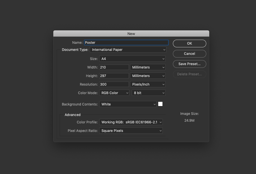
Step 1
Start by launching Photoshop and creating a new 300dpi portrait document. I recommend using either the A4 or Us Letter presets for simplicity.
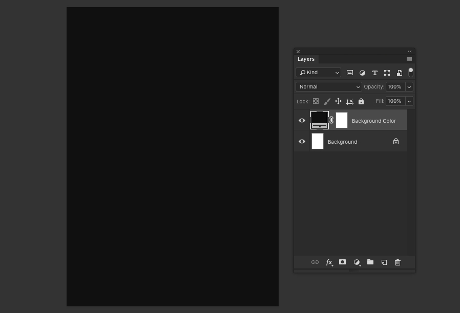
Step 2
Create a background layer by going to the Layer > New Fill Layer menu and selecting Solid Color... then enter the color #101010 and click OK.
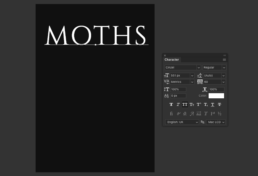
Step 3
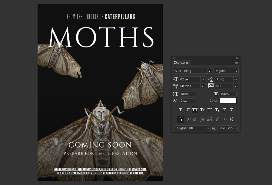
Time to start laying out the content, at the top of the document create a new text layer and type out the name of the movie (Moths) using the font Cinzel at 551px with 60 letter spacing.
Tip: Press CMD+SHIFT+K on Mac or CTRL+SHIFT+K on Windows when a type layer is active to convert the text to all caps
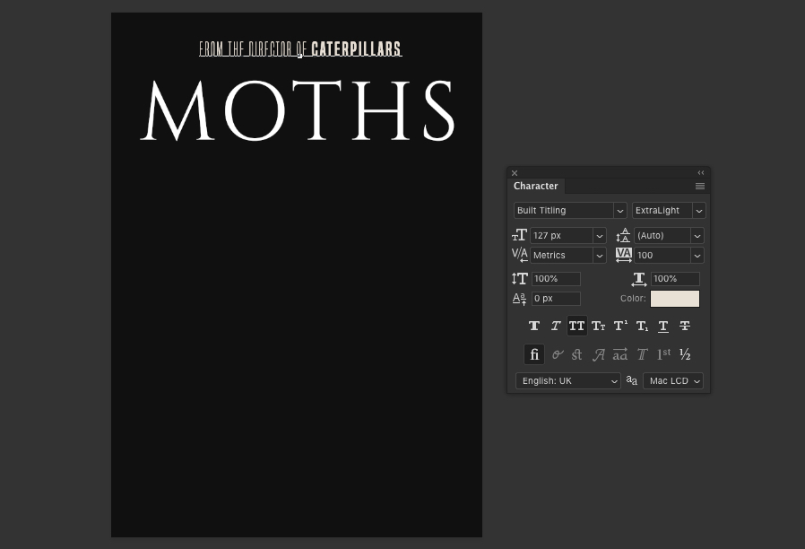
Step 4
Create another text layer above the title of the movie and type out 'From the director of Caterpillars' using the free font Built Titling at 127 px with 100 letter spacing and set the text color to #e8e0d5.
Set the font weight to ExtraLight and then highlight the word 'caterpillars' and make it Regular, which will look bold in comparison.
Step 5
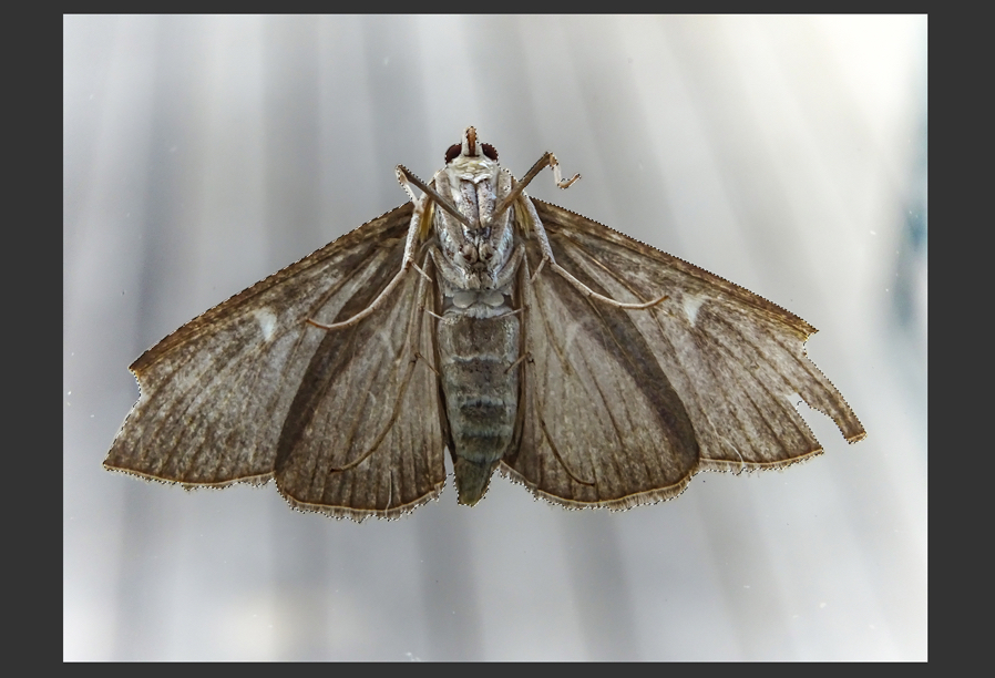
Download this free stock photo from Pixabay and open it up in Photoshop. If you are using Photoshop version CC2018 or newer go to the Select menu and choose Subject. If not, continue to the next step.
Step 6
From the Select menu choose Select and Mask... and either refine the automatic selection from the previous step or create a new selection manually. The idea here is to isolate the moth from the background, it doesn't need to be perfect but try to get it pretty close.
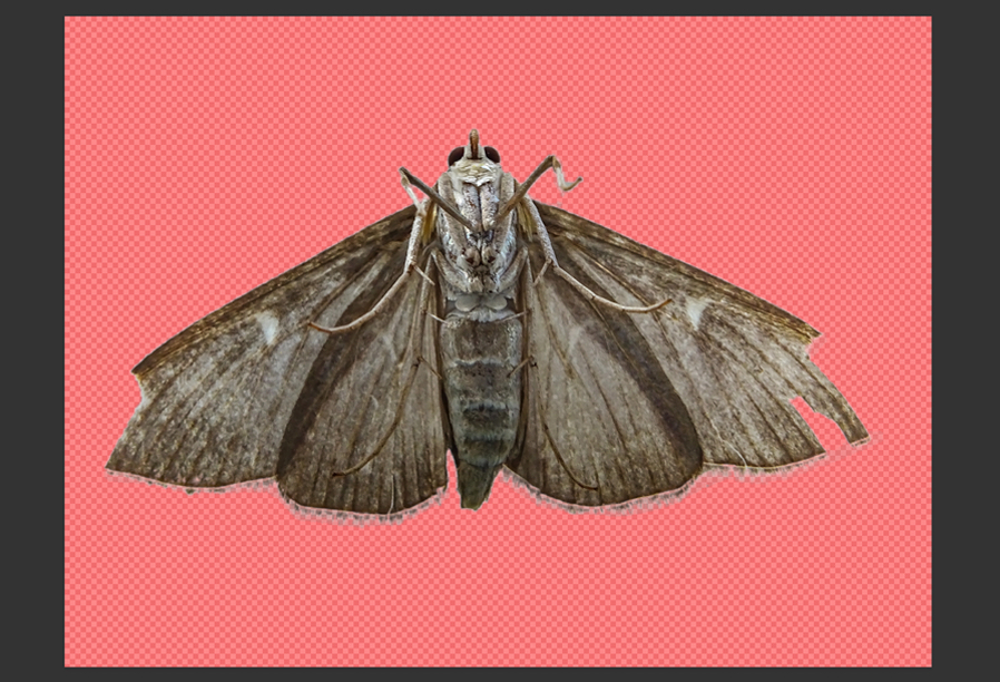
When you are done output the selection as a Layer Mask, then copy the isolated moth to the clipboard.
Step 7
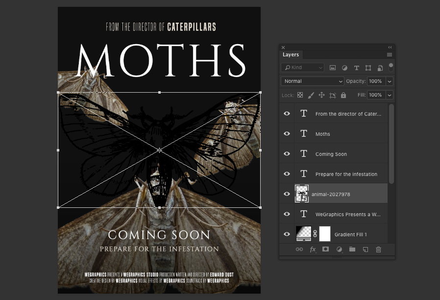
Head back to the poster document and paste the isolated moth onto a new layer below the text. Right click on the layer and select Convert to Smart Object.
Next, resize the graphic so that it fills roughly 1/3rd of the document and move it to the bottom of the artboard. Use the transform tools to skew the graphic slightly and make it appear more symmetrical.
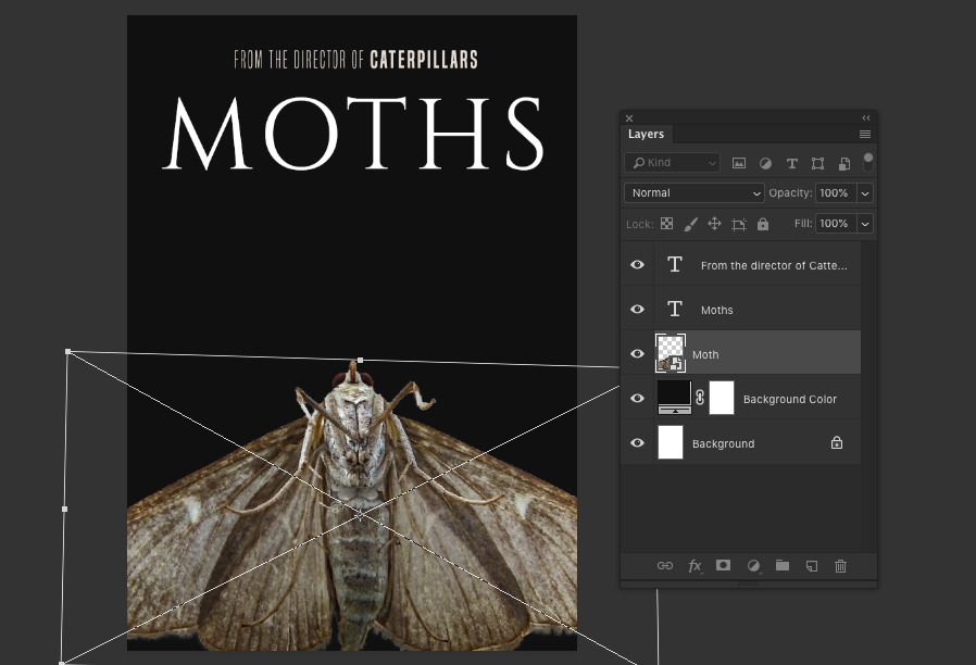
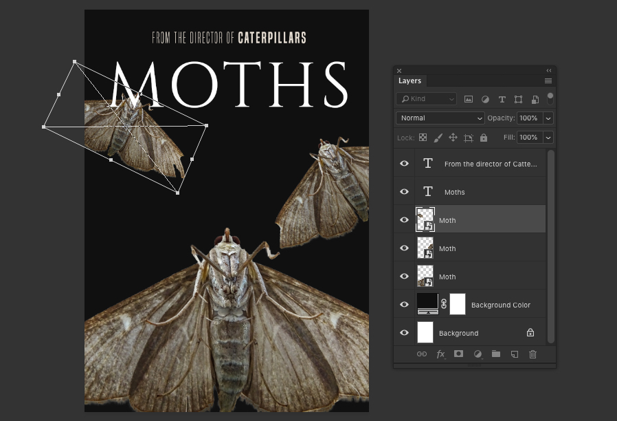
Step 8
Duplicate (CMD+J or CTRL+J) the moth graphic, resize it and rotate it roughly 30 degrees. Place the graphic on the right hand side of the document as shown below.
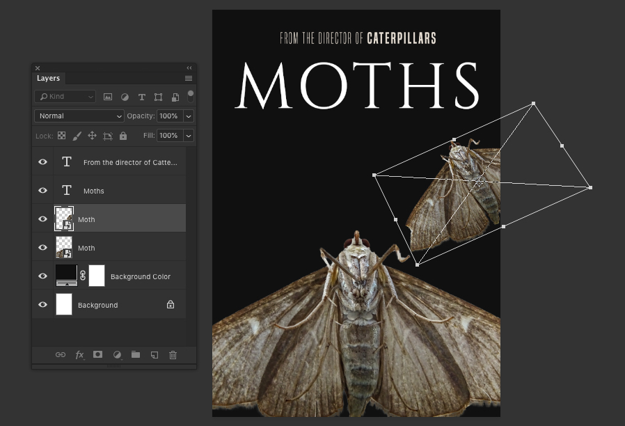
Step 9
Duplicate the graphic again and repeat the last step but place it on the left side this time.
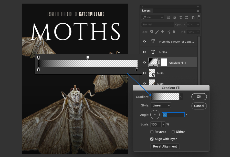
Step 10
Go to the Layer > New Fill Layer menu and select Gradient... Create a solid black to transparent gradient with the solid black stop at 0 and transparent stop at 50.
Set the style to Linear and the angle to 90 degrees then click OK and set the Opacity of the layer 50%. The purpose of this layer is to fade the lower section of the design to black. This layer should be above the moth graphics but underneath the text layers.
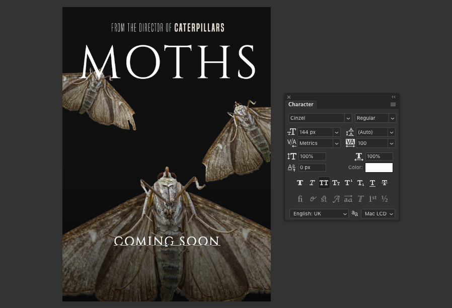
Step 11
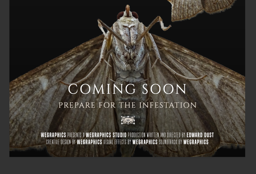
Create a new white text layer and type out 'Coming soon'. Use the font Cinzel at 144 px with 100 letter spacing. Align it to the center of the artboard and place it near the bottom as shown in the screenshot.
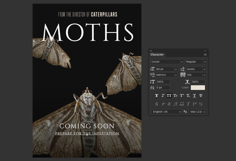
Step 12
Create another text layer and type out 'Coming soon'. Use the font Cinzel at 80 px with 100 letter spacing and #e8e0d5 color. Align it to the center of the artboard and place it near the bottom as shown in the screenshot.
Step 13
Now for the small print, create a new white text layer using Built Titling ExtraLight for the main text and Regular for names. Font size 62 px and letter spacing 100. You can make up your own text or simply copy and paste the paragraph below:
WeGraphics Presents a Wegraphics Studio Production written and directed by Edward Dust Creative design by WeGraphics Visual effects by Wegraphics Soundtrack by Wegraphics
Step 14
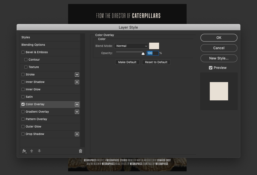
For a nice little extra touch download this vector drawing of a moth from Pixabay to use as a divider between the two sections of text. Place the .svg into your document as a Smart Object*
*If using an older version of Photoshop which doesn't support SVG you may need to open it in another application such as Illustrator first and copy and paste it into Photoshop.
Step 15
Double click on the moth layer and apply a Color Overlay. Use the color #e8e0d5, blending mode Normal and Opacity 100%.
Step 16
Hold Shift and resize the moth drawing by dragging one of the corner handles until it is roughly 140 pixels wide. Arrange it in between the 'Prepare..' and 'WeGraphics presents...' text and align it horizontally to the center of the dartboard.
Step 17
Download this free sample texture from the Rustic Metal Screen Textures set and place it into your design below the Gradient Fill layer. Resize the texture whilst holding Shift until it fills the whole artboard then confirm.
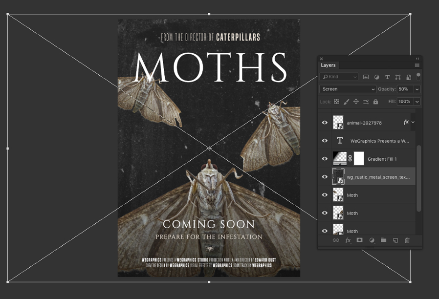
Step 18
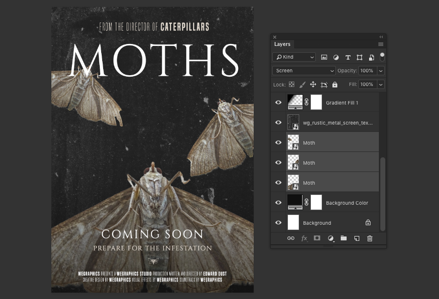
Our poster is starting to come together now, we have all of the elements in place but we can blend the moths and the texture together better and make the moths look even creepier with a couple of simple adjustments.
Select the first moth layer and go to Image > Adjustments > Levels... (CMD+L or CTRL+L) Enter 104 for the shadow input level.

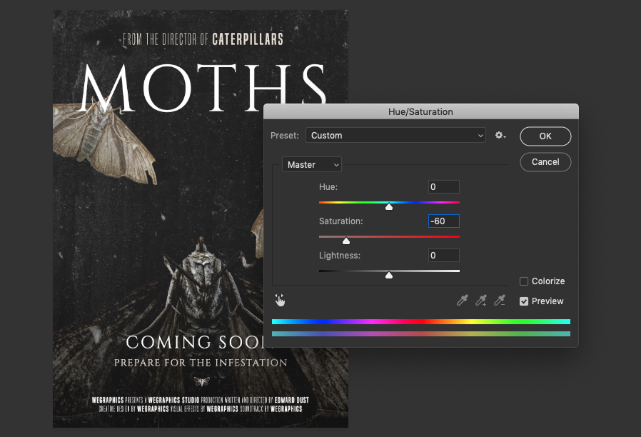
Step 19
To compensate for the increased saturation from the last step, go to Image > Adjustments > Hue/Saturation... (CMD+U or CTRL+U) and enter -60 for the Saturation.
Step 20
Repeat steps 18 and 19 for the other two moths.
Step 21
Some final touches now, let's add a vignette. Use the Ellipse Tool (U) to draw a large black oval that fills the artboard.
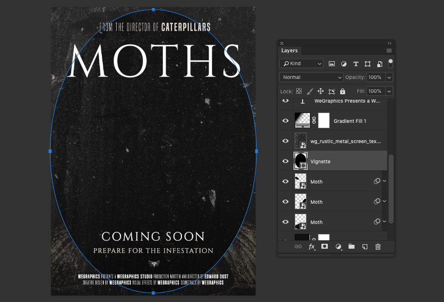
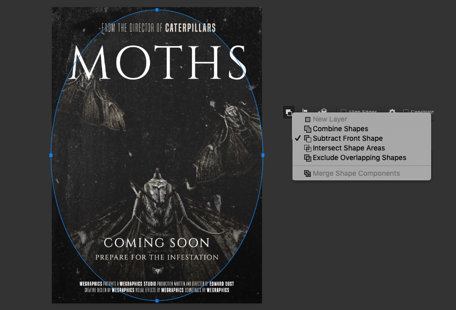
Step 22
In the top bar choose Subtract Front Shape from the path operations dropdown. This will invert the shape so that we have the 4 corners.
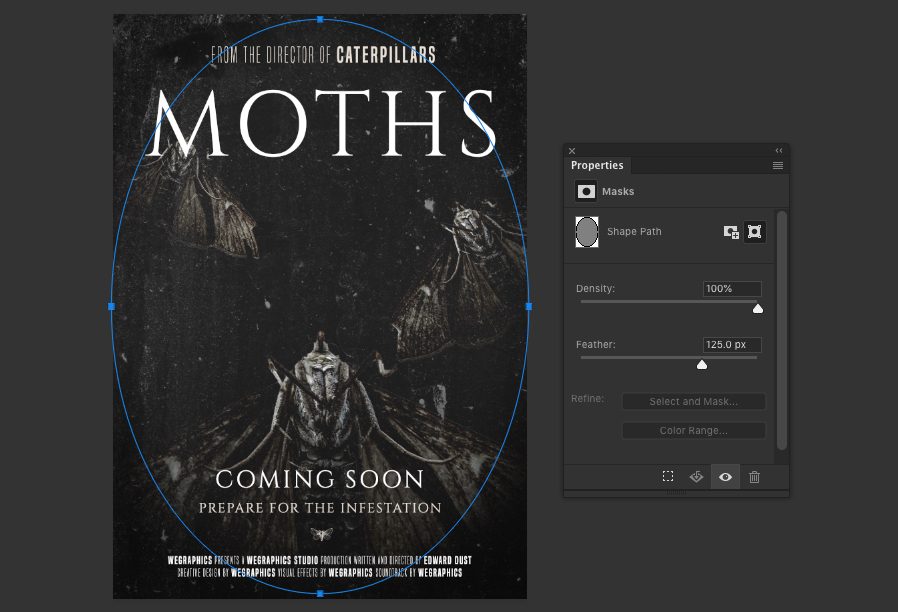
Step 23
In the Properties window (Window > Properties) click the Masks button and enter 125 px in the Feather input field. This will blur the layer creating a nice simple vignette effect.
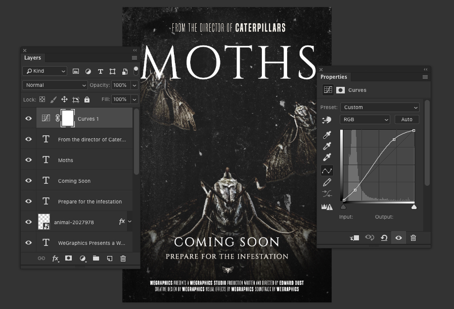
Step 24
Finally, add a new Curves Adjustment Layer and add two new points emulating the curve shown in the screenshot below (or to your preference):
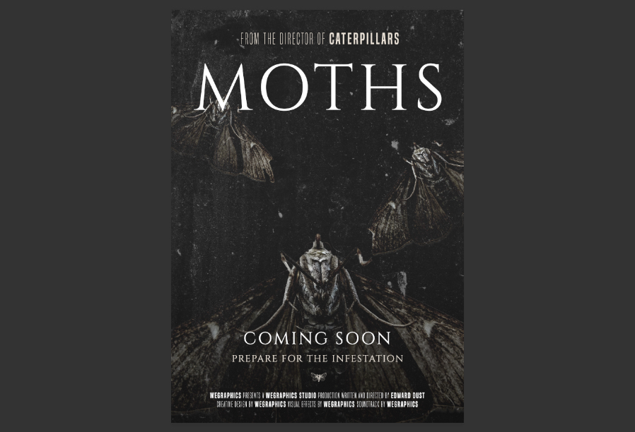
Result &Conclusion
Here is the final result:
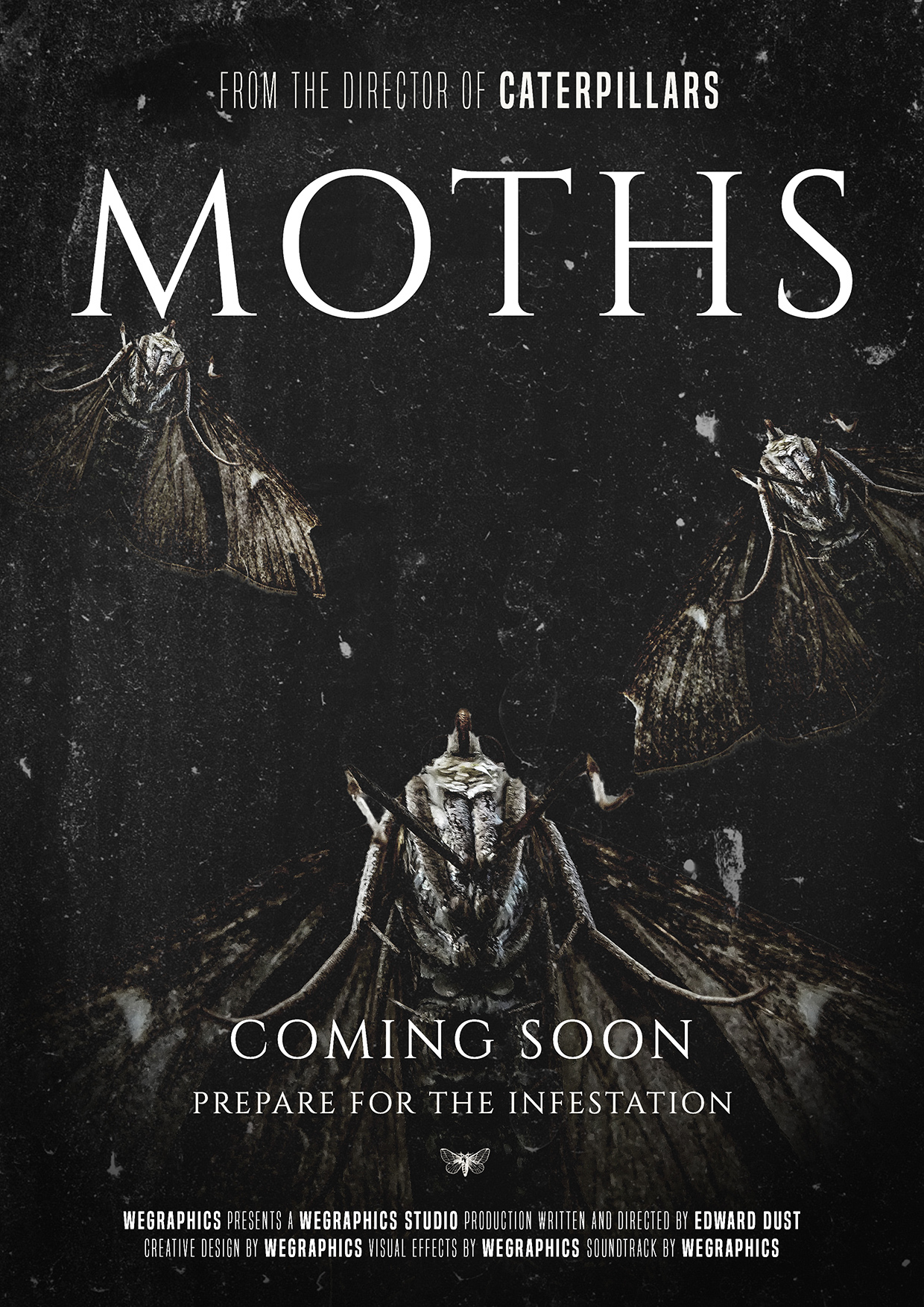
(Note: I moved one of the moths down slightly so that it wasn't being covered by the 'M')
Thanks for reading, I hope you enjoyed following along with this tutorial. We have covered a variety of techniques including image masking, adjustment layers and typography. These same techniques can be used for many different formats including album covers, merchandise, web banners etc.
More from Tutorials

How to Make Light Leaks From Images in Photoshop
Tutorialsby Diego Sanchez
Light leaks can instantly add warmth, depth, and a cinematic feel to your images, and creating them in Photoshop is much easier than you might think. In this tutorial, we’ll transform ordinary images into beautiful light leak overlays using just a few simple tools like Blur, Contrast adjustments, and the Liquify filter. By manipulating colors and shapes, you can craft soft gradients of light that bring a nostalgic, film-inspired atmosphere to your photos. Whether you want to enhance portraits, add flair to design projects, or create dreamy lighting effects, this method gives you full control over the final look in just a few minutes.
Read more
Enhance Autumn Colors in Lightroom with Ease
Tutorialsby Diego Sanchez
Enhancing the warm and vibrant tones of autumn photography is easier than it seems with just a few simple adjustments in Lightroom. By carefully refining exposure, boosting contrast, and enhancing the reds, oranges, and yellows, you can transform any fall image into a rich and captivating scene. Using only Lightroom’s basic tools along with the Color Mixer and Color Grading panels, you’ll bring out the full beauty of autumn landscapes with ease.
Read more
Easily Add a Twilight Mood to Your Photos in Lightroom
Tutorialsby Diego Sanchez
Give your photos a mystical touch by transforming ordinary daylight or sunset shots into captivating twilight scenes. By combining simple adjustments with precise tweaks in the Color Mixer, enhancing tones with Color Grading, and adding a delicate layer of Grain, it’s possible to achieve a soft, cinematic glow. These subtle yet impactful edits can shift the mood of your images, creating a serene, atmospheric look that feels like the perfect blue hour moment.
Read more
How to Create an Editable Soft Glow Text Effect in Illustrator
Tutorialsby Diego Sanchez
Creating eye-catching visual effects in Illustrator doesn’t always require complex tools or multiple layers. Sometimes, a single feature—used creatively—can deliver stunning results. Today, I’ll show you how to create a soft glow text effect using nothing but the Appearance Panel in Illustrator. Thanks to its non-destructive structure, you’ll be able to edit your text at any time without losing the effect, making it perfect for experimenting with different styles, colors, and typefaces without starting over.
Read more