Designing a highly-professional website, from the sketch to the code
Making great websites is like designing excellent buildings. A good web designer approaches the planning of a website like a worthy architect starts a new projects for a physical structure. The art and science of designing 'something', a website or a building, includes technical, aesthetic and functional criteria and all structures created through a balanced mix of usability and creativity will be a little piece of art.
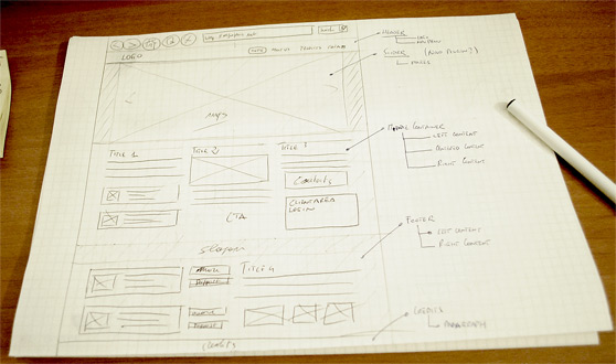
In this new post of 'The web side of WeGraphics' series we will try to design a super-professional and very clean website for a fictional Architecture studio, that we call 'Studio Hunter'. We want to reproduce through the website the main objectives of the studio: elegance, simplicity, rhythm and professionalism.
We can start! Remember that you may become a member of WeGraphics to download the source files of this tutorial (PSD+HTML/CSS).
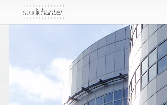
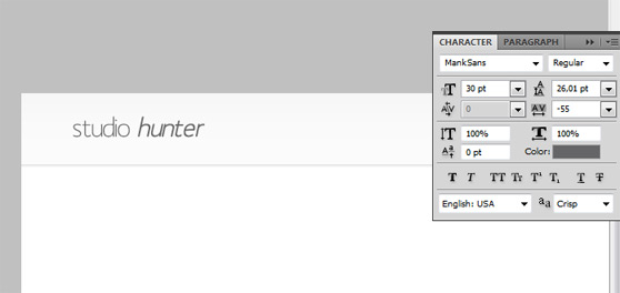
 Generally the logo needs a proper design process, but the main objective of the post is explaining how to create the entire web layout, for this reason we're going to drawn an elegant and simple logo with Photoshop and directly on the layout. We use Mank Sans Font with the Type Tool and add two new layer of text (color #656567, 30pt) as shown below (use italic and bold for the word 'hunter').
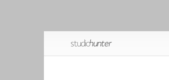
 Raterize the layer 'hunter' and transform and move the two layers in order to create the following string. You can use the Eraser Tool to delete some pixel to customize your logo.
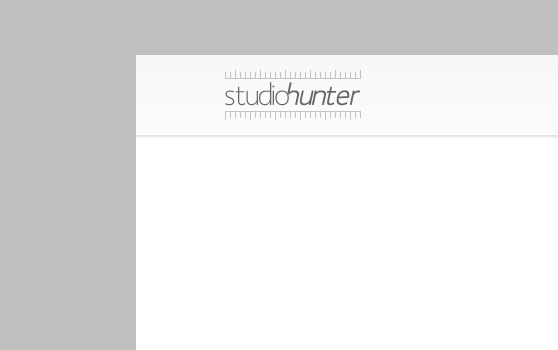
 Now, with the help of the grid (View>Show>Grid, set 'Gridline every' from Edit>Preferences>General>Guides, Grid and Slices to 1px) and of the Rectangular Marquee Tool draw a nice ruler as shown below.
 Repeat the previous operation to complete the logo.
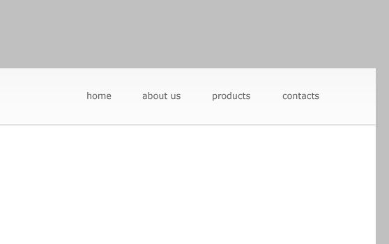
 Add the items for a navigation menu on the right using the Type Tool (font Verdana, 13pt, #656463).
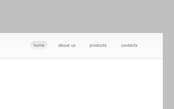
 Use Rounded Rectangle Tool (radius 15px) to draw a shape, useful for the hover effect in our menu. Experiment adding Inner Shadow, Gradient Overlay and Stroke in order to obtain an engraved effect as the following image shows.
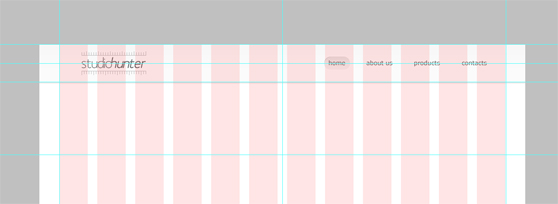
 Don't forget to collocate all elements created in the correct way with the helps of the 12 Col Grid layer and the Photoshop guides.
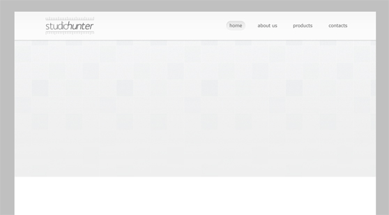 Add one of the images, previously downloaded, and two white borders (two 1px lines) as shown.
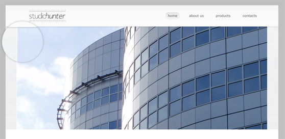 With the help of the Ellipse Tool draw a white circle, then use the Type Tool to create a layer with '<'. Rasterize the layer with the round shape and use the '<' to engrave an arrow from the main shape.
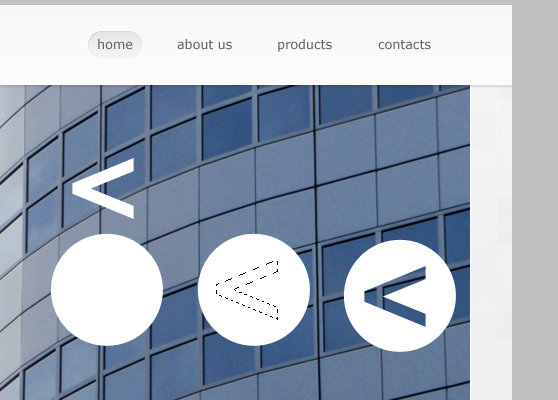 Add the following style to the custom shape just created.
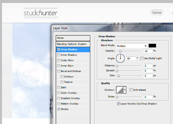
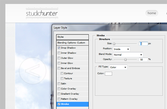
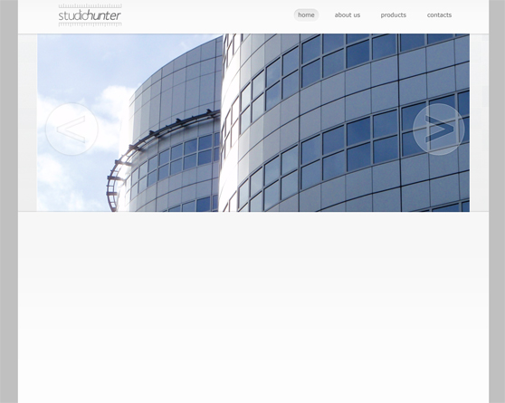 Below is the style that we have applied to the layer. Make sure that the order of the different layers is correct to have a good shadows effect.
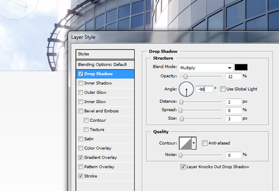
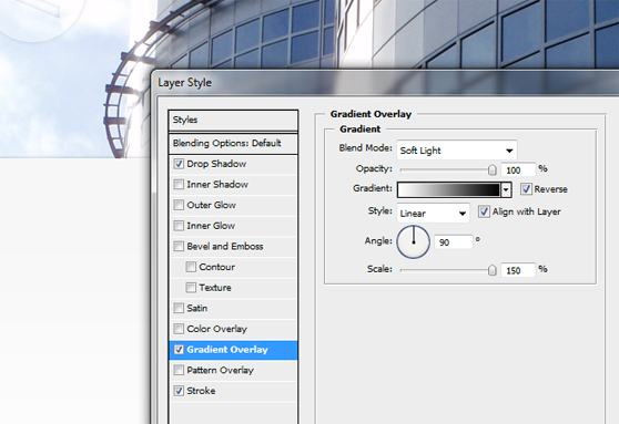
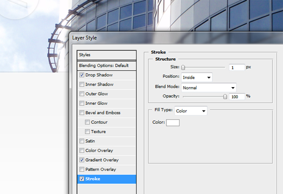
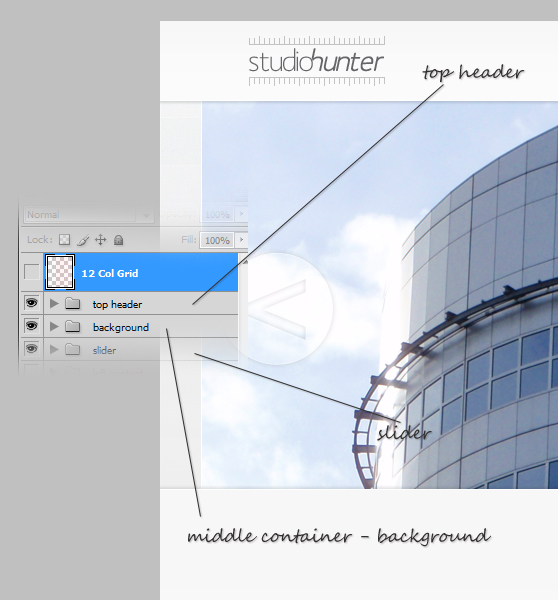 Now we can fill the container with three columns, this task can be easier using the 12 Col Grid layer (form the 960 Grid System).
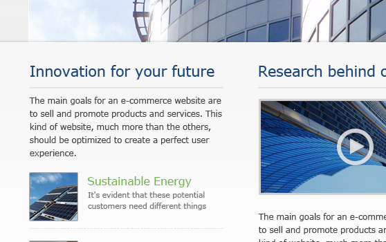
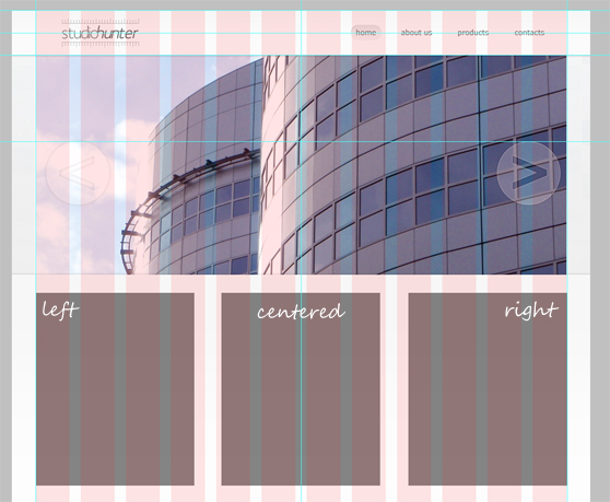 Fill the left column with the heading, a bottom-line to separate title and paragraph and a list of two specific articles. Use the Line Tool to draw the solid line and Type Tool text typing in a string of '- - - - - - - - -' for the dashed borders.
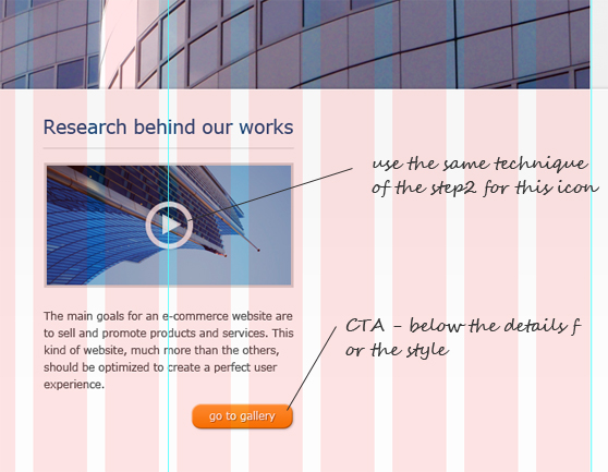
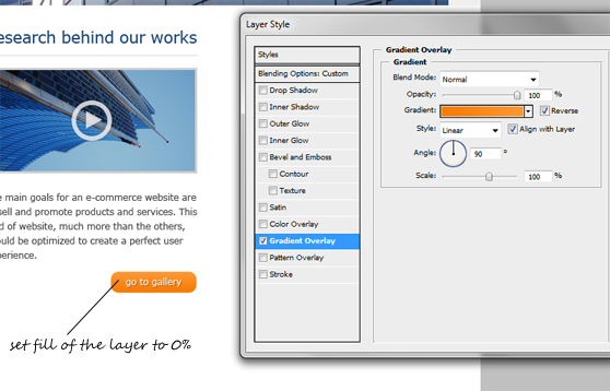
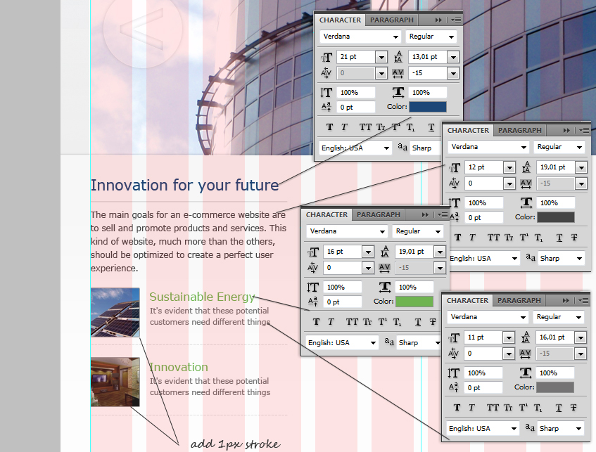 Within the centered container we can link a video presentation through an image, adding a paragraph to provide a short description and a call-to-action button to the gallery of the website.
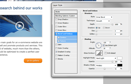
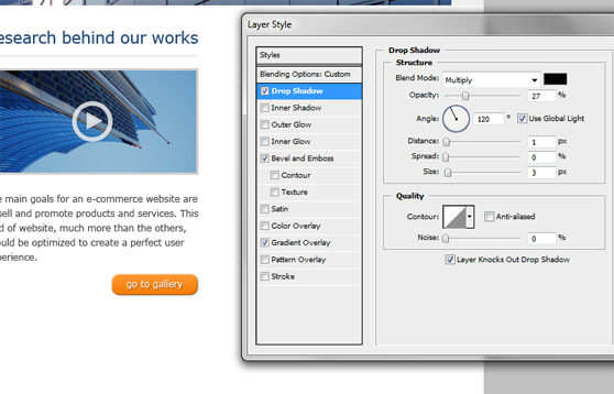
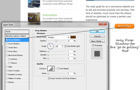 The right side of the middle container is for contacts details.
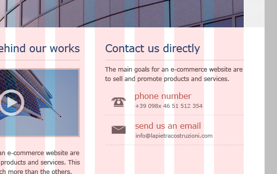 You can create the two icons (phone and email) using the Pen Tool and the Rectangle Tool; you should work with a zoom value of 2800% - 3200%.
Use the pen tool to draw a custom shape, then right-click and choose 'Make selection' from the menu, create a new layer (ctrl+shift+n) and finally fill the selection with a dark color.
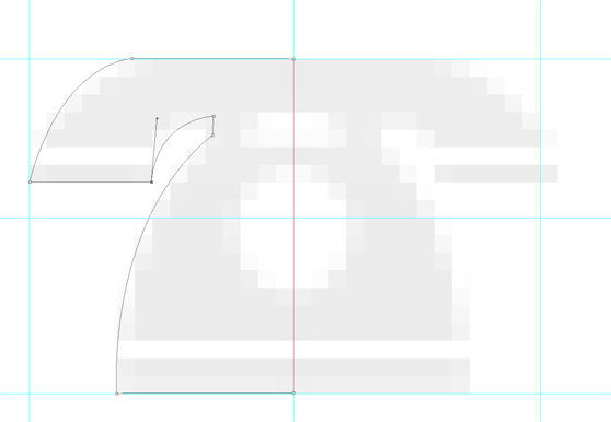
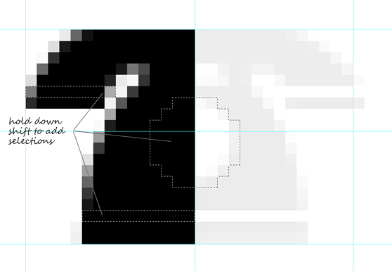
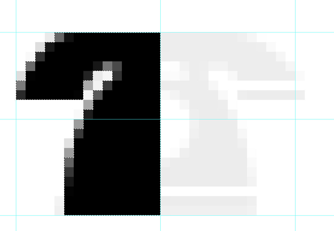 Use the Rectangular Marquee Tool and Elliptical Marquee Tool to delete (ctrl-x) some extra pixels and make more elegant your icon.
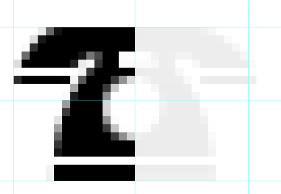 Duplicate the layer, Edit>Transform>Flip Horizontal and merge the two shapes just created. You may set the opacity value to brighten up the icon.
 Use the same technique to create the email icon, this time you can generate the basic shape with the help of the Rectangle tool.
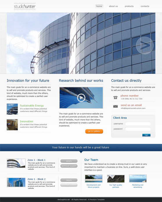
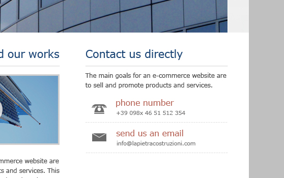
 Take a look at the final result, it's clear that the other elements (texts and borders) of this section are created using the same procedure adopted for filling the previous columns.
 Now we can add a simple form for the login. With the Rounded Rectangle Tool add a custom shape as shown and don't forget the style: Inner Shadow and Gradient Overlay.
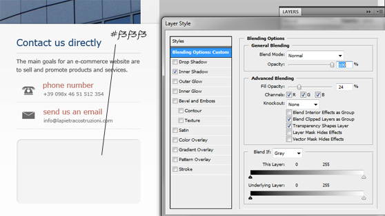
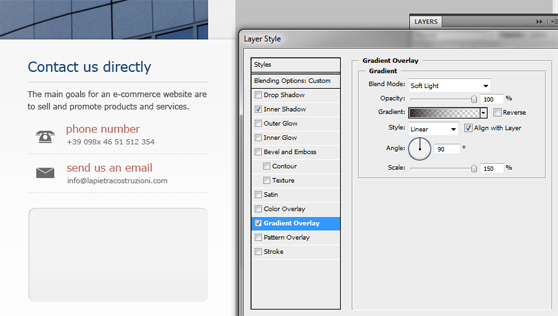 Complete the form with the title 'Client Area' (Type Tool, Verdana, #015990, 13pt; add a soft Drop Shadow too), labels and input (design the text input using the Rounded Rectangle Tool with a radius of 20px and then apply a soft Inner Shadow).
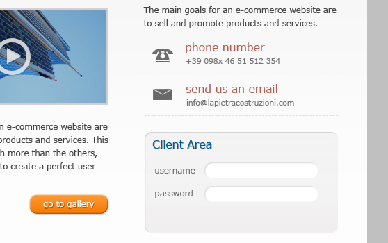 The button needs a specific style, take a look to the following images to understand how to create a nice effect.
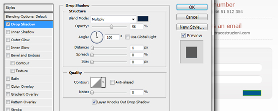
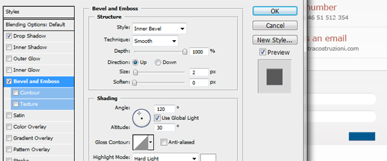
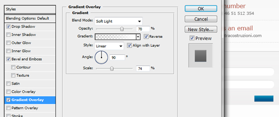 Add the text with a strong Drop Shadow.
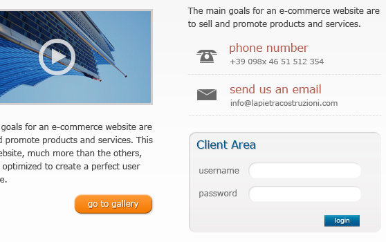
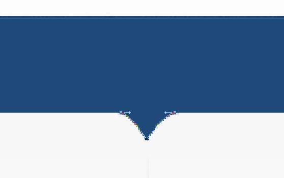 Rasterize the layer, add a soft noise effect (Filter>Noise>Add Noise), a nice style (Gradient Overlay and a white - 1px - strong Drop Shadow) and write a slogan (font Verdana, color #fff and a strong Drop Shadow).
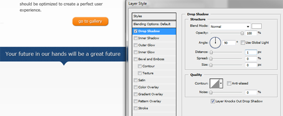
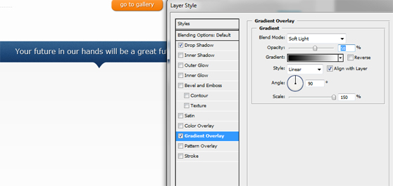 Add a new rectangular shape for the background of the footer with the same Gradient Overlay of the middle container background (from #f7f7f7 to #fdfdfd). Fill the footer with two columns (width about 470px), more of the footer elements are texts, headings and borders... and we know how to 'fight' with this kind of contents.
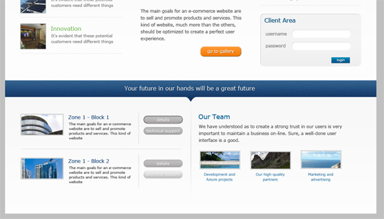 Just the buttons on the left side and the separator need some explanations. The following screenshots explain how to create the grey buttons.
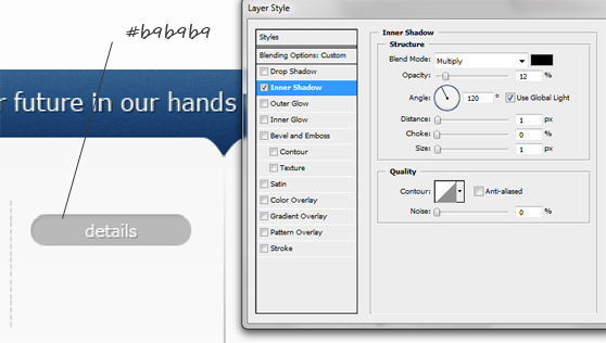
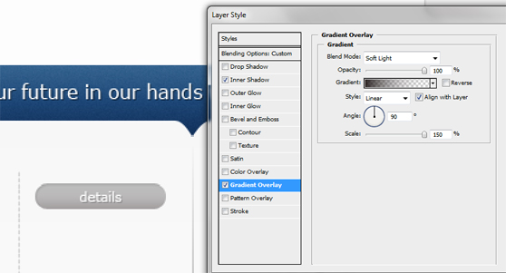 For the separator draw a vertical 1px line using the Line Tool (an opportune guide can help you to design a perfect segment), set the Fill to 0% and add a radial Gradient Overlay as shown (use a light grey).
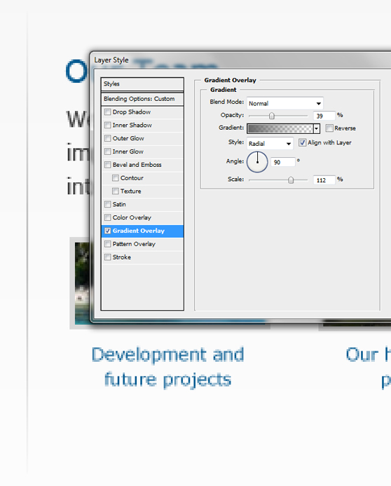 Finally add a new dark grey shape with a 3px top-border (light grey) and the credits as shown.
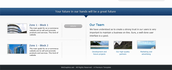
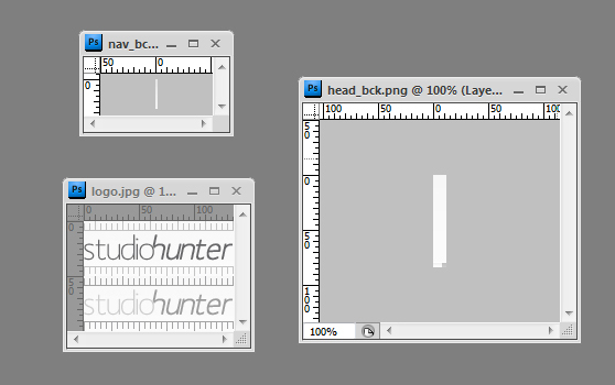 The markup for the top-header, we use unordered lists for the menu and h1 for the logo.
 Now take a look at the markup for the slider.
The Final Result
Below you can see the final result of our efforts: a grid-based web layout with a clean design and a professional look to engage the visitors. Click here to see a large preview of the template.


DOWNLOAD PSD + HTML/CSS TEMPLATE
[hidepost] [download id="69" format="1"] [/hidepost]
Become a Premium Member and get unlimited access to source files and premium resources for only 7$/month. Click here to learn more.
The Design Process
A good website borns from a white sheet that a masterly hand fills with some opportune lines, in fact the sketch is the first, important, step in the design process. You have to keep in mind the main aim of the website and what kind of design you want to create, then you can start to draw your layout on paper. In this case we should build a professional and super-clean layout that has to communicate a strong message with elegance. For these reasons we decide to show directly the works of studio's architects through a big slider, containing 'featured works', and to include other contents in a grid-based system (3-columns for the middle container with some important information and 2-columns for the bottom of the page with side information).
Step 0 - The canvas
Let's start with Photoshop. First of all, create a new document 1024x1280 pixels with a resolution of 72 pixels/inch. Import the 960 grid template (12 Col Grid), it is useful to design the page within 940 pixels (in this case) and to easily draw the columns for the grid.Step 1 - The header
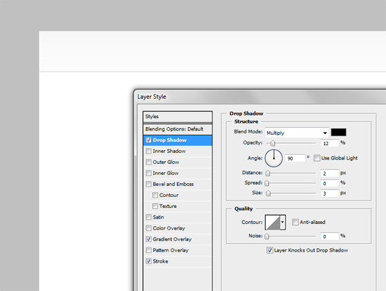
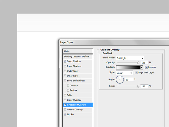
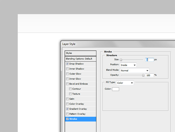
Draw a rectangle on the top of the page (using the Rectangle Tool) and add a Drop Shadow, a soft Gradient Overlay and a with (1px) Stroke in order to obtain the following result.

 Generally the logo needs a proper design process, but the main objective of the post is explaining how to create the entire web layout, for this reason we're going to drawn an elegant and simple logo with Photoshop and directly on the layout. We use Mank Sans Font with the Type Tool and add two new layer of text (color #656567, 30pt) as shown below (use italic and bold for the word 'hunter').
 Raterize the layer 'hunter' and transform and move the two layers in order to create the following string. You can use the Eraser Tool to delete some pixel to customize your logo.
 Now, with the help of the grid (View>Show>Grid, set 'Gridline every' from Edit>Preferences>General>Guides, Grid and Slices to 1px) and of the Rectangular Marquee Tool draw a nice ruler as shown below.
 Repeat the previous operation to complete the logo.
 Add the items for a navigation menu on the right using the Type Tool (font Verdana, 13pt, #656463).
 Use Rounded Rectangle Tool (radius 15px) to draw a shape, useful for the hover effect in our menu. Experiment adding Inner Shadow, Gradient Overlay and Stroke in order to obtain an engraved effect as the following image shows.
 Don't forget to collocate all elements created in the correct way with the helps of the 12 Col Grid layer and the Photoshop guides.

Step 2 - Slider
The main goal is to emphasize the works of the architects and often the best way to present them is a big slide-show. Download some images from stock.xchng, like 'Rotterdam 2010' (remember that in this article it's all fiction). Add a new rectangular shape using the Rectangle Tool that covers the entire width of the document; add the style: Gradient Overlay and Pattern Overlay (use one of the soft and 'white' pattern of the set 'Soft Grunge Patterns'). The result should be the following. Add one of the images, previously downloaded, and two white borders (two 1px lines) as shown.
 With the help of the Ellipse Tool draw a white circle, then use the Type Tool to create a layer with '<'. Rasterize the layer with the round shape and use the '<' to engrave an arrow from the main shape.
 Add the following style to the custom shape just created.


Step 3 - The middle container
Create a new big rectangle for the background of this section of the layout, add a Drop Shadow and a Gradient overlay in order to obtain the following result. Below is the style that we have applied to the layer. Make sure that the order of the different layers is correct to have a good shadows effect.


 Now we can fill the container with three columns, this task can be easier using the 12 Col Grid layer (form the 960 Grid System).
 Fill the left column with the heading, a bottom-line to separate title and paragraph and a list of two specific articles. Use the Line Tool to draw the solid line and Type Tool text typing in a string of '- - - - - - - - -' for the dashed borders.
 Within the centered container we can link a video presentation through an image, adding a paragraph to provide a short description and a call-to-action button to the gallery of the website.


 The right side of the middle container is for contacts details.
 You can create the two icons (phone and email) using the Pen Tool and the Rectangle Tool; you should work with a zoom value of 2800% - 3200%.
Use the pen tool to draw a custom shape, then right-click and choose 'Make selection' from the menu, create a new layer (ctrl+shift+n) and finally fill the selection with a dark color.

 Use the Rectangular Marquee Tool and Elliptical Marquee Tool to delete (ctrl-x) some extra pixels and make more elegant your icon.

 Duplicate the layer, Edit>Transform>Flip Horizontal and merge the two shapes just created. You may set the opacity value to brighten up the icon.
 Use the same technique to create the email icon, this time you can generate the basic shape with the help of the Rectangle tool.
 Take a look at the final result, it's clear that the other elements (texts and borders) of this section are created using the same procedure adopted for filling the previous columns.
 Now we can add a simple form for the login. With the Rounded Rectangle Tool add a custom shape as shown and don't forget the style: Inner Shadow and Gradient Overlay.

 Complete the form with the title 'Client Area' (Type Tool, Verdana, #015990, 13pt; add a soft Drop Shadow too), labels and input (design the text input using the Rounded Rectangle Tool with a radius of 20px and then apply a soft Inner Shadow).
 The button needs a specific style, take a look to the following images to understand how to create a nice effect.


 Add the text with a strong Drop Shadow.

Step 4 - The footer
Use the Rectangle Tool to draw a rectangular shape just below the middle container (height about 50 pixels, color #8f7544). Add three guides at the center of the document (as shown in the image below) and, using Add Anchor Point Tool, insert three points to the rectangle (on the bottom line), use the Direct Selection Tool (A) to draw a little arrow. Rasterize the layer, add a soft noise effect (Filter>Noise>Add Noise), a nice style (Gradient Overlay and a white - 1px - strong Drop Shadow) and write a slogan (font Verdana, color #fff and a strong Drop Shadow).

 Add a new rectangular shape for the background of the footer with the same Gradient Overlay of the middle container background (from #f7f7f7 to #fdfdfd). Fill the footer with two columns (width about 470px), more of the footer elements are texts, headings and borders... and we know how to 'fight' with this kind of contents.
 Just the buttons on the left side and the separator need some explanations. The following screenshots explain how to create the grey buttons.

 For the separator draw a vertical 1px line using the Line Tool (an opportune guide can help you to design a perfect segment), set the Fill to 0% and add a radial Gradient Overlay as shown (use a light grey).
 Finally add a new dark grey shape with a 3px top-border (light grey) and the credits as shown.

PSD-to-HTML conversion
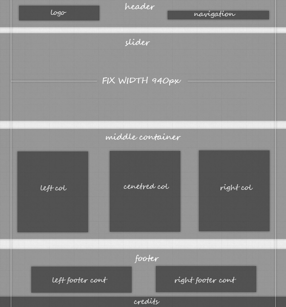
Now it's time to create the HTML/CSS structure. First of all we have to understand the main structure of the layout.
Step 5 - HTML Structure
Create a blank index.html and style.css, then, using our favourite text editor (I write my code through Notepad), we can initialize our HTML document with Doctype, head and body.<!DOCTYPE html PUBLIC "-//W3C//DTD XHTML 1.1//EN" "http://www.w3.org/TR/xhtml11/DTD/xhtml11.dtd"> <html xmlns="http://www.w3.org/1999/xhtml"> <head> <title>Studio Hunter - Awesome architects</title> <meta http-equiv="content-type" content="text/html; charset=UTF-8" /> <link rel="stylesheet" href="style.css" media="screen" /> </head> <body> </body> </html>Now, according with the structure displayed in the above image, we can write the basic html structure. Note that the <div class="fix_width"> will be useful to force the contents within the 940px.
<!DOCTYPE html PUBLIC "-//W3C//DTD XHTML 1.1//EN"
 "http://www.w3.org/TR/xhtml11/DTD/xhtml11.dtd">
<html xmlns="http://www.w3.org/1999/xhtml">
<head>
<title>Studio Hunter - Awesome architects</title>
<meta http-equiv="content-type" content="text/html; charset=UTF-8" />
<link rel="stylesheet" href="style.css" media="screen" />
</head>

<body>

<div id="header">
	<div class="fix_width">

	</div>
</div>

<div class="slide_cont">
	<div class="fix_width">

	</div>
</div>

<div id="middle_container">
	<div class="fix_width">

	</div>
</div>

<div id="footer">
	<div class="fix_width">

	</div>
</div>

<div id="credits">
</div>

</body>
</html>
Add reset to the style.css as shown below.
/* CSS Reset */

html, body, div, span, h1, h2, h3, h4, h5, h6, p, img, ul, li, fieldset, form, label { margin: 0; padding: 0; border: 0; outline: 0; font-size: 100%; vertical-align: baseline; background: transparent; }

ol, ul { list-style: none; }

:focus { outline: 0; }

h2, h3, h4 { font-weight: normal; }
Step 6 - Header
Extract the following images to reproduce the top of the website as we have planned in Photoshop. The markup for the top-header, we use unordered lists for the menu and h1 for the logo.
<div id="header">
	<div class="fix_width">
	<div class="logo">
		<h1><a href="#">Studio Hunter - Architecture</a></h1>
	</div>

	<ul class="nav">
		<li><a href="#">Home</a></li>
		<li><a href="#">About us</a></li>
		<li><a href="#">Services</a></li>
		<li><a href="#">Contacts</a></li>
	</ul>
	</div>
</div>
And now the CSS rules.
/* General */
body { background: #fdfdfd; font: 12px Verdana, sans-serif; line-height: 1.5em; color: #444; }

.fix_width { width: 940px; margin: 0 auto; }
.fix_width:after, .left_foot_cont ul li:after { content: " "; display: block; height: 0; clear: both; visibility: hidden; }

a { text-decoration: none; }

p { line-height: 1.7em; }

/* Header */
#header { background: url(images/head_bck.png); height: 84px; z-index: 3; position: relative; }
	.logo { float: left; margin: 15px 0 0 35px; }
	.logo h1 a { background: url(images/logo.jpg) no-repeat 0px 0px; display: block; width: 136px; height: 50px; text-indent: -9999px;}
	.logo h1 a:hover { background-position: 0px -50px; }

	ul.nav { float: right; margin: 30px 20px 0 0; }
	ul.nav li { display: inline; }
	ul.nav li a { color: #656463; padding: 6px 10px; margin: 0 5px; }
	ul.nav li a:hover { background: url(images/nav_bck.jpg); -moz-border-radius: 10px; -khtml-border-radius: 10px; -webkit-border-radius: 10px; border-radius: 10px; -moz-box-shadow: 1px 1px 0px #fff, -1px -1px 0px #d9d9d9; -khtml-box-shadow: 1px 1px 0px #fff, -1px -1px 0px #d9d9d9; -webkit-box-shadow: 1px 1px 0px #fff, -1px -1px 0px #d9d9d9; box-shadow: 1px 1px 0px #fff, -1px -1px 0px #d9d9d9;   }
Step 7 - Slider
Now we can add the slider. In order to realize a nice slide-show we use the Nivo Clider Plugin. First of all download the jQuery plugin and paste the file 'slider.js' into the folder of our template called js, download jQuery and paste 'jquery.js' into the same folder (js); then you have to add the following lines of code into the 'index.html'.<head>
<title>Studio Hunter - Awesome architects</title>
<meta http-equiv="content-type" content="text/html; charset=UTF-8" />
<link rel="stylesheet" href="style.css" media="screen" />
<script src="js/jquery.js" type="text/javascript"></script>
<script src="js/slider.js" type="text/javascript"></script>
<!-- Activate the slider! -->
<script type="text/javascript">
$(window).load(function() {
$('#slider').nivoSlider({
animSpeed:900,
pauseTime:5500,
directionNav:true,
directionNavHide:true,
controlNav:false
});
});
</script>
</head>
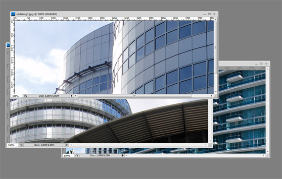
For the slider section we use a nice pattern for the background, and some images of buildings.

 Now take a look at the markup for the slider.
<div class="slide_cont">
	<div class="fix_width">
		<div id="slider">
		<img src="images/slideimg1.jpg" alt="" />
		<img src="images/slideimg2.jpg" alt="" />
		<img src="images/slideimg3.jpg" alt="" />
		</div>
	</div>
</div>
It?s time for the style.
/* Slider */
.slide_cont{ background: url(images/slider_bck.jpg); position: relative; top: -4px; z-index: 1; margin: 0 auto; }
	#slider img { border-left: 1px solid #fff; border-right: 1px solid #fff; position: absolute; top: 0px; left: 0px; }
	.nivo-slice { display:block; position:absolute; z-index:50; height:100%; }
	.nivo-directionNav a { position:absolute; top: 38%; text-indent: -9999px; cursor: pointer; z-index: 99; }
	.nivo-prevNav { left:10px; display: block; width: 122px; height: 122px; background: url(images/slide_nav_left.png); }
	.nivo-nextNav { right:10px; display: block; width: 122px; height: 122px; background: url(images/slide_nav_right.png); }
Step 8 - Middle container
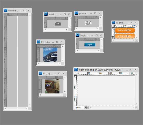
Create the grid for the 'middle_container' section using the following HTML structure. Below the images that we have to extract from the psd.
<div id="middle_container">
	<div class="fix_width">
	<div class="left_cont">
		<h2>Innovation for your future</h2>
		<p>The main goals for an e-commerce website are to sell and promote products and services. This kind of website, much more than the others, should be optimized to create a perfect user experience.</p>

		<ul>
		<li><a href="#"><img src="images/list_1.jpg" alt="image1" /><span class="list_tit">Sustainable Energy</span><br /><span class="list_text">It's evident that these potential customers need different things</span></a></li>
		<li><a href="#"><img src="images/list_2.jpg" alt="image2" /><span class="list_tit">Innovation</span><br /><span class="list_text">It's evident that these potential customers need different things</span></a></li>
		</ul>
	</div>

	<div class="centered_cont">
		<h2>Research behind our works</h2>
		<a href="#"><img src="images/image_1.jpg" alt="images1" /></a>

		<p>The main goals for an e-commerce website are to sell and promote products and services. This kind of website, much more than the others, should be optimized to create a perfect user experience.<span class="cta"><a href="#">go to gallery</a></span></p>

	</div>

	<div class="right_cont">
		<h2>Contact us directly</h2>
		<p>The main goals for an e-commerce website are to sell and promote products and services.</p>

		<ul>
		<li class="phone"><span class="list_tit_right">Phone number</span><br /><span class="list_text">+39 098x 46 51 512 354</span></li>
		<li class="email"><a href="#"><span class="list_tit_right">Send us an email</span><br /><span class="list_text">[email protected]</span></a></li>
		</ul>

		<form action="#" method="post" id="login">
			<fieldset>
				<legend>Client area</legend>
				<div class="login_input">
				<label for="username">Username</label>
				<input type="text" maxlength="60" name="username" id="username" />
				</div>
				<div class="login_input">
				<label for="pass">Password</label>
				<input type="password" name="pass" id="pass" />
				</div>
				<input type="submit" name="login" value="login" class="form_submit" />
			</fieldset>
		</form>

	</div>
	</div>
</div>
Use the following style to create the middle container as we've planned in the psd mockup.
/* Middle container */
#middle_container { background: url(images/content_bck.png) repeat-x; position: relative; top: -12px; z-index: 3; padding-top: 40px; }
	#middle_container  h2 { color: #1d4777; font-size: 18px; border-bottom: 2px solid #d9d9d9; padding-bottom: 10px; margin-bottom: 10px; }
	.left_cont, .centered_cont, .right_cont { width: 280px; float: left; }
	.left_cont img { border: 1px solid #d0cece; }
		.left_cont ul  { margin-top: 10px; }
		.left_cont ul li { clear: both; margin: 0; border-bottom: 1px dashed #d0cece; }
		.left_cont ul li a { display: block; padding: 10px 0; min-height: 69px; }
		.left_cont ul li a:hover { background: #f7f7f7;}
		.left_cont ul li img { float: left; margin: 0 10px 0 0; }
		.right_cont ul { margin-top: 5px; }
		.right_cont ul li { padding: 10px 0 10px 0; border-bottom: 1px dashed #d0cece; }
		.right_cont ul li.email a { display: block; }
		.right_cont ul li.phone { padding-left: 55px; background: url(images/phone.png) no-repeat 10px 20px; }
		.right_cont ul li.email { padding-left: 55px; background: url(images/email.png) no-repeat 10px 20px; display: block; }
		.right_cont ul li.email:hover { background: #f7f7f7 url(images/email.png) no-repeat 10px 20px; }
		span.list_tit { font-size: 14px; color: #6fb450; }
		span.list_tit_right { font-size: 14px; color: #a1493a; }
		span.list_text { font-size: 10px; color: #757474;  }
	.centered_cont { margin: 0px 50px; }
	.centered_cont img { margin: 4px 0 5px 0; border: 2px solid #d0cece; }
	span.cta a { display: block; width: 117px; height: 32px; background: url(images/cta.png); float: right; margin-top: 15px; text-indent: -9999px; }
	span.cta a:hover { background-position: 0 -32px; }

	form#login { width: 278px; height: 146px; background: url(images/login_bck.png) no-repeat; margin: 40px 0 0 2px; }
		.login_input { padding: 5px 20px;}
		legend { color: #1d4777; font-size: 18px; text-shadow: 1px 1px 2px #ccc; padding: 12px 10px; }
		label { font-size: 11px; float: left; margin-right: 8px; padding-top: 2px; width: 70px; }
		form#login input[type="text"], form#login input[type="password"] { width: 130px; font-size: 12px; padding: 4px 10px; border: none; -moz-border-radius: 20px; -khtml-border-radius: 20px; -webkit-border-radius: 20px; border-radius: 20px; -moz-box-shadow: 1px 1px 0px #fff, -1px -1px 0px #ccc;  -khtml-box-shadow: 1px 1px 0px #fff, -1px -1px 0px #ccc;  -webkit-box-shadow: 1px 1px 0px #fff, -1px -1px 0px #ccc; box-shadow: 1px 1px 0px #fff, -1px -1px 0px #ccc;  }
		form#login input[type="submit"] { width: 52px; height: 17px; background: url(images/login.png) no-repeat; text-indent: -9999px; float: right; border: none; margin: 10px 30px 10px 10px; cursor: pointer; }
Step 9 - Footer and credits
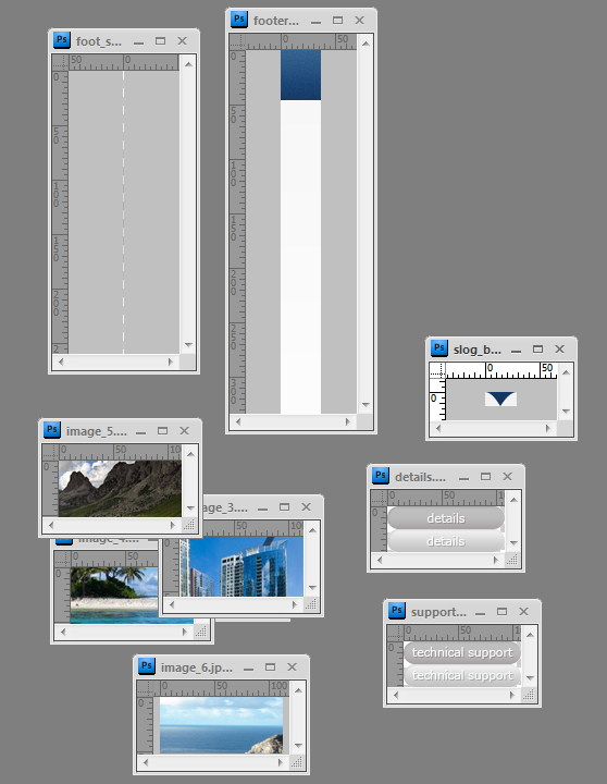
Finally we can complete our layout with the footer. Below the images and the markup.
<div id="footer">
	<div class="fix_width">
	<h4>Your future in our hands will be a great future</h4>
	<div class="left_foot_cont">
		<ul>
		<li>

			<img src="images/image_2.jpg" alt="images2" />

			<div class="list_foot_text">
				<h3><a href="#">Zone 1 - Block 1</a></h3>
				<p>The main goals for an e-commerce website are to sell and promote products and services</p>
			</div>
			<div class="foot_list_info">
				<ul>
				<li class="details"><a href="#">details</a></li>
				<li class="support"><a href="#">technical support</a></li>
				</ul>
			</div>

		</li>

		<li>

			<img src="images/image_3.jpg" alt="images3" />

			<div class="list_foot_text">
				<h3><a href="#">Zone 1 - Block 2</a></h3>
				<p>The main goals for an e-commerce website are to sell and promote products and services. This kind of website</p>
			</div>
			<div class="foot_list_info">
				<ul>
				<li class="details"><a href="#">details</a></li>
				<li class="support"><a href="#">technical support</a></li>
				</ul>
			</div>

		</li>

		</ul>
	</div>

	<div class="right_foot_cont">
		<h3>Our team</h3>
		<p>We have understood as to create a strong trust in our users is very important to maintain a business on-line. Sure, a well-done user
interface is a good.</p>

		<ul>
			<li><div><a href="#"><img src="images/image_4.jpg" alt="images4" /></a></div><a href="#">Development and future projects</a></li>
			<li><div><a href="#"><img src="images/image_5.jpg" alt="images4" /></a></div><a href="#">Our high-quality partners</a></li>
			<li><div><a href="#"><img src="images/image_6.jpg" alt="images4" /></a></div><a href="#">Marketing and advertising</a></li>
		</ul>

	</div>
	</div>
</div>

<div id="credits">
	<p>WeGraphics.net - All Rights Reserved - A Premium Template</p>
</div>
Use the following style to complete the footer.
/* Footer */
#footer { background: url(images/footer_bck.jpg) repeat-x; margin-top: 30px; }
	#footer h4 { font-size: 16px; text-shadow: 1px 1px 1px #0d2540; color: #fff; text-align: center; height: 50px; padding: 13px 0; background: url(images/slog_bck.jpg) no-repeat 50% 46px; }
	.left_foot_cont { width: 445px; float: left; margin-top: 25px; background: url(images/foot_sep.png) no-repeat right; padding-right: 24px; }
	.left_foot_cont ul li { clear: both; border-bottom: 1px dashed #d0cece; margin-bottom: 15px; padding-bottom: 15px; }
		.left_foot_cont ul li  img { float: left; border: 2px solid #d0cece; }
		.list_foot_text { padding-left: 15px; width: 180px; float: left; margin-right: 5px; }
		.list_foot_text h3 { margin-bottom: 5px; }
		.list_foot_text h3 a { font-size: 16px; color: #1d4777; margin-bottom: 5px; }
		.list_foot_text h3 a:hover { text-decoration: underline; }
		.right_foot_cont h3 { font-size: 18px; color: #1d4777; margin-bottom: 10px; }
		.list_foot_text 	p { font-size: 10px; line-height: 1.4em; }
		.foot_list_info { float: left; border-left: 1px dashed #d0cece; }
		.foot_list_info ul li { padding: 0; margin: 10px 0 10px 10px; border: none; }
		.foot_list_info ul li.details  a { background: url(images/details.png) no-repeat; width: 108px; height: 21px; display: block; text-indent: -9999px; }
		.foot_list_info ul li.support  a { background: url(images/support.png) no-repeat; width: 108px; height: 21px; display: block; text-indent: -9999px; }
		.foot_list_info ul li.details  a:hover, .foot_list_info ul li.support  a:hover  { background-position: 0px -21px; }
	.right_foot_cont { width: 445px; float: right; margin-top: 25px; }
		.right_foot_cont ul  { margin-top: 15px; }
		.right_foot_cont ul li { display: inline; width: 120px; float: left; text-align: center; padding: 3px 12px; }
		.right_foot_cont ul li:first-child  { padding-left: 0; }
		.right_foot_cont ul li img { border: 2px solid #d0cece; }
		.right_foot_cont ul li { line-height: 1.1em; }
		.right_foot_cont ul li a { color: #116397; font-size: 10px; display: block; margin-top: 3px; }
		.right_foot_cont ul li a:hover { color: #011e31; background: #f7f7f7; }

/* Credits */
#credits { background: #21262b; border-top: 3px solid #d0cece; margin-top: 50px; padding: 8px; }
	#credits  p { font-size: 11px; color: #ddd; text-align: center; }
That?s all, friends! I hope you will appreciate the article and the final result.
DOWNLOAD PSD + HTML/CSS TEMPLATE
[hidepost] [download id="69" format="1"] [/hidepost]
Become a Premium Member and get unlimited access to source files and premium resources for only 7$/month. Click here to learn more.
