Design and code a textured navigation menu
In this 2 steps tutorial you will learn how to create an elegant and textured navigation bar in Photoshop and how to code it. We will use some textures to add awesome details to the background, and we will deal with blending options and other Photoshop tricks to realize all the elements of the menu bar. Finally we will give life to the design with html, css and jQuery.
Enjoy the tutorial, we hope it will be useful!
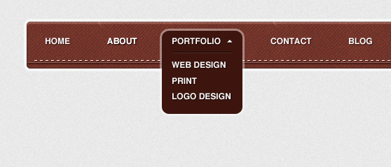
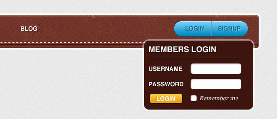 This tutorial is written in 4 hands by me and Piervincenzo. I will drive your through the first part, the one focused on Photoshop and the interface graphical construction. Then I will pass the ball to Piervincenzo, who will explain how to convert the design into a fully functional html/css web navigation bar.
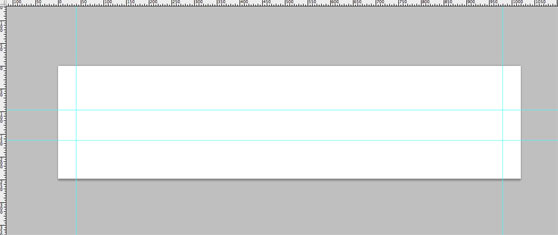
 940 px is a good length for a navigation bar. So use the guides to delimite 940 px (put the first vertical guide at 40px and the second one at 980px)
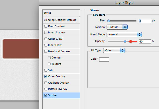
 Then a semi-transparent white stroke effect:
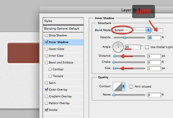
 The inner shadow with the right settings can be used to add depth to the shape:
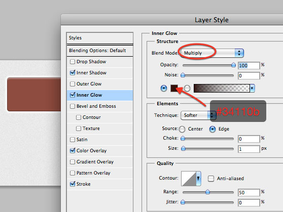
 Finally add a thin inner glow to create the stroke effect (we've used "stroke" to create the semi-transparent border, so we can't use it again. Anyway the inner glow with the right settings will work fine).
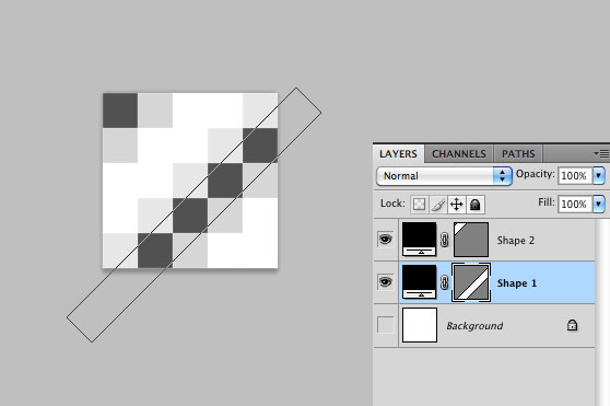 Go to Edit>Define pattern to save the pattern. If "Define pattern" is not visible on your menu, try to click on the background layer thumb before, then try a second time.
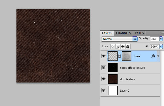
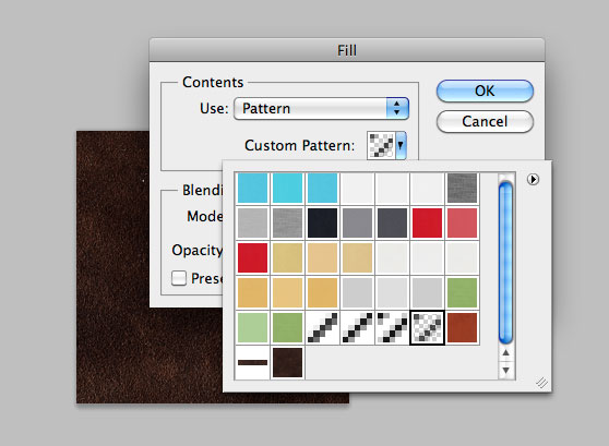 To change the lines color, use the blending options and add a white color overlay. Also reduce opacity to 20%.
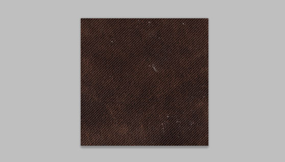 Finally if you want to make the lines more dirty, create a layer mask and use a black grunge brush to erase some parts of the lines. The pattern is ready and you can save it (Edit>Define pattern).
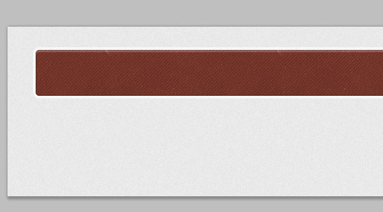
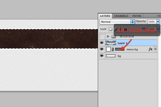 Switch the layer blend mode to overlay with opacity 40%.
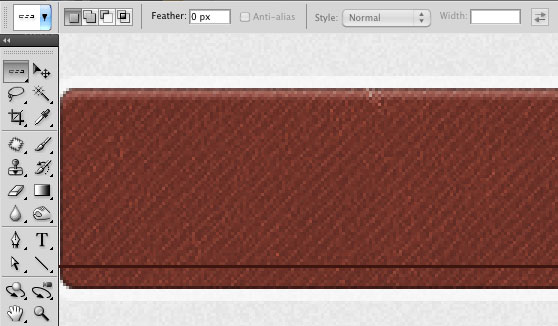 Created a second 1px line immediately above the first one, and fill it with white. Reduce the opacity to 20%.
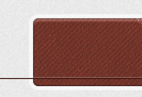 Both from the left and the right, eliminate the parts of the lines that exceed the main shape.
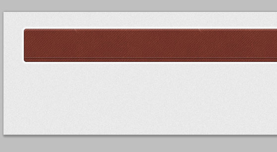
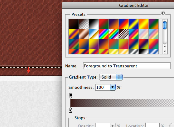
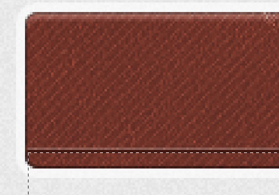 Set the same dark brown (#3d150e) of the first 1px line as foreground color, grab the Gradient tool with a gradient going from brown to transparent, and create a soft shadow immediately below the 2 lines. Reduce the opacity of the layer to make the effect gentler:
 Duplicate the layer by pressing ctrl+J and move the duplicated below the original one. Add a dark brown (#3d150e) color overlay and click once the bottom arrow on your keyboard, and once the right one. We've so created the shadow effect.
 With the Polygon tool (set sides to 3) create a small triangle and put it inside the circle. Then if you want to squash a little bit the triangle, grab the Direct selection tool (A), select the bottom anchor point of the triangle, and drag it up. Finally add the same drop shadow of the portfolio text.
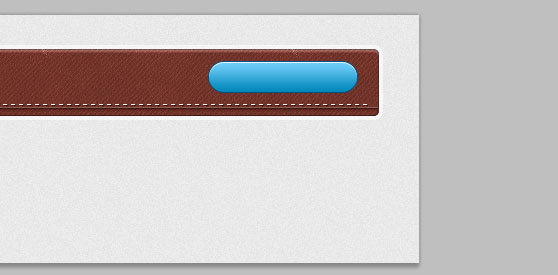
 Then add a gradient overlay (from #0087b9 to #70cffb) and a dark blue (#005281) 1px stroke effect.
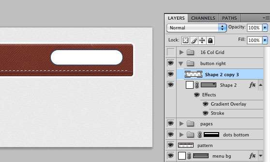 Ctrl+click on the white copy of the shape to select its pixels, grab one of the selection tool and click once the bottom arrow on your keyboard to move 1px down the selection. Then hit delete and reduce the opacity to around 80% to create a nice light effect.
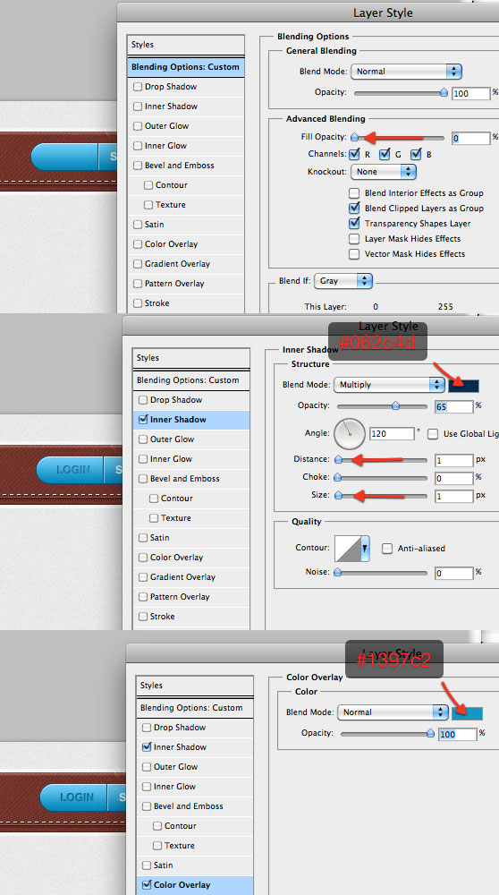
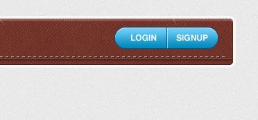 Then open the blending modes window and firstly reduce fill opacity to 0%, then add a thin inner shadow and a color overlay:
 Do the same with the word "signup":

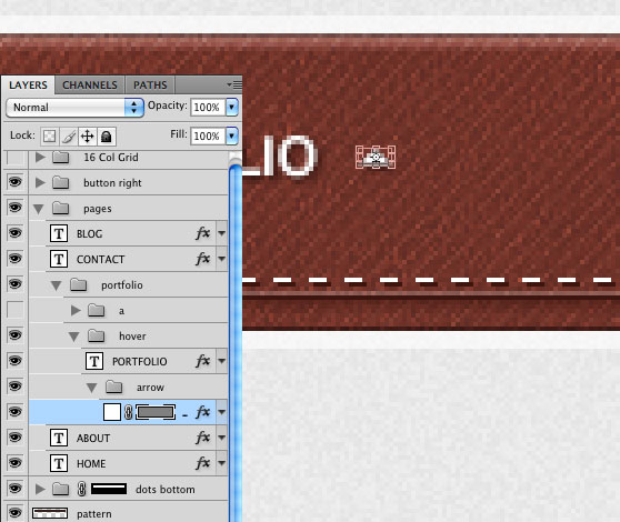
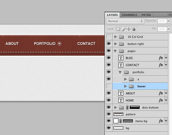 I've created a group titled "hover" where to put inside all the layers of the hover effect. For the moment inside this group I've put in a copy of the portfolio text layer and one of the arrow, rotated of 180° (press ctrl+T then rotate the shape). So you can hide the "a" group for the moment and work only with the "hover" one.
 We've finished the first part guys! It's time now to code the design.
 We've linked our style.css within the head tag.
Preview:
You can click here to see the live demo of the navigation bar

DOWNLOAD PSD + HTML/CSS TEMPLATE
[hidepost] [download id="138" format="1"] [/hidepost]
Become a Premium Member and get unlimited access to source files and premium resources for only 7$/month. Click here to learn more.
Lesson menu
Part 1: create the menu in Photoshop
So let's start the lesson with me (I'm the boy of the picture on the left!)
*note for Mac users: ctrl=cmd, alt=option
Step 1
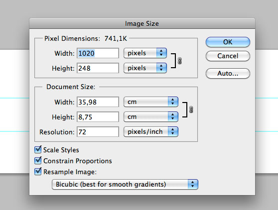
Create a new 1020x248 pixels Photoshop document. Since my aim is to realize a navigation bar, this size will work fine. Of course, if you want to realize the entire interface of a website, you need a higher document. 940 px is a good length for a navigation bar. So use the guides to delimite 940 px (put the first vertical guide at 40px and the second one at 980px)
How to create guides? You can create a guide by clicking and dragging from the ruler. If you want to hide guides go to View>Show>Guides. If you don't visualize the rulers, go to View>Rulers.

Step 2
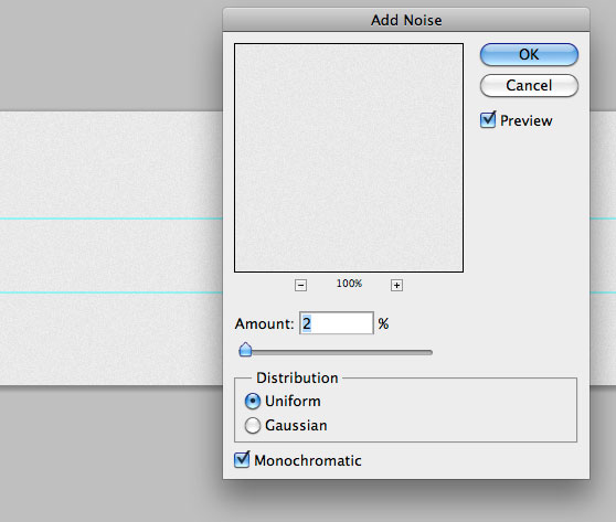
Fill the background with a light grey (#e9e9e9). Then go to Filter>Noise>Add noise to create a nice subtle background for the navigation bar.
Step 3
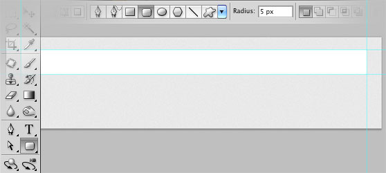
With the Rounded Rectangle tool, and a radius of 5px, create the main shape of the bar. You can notice that I've delimited also the height with 2 guides.
Step 4
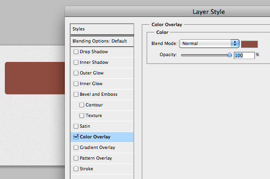
We can now play with blending options (right click on the layer thumbnail>Blending options) to stylize the shape. Start by adding a brown color overlay (#8e4b3e): Then a semi-transparent white stroke effect:
 The inner shadow with the right settings can be used to add depth to the shape:
 Finally add a thin inner glow to create the stroke effect (we've used "stroke" to create the semi-transparent border, so we can't use it again. Anyway the inner glow with the right settings will work fine).

Step 5
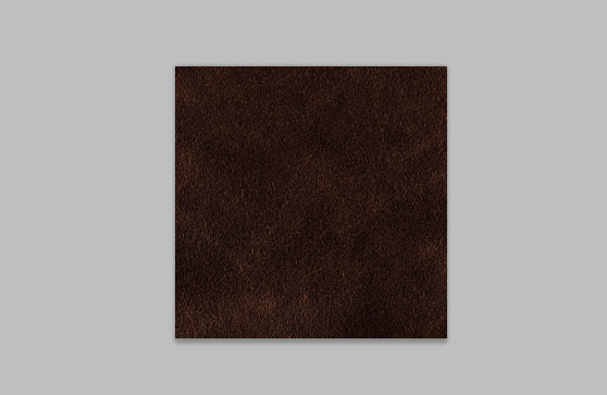
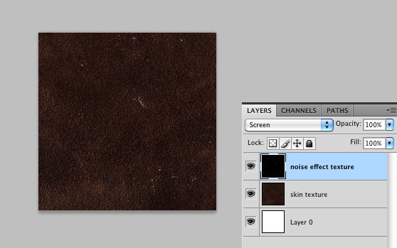
Now that the main shape is ready, we can work on the texture effect on a separate document. We will create a pattern for this purpose, so let's create a new 250x250 pixels document in Photoshop. Take in mind that every time you need to work with files that are not too light, like textures, it's a good habit to create patterns instead of working with the entire texture. In the new Photoshop document, I've pasted in (Open>Select the texture) one of our skin textures. Remember to scale down the texture (ctrl+T)
Step 6
To add other nice effects, I've pasted in one of our noise effect textures, set on "screen" to eliminate the black areas.
Step 7
I'm still not satisfied with the result. So let's create another small Photoshop document to realize a micro pattern. The size of the document is 5x5 pixels. With the Line tool, create two 45° lines as shown in the screenshot. To be sure that the angle is 45°, hold down shift while drawing the lines. Go to Edit>Define pattern to save the pattern. If "Define pattern" is not visible on your menu, try to click on the background layer thumb before, then try a second time.
Step 8
Switch to the texture pattern document. Create a new layer and go to Edit>Fill and select the pattern just created from the library. To change the lines color, use the blending options and add a white color overlay. Also reduce opacity to 20%.
 Finally if you want to make the lines more dirty, create a layer mask and use a black grunge brush to erase some parts of the lines. The pattern is ready and you can save it (Edit>Define pattern).

Step 9
We can now switch to the main Photoshop canvas. Create a new layer. Then ctrl+click on the vector mask of the main shape layer to select its pixels, and go to Edit>Fill and select the textured pattern. Finally press ctrl+D to deselect. Switch the layer blend mode to overlay with opacity 40%.

Step 10
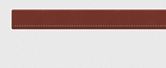
To add even more style to the navigation bar, we can create stitchings and other nice effects. With the Single Row Marquee Tool create a 1px horizontal selection, create a new layer and fill the selection with a dark brown (#3d150e). Created a second 1px line immediately above the first one, and fill it with white. Reduce the opacity to 20%.
 Both from the left and the right, eliminate the parts of the lines that exceed the main shape.

Step 11
With the Rectangular Marquee tool, make a selection over all the bottom area of the main shape, immediately below the two horizontal lines, as shown in the screenshot below: Set the same dark brown (#3d150e) of the first 1px line as foreground color, grab the Gradient tool with a gradient going from brown to transparent, and create a soft shadow immediately below the 2 lines. Reduce the opacity of the layer to make the effect gentler:

Step 12
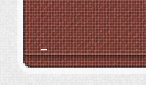
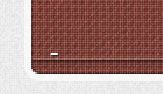
To create the stitchings is very simple. Create a new layer, zoom in and grab the Rectangular Marquee tool (M). Make a small rectangular selection (1x4 pixels), and fill it with white. Duplicate the layer by pressing ctrl+J and move the duplicated below the original one. Add a dark brown (#3d150e) color overlay and click once the bottom arrow on your keyboard, and once the right one. We've so created the shadow effect.

Step 13
Now you can select both the layers and merge them (ctrl+E). Then you can create several copies of the stitching by holding-down alt and clicking and dragging with your mouse. Continue until you've covered the entire navigation bar.
Step 14
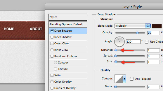
At this point we can put in the menu links. I used Helvetica (bold, 12pt), but also Arial or another simple sans serif font will work fine. The only style added to the text is a thin drop shadow (#35120d).
Step 15
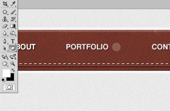
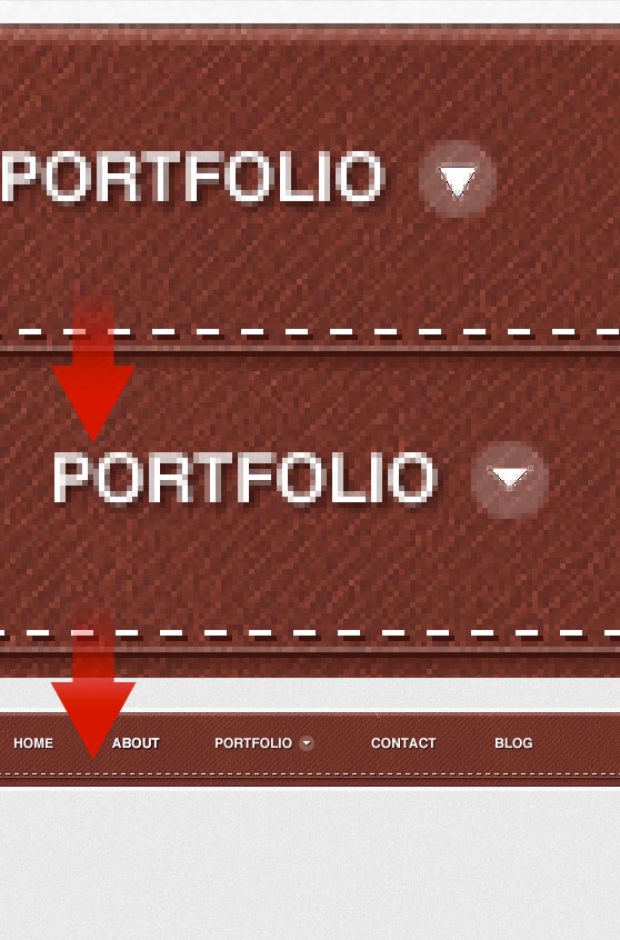
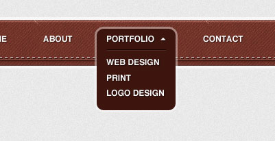
With the ellipse tool, draw a small circle near the portfolio link. We will create an arrow to indicate the existence of a drop down menu. Reduce the opacity to around 20%. With the Polygon tool (set sides to 3) create a small triangle and put it inside the circle. Then if you want to squash a little bit the triangle, grab the Direct selection tool (A), select the bottom anchor point of the triangle, and drag it up. Finally add the same drop shadow of the portfolio text.

Step 16
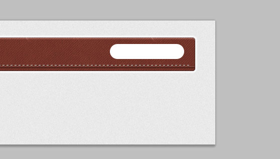
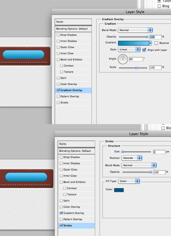
On the right side of the navigation bar we will create the login/signup button. With the Rounded Rectangle tool (radius 20px) draw a shape as shown in the screenshot: Then add a gradient overlay (from #0087b9 to #70cffb) and a dark blue (#005281) 1px stroke effect.

Step 17
Duplicate the layer, eliminate all the styles and rasterize it (right-click>Rasterize layer). Ctrl+click on the white copy of the shape to select its pixels, grab one of the selection tool and click once the bottom arrow on your keyboard to move 1px down the selection. Then hit delete and reduce the opacity to around 80% to create a nice light effect.

Step 18
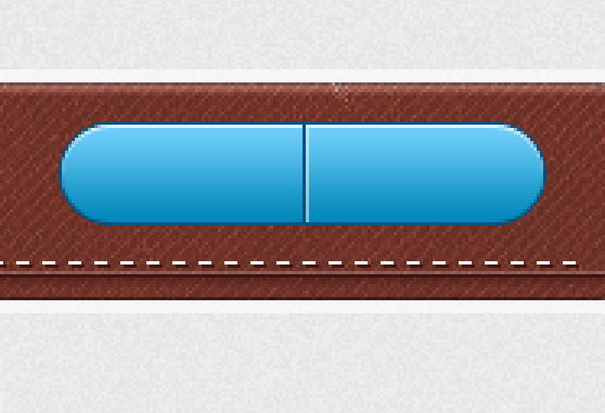
With the Line tool, create 2 vertical lines in the center of the shape. The one of the left of the same blue (#005281) of the stroke effect, while the one of the right is white with opacity reduced to 50%.
Step 19
Using always Helvetica, write in "login" and "signup". Then open the blending modes window and firstly reduce fill opacity to 0%, then add a thin inner shadow and a color overlay:

Step 20
Duplicate the login type layer and move the duplicated below the original one, then eliminate all the styles so that we have only a white colored text. Move this layer 1px down and 1px to the right. Finally reduce opacity to 50%. Do the same with the word "signup":

Step 21
Now that the navigation bar is complete, we can create the hover effects, starting from the portfolio link. In this phase, it's important the way you organize your layers. Take a loot at how I organized mines: I've created a group titled "hover" where to put inside all the layers of the hover effect. For the moment inside this group I've put in a copy of the portfolio text layer and one of the arrow, rotated of 180° (press ctrl+T then rotate the shape). So you can hide the "a" group for the moment and work only with the "hover" one.

Step 22
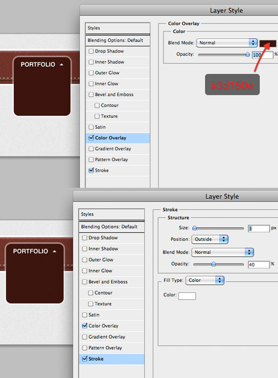
For the hover effect I've decided to create a rounded rectangle box (radius 10px) with the following styles:
Step 23
Put in the sub-pages. The font is the always the same, Helvetica 12pt bold. To separate the main page from the sub pages, I've used 2x 1pixel lines. The top one is dark brown (#190603), while the one below is white with opacity 10%.
Step 24
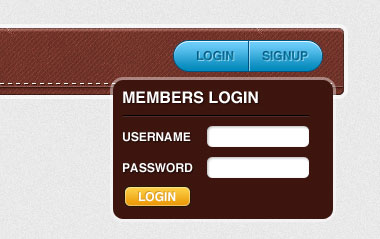
The last step is to design the modal window that will appear when someone will click on the "login" button. I've decided to use the same box of the portfolio hover effect. Then I've filled it with a form and a simple button created using the same method of the login/signup button. The only stile added to the boxes of the form is a soft inner shadow.
Step 25
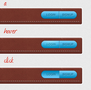
We can create the "hover" and "click event handler" effects for the two buttons (login + signup). As we made for the portfolio link, create 2 groups to make order, and title them "hover" and "click". The hover effect is obtained with a gentle light effect. Simply create a layer, grab a soft white brush with hardness 0%, click once and set the layer to overlay. For the click effect, I've only inverted the gradient overlay. We've finished the first part guys! It's time now to code the design.
Part 2: code the menu - html/css/jQuery
Perfect, we have a nice and textured menu design. We are going to code it using XHTML 1.0 Strict markup, CSS (with a little bit of versione 3) and a simple jQuery script (based an 1.4.2 version).
Step 26
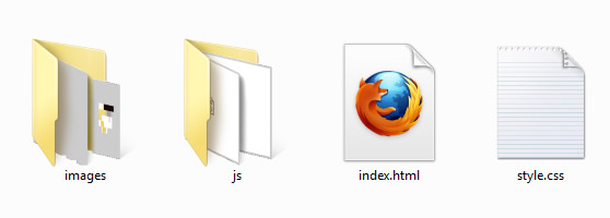
Create a new directory /WG_textured_menu where you can put in the necessary files, index.html and style.css, the folders for the images (/images) and the folder for the Javascript files (/js).
Step 27
Prepare the document. Open index.html using your favourite text editor (I usually work with Notepad++); define the DOCTYPE, we use XHTML 1.0 Strict that "contains all HTML elements and attributes, but does NOT INCLUDE presentational or deprecated elements (like font);" define the head of your document (that's a container for all the head elements such as scripts meta information, and more). We add also two div container, a wrapper (which will allow us to center the structure) and the container for our navigation menu.<!DOCTYPE html PUBLIC "-//W3C//DTD XHTML 1.0 Strict//EN" "http://www.w3.org/TR/xhtml1/DTD/xhtml1-strict.dtd"> <html xmlns="http://www.w3.org/1999/xhtml"> <head> <meta http-equiv="Content-Type" content="text/html; charset=utf-8" /> <title>Textured menu</title> <link href="style.css" rel="stylesheet" type="text/css" /> <script type="text/javascript" src="js/jquery.js"></script> <script type="text/javascript" src="js/custom.js"></script> </head> <body> <div class="wrapper"> <div id="navigation_bar"> </div> </div> </body> </html>
Step 28
Now you can add the unordered list for the main navigation menu.<ul id="gen_navigation"> <li><a href="#">Home</a></li> <li><a href="#">About</a></li> <li><a href="#">Portfolio <span></span></a></li> <li><a href="#">Contact</a></li> <li><a href="#">Blog</a></li> </ul>
Step 29
Complete the markup adding the sub-level navigation panel. In order to append the panel we include a div with a class of "sub_panel" and a nested unordered list within the list item of the main ul as shown below.<ul id="gen_navigation"> <li><a href="#">Home</a></li> <li><a href="#">About</a></li> <li><a href="#">Portfolio <span></span> <div class="sub_panel"> <ul> <li><a href="#">Web Design</a></li> <li><a href="#">Print</a></li> <li><a href="#">Logo Design</a></li> <li><a href="#">Other Media</a></li> </ul> </div> </li> <li><a href="#">Contact</a></li> <li><a href="#">Blog</a></li> </ul>Let's add a new nested unordered list with a class of "sign_navigation" for the menu "login/sign-up."
<ul id="gen_navigation">
	<li><a href="#">Home</a></li>
	<li><a href="#">About</a></li>
	<li><a href="#">Portfolio <span></span>
		<div class="sub_panel">
		<ul>
			<li><a href="#">Web Design</a></li>
			<li><a href="#">Print</a></li>
			<li><a href="#">Logo Design</a></li>
			<li><a href="#">Other Media</a></li>
		</ul>
		</div>
	</li>
	<li><a href="#">Contact</a></li>
	<li><a href="#">Blog</a></li>
	<li>
	<ul id="sign_navigation">
		<li><a class="login_button" href="#">login</a></li>
		<li><a class="sign_in_button" href="#">sign-in</a></li>
	</ul>
	</li>
</ul>
Step 30
Sebastiano planned also a nice login panel, so we are going to add it in our markup just after the </ul> of the main unordered list using <form>, <label> and <input>.<div class="login_panel hidden"> <form method='post' action=''> <fieldset> <h3>members login</h3> <span class="close_login"></span> <label for='username'>Username</label> <input id='username' value='' title='username' name='login' type='text' /> <label for='password'>Password</label> <input id='password' name='pass' value='' title='password' type='password' /> <p> <input id='signin_submit' value='' type='submit' /> <input type='checkbox' name='remember_login' value='1' id='remember' /> <label for='remember'>Remember me</label> </p> </fieldset> </form> </div>
Step 31
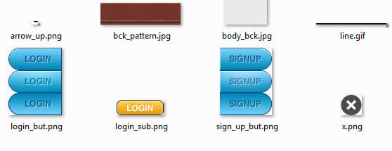
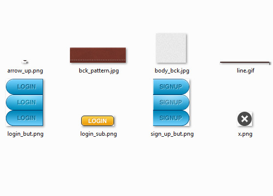
Extract all the necessary images for the style from the psd. We've linked our style.css within the head tag.
<link href="style.css" rel="stylesheet" type="text/css" />Now open the file "style.css" into your text editor and start to set some general reset.
* { margin: 0; padding: 0; border: none; } /* no margin and no padding for all elements */

a { text-decoration: none; } /* reset text-decoration on links */

:focus { outline: none; } /* reset focus */
Step 32
We set the style for the <body> the "wrapper" container and the "navigation_bar" container. Note tha we use the #navigation_bar container to create a light grey background; the login panel will be placed through an absolute positioning, be sure to add a relative positioning to the #navigation_bar.
body { background: #e7e7e7 url(images/body_bck.jpg); font-family: "Helvetica Neue", Helvetica, Arial, sans-serif; font-size: 12px; }

.wrapper { width: 973px; height: 500px; margin: auto; } /* margin auto and width to center our structure */

#navigation_bar { margin: 60px 0 20px 0; padding: 4px; background: #f7f7f7; -moz-border-radius: 10px; -webkit-border-radius: 10px; -khtml-border-radius: 10px; border-radius: 10px; width: 967px; }
Step 33
Time to style our navigation menu. Note that the dropdown menu will be placed through an absolute positioning, be sure to add a relative positioning to the list item.
ul#gen_navigation { float: left; width: 940px; height: 45px; background: url(images/bck_pattern.jpg) repeat-x; -moz-border-radius: 10px; -webkit-border-radius: 10px; -khtml-border-radius: 10px; border-radius: 10px; border: 1px solid #472620; list-style: none; padding: 22px 0 0 25px; }

		ul#gen_navigation li { position: relative; display: inline; text-transform: uppercase; padding-right: 52px; }
		ul#gen_navigation li a { color: #fff; font-weight: bold; text-shadow: 1px 1px 0px #472620; padding: 5px; -moz-border-radius: 5px; -webkit-border-radius: 5px; -khtml-border-radius: 5px; border-radius: 5px; }
		ul#gen_navigation li a:hover { background-color: #3d150e; }
				ul#gen_navigation li a span { display: inline-block; width: 9px; height: 7px; margin-left: 15px; background: url(images/arrow_up.png) no-repeat; } /* to add the arrow */
Step 34
Now we can add the style rules for the .sub_panel.
.sub_panel { position: absolute; top: -15px; left: -18px; padding: 5px; background-color: rgba(255,255,255,0.4); -moz-border-radius: 10px; -webkit-border-radius: 10px; -khtml-border-radius: 10px; border-radius: 10px; float: left;}
				.sub_panel ul { background: #3d150e; -moz-border-radius: 10px; -webkit-border-radius: 10px; -khtml-border-radius: 10px; border-radius: 10px; padding: 43px 40px 25px 15px; }
				ul#gen_navigation li .sub_panel ul li { padding: 3px 0; display: block; font-size: 10px; }
				ul#gen_navigation li .sub_panel ul li a { background: none; text-shadow: 1px 1px 0px #1e0905; }
Step 35
Complete adding the style for the login/signup menu, the login panel and its form.
ul#sign_navigation { float: right; position: relative; top: -10px; right: -15px; text-indent: -9999px; width: 190px; height: 32px; }
				ul#sign_navigation li a { padding: 0; -moz-border-radius: 0; -webkit-border-radius: 0; -khtml-border-radius: 0; border-radius: 0; }
				ul#sign_navigation li a.login_button  { background: url(images/login_but.png) no-repeat 0px 0px; width: 76px; height: 32px; display: block; float: left;  }
				ul#sign_navigation li a.login_button:hover, ul#sign_navigation li a.sign_in_button:hover  { background-position: 0px -32px; }
				ul#sign_navigation li  a.login_button:active, ul#sign_navigation li  a.sign_in_button:active { background-position: 0px -64px; }
				ul#sign_navigation li a.sign_in_button { background: url(images/sign_up_but.png) no-repeat 0px 0px; width: 74px; height: 32px; display: block; float: left; }

				.login_panel { position: absolute; top: 55px; right: 10px; background-color: rgba(255,255,255,0.4); -moz-border-radius: 10px; -webkit-border-radius: 10px; -khtml-border-radius: 10px; border-radius: 10px; padding: 5px; float: right; }
				.login_panel form { background: #3d150e; color: #fff; padding: 10px 15px 20px 15px; -moz-border-radius: 10px; -webkit-border-radius: 10px; -khtml-border-radius: 10px; border-radius: 10px; width: 180px; }
				.login_panel form h3 { background: url(images/line.gif) repeat-x bottom left; padding-bottom: 10px; margin-bottom: 15px; }
				.close_login { position: absolute; right: -5px; top: -5px; background: url(images/x.png) no-repeat; width: 30px; height: 29px; display: block; cursor: pointer; }
				.login_panel form label { font-size: 10px; float: left; padding-top: 5px; clear: both; }
				.login_panel form input[type="text"], .login_panel form input[type="password"] { height: 10px; width: 110px; float: right; margin: 0 0 15px 10px; padding: 5px; font-size: 10px; -moz-box-shadow: inset 1px 1px 1px #ccc; -khtml-box-shadow: inset 1px 1px 1px #ccc; -webkit-box-shadow: inset 1px 1px 1px #ccc; box-shadow: inset 1px 1px 1px #ccc; -moz-border-radius: 5px; -khtml-border-radius: 5px; -webkit-border-radius: 5px; }
				.login_panel p { clear: both; }
				.login_panel form input[type="submit"] { width: 67px; height: 21px; background: url(images/login_sub.png) no-repeat; float: left; margin-right: 12px; cursor: pointer; }
				.login_panel form p label { clear: none; padding: 1px 0 0 5px; margin-top: 3px; }
				.login_panel form input[type="checkbox"] { float: left; margin-top: 3px; }
Step 36
When a float is contained within a container box that has background, that float does not automatically force the container's height and the backgorund isn't visible. So we have to add an empty bottom container <div class="clear"></div> (just before the close tag of <div id="navigation_bar">) and the relative css class .clear { clear: both; } to fix this "bug."Step 37
Remember the "Step 27?" We've added the following line of codes:<script type="text/javascript" src="js/jquery.js"></script> <script type="text/javascript" src="js/custom.js"></script>They link the .js script with our page. So we have to add the file jquery.js into the /js folder, open it and paste the jQuery code. Then create the file custom.js into the /js folder and open it. Now we're ready to write our custom script.
Step 38
Start to work with the login panel. We'll use the .toggleClass() method to show and hide our panel, so we have to add the following class in our style.css: .hidden { display: none; }
$(function() {

	// show/hide login panel by clicking on .login_button
	$('.login_button').click(function() {
		$('.login_panel').toggleClass('hidden');
	});

	// hide login panel by clicking on .close_button
	$('.close_login').click(function() {
		$('.login_panel').addClass('hidden');
	});

	// prevent default clicking event within the login panel
	$('.login_panel').click(function(event) {
		event.preventDefault();
	});

});
Step 39
Finally the jQuery code for the dropdown panel. An important notification: our panel will be showed over the navigation menu, for this reason we have to add a new class in our css to correctly positionate the item of the main unordered list (#gen_navigation). The class, which we append via Javascript, is ul#gen_navigation li.dropdown_hover a { position: relative; z-index: 100; padding-bottom: 7px; background: url(images/line.gif) no-repeat bottom left; }.
//show dropdown when the mouse is moved over the list element that contains the sub_panel
	var cus_dropdown_sel = $('ul#gen_navigation li').find('.sub_panel').parent();

	var panWidth = 0;

	$(cus_dropdown_sel).hover(function(){

		panWidth = $(this).width() + 40;
		$('.sub_panel').css('width', panWidth); //cross-browser control for the width of the sub_panel
        $(this).addClass('dropdown_hover'); // add the 'dropdown_hover' class to make visible the list item of the navigation menu
        $(this).find('.sub_panel').fadeTo(200, 1); // show the panel

    }, function(){

        $(this).removeClass('dropdown_hover'); // remove 'dropdown_hover' class
        $(this).find('.sub_panel').hide(); // hide the panel
		panWidth = 0; // reset width

    });
That's all, see how our menu looks: live demo.
DOWNLOAD PSD + HTML/CSS TEMPLATE
[hidepost] [download id="138" format="1"] [/hidepost]
Become a Premium Member and get unlimited access to source files and premium resources for only 7$/month. Click here to learn more.
