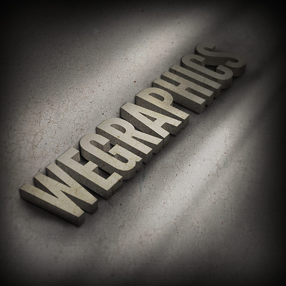
Creating Realistic 3D Text Using Photoshop's Repousse
Nothing says "Eye Candy" like a great 3D design. Using 3D elements can make a poster, book cover or magazine ad pop off of the page. In the past we've had to resort to 3rd party software to export 3D elements so that we could incorporate them into our 2D design world within Photoshop. Well that's all changed. If your using Photoshop CS5 then you're already tinkering in the realm of 3D design. In the tutorial below I will show you how to dabble a bit in Photoshop's built in 3D tools.As always, my design work leans a bit toward the experimental side of things, so if you know of a better way to accomplish the task I've set forth below... Please add your thoughts using the comment fields at the bottom of the page.

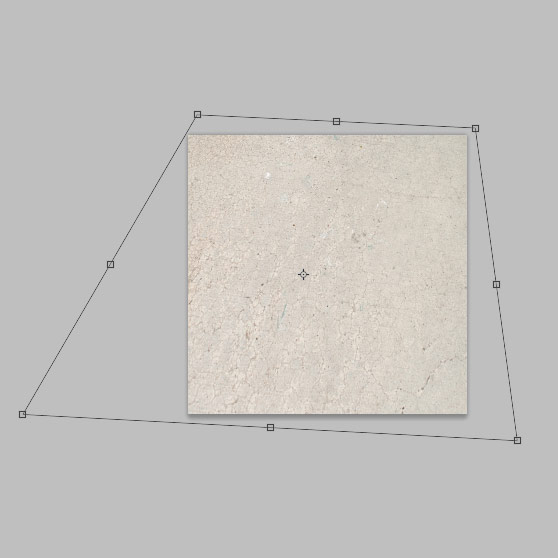 The change here is subtle, but it starts to take on the perspective look that we are after.
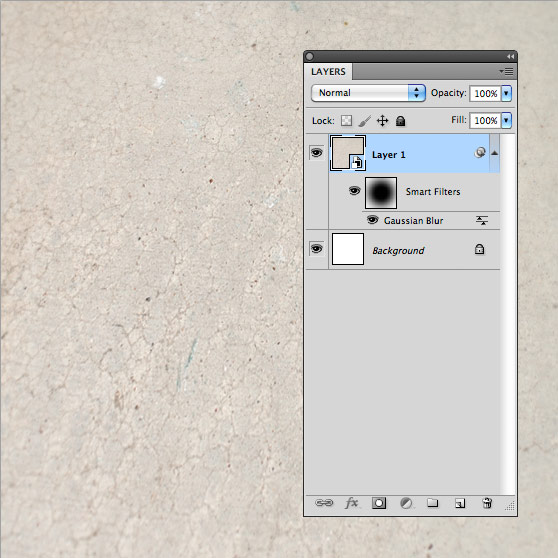
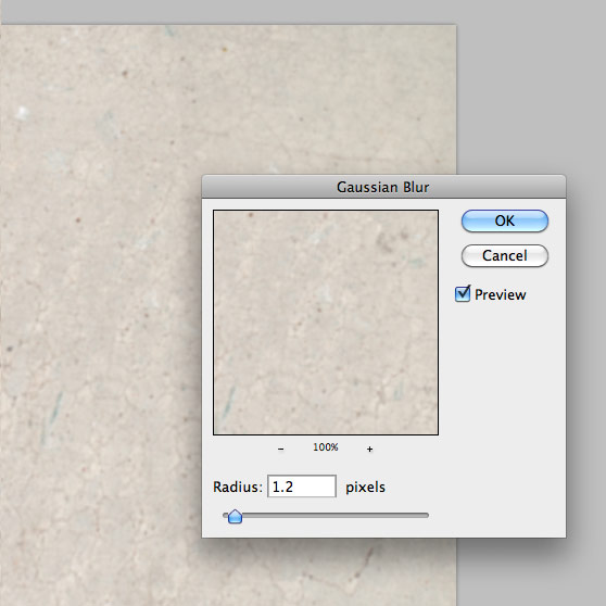 When applying Smart Filters it doesn't really effect the original layer. An advantage is you can edit what part of the layer the effect is applied to by coloring the layer mask the filter creates when applied. Color the effect similar to what I have done below so that the center of the texture is in focus and the edges are blurred.
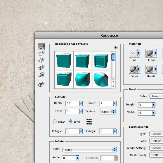 I also added a subtle texture to the sides of the text.
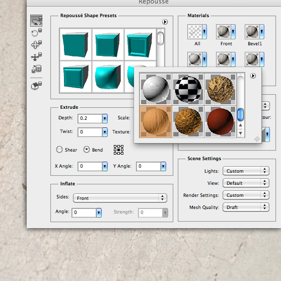 The last item is to angle the text so that it matches the angle we set for our background. The trick here to to eyeball what looks right given the angle of the background texture.
 That's it, now close the Repousse window by clicking Okay.
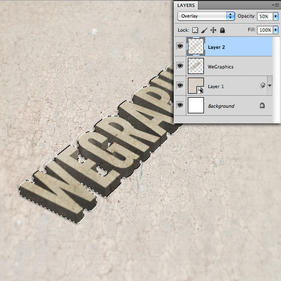
 Copy and paste this selection into a new layer above the 3D text layer. Set the blending mode to overlay and the layer opacity to 50%.
 Using the Edit | Transform | Distort tool, I'll shape these at an angle, and set the layer blend mode to Overlay.

Preview

Step 1
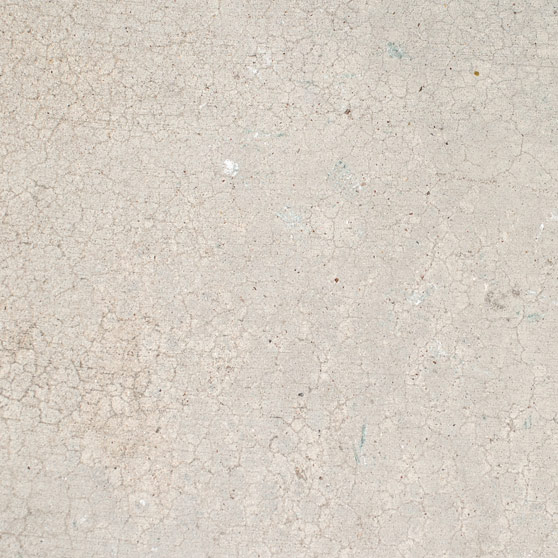
First off, we'll need to grab a nice concrete texture to use as our background. It just so happens that WeGraphics has an incredible set up for grabs right here. I chose number 5 from this set.
Step 2
We'll need to add a little bit of perspective to the texture. I did this by using the Edit | Transform | Distort tool. You could also accomplish something similar using the Perspective too... Which ever one floats your boat. Transform the texture until you get something similar to what I have below. Note: You'll have to zoom out on the canvas in order to see the edit points. The change here is subtle, but it starts to take on the perspective look that we are after.
Step 3
Next, We'll add a bit more depth by adding some blur. But we're going to the "Smart" way. Go to Filter | Convert to Smart Filters. You'll notice a small icon will appear over the layer thumbnail in the layers palette. Now apply a Gaussian Blur by going to Filters | Blur | Gaussian Blur. When applying Smart Filters it doesn't really effect the original layer. An advantage is you can edit what part of the layer the effect is applied to by coloring the layer mask the filter creates when applied. Color the effect similar to what I have done below so that the center of the texture is in focus and the edges are blurred.

Step 4
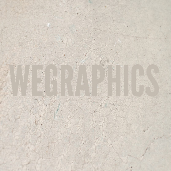
Okay, we're going to leave the background alone for a little bit and concentrate on our text layer. Choose a color from the background texture and create a new text layer by choosing the text tool and typing something onto the canvas.
Step 5
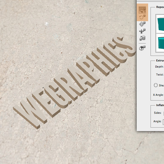
And here's where the fun starts. With your text layer selected, go to 3D | Repousse | Text Layer to open the Repousse window. You now have a plethora of 3D editing tools laid out before you, but be careful, subtlety is the key here. I changed the Depth to .2 so that the 3D extrusion of the text was less than the default setting. I also added a subtle texture to the sides of the text.
 The last item is to angle the text so that it matches the angle we set for our background. The trick here to to eyeball what looks right given the angle of the background texture.
 That's it, now close the Repousse window by clicking Okay.
Step 6
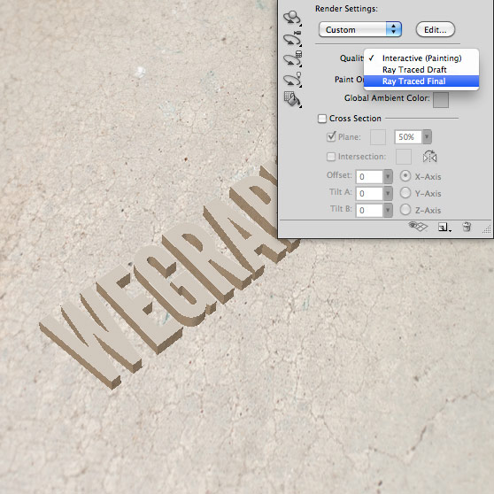
Now you'll notice that the text looks a little jagged. That's because we haven't rendered it yet. Open the 3D panel Window | 3D, and select "Ray Traced Final" from the Quality drop down menu. Note: The render will take a little bit so now is a good time to go grab a cup of coffee or take a potty break. I'll see you back here in a bit.
Step 7
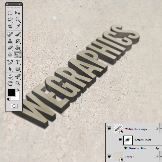
Okay, we're back and you have a full rendered 3D text layer that looks all smooth and nice. Now, we're going to get a little experimental in these last few steps to achieve the look of depth and light that we're after. Start by rasterizing your 3D text layer. Ctrl+click the layer and choose Rasterize 3D. Now you should have a regular old 2D layer... but don't worry there is still fun to be had in these last few steps ;-) Now we need to darken the edges and apply a little bit of that Gaussian Blur from earlier to our 3D text layer. I darkened the edges by using the Burn tool (very subtly) to the text, and then I applied the blur using the same method as before using Smart Filter.
Step 8
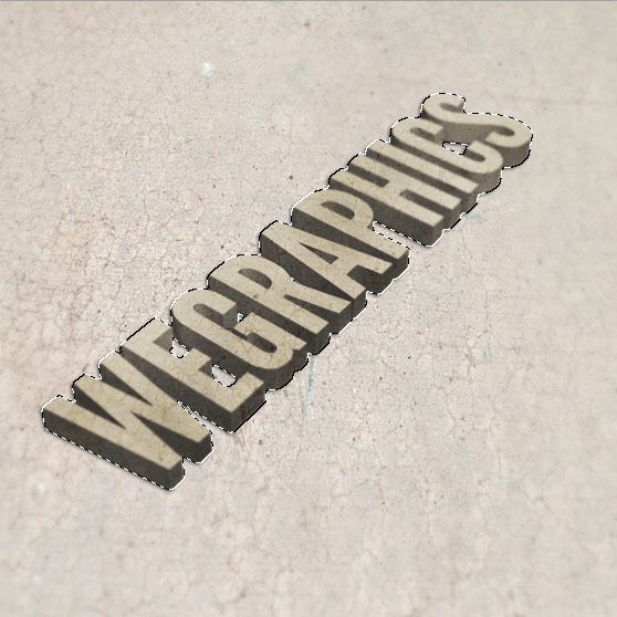
Next, select the background texture layer, and then Command+Click the thumbnail for the 3D text layer. This will make a selection of the background in the shape of the text. Copy and paste this selection into a new layer above the 3D text layer. Set the blending mode to overlay and the layer opacity to 50%.

Step 9
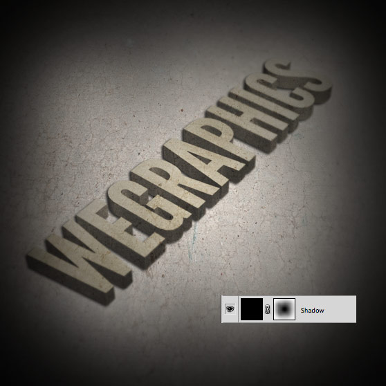
It's starting to look pretty good, but I want to add a bit of light to the scene. Create a new layer and fill it with black. Create a new layer mask for this layer and color then center of the mask as shown below. This will create the shadows we need around the edge of the scene.
Step 10
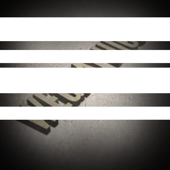
Now we need light... I want to create some streaks of light as though it's being filtered by something outside of the scene. To do this I'm going to make a new layer with several white bars. Using the Edit | Transform | Distort tool, I'll shape these at an angle, and set the layer blend mode to Overlay.

Step 11
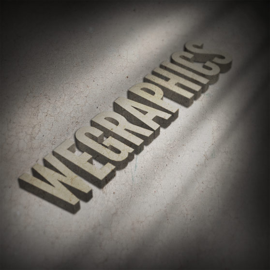
The last step is to apply some shadows underneath the next. There is no trick or anything particularly fancy here. I just grabbed a soft black brush, and took the opacity down to around 40% and began painting the shadows underneath the text. Paint the shadows until it looks right to your eye, but remember to be subtle and don't over do it. You should now have something similar to the image below.