Creating an Interface Slider Graphic in Photoshop
Slider graphics have become a widely used trend in web design. They come in all shapes and sizes, and are only limited by your imagination in how they look and perform. Creating these sliders in Photoshop is extremely easy to do. In this short tutorial I will run through my process for creating a slider graphic using layer styles.

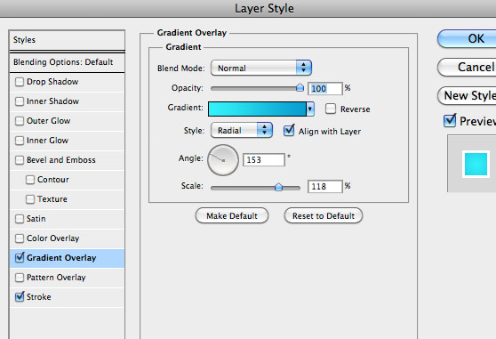
 Next, let's add a Gradient Overlay using the settings below. I chose these two shades of blue: Light blue - #34f2f9, Dark blue - #0ba0d1
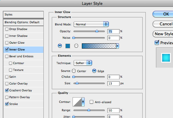
 Now let's set an Inner Glow with the setting below. I chose a darker blue for the effect. #1178ae
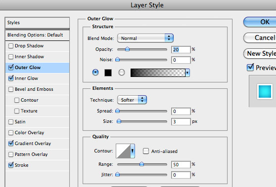
 For our last layer effect, let's create an Outer Glow to act as a slight shadow around the box. Use the settings below to create the shadow.
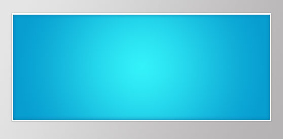
 You slider box should now look something like this.
 Next choose Edit | Transform | Distort, and edit the black box to a shape similar to the one below. Press Enter to transform the box.
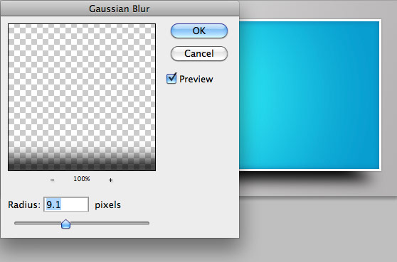
 Now apply Filter | Blur | Gaussian Blur as I have in the image below.
 Then set the layer opacity to 75%.
 I added arrows using <> in a font called Technical Forest.
 I applied the following effects to the font.
Color: #525353
Inner Shadow
Opacity: 75%
Angle: 90
Distance: 3
Choke: 0
Size: 7
Outer Glow
Blend Mode: Overlay
Opacity: 100%
Technique: Precise
Spread: 0
Size 2

Preview

Step 1
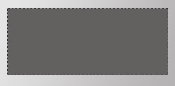
First create a new PS document that size appropriately so that it will contain your slider box plus room to add a shadow around the boarder. Use the Rectangular Marque Tool to draw a box, in a new layer, and fill it with a neutral gray.
Step 2
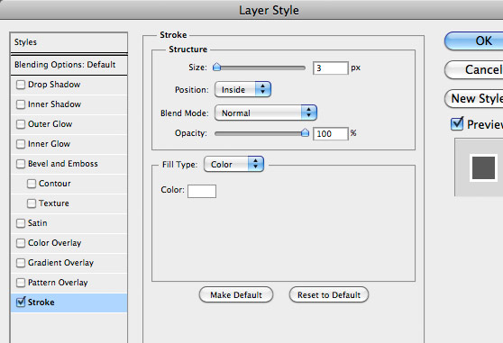
Double click the layer containing the box to open the Layer Styles window. Let's start by adding a white stroke with a size of 3 pixels Next, let's add a Gradient Overlay using the settings below. I chose these two shades of blue: Light blue - #34f2f9, Dark blue - #0ba0d1
 Now let's set an Inner Glow with the setting below. I chose a darker blue for the effect. #1178ae
 For our last layer effect, let's create an Outer Glow to act as a slight shadow around the box. Use the settings below to create the shadow.
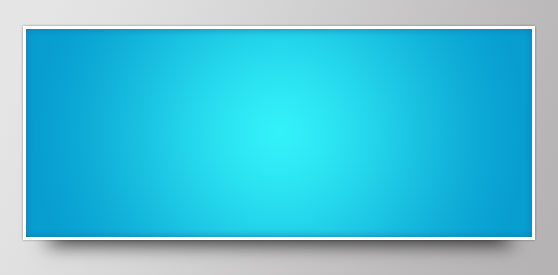
 You slider box should now look something like this.

Step 3
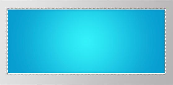
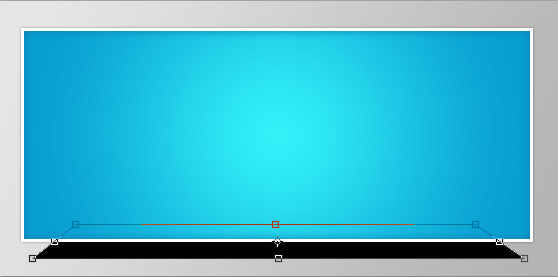
Now let's add a shadow below the slider box by creating a new layer below the layer containing the box. Command+Click the thumbnail for the box to select it, then make sure your new layer is selected and fill the selection with black. You won't be able to see the new black box since it is behind our slider box. Next choose Edit | Transform | Distort, and edit the black box to a shape similar to the one below. Press Enter to transform the box.
 Now apply Filter | Blur | Gaussian Blur as I have in the image below.
 Then set the layer opacity to 75%.

Step 4
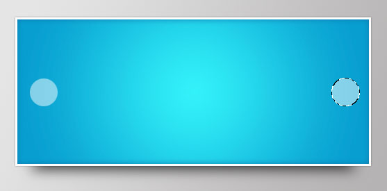
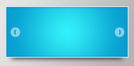
Let's add slider controls by creating a circle using the Elliptical Marque Tool, filling the circles with white and setting their layer opacity to 50% I added arrows using <> in a font called Technical Forest.

Step 5
To finish up, I'm going to add some type to the slider. I chose a font called Ballpark Weiner. It's a great vintage style font that you need, if you don't have it all ready. I applied the following effects to the font.
Color: #525353
Inner Shadow
Opacity: 75%
Angle: 90
Distance: 3
Choke: 0
Size: 7
Outer Glow
Blend Mode: Overlay
Opacity: 100%
Technique: Precise
Spread: 0
Size 2
Step 6
I guess this wouldn't really be a WeGraphics tutorial if we didn't go one more step, and apply a little grunge. I chose texture #1 from the Subtle Grunge Textures Vol. 2 pack. I scaled it down and placed it in a layer above my slider box layer. I set the Blend Mode to Overlay and the Opacity to 50% to achieve the final result.