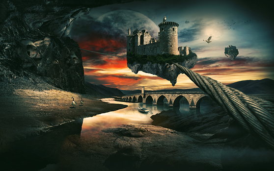
Create a Surreal Landscape Using Photo Manipulation
In this tutorial I will give you some tips on how to make a surreal photo manipulation. The most challenging of doing manipulation is usually finding the right balance between your imported elements. Also the color of your elements and dynamic lightning are important things to make the scene more ?believable? (not too realistic in this case).
I'll use a selection of stock images (free and paid) to build the composition. This is just my selection. If you don?t want to use paid images, there are also tons of free images on the internet to use to complete this tutorial.

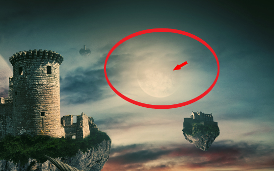 Also we need to add an extra light source. Create a big white radial gradient between the two castles and pull the opacity down to 40%. Place the planet image on top of the radial gradient. Create a layer mask and remove the right top of the planet with a soft brush. After that desaturate the image and give it a ?soft light? blending mode with a 70% opacity.
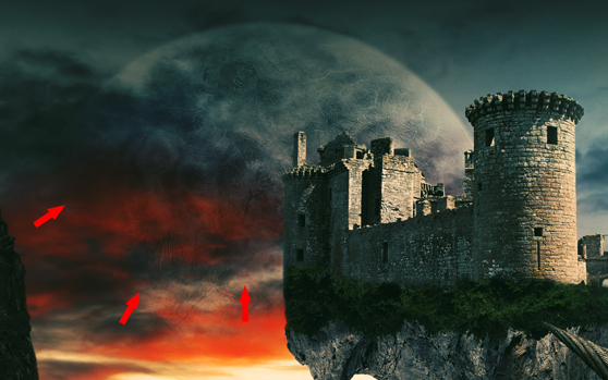 Now use the same routine by adding the big planet. Place the image on your canvas. Create a layer mask on your image layer and use a soft brush to remove the lower and left side of the planet. Also desaturate / soft light and set your opacity to 70%.
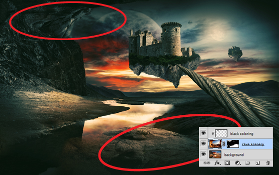 It really about spatial awareness and what works best for you in the landscape. In the layer picture you can view the parts I masked from the cave image to achieve this.
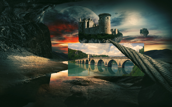 Don?t pen-tool the bridge image out completely. Keep some of the water parts under the bridge in tact and try to blend them together with the water which is in the background. Duplicate the bridge and give the top layer a ?multiply? blending mode of 70%
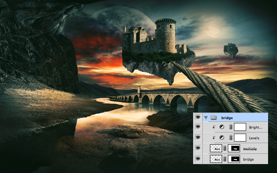 Use the folowing settings to change to color of the bridge and clip them to the top layer of the bridge
Brightness / contrast:
Brightness: 2
Contrast: 20
Levels:
54 / 1,00 / 255
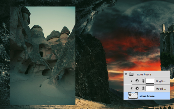 Remove the sky from the image and try to blend in the image into the background with a soft brush on a layer mask. Now duplicate the layer and set the blending mode to ?overlay?. This gives the image a little more contrast.
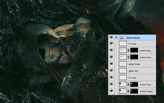 I added some hi-lites to some parts of the rock to add contrast and depth. To add hi-lites, you simple put a layer on top of your image and use a white brush (50%) with ?overlay? blend mode.

Stock images used:
Rock Landscape Bridge Cave Wooden Boat Hawk Castle Castle 2 Castle 3 Birds Stone House Rope Planet Wegraphics material used Noise Effect TexturesPreview:

Step 1
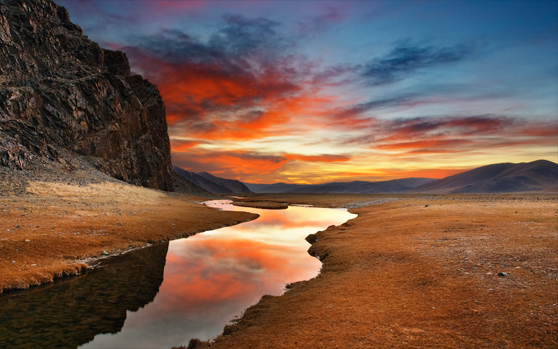
Start out with opening the landscape image. I used a canvas of 3000 px width with a resolution of 300 dpi. Always try to work on a big canvas with high-resolution images. This gives you more freedom on scaling your images at a later stage.
Step 2
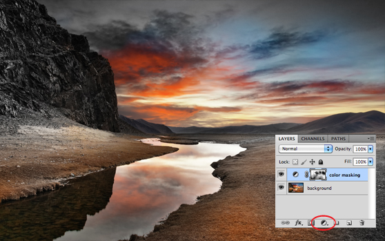
This already is a beautiful heavily colored image but I want choose my own color placement. Place a black and white adjustment layer on top of the background image. The image will now be full black and white. The next thing to do is adding a layer mask to the adjustment layer. After that take a big soft brush (60%) and brush the spots you want to have color.
Step 3
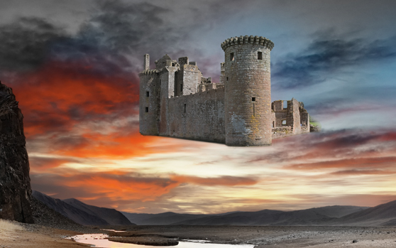
We continue by adding the main image from the composition; the floating castle. Place the image on your canvas, scale it and use your pentool to cut-out everything except the castle. Add a mask to the layer so you can always change or adjust your selection later.
Step 4
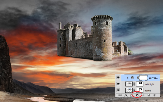
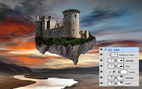
The castle looks pretty plain without too much contrast. Let?s add some more depth to the image. Duplicate the image, desaturate the top image and set the blending mode to ?soft light?. On top of the duplicated image you can add a ?curves? adjustment layer. Play round with the curve until you are satisfied. Don?t forget to clip the adjustment layer to the two layers below them. When you do that it will only affect those layers and not your whole image.
Step 5
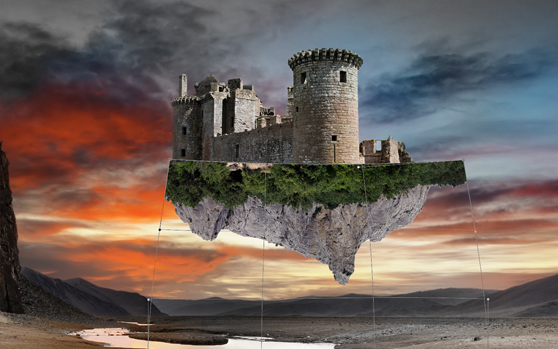
Use the mountain image to place under the castle. Cut out the sky and use your warp-tool (edit -> transform -> warp) to position the rock around the castle as shown in the image.
Step 6
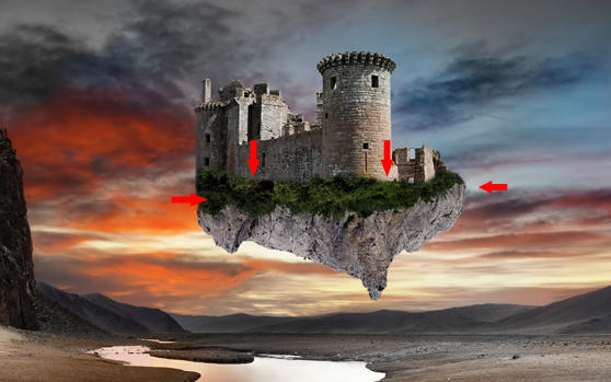
When the rock is place on top of the castle layer, it?s time to blend them together. Create a layer mask on the layer and use a soft brush (80%) to remove small piece of the top and sides of the rock image.
Step 7
To finalize the floating castle image for now, you need to also duplicate the rock image, desaturate it and set the blending mode to ?soft light?. To add even more depth / shadow to the rock you can add a clipping mask on top of the rock and use a soft black brush to darken certain spots.
Step 8
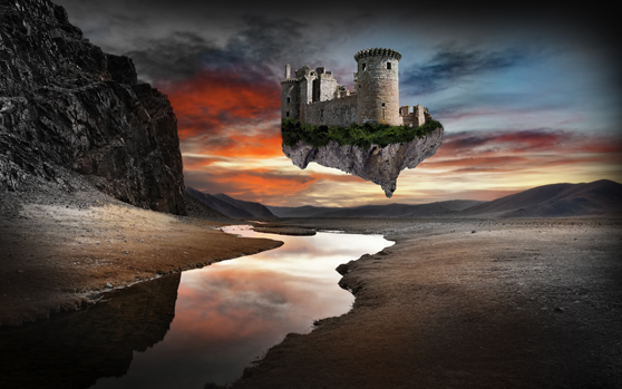
To add some more focus to your image you can add an inner shadow. I prefer to draw them myself so you have more control over it. Use a big soft black brush (80%) and make the corners of the image a bit darker.
Step 9
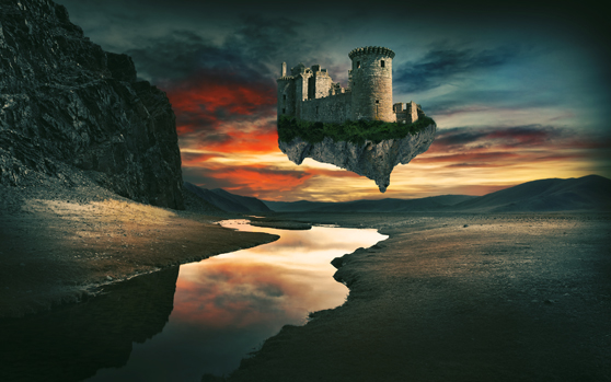
To give the scene a more ?dreamy? and ?warm? look you need to make some color adjustments. Create a new folder on top of all your layers and add the following adjustment layers. Selective color: Yellow: 0, 0, 0, +35 Neutrals: +25, 0, 0, 0 Blacks: +2, -3, 0, -4 Photo filter: 40% Color fill blue: color: #3ABDEE, set blending to soft light 30% Color fill yellow: color: #FFD200, set blending to multiply 15% Brightness / contrast: Brightness: 0 Contrast: 35
Step 10
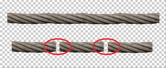
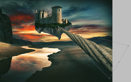
For making the rope I used this texture. As you can see the rope texture needs to be tiled cause it?s too short to use. Just remove the background from the texture and blend the images together. Use a soft brush to clear the hard edges when putting the images on top of one another.
Step 11
Place the tiled texture of the rope on your canvas and scale it / rotate it till it?s in the right place. After that use your perspective tool to give depth to the rope. To add some more realism on the depth you can blur the closest part of the rope a bit with your blur tool and draw a shadow under the rope. To add more contour to the rope you can always use the method used with the rock and the castle. (duplicate the image and blend).
Step 12
At this stage we?re going to add more castles. You can duplicate the one you made, but it?s more fun to add some extra different castles. Use the same technique used in the first castle scale it down and set the opacity of the image to 80%. That way it look less sharp and more in the distance then the main castle. You could also choose to blur it a bit. Also we need to add an extra light source. Create a big white radial gradient between the two castles and pull the opacity down to 40%. Place the planet image on top of the radial gradient. Create a layer mask and remove the right top of the planet with a soft brush. After that desaturate the image and give it a ?soft light? blending mode with a 70% opacity.
 Now use the same routine by adding the big planet. Place the image on your canvas. Create a layer mask on your image layer and use a soft brush to remove the lower and left side of the planet. Also desaturate / soft light and set your opacity to 70%.
Step 13
This step is pretty difficult and hard to explain. We are going to add an extra layer on top of the background to add some details to the landscape. Place the cave image on your canvas. Scale it till it?s just as big as your canvas. Now remove the background (air) from the image and only keep the part circled in red. Make sure this image is placed on top of you background so it shows up behind the elements you already added. It really about spatial awareness and what works best for you in the landscape. In the layer picture you can view the parts I masked from the cave image to achieve this.
Step 14
Place the image of the bridge on your canvas. Scale it down to the size as shown in the image. I choose a image of a bridge where the viewpoint already is good to use. If you have for example use a image of a bridge shot from the side you can use your perspective tool the change give it more depth. Don?t pen-tool the bridge image out completely. Keep some of the water parts under the bridge in tact and try to blend them together with the water which is in the background. Duplicate the bridge and give the top layer a ?multiply? blending mode of 70%
 Use the folowing settings to change to color of the bridge and clip them to the top layer of the bridge
Brightness / contrast:
Brightness: 2
Contrast: 20
Levels:
54 / 1,00 / 255
Step 15
As you can see in the steps before it?s recommendable to use adjustment layers to change the color of your elements. This way you work non-destructive and can always tweak the settings at a later stage. The last thing I want to explain is adding the ?houses? to the rock on the left. ?Place the image of the stone house on your canvas and give it the following adjustment layers: Brightness / contrast: Brightness: -3 Contrast: 5 Hue / Saturation: -12, -6, -12 Remove the sky from the image and try to blend in the image into the background with a soft brush on a layer mask. Now duplicate the layer and set the blending mode to ?overlay?. This gives the image a little more contrast.
 I added some hi-lites to some parts of the rock to add contrast and depth. To add hi-lites, you simple put a layer on top of your image and use a white brush (50%) with ?overlay? blend mode.
Step 16
The rest of building the composition is really up to your own imagination. To finalize the piece I added some extra elements that were placed with the various techniques explained in the tutorial. To give the image a even more vintage / dreamy look I added a noise effect texture. Place this texture on top of your image and set blend mode to ?soft light? (50%).Final Result
