Illustrator Quick Tip: Exporting Layered Files to Photoshop
Tutorialsby Nathan Brown
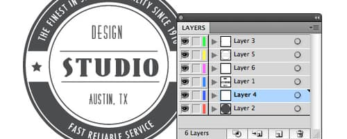
Most of the time when I transfer a vector from Illustrator to Photoshop, I use a simple copy and paste. But if you have a more complex vector with multiple layers, there's actually a much better way by exporting the file to a PSD. Lets take a look at how to do this.Lets start with a layered Illustra...
Read morePhotoshop Mastery: 25 MORE Techniques Every Designer Must Know
Tutorialsby Nathan Brown
As I stated at the beginning of our first Photoshop Mastery post, it seems that you never really stop learning Photoshop. There are always new tools and new techniques being shared. In that spirit of sharing, we decided to put together another 25 tips and techniques that every Photoshop designer mus...
Read moreIllustrator Quick Tip: Adjusting Line Width with Stroke Profiles
Tutorialsby Nathan Brown
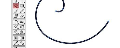
I'm constantly in search of adding hand drawn touches to vector illustrations. I recently stumbled across stroke profiles, which are new to Illustrator CS5. Using stroke profiles you can instantly adjust line weight from think to thin, giving it a hand drawn calligraphy appearance. Lets take a qu...
Read moreHow to Create a Watercolor Portrait in 3 Simple Steps
Tutorialsby Nathan Brown
Recently I began experimenting with a quick technique for creating a watercolor style portrait with some of the brushes that we've created here at WeGraphics. After some trial and error I've come up with a 3 step process that ends in a nice effect that works on just about any portrait. Here's a...
Read moreCreate a Dynamic Particle Explosion in Photoshop
Tutorialsby Nathan Brown
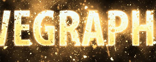
Lately, I've received several requests for tutorials on how to use some of our resources, or more specifically, how to achieve the look in the preview images. In this tutorial, I'm going to explain my process for using our latest freebie brush set to create a particle explosion. For this tutorial...
Read morePhotoshop Quick Tip: Enhancing Your Portraits with Textures
Tutorialsby Nathan Brown
One incredibly useful, but often overlooked uses for textures is to enhance portraits. Typically you might think of portraits as being soft in light and hues, but often just the addition of a textured overlay can punch the colors and contrast in very interesting ways. Lets take a quick look at some ...
Read moreHow to Create an Easy Dispersion Effect in Photoshop
Tutorialsby Nathan Brown
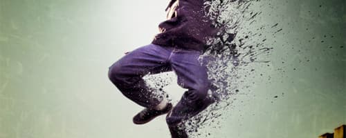
Giving a subject a dispersion or splatter effect can create an incredibly dynamic image. The best part is, it's very quick and easy to do with a few Photoshop brushes, but the end result can look very complex as if it took you hours to create. In this tutorial, I'm going to walk you through 3 easy s...
Read moreHow to Make a Metallic Transformers-Style Logo
Tutorialsby Nathan Brown
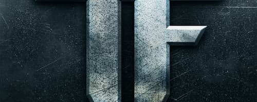
Yesterday I was browsing through the movie section at the local grocery store, and the logo graphic on this new Transformers movie box set caught my eye. It's just a simple TF, but the shape and the use of light and texture are striking. After studying it for a moment, I thought it would make an exc...
Read morePhotoshop Quick Tip: Create a Lomo Effect in 3 Simple Steps
Tutorialsby Nathan Brown
Unless you've been under a rock for the past 10 years then you're probably familiar with the look of Lomography or "Lomo" style photos. These photos typically feature unique coloring, high contrast, soft focus and dark vignettes. The movement was started in the early nineties when the founders were ...
Read moreIllustrator Quick Tip: How to Create Pop Art Using Live Trace
Tutorialsby Nathan Brown
If you're a fan of of Andy Warhol, then you're familiar with the screen printed look of pop art. Screen prints typically have a limited number of colors. Those colors are specifically chosen to represent shadows, highlights and midtones. Pop art is typically very bright and colorful which makes it v...
Read moreCreate a Dramatic Film Poster in 5 Minutes Using Photoshop
Tutorialsby Nathan Brown
Designing a film poster is pure fun. There's no question about it. It's one of those projects that you look forward to as a designer. Designing a film poster can also be incredibly fast and easy... Given the right reference photos and subject matter, a stunning poster can be created in minutes. In t...
Read morePhotoshop Quick Tip: Create a Dragan Style Portrait Effect in 5 Steps
Tutorialsby Nathan Brown
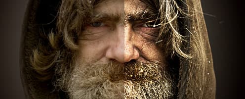
If you're a photo buff of any level, you've most likely heard of or seen the amazing work of Andrzej Dragan. His portraits have a very high contrast and color style all their own. The effect is stunning and eye catching. It reveals a lot about the subject that the naked eye doesn't get to see. A sim...
Read moreGet the newest resources
Sign up for our mailing list and get new resources sent to your inbox
