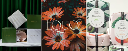
The Hero Image: 2019's Trends and Bests
Use a hero image to make a powerful first impression and give users an introduction to your company.
My Image, My Hero
The year of 2018 has come and gone and we’re well into 2019. And just like the seasons change, design trends change.
Today we’re looking at Hero Images and the best examples of them from this year so far. Then we’ll delve right in to some of the best themes for featuring your own hero image.
Why a Hero Image?
A hero image is the header or banner on a website that works as a visual message. In most cases, hero images are a full-sized photographs that cover the top of the page. Usually, text will be placed over the picture, though buttons are optional.
Your hero image should tell viewers what your company does at first sight, giving a clear introduction to your brand. More importantly, hero images let viewers know why they should stay on your page.
If you want to create a bold statement on your website, hero images are a great way to start. The hybrid of design and marketing will capture attention and start telling the story of your company.
What are Big Brands Doing?
Your hero image will be entirely your own, but sometimes it helps to get a little inspiration from the greats. Because hero images are so popular these days, there are lots of examples of how they can be used effectively.
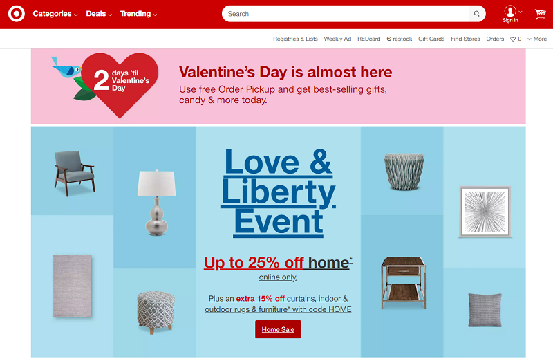
Below you’ll find several examples of how the big brands are using hero images to grab viewers’ attention and create a seamless brand experience.


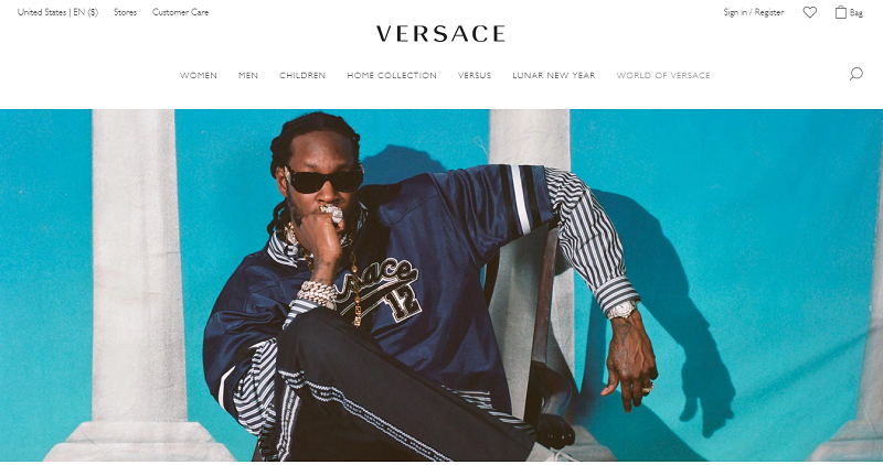


The Power of Blank Space
Just like images can be powerful, empty space can also play a huge role in design. Blank space is any space that can be glanced over without any part of a message being missed.
There are several benefits to using blank space. The first is that by being inconspicuous, the empty area naturally draws attention towards other parts of the page. The prioritizing of different design elements will put them at the forefront of viewers focus.
Blank space also makes it easier for people visiting your page to read important text, like your navigation tabs or your calls to action. Another benefit is that white space just makes a design feel purposeful and deliberate.
When you combine hero images with the power of blank space, you are left with a truly potent introduction to your website.
Check out these amazing examples of blank space in hero images.




Themes to Showcase a Hero Image
Hopefully after all the hero image inspiration above, you’re ready to create your own. Most website themes include hero image options, but not all are created equal.
Here are 11 free and premium examples of stunning themes you can use to bring the power of the hero image to your website. While all use hero images, some also utilize the white space to add some extra oomph to the design.
Spectral - Free

Forty - Free

Rosa - $75

Aerial – Free

Paradigm Shift – Free

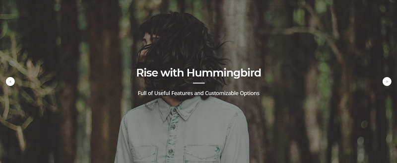
Hummingbird - $49
Massively – Free

Dimension – Free

Berry - $49

Solid State – Free

Sweety - $14


