
The Best Music Logos of the Year
Logo Inspiration for Every Music Lover
Our best music logos and design inspirations will spark your creativity for your next music-themed project.
Today’s inspiration roundup is a special one.
Music and design are two sides of the same coin. One is all about pushing boundaries and creating connections through sound. And the other does the same thing, but visually.
It makes sense that some of the most creative logo designs were spurred by music.
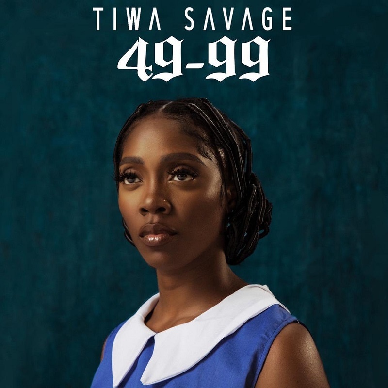
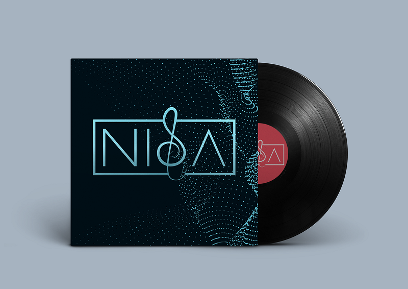
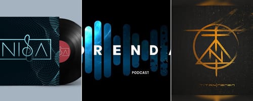
In today’s inspirational roundup, we’ll be looking at the best music logos of 2019. We’re talking record labels, band logos, and album covers. Some of these will be fake brands created by designers on a whim. Some will be updated versions of older logos. All of them have been inspired by music or musical imagery in some form.
However, before we get to some stunning inspiration, let’s take a look at what shouldn’t be done when it comes to music design.
Design Elements to Avoid in Music Logos
We’ve said this before and we’ll say it again: Design is Subjective.
What works for one person may not work for another. However, that doesn’t keep designers from trying their darndest to appeal to the largest part of their target audience.
Design, especially branding, is a constantly changing thing. Designers are always reaching and pushing the boundaries, creating new and exciting trends. And with all this change, some designs can fall behind, leaving them looking antiquated and unprofessional.
There are a few things designers can keep in mind when it comes to design that will help take their logos to the next level.
Watch Font Choice

Font preferences are an ever changing thing. However, there are some fonts that will always look a bit out of place when it comes to music logos. With just a few simple changes, a logo or badge that looks old and amateurish can be transformed into a classic, yet modern, design.
More and more, we’re seeing fonts that are art deco inspired. More clean lines and sharp edges.
Integrate Musical Elements Carefully

It makes sense in a music logo to take an aspect of music, like notes or clefs, and include it in the design. However, if this is done in a clunky manner, a music logo can end up looking more awkward than inspiring. When using musical elements in a design, be careful. In today’s best music logos, we’re seeing musical elements added in a much more subtle way than in past years.

Use Color Deliberately

Music logos of 2019 have been moving away from color. There will still be those bright, 90’s inspired logos (one of which you'll see below), but they’re rare and are used for very specific brands. Using color is not a bad thing, but it should be done sparingly and with extreme deliberation.
Keep Things Readable

Established music logos can get away with being less legible. However, for new bands or labels, it is very important for readers, or in this case listeners, to be able to know what they’re looking at. If a band name isn’t clear, why would someone spend their time on it?
Remember Less is More

Over the years, the art of simplicity has grown in popularity. When there’s too much going on in a design, the eye gets overwhelmed. Instead of connecting all the elements in a design together in one quick sweep, viewers are more likely to see nothing and get overwhelmed.
Simplicity is bliss, not just in life but in design.
Music Logo Inspiration for 2019
Now that we know what to avoid when it comes to music design, let’s take a look at how the professionals have done things well. These music logos are some of the best of the year, whether they’re updates of classic logos or dream designs for imaginary bands.
Be inspired and enjoy!


More from Inspiration
The Best Music Logos of the Year
Inspirationby Bridgette Mabuto
Our best music logos and design inspirations will spark your creativity for your next music-themed project.
Read more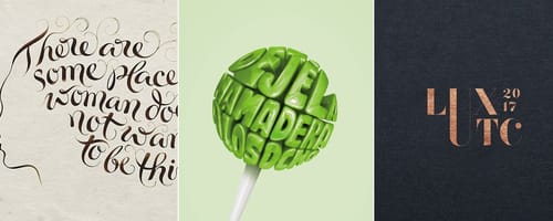
5 Big Rules of Typography, and Examples of Designers Breaking Them
Inspirationby Bridgette Mabuto
These five typography rules provide guidelines to make using different fonts easier and more effective, resulting in powerful, beautiful designs.
Read more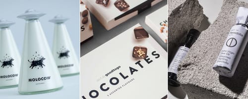
Product Packaging — Gorgeous Inspiration, and Mockups to Match
Inspirationby Bridgette Mabuto
Product packaging draws attention and sells by creatively and uniquely setting that product or brand apart.
Read more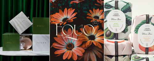
Fancy Fonts that People Love
Inspirationby Bridgette Mabuto
Fancy fonts are the perfect way of making a big impression and grabbing an audiences attention.
Read more