Summer Music Festival Poster Round-Up
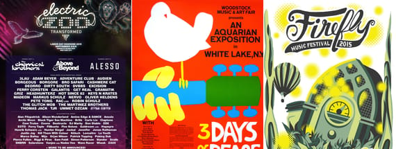
There are dozens of major outdoor festivals held throughout the summer months, each seeking to catch the eye of people with limited time and money. Even in a digital age, the classic one-sheet concert poster - like the iconic Woodstock poster below - remains a design staple. A well-designed poster is both functional and artistic and seeks to present logististical information in a visually captivating way.

A successful festival poster must overcome a few design challenges. First, the design must accommodate information about the lineup and location, which normally is best presented as text. Given that a festival can range anywhere from two to five days, a designer must be creative in presenting the text without it dominating the design. One the other hand, text must be big and clear enough to be readable. On top of all that, the poster should be creative, visually captivating and unique.
Made in America - Design Complementing Text

This year?s poster for Made in America is incredibly successful, beyond my own personal bias towards the great city of Philadelphia. The color scheme is simple red, white and blue, which fits perfectly with the festival?s patriotic theme and location. The blue is tinted darker than the other colors, letting the red and white really stick out. Budweiser, the primary sponsor of the event, uses a well-known red and white scheme in its branding. There is no need for any mention of Budweiser other than the small logo at the top of the poster because the colors alone successfully and subtly associates Made in America with Budweiser
A logo formed from a stylized liberty bell dominates more than half of the poster. The bell is surrounded by large, strong font reminiscent of a varsity jacket. The design works as visual shorthand for ?Philadelphia? because of its close association with the city. As a result, the design saves valuable space for other information best expressed as text, such as the lineup which takes up the bottom portion of the poster. While smaller acts are harder to read, and the forward slash separating artists is a little visually cluttered, the poster successfully uses images and color to convey important information in a visually creative way.
Electric Zoo - Creating a Unified Brand Aesthetic

Also dominating Labor Day Weekend headlines is Electric Zoo. Taking place on Randall?s Island in New York City, this is a major event for electronic dance music on the East Coast.
In terms of organizing its content, the Electric Zoo poster is almost and inversion of Made in America. A massive list of acts and artists dominates most of the page, with the logo and other information pushed to a much smaller block at the top. This suggests that Electric Zoo promoters believe that what is most important to their audience is the variety and breadth of musical acts. The bold, sans-serif font is very large even for the smaller acts, and the choice to list artists alphabetically suggests that this poster cares a great deal about readability. In contrast to the way that Made in America boldly communicated the fact that it takes place in Philadelphia, one could quickly scan the Electric Zoo poster and notice their favorite musician before they realize where Electric Zoo is held.
However, this poster also successfully creates an aesthetic fitting an electronic music festival. The logo uses two heavily stylized fonts suggesting wires and digital screens, and the motif of a circuit board is repeated below the logo and in the background. Coupled with the ?electric? animals traced in light and slowly dissolving into pixels, this poster creates a mood and aesthetic around fantasy and technology.
Coachella - The Importance of Place

The annual poster for Coachella, which takes place in early April of each year, falls somewhere between Made in America and Electric Zoo in terms of design. Originally a simple music festival, Coachella has grown to become a major event for culture and industry. The design of the poster each year has remained remarkably consistent as the scope and the meaning behind the Coachella brand has evolved.
Named for its setting in the Coachella Valley, much of the festival?s identity comes from its location in the mountains east of Los Angeles. For many years, the Coachella poster has essentially been an image of the natural landscape of the Valley with text on top, and this year continues that tradition. The contrast between the dry mountains and the lushness of the field below suggests an oasis, conjuring up ideas of Coachella as an almost magical place. The beauty of the night sky also serves as a perfect background to present the astonishingly large list of musical acts spread across three days. The stars add texture and variety to the background without taking away from readability. Image and text work together to cement the idea that Coachella is a destination worth traveling to, both for the quality of the musical acts and for the beauty of its setting.
Governors Ball - Overcoming the Challenge of Large Line-ups

Governors Ball, another popular festival in New York City, commissioned three different posters this year - one for each day of the festival. Because the incredibly large list of performers is split up across three days, each individual poster has more room to focus on design and aesthetics. The poster above, which was for the first day of the festival, features a really interesting cartoon-like hand-drawn style, using a limited color palette reminiscent of comics in Sunday newspapers.
FireFly Music Festival - Crowd Sourced Designs


Firefly Music Festival, a massive outdoor camping/music extravaganza, chose their 2015 poster from fan submissions. The image on the left is the poster chosen by the festival organizers, but the poster on the right was also honored as a ?Fan Favorite?. Both do a great job utilizing the yellow-green glow of the firefly for which the festival is named.
Tell Us What You Think
Do you have other examples of great poster designs? Tell us about your favorites and what you think makes them great in the comments.


