Social Media Design Inspiration — Gorgeous Feeds and Posts
Inspiration for Your Feeds
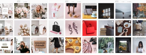
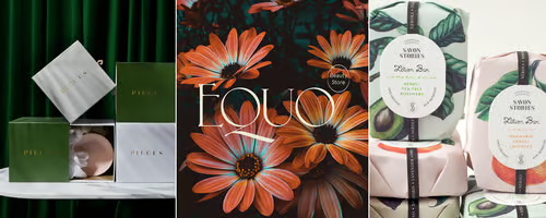
Use these gorgeous social media feeds for inspiration on how to use color, design, and typography to your benefit.
For today’s inspiration roundup, we wanted to focus on social media and several creators who have gone above and beyond in their designs.
Advice is rampant on how to craft the best and most engaging social media posts. And with good reason. Most businesses and personalities do the majority of their communication with their audiences on social media. So the way those messages are crafted is extremely important.
We could go into all the details of how to best use social media, but for this roundup we’re going to focus on three: Simplicity, Color, and Typography. By using these three elements deliberately, social media experts have been able to resonate with larger audiences and grow their businesses. In fact, more and more companies are following their lead and working towards creating better social media content.
And the results of their efforts can be absolutely stunning.
Simple Designs
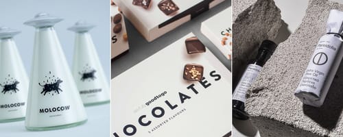
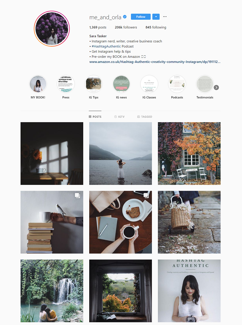
No matter what the target audience, there is an innate draw to simplicity. By taking design back to the bare bones and showcasing ideas, images, and concepts that are relatable, content resonates with more people.
And the same is true when it comes to social media design. Whether it’s a quote or a picture, the simpler the better. If an account is all about London, the content should simply be about London. Shoe companies should show their shoes. And coffee companies should focus on coffee.
It’s not just about simplicity in content, though. Simplicity can also be applied to the design of that content. Simple backgrounds, focused images, even black and white photography. It all combines to make simple, easy to consume content.
And simplicity also makes it a lot easier for designers to produce their content, resulting in more posts in less time.



Color Combinations
If a brand is already associated with a certain color or tone, then what better way to communicate with an audience on social media?
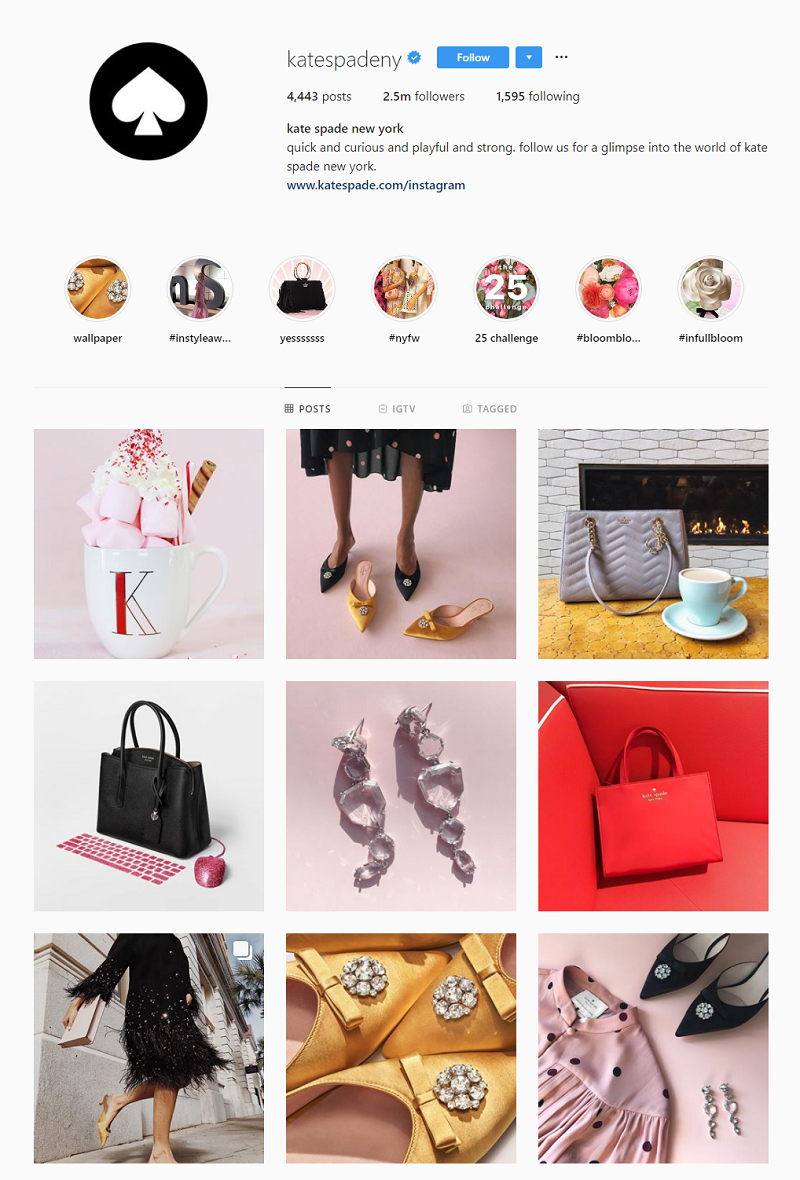
Color is one of the most basic aspects of design and is vitally important to the reaction and recognition to social media content. Keeping content in the same theme or with coordinating colors creates a connection with viewers. Plus, it can be absolutely stunning.
The key is, however, finding the right combination of colors. There’s always the danger of becoming too monochrome, which is why the best social media feeds have variety and are constantly finding creative ways to use color combinations.
Pops of a certain color. Tints of another color. A combination of colors that have the same vibrancy. All of these are options when it comes to creating a consistent color combination for social media design.




Beautiful Typography
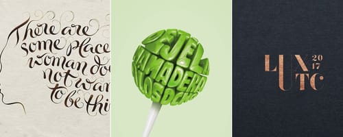
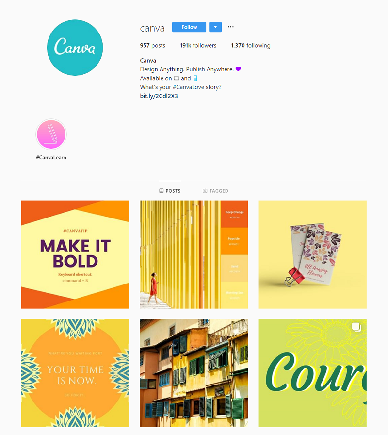
Typography might not be at the top of everyone’s list when it comes to social media design inspiration. However, the best designers know that it’s not just about the message, it’s how that message is presented that matters.
Fonts have personality, which is why it’s important to pick the right one. A company trying to be relatable and fun will have a different font than one trying to spread a serious message. The balance of these different typographies can be difficult, but also a lot of fun.
And typography isn’t all about looks, either. A font could be beautiful, but if it can’t be read in passing, it won’t work well on social media. And typefaces used for headlines will look different than those used for the body of a work. All these little variations need to be taken into account when considering typography. Finding a font that can be used consistently throughout social media will take some work. Thankfully, there are true artists out there who have crafted inspirational typography options.


