"Product Placement" Inspiration: Solid Color Product Backgrounds
Inspiring Product Backgrounds
Neutral, bright, or primary solid backgrounds can perfectly show off all the best qualities of products when used properly.
Today’s inspiration roundup is all about product backgrounds. When it comes to showing off a product and creating a solid brand, the colors used in product placement are extremely important.
Product backgrounds should accentuate the item being showcased. They should tell a story while simultaneously drawing customer’s eyes to product.
More and more, product placements are taking place on ‘natural’ backgrounds, creating a more lifestyle approach. However, there is something so clean and stunning about solid color backgrounds, which are what we’re going to take a look at today.
Light
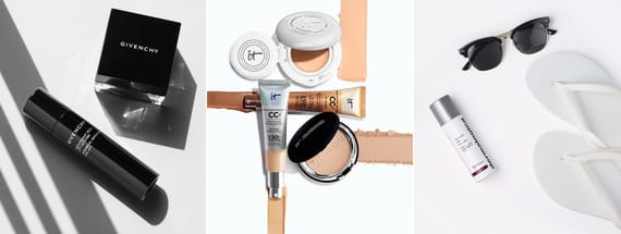
We won’t get far in a conversation about product backgrounds without discussing the classic light or white option.
A white background is the perfect way to highlight a product and draw attention to the details. Lighter backgrounds also allow for a consistency that pleases even the most picky of photo editors.
While you’ll see a light background used for a variety of different products, they work very well for cosmetics and other personal care items. In the fashion industry, white backgrounds are ideal for showing off details, especially of darker and patterned clothing items.
So, white may be considered basic when it comes to solid color product backgrounds, but basic is just another word for classic.


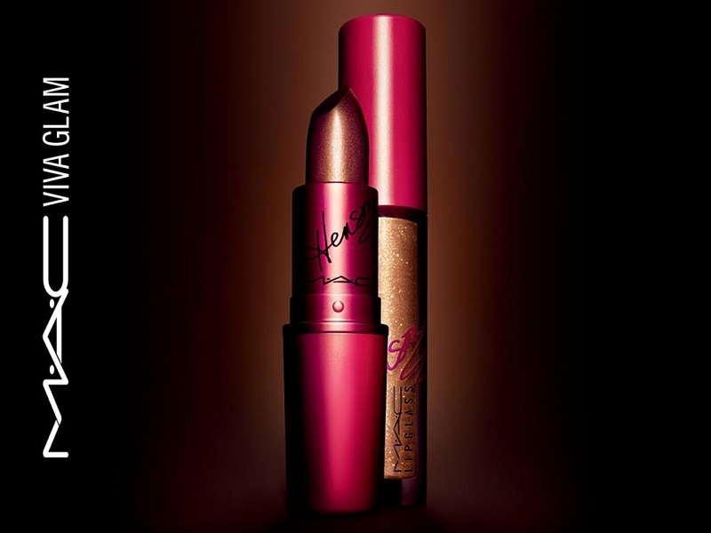
Dark
Like light backgrounds, dark solid color backgrounds allow for a degree of consistency. However, while light backgrounds exude bright cheerfulness, dark backgrounds showcase luxury.
There’s something about a dark background that makes a product seem more shiny, which is why metals are frequently placed on solid black backgrounds. Black also makes colors pop more, so there really is no way to go wrong with a darker color when it comes to product placement.
Because darker backgrounds are perfect for narrowing in focus and making a product seem more expensive, you’ll often see them used for items like jewelry, watches, and electronics.


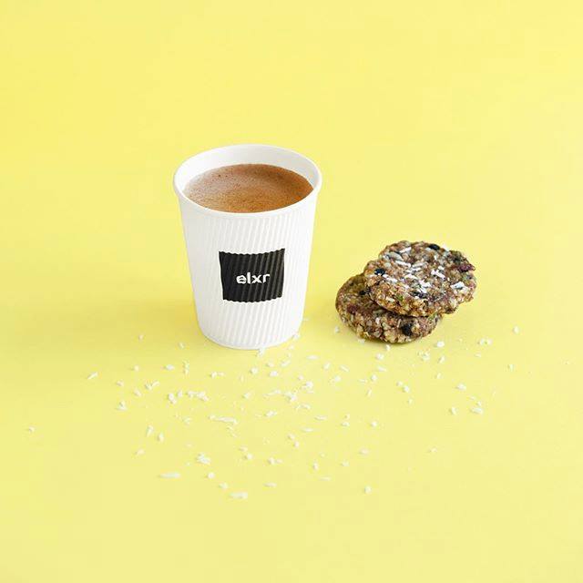
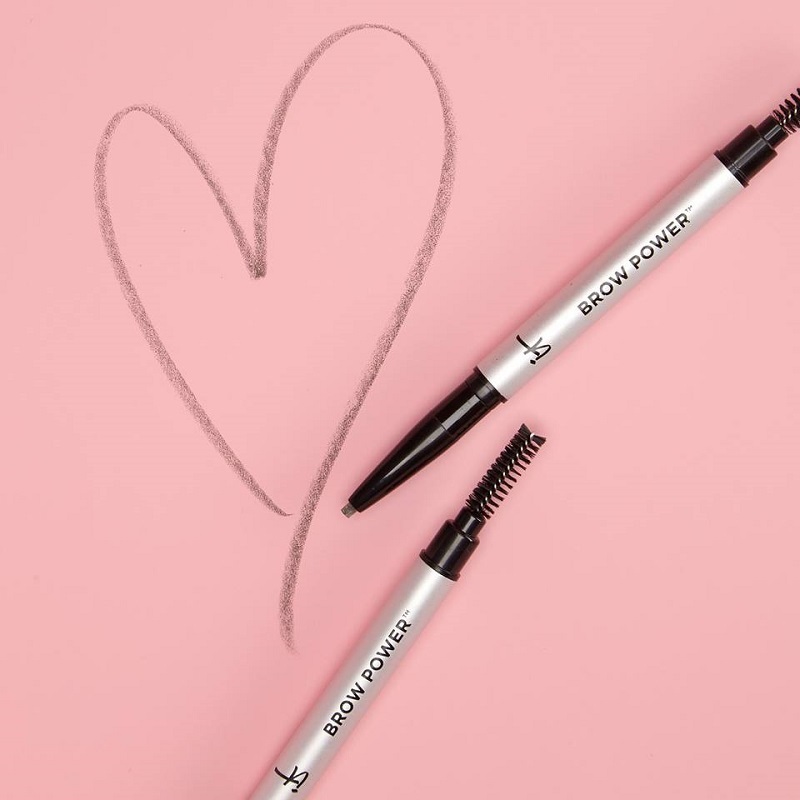
Bright and Bold
You don’t have to keep things in black and white when it comes to product placement. In fact, more and more these days, companies are opting to use vibrant, electric colors to complement their products.
However, you have to be careful with brighter colors, because they can be overwhelming at times. Using coordinating shades can help tie a product together with its background. The careful use of shadows in these brighter colors can also add a little dimension to an otherwise risky creative move.
One thing bright colors have going for them is they definitely grab attention of viewers. And in a world where most products are seen in passing as people scroll down their feed, jumping out and grabbing attention is extremely important.


Solid Textures and Tones
Even when using solid colors for product placement photography, there’s no need to be boring. By adding simple textures or different tones, a solid background can be completely transformed.
When a product is already clean and smooth, putting it on a textured background adds enough variety to the scene to draw the eyes.
Another option in product placement is to use two solid tones together. The split between the colors adds a dynamic to the image, making an otherwise flat image jump out at the viewer.


More from Inspiration

The Best Music Logos of the Year
Inspirationby Bridgette Mabuto
Our best music logos and design inspirations will spark your creativity for your next music-themed project.
Read more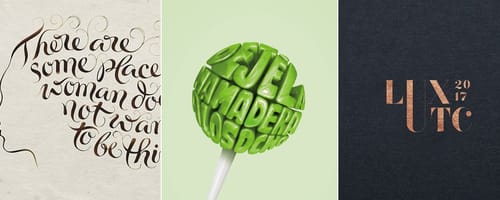
5 Big Rules of Typography, and Examples of Designers Breaking Them
Inspirationby Bridgette Mabuto
These five typography rules provide guidelines to make using different fonts easier and more effective, resulting in powerful, beautiful designs.
Read more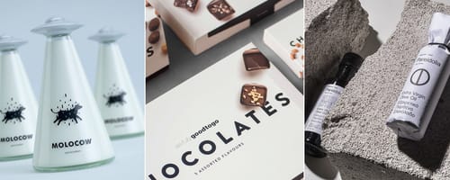
Product Packaging — Gorgeous Inspiration, and Mockups to Match
Inspirationby Bridgette Mabuto
Product packaging draws attention and sells by creatively and uniquely setting that product or brand apart.
Read more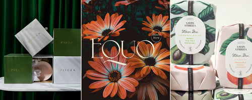
Fancy Fonts that People Love
Inspirationby Bridgette Mabuto
Fancy fonts are the perfect way of making a big impression and grabbing an audiences attention.
Read more