PNG Masking: How to Dynamically Shape Any Image on Your Website
Since the release of Roundfolio, I've received a lot of requests in regards to the round gallery images and how they were created. The round thumbnail is really just one transparent PNG image overlaying each thumbnail in the gallery. You typically see PNG images used as subtle shadows or image borders, but with Roundfolio we took it a step further and created a full transparent mask to change the shape of the thumbs. Let's take a closer look at how this is done, and a bit of HTML/CSS to make it all work.
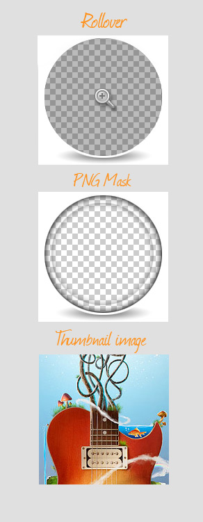 The first two images will need to be saved as transparent PNG files. To do this in PS, select ( File | Save for Web and Devices ) from the new window choose "PNG-24" from the drop down in the upper right corner. Then make sure that "Transparency" is checked. Click to save in your website images directory.
Each of these images should be the same width and height, in this case a 187px square. I saved my images as "gallery-thumb.jpg" for the thumbnail, "gallery-shadow.png" for the transparent mask, and "gallery-rollover.png" for the rollover image.
 As you can imagine this creates a pretty cool effect.
Creating the Separate Layers in Photoshop
In Photoshop we can create the layers we need that will later overlap via CSS. See the example below to understand the visual hierarchy. The first two images will need to be saved as transparent PNG files. To do this in PS, select ( File | Save for Web and Devices ) from the new window choose "PNG-24" from the drop down in the upper right corner. Then make sure that "Transparency" is checked. Click to save in your website images directory.
Each of these images should be the same width and height, in this case a 187px square. I saved my images as "gallery-thumb.jpg" for the thumbnail, "gallery-shadow.png" for the transparent mask, and "gallery-rollover.png" for the rollover image.
Now let's take a look at the HTML
<a href="images/gallery-full.jpg" class="item">
<span class="rollover"></span>
<span class="gallery-shadow"></span>
<img src="images/gallery-thumb.jpg"/>
</a>
You'll notice we have a typical href tag, with a class of "item", linking our thumbnail image to it's counterpart, the full image file. What's different about this block of code is that there are other elements between the open and closing href tags. The two span tags will house our mask and rollover state.
Let's peek at the CSS to see how it works.
a.item{
position:relative;
display:block;
height:187px;
width:187px;
float:left;
}
a.item .gallery-shadow{
display:block;
position:absolute;
top:0%;
left:0%;
width:187px;
height:187px;
background:url(images/gallery-shadow.png);
}
a.item .rollover{
display:block;
position:absolute;
top:0%;
left:0%;
width:187px;
height:187px;
background:url(images/gallery-rollover.png);
}
This CSS is pretty straight forward. Basically we are setting our span elements to "block" giving them a matching width and height and setting their positions to match as well.
I'm using a small bit of Javascript in the header to control the rollover. Let's take a quick look.
<script type="text/javascript">
	$(document).ready(function(){
	$(".rollover").css({'opacity':'0'});
	$('#gallery a.item').hover(
		function() {
		$(this).find('.rollover').stop().fadeTo(500, 1);
		  },
		   function() {
		   $(this).find('.rollover').stop().fadeTo(500, 0);
		  }
		 )
		});
	</script>
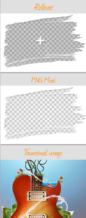
Now that you've seen how easy it is to recreate the effect used in Roundfolio, let's take it a step further. Let's try using a brush stroke as our mask image. I'm using a brush from the Dry Paint Strokes brush set here at WeGraphics.
Here are my three images laid out in Photoshop. Remember these images have to be the exact same width and height.
 As you can imagine this creates a pretty cool effect.
