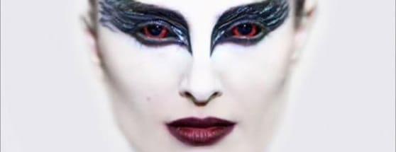
Outlets of Inspiration: In Search of Apotheosis
Every designer has a different way of creating a piece of digital art, web design, or typography. There are many things that go into consideration from first envisioning the design to gathering resources and inspiration to selecting the tools to use for the project and finally executing the work.
There are several external elements that affect the creation of a design from the current emotional state and motivation level of the designer, to other artist influences, and many other factors.
In my work flow, I like to approach my ideas as organically as I can so my final design doesn't come off as being forced or not unique. BUT WAIT!
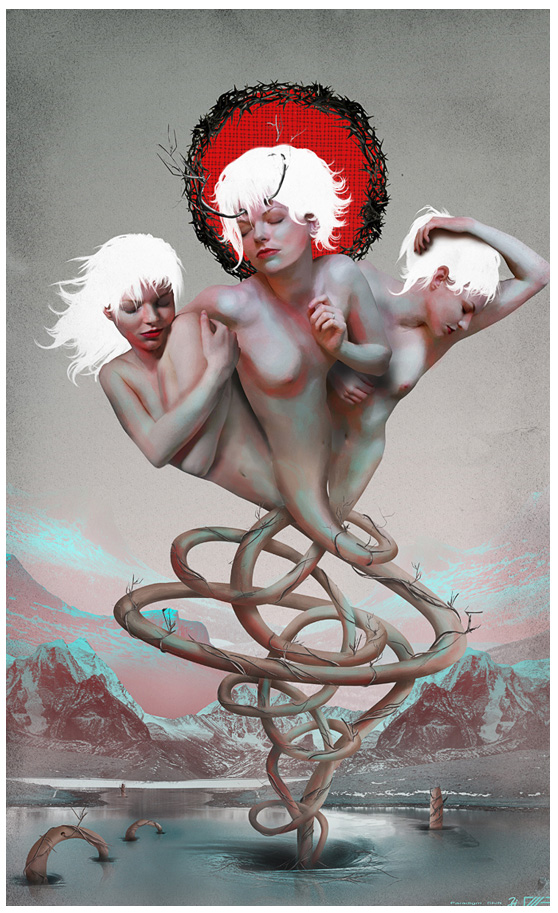 The first thing that came to my mind was the concept which I developed from a single word ?Apotheosis?.
The idea to mind while watching an episode of the TV Series ?Caprica?, in which the plot involved Apotheosis as a way to create a virtual heaven where everyone could exist forever.
The way it was used made me curious and I researched more about the true meaning of the word in culture, as well as, in art. It all came to one conclusion, ?Apotheosis is the exaltation of something to a divine level?. With all that research and information, I was ready to start building a concept and finally a sketch of the image I wanted to create.
As you can see, the inspiration for the idea first came from a TV show, which developed from a single word and it's meaning. Sometimes inspiration can come from music, a movie, a book or a feeling. It changes depending of my mood and my interest of the subject.
For this piece, I imagined some sort of female shape in the middle of the sky with some sort of sun/halo on her back representing her ascention to divinity.
Starting with a vague idea in my mind, I began thinking about the style, textures, mood and colour palette that were going to be used for the image.
I really wanted to step out of my confort zone and use colors that I've never used in my work. They needed to be soft with a combination of warm and cold colors to illustrate an ethereal mood. Browsing the web for some inspiration, I found the beautiful artwork of Sam Wolfe Conelly, and I was really intrigued by the color palette he uses in most of his work. He uses various shades of pinks and beiges with dashes of blues reds and purples.
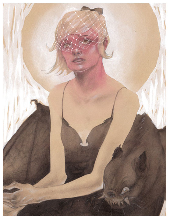 ?Strelka? by Sam Wolfe Conelly
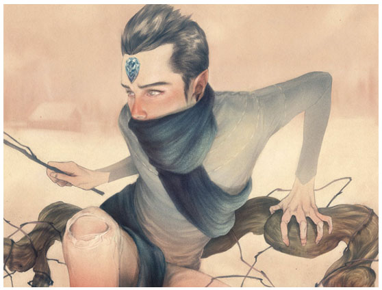 ?Jack Frost? by Sam Wolfe Conelly
Using his color palette as a guide, I selected the colors I wanted to predominate my piece.
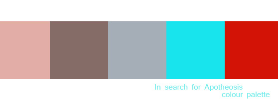 Then it was time to search for the main stock image which would be the focus of the piece. Browsing through female figure stocks photos, I found one that had visual appeal and a pose similar to what I first imagined.
One of the main struggles I had while composing the image was deciding wether I wanted to make a photorealistic manipulation, a surreal one or a more illustrated piece. Since I wanted to step out of my comfort zone, I decided I wanted some sort of mix between the three styles, and then I came across the work of Ruben Ireland.
I liked the way he mixed human forms with different styles of illustrated elements and I wanted to incorporate something like that in my work.
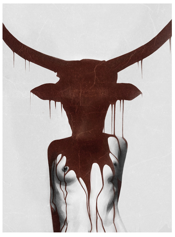 ?Taurus? by Ruben Ireland
This is how I cam up with the idea of the hair and the sun. As you can see on the finished artwork they have more of an illustrated look than the rest of the image.
Now that I had compiled all of my resources and research I was ready to sketch out my design in Photoshop.
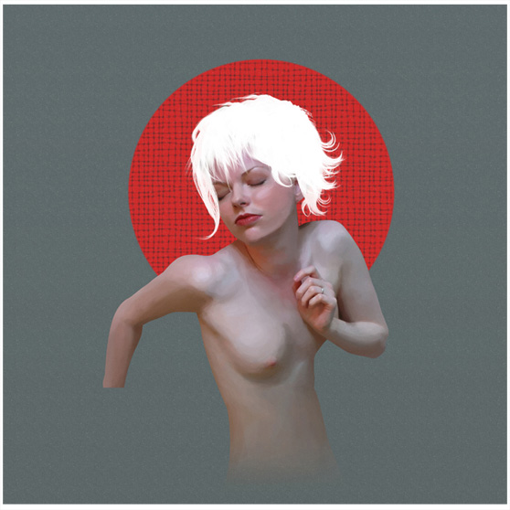 As I went further with the illustration, I added the mountains and the lake and reworked the sky. I needed to have an evironment where the story of this piece was going to happen. Then I included two other women to enhance my concept and have more impact on the overall image.
Another artist that really influenced the final outcome of this piece was Edith Lebeau. Edith's work influenced the way I stylized the three women with heavy brushstrokes textures on the skin and the use of branches as horns and other detailing around the bodies.
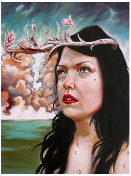 ?Hamadryad? by Edith Lebeau
Another subtle effect I noticed on Edith's works was the delicate red accents she gave on the shadows and blue accents to the highlights on her images. That's a little detail that I wanted to incorporate in my work to give a lot more depth and power to the main focal point.
Browsing through surreal style artwork I came up with the idea of the lower bodies of the three women. The idea was to morph them into tubular shapes and intertwine them between each other to represent chaos and the struggle of ascention to a final state divinity.
 ?Nereid? by Jerico Santander
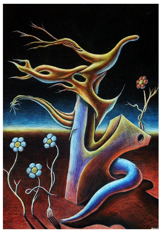 ?Fluttering Void?by McWgogs
As you can see there were many influences that came while making ?In search of Apotheosis? as well as a lot of experimentation based on my research and the results I was after. Some of my previous work had a big impact on the tecniques I used, as well as, the methodology like ?Savant? and more specifically ?On the coldest winter day?.
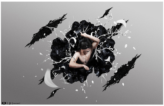 ?Savant?
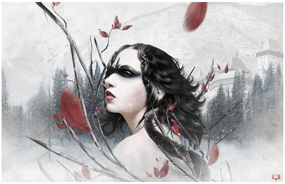 ?On the Coldest Winter Day?
This second one had a different approach in the way it was created. The concept came from the name of a song "On the coldest winter night" by a metal band called Kamelot. I wanted to illustrate a scene where a woman was all alone in a frozen forest, in the middle of a blizzard, trapped in branches with a very sad and nostalgic look on her face.
Since I had no visual references that time I started building up the image using only my concept but not really knowing where it would lead.
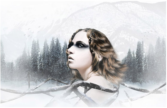 It was around the same time the trailer and first poster for the movie ?Black Swan? was released, and I was very intrigued with the colors used in the image.
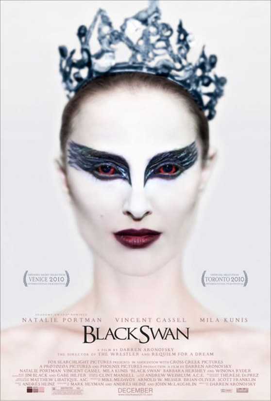 The reds contrasting with the whites and pinks were very appealing to me and I decided to incorporate that in my illustration, taking a more litteral approach in the way I stylized my design.
As you can see in these two examples, the process in which design work is created can change depending on different factors. It's very rare for a designer to follow an exact path in the creation of a piece, although the same methodology may be applied for every work, the experience changes as the design requires it.
What do I mean when I say ?organically??
You've probably heard this term before used by many designers and artists. What I mean when I say "organic" is I try to approach my work like a story. Having a general idea of the story I want to tell, and letting it grow organically through the design process, is the best way to create something fresh that will appeal to the audience. When it comes to design nothing is written in stone, and while having a plan helps a lot as a guide to finishing something, there are always parts of it that we may change or ignore as we go through our process. There is an uncertainty factor that comes into play and it's our job to figure out a way to make everything work out like we want. To illustrate what I mean, I'm going to give you a behind the scenes look at the creation of one of my most recent works called ?In Search of Apotheosis?. The first thing that came to my mind was the concept which I developed from a single word ?Apotheosis?.
The idea to mind while watching an episode of the TV Series ?Caprica?, in which the plot involved Apotheosis as a way to create a virtual heaven where everyone could exist forever.
The way it was used made me curious and I researched more about the true meaning of the word in culture, as well as, in art. It all came to one conclusion, ?Apotheosis is the exaltation of something to a divine level?. With all that research and information, I was ready to start building a concept and finally a sketch of the image I wanted to create.
As you can see, the inspiration for the idea first came from a TV show, which developed from a single word and it's meaning. Sometimes inspiration can come from music, a movie, a book or a feeling. It changes depending of my mood and my interest of the subject.
For this piece, I imagined some sort of female shape in the middle of the sky with some sort of sun/halo on her back representing her ascention to divinity.
Starting with a vague idea in my mind, I began thinking about the style, textures, mood and colour palette that were going to be used for the image.
I really wanted to step out of my confort zone and use colors that I've never used in my work. They needed to be soft with a combination of warm and cold colors to illustrate an ethereal mood. Browsing the web for some inspiration, I found the beautiful artwork of Sam Wolfe Conelly, and I was really intrigued by the color palette he uses in most of his work. He uses various shades of pinks and beiges with dashes of blues reds and purples.
 ?Strelka? by Sam Wolfe Conelly
 ?Jack Frost? by Sam Wolfe Conelly
Using his color palette as a guide, I selected the colors I wanted to predominate my piece.
 Then it was time to search for the main stock image which would be the focus of the piece. Browsing through female figure stocks photos, I found one that had visual appeal and a pose similar to what I first imagined.
One of the main struggles I had while composing the image was deciding wether I wanted to make a photorealistic manipulation, a surreal one or a more illustrated piece. Since I wanted to step out of my comfort zone, I decided I wanted some sort of mix between the three styles, and then I came across the work of Ruben Ireland.
I liked the way he mixed human forms with different styles of illustrated elements and I wanted to incorporate something like that in my work.
 ?Taurus? by Ruben Ireland
This is how I cam up with the idea of the hair and the sun. As you can see on the finished artwork they have more of an illustrated look than the rest of the image.
Now that I had compiled all of my resources and research I was ready to sketch out my design in Photoshop.
 As I went further with the illustration, I added the mountains and the lake and reworked the sky. I needed to have an evironment where the story of this piece was going to happen. Then I included two other women to enhance my concept and have more impact on the overall image.
Another artist that really influenced the final outcome of this piece was Edith Lebeau. Edith's work influenced the way I stylized the three women with heavy brushstrokes textures on the skin and the use of branches as horns and other detailing around the bodies.
 ?Hamadryad? by Edith Lebeau
Another subtle effect I noticed on Edith's works was the delicate red accents she gave on the shadows and blue accents to the highlights on her images. That's a little detail that I wanted to incorporate in my work to give a lot more depth and power to the main focal point.
Browsing through surreal style artwork I came up with the idea of the lower bodies of the three women. The idea was to morph them into tubular shapes and intertwine them between each other to represent chaos and the struggle of ascention to a final state divinity.
 ?Nereid? by Jerico Santander
 ?Fluttering Void?by McWgogs
As you can see there were many influences that came while making ?In search of Apotheosis? as well as a lot of experimentation based on my research and the results I was after. Some of my previous work had a big impact on the tecniques I used, as well as, the methodology like ?Savant? and more specifically ?On the coldest winter day?.
 ?Savant?
 ?On the Coldest Winter Day?
This second one had a different approach in the way it was created. The concept came from the name of a song "On the coldest winter night" by a metal band called Kamelot. I wanted to illustrate a scene where a woman was all alone in a frozen forest, in the middle of a blizzard, trapped in branches with a very sad and nostalgic look on her face.
Since I had no visual references that time I started building up the image using only my concept but not really knowing where it would lead.
 It was around the same time the trailer and first poster for the movie ?Black Swan? was released, and I was very intrigued with the colors used in the image.
 The reds contrasting with the whites and pinks were very appealing to me and I decided to incorporate that in my illustration, taking a more litteral approach in the way I stylized my design.
As you can see in these two examples, the process in which design work is created can change depending on different factors. It's very rare for a designer to follow an exact path in the creation of a piece, although the same methodology may be applied for every work, the experience changes as the design requires it.
