How to Turn Inspiration from Others into Personal Original Works
This is not an article on how to find inspiration. Everyone has his own sources when there's a lack of ideas. This is an article on how to turn inspiration that derives from others' digital projects into a new original piece. When you come accross talented designers works, do you spend days trying to achieve a similar result? If yes this post is for you. I want to show you a constructive practice to grow as designer.
Young designers are often in the habit of imitate others' works. This is not bad. Not at the very beginning. To have a reference point is fundamental when starting a career, or simply cultivate a passion. But insist in this street will drive the designer to face a series of problems:
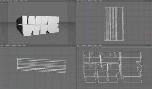
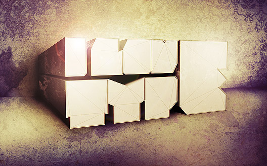 2 days ago I published a showcase of 30 amazing type treatments. This inspired me to create a poster focused on 3D typography. I had no idea of how to begin, so I started searching for typography related images. The first one that inspired me was Rebuild, created by Gomedia:
 Let's look at the image with attention. What could a young designer ask to himself after have seen this work? Maybe he would like to know what software has been used to create the text. He would like to learn how to create 3d type. He would start searching for tutorials on how to create 3D type. This is good, but not enough.
What is the first step to learn from the master? Observation. This goes beyond the technique. I can't learn the method they used to create this piece, even if experience can suggest me a method to achieve a similar result (methods can be learn with tutorials). You have to observe important details that make the difference.
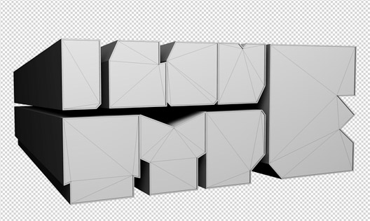 (I love type)
We will now repeat the same experiment with other works.
As you can notice from the following piece (Deadline realized by Rogier de Boevé) a grunge subtle background can help the text to stand out. Borders give to the work a canvas printed look. Background colors have a low saturation. This create a nice contrast with vivid 3D elements.
 After played for a while with layer styles and grunge brushes, I create my background:
 Take a look at Halifax by Nik Ainley
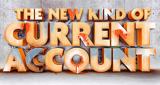 You can notice that the floor gives a realistic look to 3d text. Nik enhances his text with soft light effects. Also don't forget that where there's a 3d text with a wall, there shall be a shadow. With this in mind, here is how I modify my work:
 I'm creating a sort of room. At this point I have the impression there is something missing. In particular the wall shall be modified. This work created by Steve Goodin suggests me to realize decorative elements to cover the background. They make the background more pleasant without be distracting.
 You know better then me that inspiration can't derive only from web. Sometimes we need to go out from home breaking the umbilical cord that tie us to the computer. The following photo was made with my phone into a shop. My attention was attracted by the wall decorative motif.
 With the photo as a reference I'm able to sketch a nice baroque pattern that I vectorize in Illustrator and then import in Photoshop.
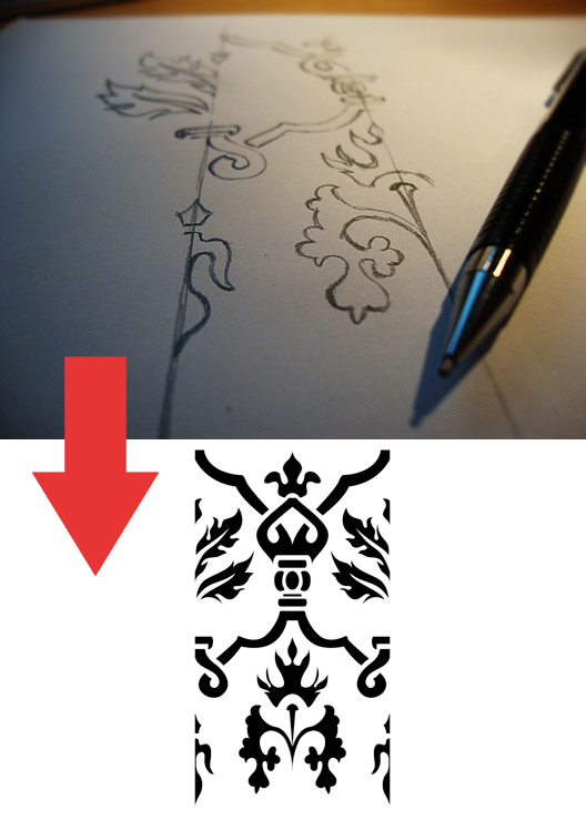 Here is where I place baroque decorations:

 From now go on is all about playing with colors and adjustment layers. It's surprising how these tools can give a totally new look to your images. Also I add nice details like the spider's web and the soft letters grunge effects. Here is the final result:


- Frustration - he/she wasn't be able to replicate the style of a more navigated designer.
- Lose of identity - he/she will spend weeks without working on his/her personal style.
- Lose of time - he/she will realize at the end that this is not the best street to follow.
Genius is one per cent inspiration and ninety-nine per cent perspiration.Thomas Edison
The Making of Type Grunge Poster
Premium members can download psd file of the poster at the end of the article (click on the image for a larger preview). 2 days ago I published a showcase of 30 amazing type treatments. This inspired me to create a poster focused on 3D typography. I had no idea of how to begin, so I started searching for typography related images. The first one that inspired me was Rebuild, created by Gomedia:
 Let's look at the image with attention. What could a young designer ask to himself after have seen this work? Maybe he would like to know what software has been used to create the text. He would like to learn how to create 3d type. He would start searching for tutorials on how to create 3D type. This is good, but not enough.
What is the first step to learn from the master? Observation. This goes beyond the technique. I can't learn the method they used to create this piece, even if experience can suggest me a method to achieve a similar result (methods can be learn with tutorials). You have to observe important details that make the difference.
What are the feature of this piece that I observed?
- If you create a dominant text effect, you don't need to add lots of details to the image>Next time I won't spend hourse adding hundreds of details>The importance of balance in graphic design
- 3D text rocks when the font of choice is very bold>Download bold fonts for next projects with 3d type
- 3D elements can be harmoniously combined with natural landscape>I could try to put 3d elements into water!
- Text effects give a nice result if I play with letters rotation>Next time I'll write something I'll try this
- Light orientation is fundamental. Frontal text face stand out from the rest> I have to go into this argument, maybe a book can help me.

 (I love type)
We will now repeat the same experiment with other works.
As you can notice from the following piece (Deadline realized by Rogier de Boevé) a grunge subtle background can help the text to stand out. Borders give to the work a canvas printed look. Background colors have a low saturation. This create a nice contrast with vivid 3D elements.
 After played for a while with layer styles and grunge brushes, I create my background:
 Take a look at Halifax by Nik Ainley
 You can notice that the floor gives a realistic look to 3d text. Nik enhances his text with soft light effects. Also don't forget that where there's a 3d text with a wall, there shall be a shadow. With this in mind, here is how I modify my work:
 I'm creating a sort of room. At this point I have the impression there is something missing. In particular the wall shall be modified. This work created by Steve Goodin suggests me to realize decorative elements to cover the background. They make the background more pleasant without be distracting.
 You know better then me that inspiration can't derive only from web. Sometimes we need to go out from home breaking the umbilical cord that tie us to the computer. The following photo was made with my phone into a shop. My attention was attracted by the wall decorative motif.
 With the photo as a reference I'm able to sketch a nice baroque pattern that I vectorize in Illustrator and then import in Photoshop.
 Here is where I place baroque decorations:

 From now go on is all about playing with colors and adjustment layers. It's surprising how these tools can give a totally new look to your images. Also I add nice details like the spider's web and the soft letters grunge effects. Here is the final result:


Conclusions
If you have a computer and an internet connection, you have all what you need to improve your skills as a graphic designer. With this article I wanted to suggest you to spend more time on details. You can learn a lot from other's works, but this implies that you have to improve your ability to catch the details that make the difference, and integrate them into your works.DOWNLOAD SOURCE FILE
[hidepost] [download id="28" format="1"] [/hidepost]Become a Premium Member and get unlimited access to source files and premium resources for only 7$/month. Click here to learn more.
