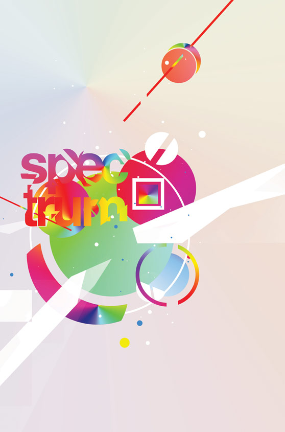
Creating a Spectrum Poster Design in Photoshop
In this tutorial, new WeGraphics contributor, Jonathan Wong walks you through how to create a Spectrum Poster design using Adobe Photoshop. So pull up a chair and join in as Jonathan takes us on a trip through his creative process.


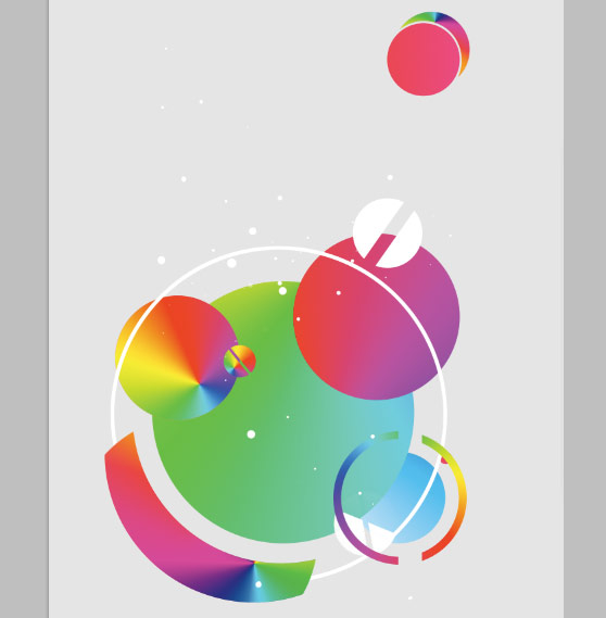
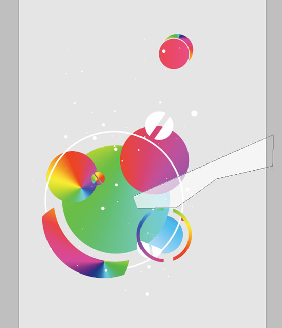
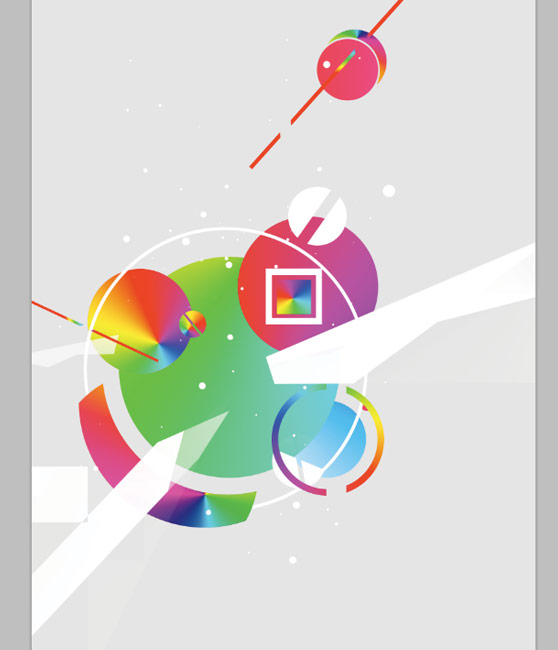
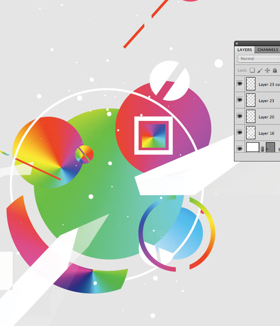
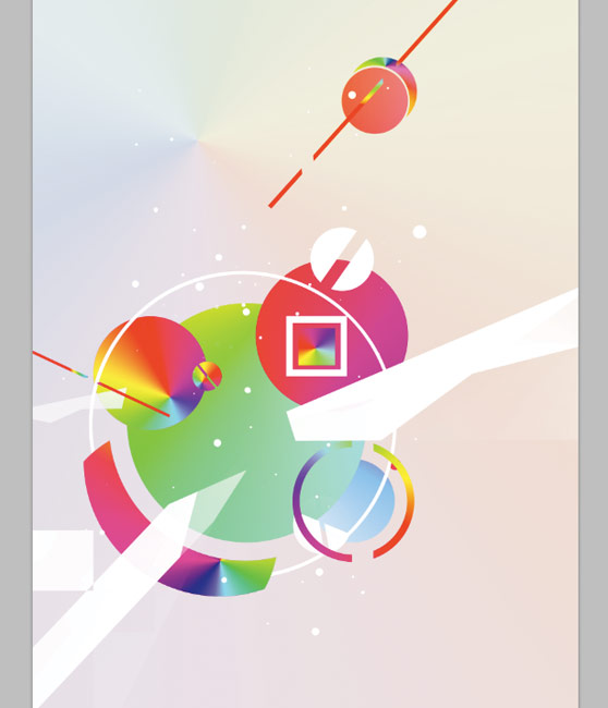

Preview

Step 1
Create a new document and make it whatever size you please. Select the fill tool from the toolbar and make the foreground a grey color. Fill the background layer with the grey color. This gives the background a softer feel and won't be as harsh on the eyes as a white foreground, especially when it's going to be mixed with large popping colors.Step 2
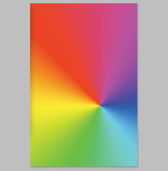
Create a new layer. Select the gradient tool from the toolbar. Pick the colorful preset as shown. Also make sure you choose the angle gradient from the gradient settings at the top of the screen. It is important to the effect.
Step 3
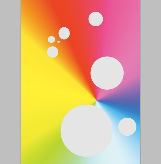
Drag and make the gradient in the new layer as shown. The longer you drag the gradient line, the more subtle the gradient is between the colors. You are going to want a somewhat even dispersion but you can mess around yourself.
Step 4
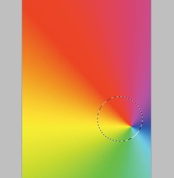
Once the gradient is made, select the circular marquee tool from the tool bar. Now on the same layer as the gradient, hold shift and make a circular marquee over a spot of color that you would like to make a shape from. Right click and select layer via cut. This will cut the shape from the gradient and produce a new layer with the circular color. You can proceed to do this as many times as you like, cutting circles of varying sizes from the gradient layer.
Step 5
You should now be left with something like the image seen above, depending on how many circles you cropped out. Now it is up to you on how you want to style and position the piece. Move the circle layers around and create a composition that you like. It can be with as many amount of circles as you want. Note that it helps to have circles that vary in scale. It gives the piece a much better dynamic.
Step 6
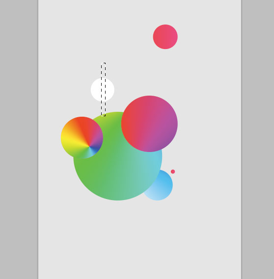
Now you can start adding some different circles and shapes to mix up the composition and the elements. So, select the marquee tool and make another circle. You can choose from using the fill tool or gradient tool this time and begin by making new colored shapes. In my example, I mixed it up from you using the gradient tool and using some fill colors like white. Once the circles are made, select the rectangular marquee tool. Make a rectangular shape that dissects the circle on your chosen layer. Hit backspace/delete and then press cmd+d to deselect the marquee. Proceed then to rotate the circle and hitting the shortcut cmd+t. Repeat this process a few times over to create some unique shapes.
Step 7
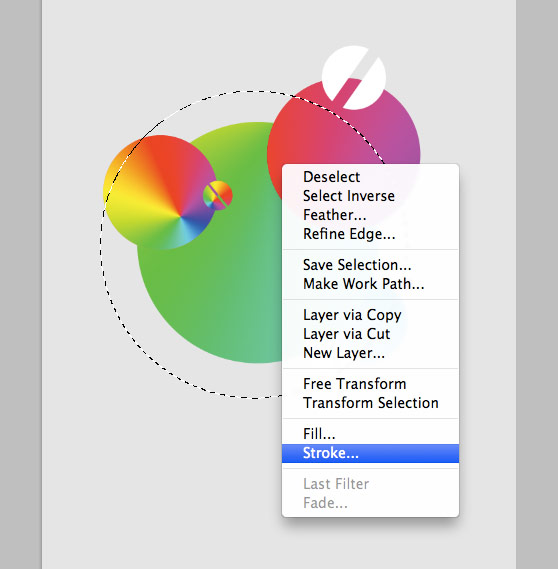
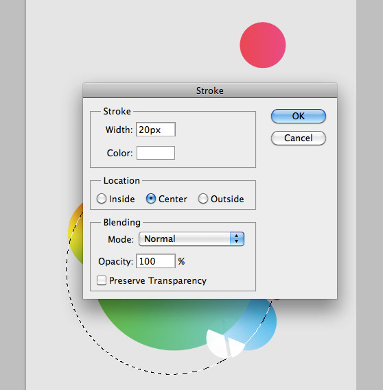
Another cool shape I like to make is a circular stroke bar. Now like most things in Photoshop, there are countless ways to produce elements with the same outcome. How I generally make these is very straight forward. Make a new layer and select the circular marquee tool once again, hold shift and drag out to make a proportional circle. Then right click on the marquee and select stroke. A popup box will appear. Make the stroke as thick or thin as you want by altering the pixel size on the stroke in the box. I chose a thick stroke for this at 20px and filled the color with white. Select okay. This stroke can then be cut and dissected, similar to the previous step.

Step 8
For this step, I wanted to add in some even smaller circles/dots to the composition. In every piece, the small details play just as important a role as the large elements. The details really bring the piece together in my opinion. Select the brush tool and choose a brush with a hard edged with a low pixel size varying from 2px to 20 px. With brush selected, paint some circles varying in size around the composition. Don't over do it on this stage. you want to create some dynamic but you don't want it to end up looking like a cheap splash brush.
Step 9
Now to help bring the same shapes together, I'm gonna create some nice angular vectors to give the piece an extra dimension. Select the pen tool, with a white foreground and very simply draw some interesting shapes that bridge the circles on the composition. It make take a few tries to get a nice interesting shape that helps the composition. When the shape has been created, lower the opacity on the shape. This gives it a nice glassy, futuristic look. Repeat this step however many times you desire.

Step 10
Again to really bring the piece along, I added some more new shapes. This time with some simple lines and squares. To make a line, simply select the line tool from the toolbar. Make a new layer, and then drag the line on the canvas. You can vary its weight from the toolbar on the top of the screen as shown. And to make the square, it's the same way as you would using the circles just instead of selecting the circular marquee, you select the rectangular marquee. This is achieved by clicking and holding the circular marquee and then dragging out to the right. this brings up a selection of the different shapes you can select with the marquee tool.
Step 11
To bring the piece together, I used a little trick that I learned that works better than a colour balance in this instance. Create a new layer and similar to what you did in step 2, create a new angular gradient using the same multicolored gradient as before. Once created, set the blending mode on the layer to soft light. This casts a feint sheen of colour over the composition and gives it a nice finish.
Step 12
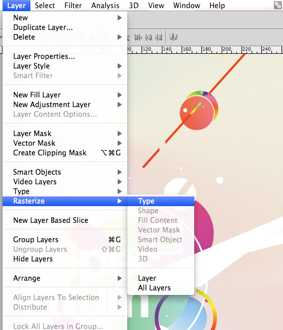
For the finishing touch, I added in some typography to give the piece a focal point and tie it all together. Select the type tool and click on the canvas, this will bring up a new layer. I named the piece spectrum and said the type in Helvetica bold. Once you are happy with the type, you can dissect and chop it up by rasterizing the layer. To rasterize, simply go to layer, rasterize, type as shown. Once the layer is rasterized, you can cut the text up and alter it how you please, adding different gradients and such.
Final
