Art Deco Design Trends of 2019
Welcome Back to the Roaring 20s!
Design trends in 2019 are moving towards styles and influences of the 1920s, showing history really does repeat itself.
When people think of the 1920s, they often think of flapper dresses, zoot suits, and speakeasies. But there is so much more to that era than what is seen on The Great Gatsby.
The styles of the 1920s, called Art Deco, are so iconic that as we approach the 2020s, more and more of those influences can be seen in modern day.
In today’s inspiration roundup, we’ll be looking at the influences of the 1920s on branding, fonts, and home design in 2019. The way creatives in today’s world have blended elements from a century ago and made them relatable and desirable for a new generation is something truly inspirational.
What is Art Deco?
Before we get started, we need to take a closer look at what exactly constitutes as art deco.
As is the case with most great things, art deco originated from France, where it was called style moderne. The new style was a sign of wealth, blending aspects of European modernism into fashion and design.
Art deco style is recognized by its use of geometric shapes, clean lines, and surrealism. Because this style was so closely tied with the feeling of sophistication, advertisers would often use elements to make their products seem one-of-a-kind or limited edition. Over the two decades where art deco was most prominent, the style morphed into one used heavily in branding.
If you aren’t sure if something is art deco, think of buildings like the Empire State Building or the Chrysler Building. Edward McKnight Kauffer was an artist and designer whose work mirrors the art deco movement. And the fashion designer Paul Poiret used art deco influences in his pieces.
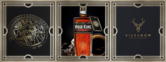
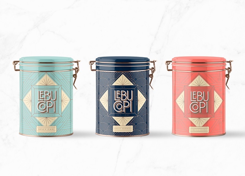
Art Deco in Branding
When it comes to art deco influences in branding today, there are so many features and elements from which to draw.
What makes art deco perfect for branding and design is that the stylistic movement has a foundation in advertising. The stark contrasts and eye-popping elements were all crafted to grab attention and sell products.
So it makes sense that designers would be drawn to the characteristics found in 1920s style.
When it comes to branding and design, there are a few things to look for if trying to give that art deco feel. The first is the combination of heavy, thick lines and geometric shapes. Art deco makes use of zigzags, strong strokes, and hard edges. You’ll see lots of rectangles and triangles in art deco branding.
Secondly, you should look for very defined spaces, specifically empty or unused space. The balance of heavier lines and empty space brings these designs to an equilibrium.
Images in art deco design aren’t 3D or realistic, opting instead to use the rigid lines and shapes to give a flat, severe look.
And finally, art deco in branding leans towards simplicity when it comes to coloring. More often than not, you’ll see one or two colors that are used heavily rather than a more diverse palette.


Art Deco Fonts
Typography in the 1920s was known for its thick lines and heavy strokes, moving away from the more decorative, elaborate swashes and flourishes found in previous fonts.
Again, because these fonts were created with advertising in mind, they needed to be bold and easy to read.
Despite the use of heavier, straighter lines, art deco fonts are still quite decorative. Instead of using swashes and tails, however, the use of varying line weights and fills were used to add a fun twist. Because art deco fonts are so unique and powerful in their display, they can be used on their own to create a design.
One last thing you’ll notice about art deco typefaces is that they often come in all-caps. Once again, this points back to the roots of art deco in advertising. Now and then, you’ll see examples with lower-case options, but traditional art deco fonts will usually present in capitalized lettering, making them perfect for headings.


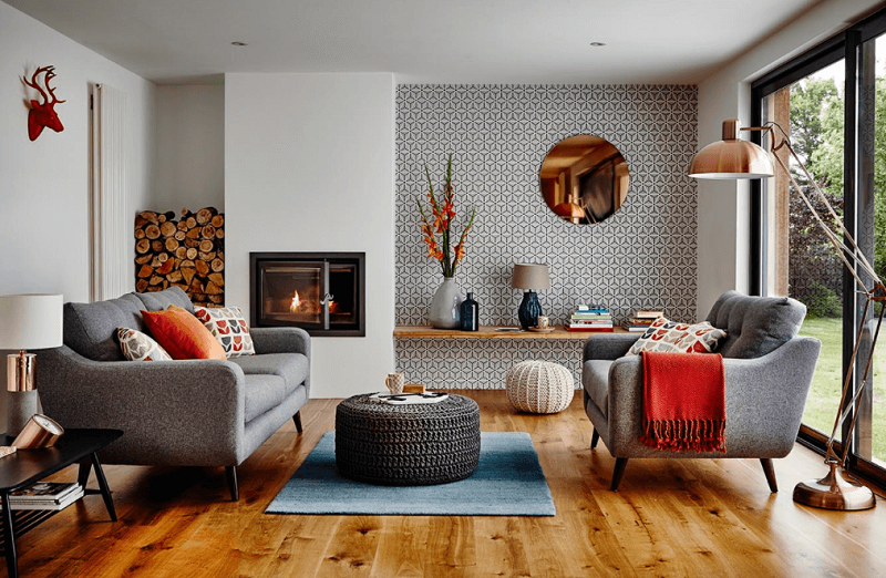
Art Deco in Home Design
The foundation and roots of art deco can be seen in home designs of the 1920s and in the recent resurgence of that eras influence today.
Art deco is all about grabbing attention and making bold statements. There’s a tendency towards symmetry and geometric patterns, whether in textiles or in the actual architecture of the home. The powerful angles are softened by the warmth of gold, glass, and wood that often made appearances in 1920s home design.
Of course, these styles have been updated for the modern world, where most people prefer balance than an all-out commitment to one style. You’ll still see animal patterns, chrome, and an abundance of triangles, but in more grounded, subtle ways.
Colors are vitally important when it comes to art deco in home design. There are the more typical yellows, reds, and golds, but you’ll also see black, chrome, and silver. The colors are often played against heavier, larger wood pieces, though again, this has changed in modern times.
In 2019, sharp angles and solid colors still pay homage to the art deco styles of the 1920s, but in a hybrid way that is recognizable without being overwhelming.


More from Inspiration

The Best Music Logos of the Year
Inspirationby Bridgette Mabuto
Our best music logos and design inspirations will spark your creativity for your next music-themed project.
Read more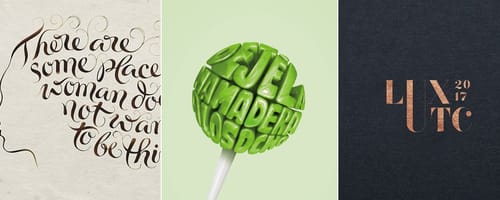
5 Big Rules of Typography, and Examples of Designers Breaking Them
Inspirationby Bridgette Mabuto
These five typography rules provide guidelines to make using different fonts easier and more effective, resulting in powerful, beautiful designs.
Read more
Product Packaging — Gorgeous Inspiration, and Mockups to Match
Inspirationby Bridgette Mabuto
Product packaging draws attention and sells by creatively and uniquely setting that product or brand apart.
Read more
Fancy Fonts that People Love
Inspirationby Bridgette Mabuto
Fancy fonts are the perfect way of making a big impression and grabbing an audiences attention.
Read more