A step to be ahead: start designing for mobile devices
Our world is evolving. New technologies and new researches are giving us more opportunities to develope internet-based applications for several, and different, devices. In particular, taking a look to the new telecommunication frontiers, it seems to be clear that the challenge is to provide a lot of services on mobile phones. The next level, so, will be to communicate in mobility.
I'm not speaking just about WiFi on your iPhone or Android-based phone, but about a mobile network technology that will allow us to browse our favorite website and use our useful web-apps everywhere (WiMAX, Long Term Evolution and so on).
Moreover, new features, hardware upgrades and cool applications are trasforming our mobile phone in a productivity machine. These are the main reasons that should drive us, web designers and developers, to digg into the fantastic world of the mobile web design and development.
It is a field relatively new, but, as said, it isn't science fiction to think in few years a good percent of internet users will browse using brilliant and versatile mobile phones through a stable mobile network.


Get unlimited access to 2500+ design resources for only $7! Take a tour or sign-up now.
Why should we consider mobile users now?
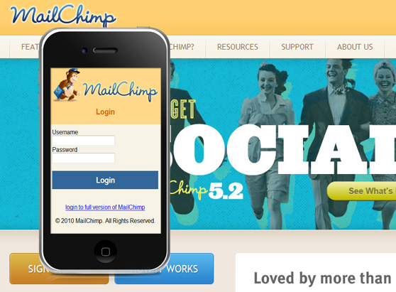
Well, if I'd ask you the main use of a mobile phone, I'm sure that the answer is 'to communicate with people.' It is not a One Million Dollar Question, but if I'd ask you how many ways you know to communicate today, the answer will be articulated. Nowadays, thanks to social networking platforms (such as Facebook or Twitter) or instant messaging services (such as Skype, AIM, Google Talk), people communicate using different approaches, with few clicks you can send a notification to a list of friends or write a short message in real time. Try to imagine if this is possible ever and everywhere... this is the future: the mobility. It's evident that the web, the classic web, is dying. Internet users are not dummies or beginners who looks for some information. They want services, they want to stay connected with their friends, sharing their passions, in real-time. So, website owners, who offer good information and who love their users, must create a service, not jut a website. Creating a good mobile version of a website contributes to build a good service, right now!Mail Chimp
MailChimp is a powerful, easy-to-use email marketing service. They have a light version of the app for mobile users.
What mobile users want?
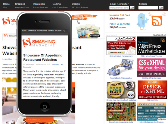
Hard question, at the moment... the technology in this field is evolving and there is an epic 'battle' among the companies who works to improve their products. There are new features and hardware upgrades every month and too many devices; so the users don't have a 'standard behaviour,' but there is a fact: they want to stay updated! Often is sufficient to create a new version of the website (or web-app) simplifying the layout and focusing attention on the content (highlighting the recent articles).Smashing Magazine
Smashing Magazine delivers useful and innovative information to Web designers and developers. The mobile version of SM is absolutely focused on the content.
Web Designer Depot
The blog is a joint effort and collaboration between leading designers around the world which contribute a wealth of expertise on all fields of design. The readers can stay updated through the mobile version that show the last articles of the blog.
Ride the challenge
Yes, it's a challenge. The number of users browsing the Web from mobile phones is rising, but the mobile context has a wide variety of devices with different screen sizes and features. You have to create a mobile website that should works considering the screen dimensions of most common phones available: 128x160px, 176x220px, 240x320px, 320x480px; you have to synthesize the content, the navigation menus and the links of your website; you have to design for an optimal user experience. The mission is not easy, but as web designers and developers we have to stay on top in order to create useful services and to get relevance in the industry. Mobile website development will be really significative for our next web projects; so below there are some points to keep in mind planning the mobile version of a site.Target your users
This is an important step in all web projects, but in this case you should trace a more detailed profile of your kind of mobile visitors in order to provide them a better service.The simplicity is the key
As said, the mobile users need quick updates or to accomplish some basic tasks on their favourite web-apps. So, try to provide only relevant information and tools on the mobile version of your website.Emphasize yor content
Satisfy the visitors delivering what they want. If your mission is the sharing of good and useful information about specific topics, you should show the content hiding other unnecessary elements and providing only the essential navigation options to the user.Design a responsive website
If we've learned a lesson, it is that there so many devices able to render a website or a web-application. For this reason our designs should be really adaptive and responsive to engage more mobile users. One-column liquid layout and/or the use of media queries could be great ideas.Test to enhance
The best way to improve your design.Don't stop to learn and stay updated
In this field the changes are frequent and new technologies are developed daily. The best way to stay on top of is to learn new things day by day. Stay updated, follow interesting blogs and people on social media!Showcase of well-done mobile websites
jaguars.com

wvutoday.edu

vspink.mobi

wansonvitamins.com

mandelgroup.com

esignbleach.com

marinayachting.it

vimeo.com

mashable.com

nike.com

flickr.com

nclud.com

google.com/finance

visitkc.com

vondicomm.com

diesel.com

Articles and resources
Useful articles:
- Designing for the Mobile Web
- Responsive Web Design
- Mobile screen size trends
- More on mobile screen size trends
- CSS3 Media Queries
- Mobile Web Design: Best Practices
Emulators for testing:
- Android Emulator
- BlackBerry Simulators
- Firefox Mobile emulator
- iBBDemo2 - Cross Platform iPad and iPhone Simulator
- Mozilla Fennec emulator
- Nokia Mobile Browser Simulator 4.0
- Opera Mini Simulator
- Windows Mobile Developer Center


