
5 Big Rules of Typography, and Examples of Designers Breaking Them
Making Statements with Typography
These five typography rules provide guidelines to make using different fonts easier and more effective, resulting in powerful, beautiful designs.
Typography is everywhere.
And it’s so pervasive, whether on websites, in magazines, or on billboards, that most people don’t even realize the power typography has over them.
The truth is, typography, and the art of selecting and arranging it, plays a huge role in relaying messages to audiences. And because typography and design go hand-in-hand, it’s vitally important for designers to understand the best way to use typefaces.
In today’s roundup, we’ll be looking at five of the major rules for using typography. And then, because nothing is ever set in stone, we’ll look at how designers have learned these rules just to break them.
Enjoy!
Start with the Basics

Typography is a lot of fun.
And because it’s a lot of fun, it can be tempting to just jump in with wild abandon and hope for the best. But before adding typography to a design, it’s important to understand the fundamentals of typefaces. By taking the time to get to know the rules and best practices for typography, time-wasting mistakes can be prevented.
And learning the basics doesn’t have to be difficult. It all starts with paying attention to how experts in the past and in the present have used typefaces. Grab a couple of magazines, log into Pinterest, or look up some favorite big brands and pay attention to how they’ve used typography over the years.
One of the first basics most designers learn is the importance of visual hierarchy, or how typography leads viewers through the information. What’s the most important piece of information? Where should the eyes go next? How a font make sure the information is received in that order?
Once the fundamentals are down, it’s time to practice. And practice again. And practice once more. Nothing comes easily, especially in design. It’s vitally important to put new knowledge to work over and over again to create a comfort.
Practice comes before mastery.
And after mastery comes more practice.
Get Technical

Learning the technical, nitty gritty parts of typography is not at all fun, but it is vital. One of the fastest ways to tell the different between an expert and a novice designer is their understanding of typeface technicalities.
There are three main technical concepts of typography that every designer should know: Leading, Tracking, and Kerning.
Leading is the amount of space between each line in a paragraph. This is particularly important in designs with more content, like articles or blogs.
Tracking is the amount of space between all the words and letters in each sentence. Both tracking and leading become even more important when it comes to layouts and creating a seamless flow for the eyes to follow.
Finally, kerning is the space between specific, individual letters in a word. Kerning becomes extremely important in headlines and typeface designed to grab attention.
These may seem like small details, but when they’re done right, it makes an impact. And when they’re done wrong, it makes an even bigger impact.
A good designer will have all these measurements done so well, that most casual viewers won’t notice them, they’ll just see a beautiful design. Thankfully, many of the design programs and services automatically correct space errors, making it easier for designers to stay on track.
Focus on the Message
Typography is a tool, meaning it works to serve a purpose. Most of the time, the purpose of typography is to relay a very specific message.
In order to relay the message it needs to relay, typography has to focus on its message.
There are three things to consider in this rule: Readability, Color, and Connection.
Readability seems like an obvious requirement when it comes to typefaces, but a surprisingly high number of designers get this wrong.
A font that can be read on a computer monitor may be blurry from far away. Script fonts are notorious for being difficult to read! And it’s not just about font type, it’s about font size, too. If the words on a billboard can’t be read in the milliseconds someone driving by in a car has, that’s the wrong font.
Going hand in hand with readability is font color. Any good designer knows that colors can trigger emotions when used properly. It’s important to use colors that make sense for the design, especially when any form of branding is involved.
Final note on color: Make sure a color scheme looks the same across all mediums. Nothing can mess up a design more than a faulty printer ruining the hues of the fonts.
And finally, when working with typography, there needs to be a clear connection between the fonts and the message. A typeface that works for a dental brochure won’t work for a children’s boutique. It can be hard to put aside personal preferences and biases when choosing a font, which is why it’s a priority to remember the main target audience.
The target audience needs to respond to the message.
So it doesn’t really matter what a designer likes if that aesthetic doesn’t draw in the audience.
Pair Sparingly

Just like too many cooks can spoil the broth, too many fonts can spoil a design. Reminiscent of middle school PowerPoint Presentations, sometimes designers can get so excited about fonts that they end up throwing half a dozen into one design. The result is a hodge-podge disaster.
Everything in typography should be done in moderation.
Most designs only need two or three typeface variations to make an impression. Again, it’s all about how the fonts work together and communicate their message to the target audience.
Here’s where things can get a little bit more complicated.
While it’s not wise to use dozens of different fonts, typeface blending can result in some truly stunning designs. Different typeface options, when paired carefully, help keep the eyes moving, relaying different levels of a message.
The key is to make sure the fonts pair well together and that they are both (or all) readable. When typefaces are paired well, though, the visual hierarchy becomes more obvious and much more captivating.
Be Flexible

Yes, there are some tried and true rules when it comes to typography. And it’s important to know those rules so they can be broken with care.
Typography isn’t just a design tool, it’s an art form.
And just like any form of art, sometimes the most powerful and beautiful statements are completely outside the box. Even when following all the typical rules of typography, adjustments and additions to the little details can elevate a design.
However, a word of warning. As is the case with most art, typography goes through phases. There will always be font trends and when they hit, they are everywhere. These trends can seem exciting and challenging, but they often go out of style quickly. The key is to be authentic when using typography and allowing each project to express its own form of creativity.
A great way to use typeface creatively is to find something that catches the eye and lights the flame of creativity. Learning about how different fonts have been used in the past may trigger an idea for more contemporary designs.
There are so many resources available for typophiles, both online and in print. Exploring these resources is a great place to look for inspiration. Even better, think completely outside the box. Be inspired by nature, the lines of a building, or the angles of a car. There’s inspiration for typography everywhere.
Exceptions to the Rules
Typography is a form of art, albeit one blended with more technicalities than most. And because it’s an art form, there will always be exceptions to the five rules listed above.
And that’s what makes typography so great! Time and time again, designers have shown that the rules can be broken to great effect.
Below are some examples of how big brands have broken the rules of typography, from not prioritizing readability to using some truly insane fonts.
Enjoy!
Prioritizing Readability
In these ads and designs, readability is not as big a priority. While the message still gets across, to actually read the copy, audiences may have to look a bit longer and pay closer attention.


Pairing Sparingly
These big name designers threw the rule of using two or three fonts out the window with success. They used more typefaces to make a bigger impression.


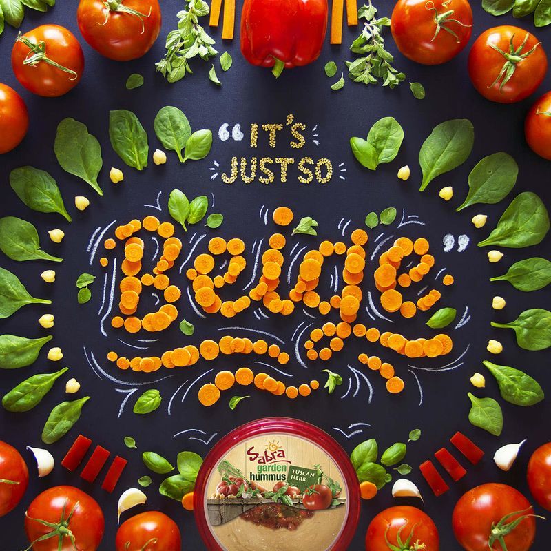
Using Interesting Font Trends
Instead of sticking with tried and true fonts, the designers of these ads got extremely creative. Not only did they use interesting font trends, they also used varied materials to display those fonts.


More from Inspiration

The Best Music Logos of the Year
Inspirationby Bridgette Mabuto
Our best music logos and design inspirations will spark your creativity for your next music-themed project.
Read more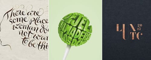
5 Big Rules of Typography, and Examples of Designers Breaking Them
Inspirationby Bridgette Mabuto
These five typography rules provide guidelines to make using different fonts easier and more effective, resulting in powerful, beautiful designs.
Read more
Product Packaging — Gorgeous Inspiration, and Mockups to Match
Inspirationby Bridgette Mabuto
Product packaging draws attention and sells by creatively and uniquely setting that product or brand apart.
Read more
Fancy Fonts that People Love
Inspirationby Bridgette Mabuto
Fancy fonts are the perfect way of making a big impression and grabbing an audiences attention.
Read more