20 unique examples of light effect in graphic design
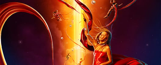
Light effects in graphic design are a way to give keenness to images creating a strong contrast between light and dark tones. These effects, an actual trend, give the best result when they are used in images really dark, so to highlight a particulate on which user attention should be attracted.
Some graphics, like Boss Logic and Pete Harrison, make lights and lightness a fundamental key for their works. What shall be considered using these elements is that light effects create shadows, areas to be made brighter and others to be made darker. It's not enough to download the picture of a lightness and set the layer to screen. Personally I like more light effects, even if used in an excessive manner.
Today I made a selection of 20 examples that can be used as source of inspiration for your next work:


Agony
by Fabian Warnke
Apache
by Wojciech Magierski and Sam Robles
Children of the idiom
by Pablo Alfieri
(Desktopography)
by Julien Morel
Electric Silence
by Pete Harrison
Eraser
by Adam Spizak
Evolution
by Nik Ainley
I feel good
by younes ze
Let her go
by Boss Logic
Monroe 3000
by Michal Sycz
Movie Poster - Fugitive
by Alex Beltechi
Nebula
by Fabian Warnke and Javier Alvarado
Positive Hype
by Ars Thanea
Rich Soil 2
by Justin M. Maller
stylish reMixx
by Edmar Cisneros
Sugar
by Pete Harrison
The Red Bulletin - Singapore
by Peter Jaworowski
The Spontaneous Self-Combustion
by Adam Spizak
Vader, I am you father
by Boss Logic
We all fall
by Jerico SantanderMore from Inspiration
The Best Music Logos of the Year
Inspirationby Bridgette Mabuto
Our best music logos and design inspirations will spark your creativity for your next music-themed project.
Read more
5 Big Rules of Typography, and Examples of Designers Breaking Them
Inspirationby Bridgette Mabuto
These five typography rules provide guidelines to make using different fonts easier and more effective, resulting in powerful, beautiful designs.
Read more
Product Packaging — Gorgeous Inspiration, and Mockups to Match
Inspirationby Bridgette Mabuto
Product packaging draws attention and sells by creatively and uniquely setting that product or brand apart.
Read more
Fancy Fonts that People Love
Inspirationby Bridgette Mabuto
Fancy fonts are the perfect way of making a big impression and grabbing an audiences attention.
Read more